HOT
HOTTailkits UI
NEWConsistent UI, zero hallucinations
Discover Tailwind button components. Button components are essential UI elements users click to perform actions and trigger events or commands.
HOTConsistent UI, zero hallucinations
 HOT
HOT12+ Shadcn Templates
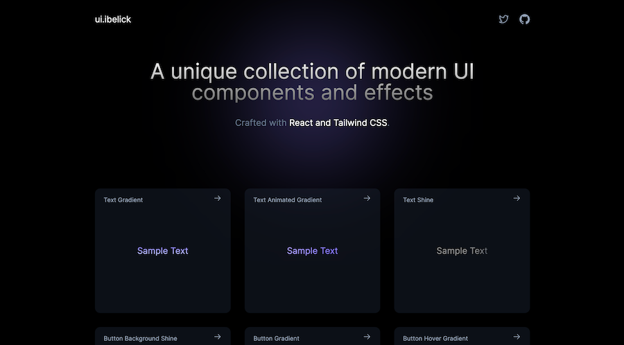
Framer Motion components from ibelick
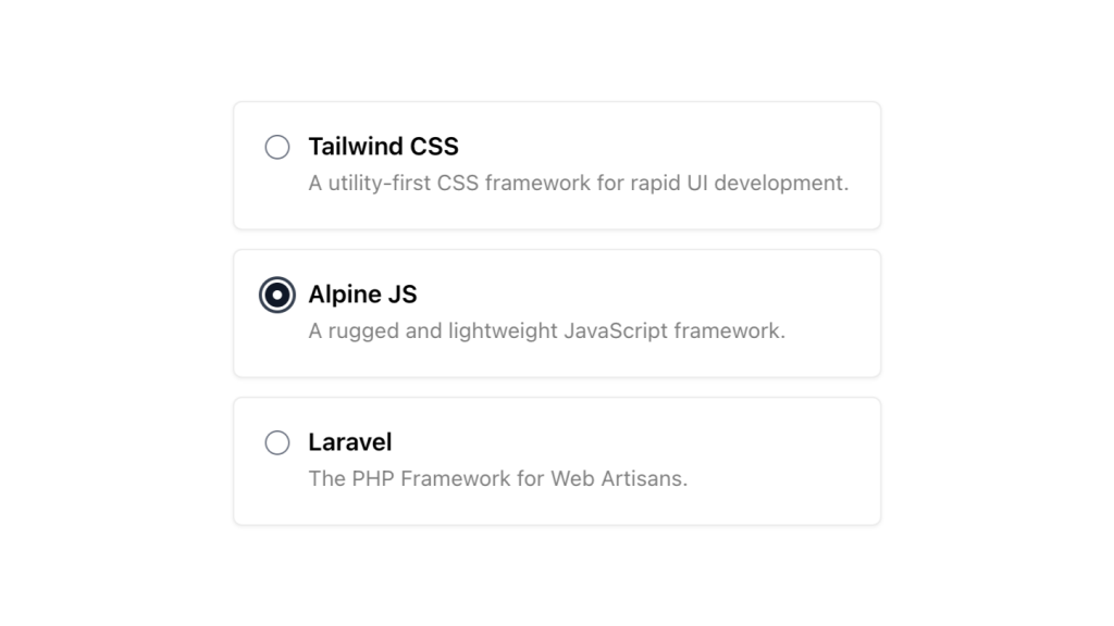
Alpine.js and Tailwind radio group component by Pines UI Library.
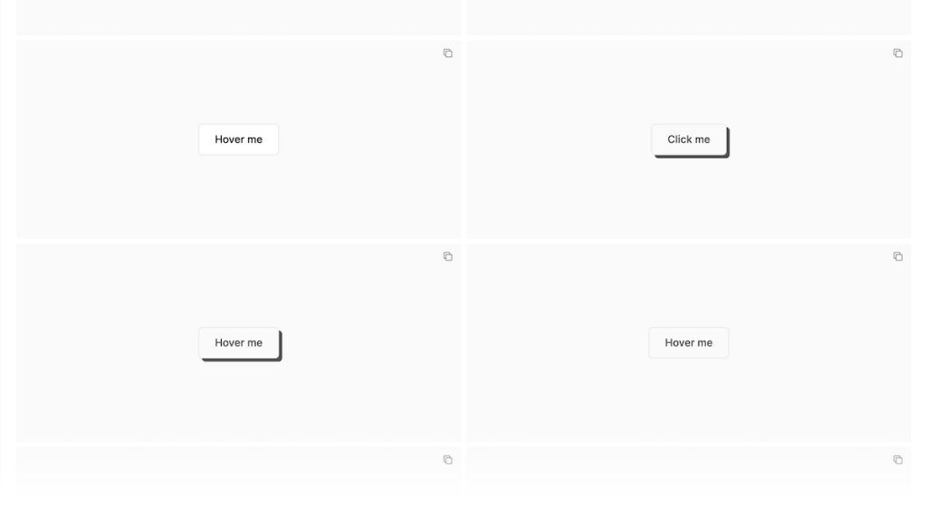
52 Free to use Tailwind buttons
18+ free React & Tailwind CSS UI Components
Sticky bottom button for Tailwind CSS
Production-ready Tailwind components for React, Next.js, Vue & HTML. Responsive, accessible UI blocks optimized for Tailwind v4 with MCP integration.
200+ ready-to-use Tailwind CSS components with MCP integration. Let AI generate complete pages from your prompts — one command, production-ready UI.
Explore Components
Buttons are fundamental elements in web design, serving as the primary means for users to interact with your website or application. Whether it's submitting a form, navigating to another page, or triggering an action, buttons play a crucial role in user experience.
Tailwind CSS stands out with its utility-first methodology, allowing developers to compose designs directly in their markup. This approach brings several advantages when creating button components:
Rapid Development: Tailwind's utility classes enable quick styling without switching between HTML and CSS files.
Consistency: Predefined classes ensure a uniform look and feel across all buttons in your project.
Customization: Easily tweak colors, sizes, and other properties to match your design requirements.
Responsive Design: Tailwind makes it straightforward to adjust button styles for different screen sizes.
Creating a basic button in Tailwind is as simple as applying a few utility classes. Here's a minimal example to get you started:
<button class="bg-blue-500 text-white px-4 py-2 rounded">
  Click Me
</button>
In this example:
bg-blue-500: Sets the background color to a shade of blue.
text-white: Sets the text color to white.
px-4 and py-2: Add horizontal and vertical padding, respectively.
rounded: Applies slightly rounded corners for a subtle aesthetic.
This basic structure forms the foundation upon which more complex and interactive buttons can be built.
Tailwind CSS allows you to create a variety of button styles to suit different purposes. Here are some popular variations:
Primary buttons are used for main actions and typically have a standout color.
<button class="bg-green-500 hover:bg-green-600 text-white px-4 py-2 rounded">
  Submit
</button>
Hover State: hover:bg-green-600 darkens the background on hover, providing visual feedback.
Secondary buttons offer alternative actions and usually have a more subdued appearance.
<button class="bg-gray-200 hover:bg-gray-300 text-gray-800 px-4 py-2 rounded">
  Cancel
</button>
Color Scheme: Uses lighter colors to indicate a less prominent action.
Outline buttons have no background color and instead use a border, creating a minimalist look.
<button class="border border-blue-500 text-blue-500 hover:bg-blue-50 px-4 py-2 rounded">
  Learn More
</button>
Border Classes: border and border-blue-500 define the border's presence and color.
Incorporating icons into buttons can enhance visual appeal and convey actions more effectively.
<button class="flex items-center bg-indigo-500 hover:bg-indigo-600 text-white px-4 py-2 rounded">
  <svg class="w-5 h-5 mr-2" /* SVG properties */></svg>
  Download
</button>
Flex Utilities: flex and items-center align the icon and text neatly.
Margin Class: mr-2 adds space between the icon and the text.
Tailwind's utility classes make it easy to tailor buttons to fit your specific design needs. Here are some customization options:
Adjusting the size of buttons can help prioritize actions on a page.
Small Button:
<button class="bg-red-500 text-white px-3 py-1 rounded text-sm">
  Small
</button>
px-3 and py-1: Reduce padding for a smaller footprint.
text-sm: Decrease the font size.
Large Button:
<button class="bg-red-500 text-white px-6 py-3 rounded text-lg">
  Large
</button>
px-6 and py-3: Increase padding for a more prominent button.
text-lg: Increase the font size.
Tailwind offers various classes to control the roundness of button corners.
Fully Rounded:
<button class="bg-purple-500 text-white px-4 py-2 rounded-full">
  Rounded
</button>rounded-full: Makes the button completely circular or pill-shaped.
Slightly Rounded:
<button class="bg-purple-500 text-white px-4 py-2 rounded-md">
  Rounded
</button>rounded-md: Applies a medium border radius for subtle rounding.
Adding shadows can give buttons depth and make them stand out.
<button class="bg-yellow-500 text-white px-4 py-2 rounded shadow hover:shadow-lg">
  Shadow
</button>shadow: Adds a basic shadow.
hover:shadow-lg: Enhances the shadow on hover for an interactive effect.
Indicating a disabled state improves user experience by communicating unavailable actions.
<button class="bg-gray-400 text-white px-4 py-2 rounded opacity-50 cursor-not-allowed" disabled>
  Disabled
</button>opacity-50: Reduces opacity to signify inactivity.
cursor-not-allowed: Changes the cursor to indicate the button is not clickable.
Ensuring that your buttons are accessible to all users is essential. Tailwind CSS provides utilities to help achieve this:
Focus States:
<button class="bg-teal-500 text-white px-4 py-2 rounded focus:outline-none focus:ring-2 focus:ring-teal-300">
  Accessible
</button>focus:outline-none: Removes the default outline.
focus:ring-2 and focus:ring-teal-300: Adds a ring around the button on focus, aiding keyboard navigation.
ARIA Attributes:
Adding ARIA labels can enhance screen reader compatibility.
<button class="bg-pink-500 text-white px-4 py-2 rounded" aria-label="Submit Form">
  Submit
</button>To maximize the effectiveness and maintainability of your button components, consider the following best practices:
Maintain a consistent style across all buttons to provide a cohesive user experience. Define primary, secondary, and other button types clearly and stick to their designated styles throughout your project.
Ensure buttons look and function well on all devices. Use Tailwind's responsive modifiers to adjust button sizes, padding, and other properties for different screen sizes.
<button class="bg-blue-500 text-white px-4 py-2 md:px-6 md:py-3 rounded">
  Responsive
</button>
md:px-6 and md:py-3: Increase padding on medium and larger screens.
Buttons should clearly communicate their purpose. Use descriptive text and appropriate colors to guide users toward desired actions.
Avoid cluttering buttons with excessive styles or elements. A clean and straightforward design enhances usability and aesthetic appeal.
Ensure that all interaction states (hover, active, focus, disabled) are visually distinct and function as intended. This feedback helps users understand how to interact with buttons.
Leveraging Tailwind's utility classes allows you to create various button component variants seamlessly. Here are some additional styles to consider:
Ghost buttons have transparent backgrounds with colored borders and text, offering a subtle yet elegant option.
<button class="bg-transparent border border-indigo-500 text-indigo-500 px-4 py-2 rounded hover:bg-indigo-50">
  Ghost
</button>Indicating a loading state within a button can inform users that an action is being processed.
<button class="bg-gray-500 text-white px-4 py-2 rounded flex items-center" disabled>
  <svg class="animate-spin h-5 w-5 mr-2" /* SVG properties */></svg>
  Loading...
</button>
Flex Utilities: flex and items-center align the spinner and text.
Animation Class: animate-spin adds a spinning motion to the loader.
Full-width buttons are useful for mobile views or forms, ensuring buttons are easily tappable on smaller screens.
<button class="bg-red-500 text-white px-4 py-2 rounded w-full">
  Full Width
</button>w-full: Makes the button span the full width of its container.
Combining buttons with dropdowns can enhance navigation and functionality.
<div class="relative inline-block text-left">
  <button class="bg-gray-300 text-gray-700 px-4 py-2 rounded inline-flex items-center">
    Options
    <svg class="w-4 h-4 ml-2" /* SVG properties */></svg>
  </button>
  <!-- Dropdown menu would go here -->
</div>
Relative Positioning: relative allows the dropdown menu to position correctly.
Inline-Flex: inline-flex ensures the button and its icon align properly.
Tailwind CSS offers a powerful and flexible approach to building button components that are both aesthetically pleasing and highly functional.
You can find answers for commonly asked questions about components.
You can incorporate SVG icons directly within your button elements. Tailwind's utility classes help align and size the icons appropriately alongside the button text.
Tailwind's responsive modifiers allow you to adjust button styles at different breakpoints. For instance, you can use md:px-6 to increase padding on medium screens and above, ensuring buttons look great on all devices.
Yes, Tailwind supports gradients through utility classes. You can apply gradient backgrounds using classes like bg-gradient-to-r, from-blue-500, and to-green-500.
Tailwind provides state variants like active: and focus:. For example, to change the background color when a button is active, you can use active:bg-blue-700. Similarly, focus:ring can help you style focus states for accessibility.
Absolutely! Tailwind allows you to customize your color palette in the tailwind.config.js file. You can define new colors or modify existing ones to match your brand's identity.