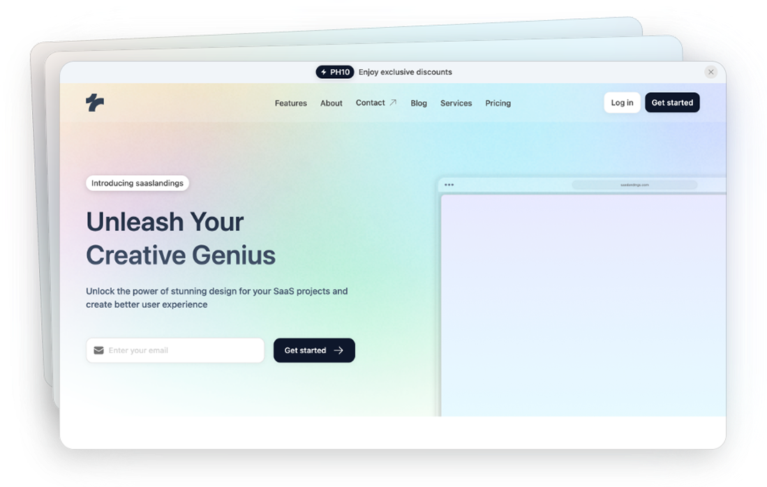
Preline UI
FreeOpen-source set of prebuilt UI components based on the utility-first Tailwind CSS.
Discover Tailwind auth components. Authentication components provide ready-made login forms, signup forms, and password reset interfaces.
Open-source set of prebuilt UI components based on the utility-first Tailwind CSS.
Discover the most popular Tailwind CSS ui components and elements. Browse top-notch Tailwind components to enhance your development process.
1300+ UI components for Tailwind CSS
When building a web application, one of the foundational elements you'll need is an authentication system.
Tailwind CSS is renowned for its utility-first approach, meaning you can style your components directly in your HTML without writing custom CSS. This approach is particularly beneficial for authentication components for several reasons:
Rapid Development: Tailwind's vast array of utility classes allows you to prototype and develop authentication forms swiftly.
Consistent Design: By using predefined classes, you maintain a consistent look and feel across all authentication elements.
Customizability: Tailwind is highly customizable, enabling you to adapt components to match your brand's identity effortlessly.
Responsive Design: Building components that look great on all devices is straightforward with Tailwind's responsive utility classes.
Let's delve into some of the most common authentication components you might need and how Tailwind simplifies their creation.
A login form typically includes fields for the user’s email and password, along with a submit button. Tailwind makes it easy to style these elements cohesively.
Input Fields: Use Tailwind classes like border
, rounded
, px-3
, and py-2
to style input fields.
Buttons: Utilize classes such as bg-blue-500
, text-white
, and hover:bg-blue-700
to create visually appealing buttons that respond to user interactions.
Registration forms are slightly more complex, often requiring additional fields like username, password confirmation, and sometimes CAPTCHA verification.
Form Layout: Flexbox utilities like flex
, flex-col
, and space-y-4
help in organizing form elements neatly.
Validation Messages: Tailwind’s text color classes like text-red-500
can highlight validation errors effectively.
Password reset components usually include a field for the user to enter their email address and instructions on how to proceed.
Instructional Text: Typography utilities such as text-gray-700
enhance the readability of instructions.
Action Buttons: Similar to login forms, buttons can be styled with Tailwind's background and text color utilities to ensure consistency.
For added security, 2FA forms require users to enter a code sent to their email or phone.
Code Input Fields: Small, consistent input fields can be created using w-12
, text-center
, and border
classes.
Submission Buttons: Ensuring these buttons are prominent and accessible using Tailwind’s interactive classes.
While Tailwind provides a solid foundation, customizing your authentication components to align with your brand is essential. Here's how you can achieve that:
Tailwind's tailwind.config.js
file allows you to tweak default settings:
Color Palette: Extend or override the default color palette to match your brand colors.
Typography: Customize font families and sizes to ensure your text aligns with your design guidelines.
Spacing and Sizing: Adjust padding and margin scales to achieve the desired layout aesthetics.
Tailwind supports theming out of the box, including dark mode. Using classes like dark:bg-gray-800
and dark:text-white
, you can ensure your authentication components look great in both light and dark environments.
Creating accessible authentication components is crucial for reaching a broader audience. Tailwind facilitates this through:
Focus States: Use focus:outline-none
and focus:ring
utilities to make interactive elements easily navigable via keyboard.
Aria Attributes: While Tailwind handles the styling, ensuring proper ARIA attributes are in place improves screen reader compatibility.
Contrast Ratios: Tailwind's color utilities help maintain adequate contrast, making text readable for users with visual impairments.
With a significant portion of users accessing websites via mobile devices, ensuring your authentication components are responsive is non-negotiable. Tailwind makes this seamless:
Responsive Classes: Utilize breakpoint prefixes like sm:
, md:
, lg:
, and xl:
to adjust styles based on the device's screen size.
Flex and Grid: Implement flex
and grid
layouts to create components that adapt fluidly across different viewports.
Beyond basic functionality, enhancing the user experience can set your authentication system apart. Tailwind provides utilities to incorporate smooth transitions and animations:
Transitions: Use transition
, duration-300
, and ease-in-out
to create subtle animations that improve interactivity.
Hover and Focus Effects: Implement hover states like hover:bg-blue-600
to provide visual feedback upon user interactions.
Tailwind doesn't lock you into any specific JavaScript framework, making it versatile for use with React, Vue, Angular, or even plain JavaScript. This flexibility ensures that your authentication components can seamlessly integrate with your chosen stack.
While we won't dive into lengthy code examples, here's a brief overview of how Tailwind can style various parts of your authentication system:
Input Field Example: An email input might use classes like border
, rounded-md
, p-2
, and w-full
to ensure it’s properly styled and responsive.
Button Example: A submit button could utilize bg-green-500
, text-white
, py-2
, px-4
, and rounded
to make it standout and clickable.
To maximize the effectiveness of Tailwind in your authentication components, consider the following best practices:
Consistent Spacing: Use Tailwind’s spacing utilities to maintain uniform padding and margins throughout your forms.
Semantic HTML: Combine Tailwind with semantic HTML elements to enhance accessibility and SEO.
Reusable Components: Create reusable components for inputs, buttons, and form groups to reduce redundancy and streamline your codebase.
Tailwind Plugins: Leverage Tailwind plugins like @tailwindcss/forms
to simplify form styling further.
Tailwind CSS offers a powerful, flexible, and efficient way to build authentication components for your web applications. Its utility-first approach simplifies the styling process, allowing you to focus on functionality and user experience.
You can find answers for commonly asked questions about components.
Yes, Tailwind’s utility classes make it easy to design multi-step forms by managing spacing, visibility, and transitions efficiently. You can create smooth and responsive multi-step authentication processes that guide users through each stage seamlessly.
Tailwind CSS automatically purges unused styles in production builds, significantly reducing your CSS bundle size. By configuring the purge option in the tailwind.config.js file, you ensure that only the necessary styles for your authentication components are included.
While Tailwind doesn't include form validation logic, it offers utility classes that make it easy to style validation states. You can use classes like border-red-500 for error states and border-green-500 for success states to provide visual feedback to users.