Bits UI
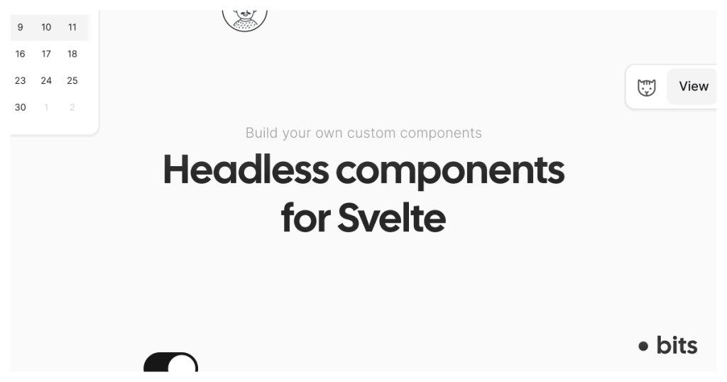
Headless Svelte components with accessibility built in

Bits UI is a headless component library for Svelte that gives you accessible UI behavior without forcing any styling. You get flexible primitives like dialogs, tooltips, popovers, and calendars, and you bring your own design system.

What is Bits UI?
Bits UI is a collection of headless UI primitives built specifically for Svelte. It handles interaction logic and accessibility concerns while leaving all visual styling to you, making it ideal for teams building custom design systems.
Definition - Headless component: UI logic and accessibility without default styles.
License: MIT.
What features does Bits UI offer? ✨
Bits UI focuses on solving the complex parts of UI development so you can stay in control of design and layout.
Fully headless and unstyled components
Accessibility-first behavior baked in
Designed with Svelte 5 in mind
Smart positioning for overlays like tooltips and popovers
Unified approach to date and time handling across locales
Active open-source maintenance and frequent releases
Which components are included in Bits UI? 📒
Bits UI covers a wide range of UI building blocks commonly used in modern applications.
Dialog (accessible modal windows)
Tooltip (contextual hover or focus hints)
Popover (floating content containers)
Calendar and range calendar
Select and list-based input patterns
Command menu components
Form helpers like labels
What are the pros and cons of Bits UI?
Pros ✅
Complete freedom over styling and theming
Strong accessibility defaults without extra work
Clear documentation and onboarding
Works well as a foundation for larger UI systems
Cons ⚠️
No visual styles included out of the box
Requires understanding of compound components
Some components introduce advanced concepts like positioning logic or date abstractions
How do you integrate Bits UI into a Svelte app?
Integration follows a simple flow: install the package, import the components you need, and apply your own styles.
Install the library using your package manager
Import only the components you need
Style components using your own classes and tokens
Ensure compatible versions when pairing with UI frameworks
Expect additional dependencies for advanced features like date handling
FAQ
Does Bits UI include default styling?
No, all components are intentionally unstyled.
Is Bits UI built for Svelte 5?
Yes, it is designed with Svelte 5 compatibility in mind.
How are overlays like tooltips positioned?
They use smart positioning logic by default, with options for manual control.
Do date components support multiple locales and time zones?
Yes, they are built to handle internationalization and time zones consistently.