Ark UI
Unstyled components for React, Vue, Solid, Svelte


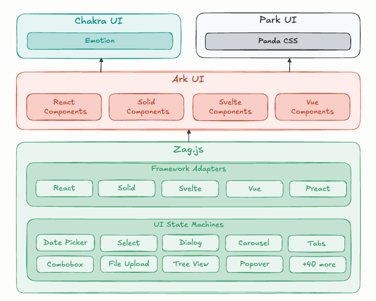
Ark UI is a headless component library that handles behavior and accessibility while leaving styling entirely to your design system. It supports React, Solid, Vue, and Svelte, and includes 45+ components built with predictable state-machine logic.
Key stats:
Components: 45+
Frameworks: React, Solid, Vue, Svelte
License: MIT
Definition: Headless components = logic + accessibility, no default styles
What Is the Ark UI?
Ark UI is a collection of unstyled UI components designed for building consistent design systems across multiple JavaScript frameworks. It takes care of keyboard interactions, ARIA patterns, and edge cases so you can focus on visuals.
Component behavior is powered by state machines, which keeps interactions predictable and consistent no matter which framework you’re using.
What features does Ark UI offer? ✨
Ark UI focuses on composability, accessibility, and framework parity. It gives you a solid behavior layer without imposing visual opinions.
Unstyled by default so you control the look
Accessibility-first interaction patterns
State-machine driven behavior
Consistent APIs across React, Solid, Vue, and Svelte
Styling hooks via stable component parts
TypeScript-friendly APIs
Which components are included in Ark UI? 📒
Ark UI ships with over 45 components covering common design system primitives. These components are meant to be assembled into real product interfaces without rebuilding logic from scratch.
Common examples include:
Dialog
Slider
Tooltip
Combobox
Popover, Accordion, and more
What are the pros and cons of Ark UI?
Ark UI works best when you want full styling control and strong accessibility guarantees. It’s less ideal if you want pre-designed UI out of the box.
Pros ✅
Ideal for custom design systems
Accessibility handled for you
Consistent behavior across frameworks
Predictable interaction logic
Cons ⚠️
Requires you to build and maintain styles
Learning curve around component composition
Not suitable if you want ready-made visual components
How do you integrate Ark UI into your app?
You install the framework-specific package, compose components, and style them using exposed parts and attributes. Most teams plug Ark UI into an existing styling setup and treat it as the behavior layer of their design system.
Install the package for your framework
Start from official templates if available
Style components using stable part selectors
Share the same component logic across multiple apps
Especially useful for teams supporting multiple frameworks
FAQ
Does Ark UI include default styles?
No. All components are intentionally unstyled.
Which frameworks does Ark UI support?
React, Solid, Vue, and Svelte.
Do I need to understand state machines to use Ark UI?
No. The state-machine logic is internal and abstracted away.
What’s the recommended way to style Ark UI components?
Style individual component parts using your existing CSS or utility framework.