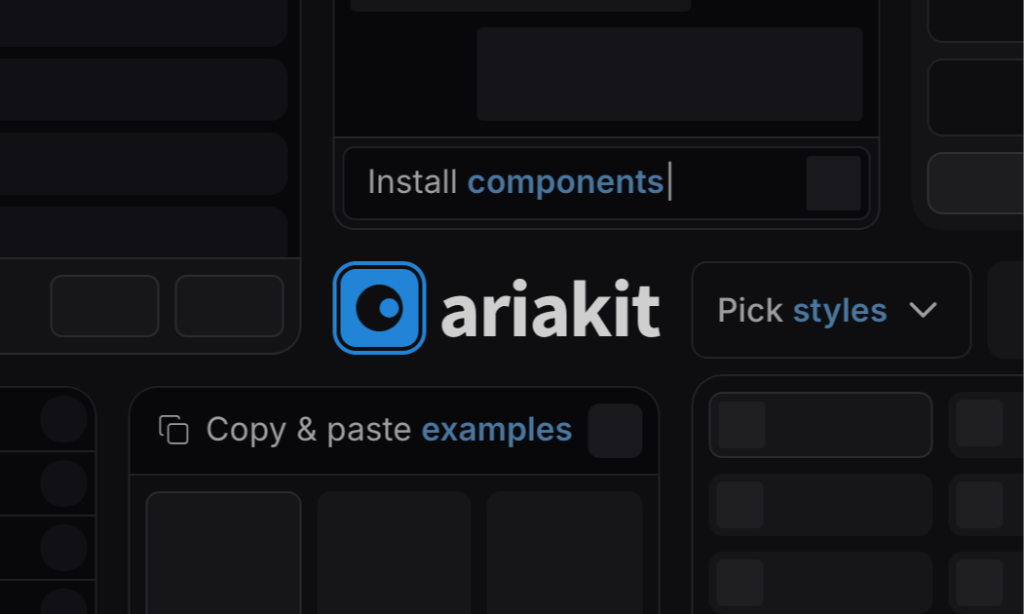
Ariakit
Accessible, unstyled React UI primitives with examples
Ariakit is a set of unstyled React components and hooks that take care of accessibility-heavy behavior like ARIA roles, keyboard navigation, and focus management. You keep full control over styling while moving faster with ready-to-use examples.
What Is the Ariakit?
Ariakit is an open-source toolkit of low-level React components and hooks designed to help developers build accessible web applications and design systems. It focuses on headless building blocks, meaning it provides behavior and accessibility without enforcing any visual style.
Definition: Headless UI
Headless components provide interaction logic and accessibility features without visual design, allowing full freedom over layout and styling.
Key stats
Works with React 17 and newer
Designed for accessibility-first component development
Suitable for apps, component libraries, and full design systems
Features ✨
Ariakit focuses on handling the hardest parts of accessible UI while staying flexible and developer-friendly.
Unstyled primitives that work with any CSS or styling system
Built-in ARIA roles and attributes
Keyboard navigation and focus management handled for you
Copy-paste examples to speed up real-world implementation
Well-structured documentation and composition patterns
Designed with performance and scalability in mind
Included Components 📒
Ariakit covers many common interactive UI patterns that are often difficult to implement accessibly from scratch.
Dialogs and modals
Menus and menu buttons
Popovers
Select and combobox patterns
Tabs
Tooltips
Form-related helpers and controls
Pros and Cons
Pros ✅
Accessibility is built in by default
Full styling freedom with no design constraints
Easy to start using through practical examples
Works well for custom UI kits and design systems
Modern React compatibility
Cons ⚠️
Requires more setup than fully styled UI libraries
Visual design is entirely your responsibility
Best suited for developers comfortable with composing components
Integration
Ariakit integrates smoothly into most modern React workflows.
Works with standard React setups
Compatible with server-rendered environments
Pairs well with Tailwind or any CSS solution
Ideal as a foundation for custom component libraries
FAQ
Is Ariakit styled by default?
No. It’s intentionally unstyled so you can design everything yourself, but it includes examples you can reuse.
Which React versions are supported?
Ariakit supports React 17 and newer versions.
Does Ariakit remove the need for accessibility testing?
It handles many accessibility concerns, but real-world testing is still important.
Can Ariakit be used with Tailwind CSS?
Yes. Since it’s unstyled, it works naturally with Tailwind and similar frameworks.