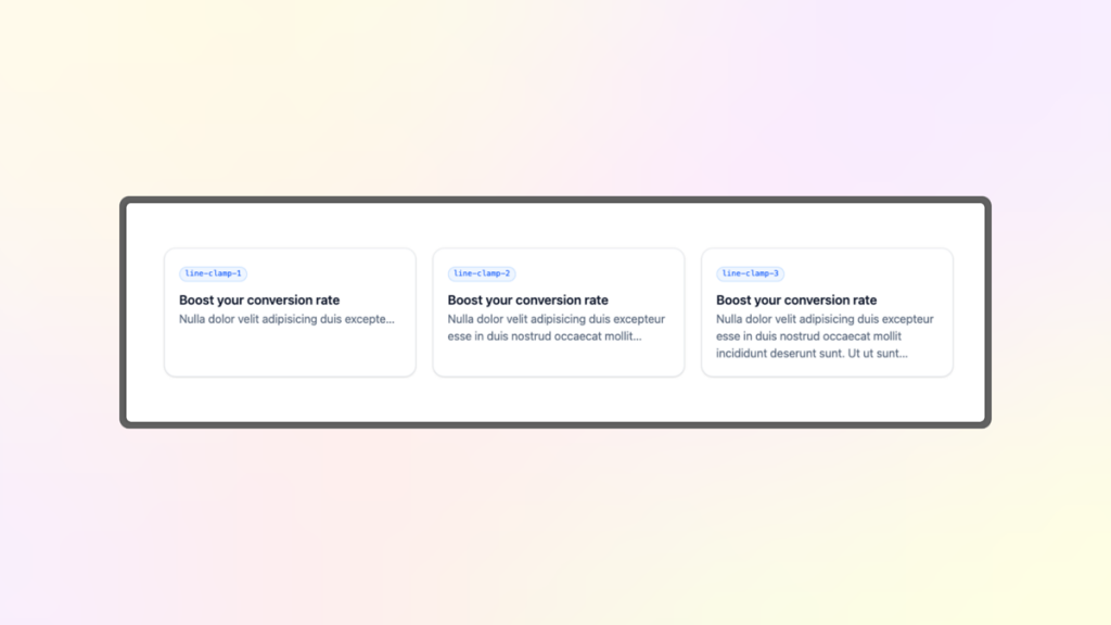
Use Tailwind’s line-clamp to shorten multi-line text with an ellipsis. See setup notes, examples, and best practices for clean, consistent UIs.
What line clamping does
Line clamping limits visible text to n lines, then hides the rest with an ellipsis. It’s perfect for card grids, list items, and preview snippets where you need consistent heights. Tailwind exposes this as line-clamp-{n} utilities. Under the hood it uses display: -webkit-box and -webkit-line-clamp, which have broad real-world support. The newer CSS line-clamp property exists but still isn’t “Baseline” across all major browsers yet.
Plugin vs core (do you need anything extra?)
No plugin needed on Tailwind 3.3+ and v4—line-clamp utilities are built in. If you’re stuck on an older Tailwind, you can still install the legacy plugin, but it’s officially unnecessary on modern versions.
Quick reference
Clamp to n lines:
line-clamp-2,line-clamp-3,line-clamp-6, etc.Remove clamping:
line-clamp-noneCustom value:
line-clamp-[8]or link to a CSS variable withline-clamp-(--my-lines)Responsive:
md:line-clamp-4
See the official docs for examples and exact CSS it maps to.
Basic usage
<article class="max-w-sm p-4 border rounded-lg">
  <h3 class="font-semibold text-lg">Boost your conversion rate</h3>
  <p class="line-clamp-3 text-slate-600">
    Nulla dolor velit adipisicing duis excepteur esse in duis nostrud occaecat mollit
    incididunt deserunt sunt. Ut ut sunt laborum ex occaecat eu tempor labore enim…
  </p>
</article>
The class adds the necessary overflow and WebKit box styles for you.
Responsive and interactive patterns
Different clamps per breakpoint
<p class="line-clamp-2 md:line-clamp-4">
  This description expands to four lines on medium screens and above.
</p>
Tailwind variants like md: work as expected with line-clamp.
“Show more / Show less” toggle
<article x-data="{ open:false }" class="space-y-2">
  <p :class="open ? 'line-clamp-none' : 'line-clamp-3'">
    Long content here… Long content here… Long content here… Long content here…
  </p>
  <button @click="open = !open" class="text-indigo-600 hover:underline">
    <span x-text="open ? 'Show less' : 'Show more'"></span>
  </button>
</article>
Toggling between line-clamp-3 and line-clamp-none is a simple, accessible way to reveal the full text.
Custom values and design tokens
If you need more than the common presets, Tailwind v4 supports arbitrary values and CSS variables:
<!-- Clamp to 8 lines -->
<p class="line-clamp-[8]">…</p>

<!-- Drive it from a design token -->
<style>
  :root { --teaser-lines: 5; }
</style>
<p class="line-clamp-(--teaser-lines)">…</p>
This maps directly to -webkit-line-clamp with your custom value or variable.
Card grid recipe for equal heights
<ul class="grid gap-6 sm:grid-cols-2 lg:grid-cols-3">
  <li class="border rounded-lg p-4 flex flex-col">
    <img src="/img/cover.jpg" alt="" class="rounded-lg mb-3">
    <h3 class="font-semibold text-base mb-1">Design systems at scale</h3>
    <p class="line-clamp-3 text-slate-600 mb-4">
      Build a shared language across teams and ship UI faster with tokens,
      tooling, and governance…
    </p>
    <a href="#" class="mt-auto text-indigo-600 hover:underline">Read article</a>
  </li>
  <!-- Repeat cards -->
</ul>
Clamping keeps card heights consistent without manual content trimming. The official Tailwind example demonstrates the same approach.
Common issues and fixes
It’s not clamping: Check that nothing forces
white-space: nowrapor similar. Conflicting utilities or styles can prevent wrapping, which breaks multi-line clamping. Community reports often trace “not working” cases to conflicting styles or rendering conditions.Single-line vs multi-line: Use
truncateortext-ellipsisfor one line. Useline-clamp-*for multiple lines. They solve different problems.Browser support reality: Tailwind’s utility relies on the widely implemented
-webkit-line-clamp. The standardizedline-clampproperty is emerging but still has limited availability today, so relying on the Tailwind utility is the practical choice.
Accessibility and UX tips
Truncated text is still in the DOM, which is good for SEO and assistive tech. Pair clamping with a visible “Show more” if the content is essential.
Avoid clamping headers or critical labels. Use it for descriptions and previews.
For links, be aware that clamping can cut in the middle of phrases. Consider an explicit “Read more” target.
When to use the legacy plugin
Only if you are on Tailwind versions older than 3.3. For current projects, the plugin is deprecated because the utilities are in core.
Related utilities
If you only need a single line, these are lighter and purpose-built:
<!-- Single-line with ellipsis -->
<p class="truncate">A very long title that will cut off…</p>

<!-- Manual ellipsis behavior -->
<p class="overflow-hidden text-ellipsis">
  Another long line that will show an ellipsis at the end…
</p>
See Tailwind’s Text Overflow docs for full details and examples.
Why this works today
Official utilities:
line-clampis documented in Tailwind v4.1 with presets, arbitrary values, and CSS variable support.Standards status: CSS
line-clampis defined, but support is still not universal, hence the continued use of the WebKit approach for reliability.
If you want, I can turn the “Card grid recipe” into a live playground snippet you can embed, or expand this with a mini “clamp vs truncate” comparison section.

Yucel is a digital product creator and content writer with a knack for full-stack development. He loves blending technical know-how with engaging storytelling to build practical, user-friendly solutions. When he's not coding or writing, you'll likely find him exploring new tech trends or getting inspired by nature.

