Top 9 Must-Have Landing Page Elements
The 9 components your landing needs now
Most pages that convert well share a repeatable skeleton: a clear hero section, specific value prop, single-minded CTA, credible social proof, and friction-free forms—all tuned for speed and mobile.
Studies from Prismic, Unbounce, Shopify, Cloudflare and others show that tightening even one of these elements can lift conversion rates well above the 6-9 % industry median.

Below is a concise checklist of those 9 “can’t-skip” components—each one paired with example copy and a practical Pro Tip you can implement.
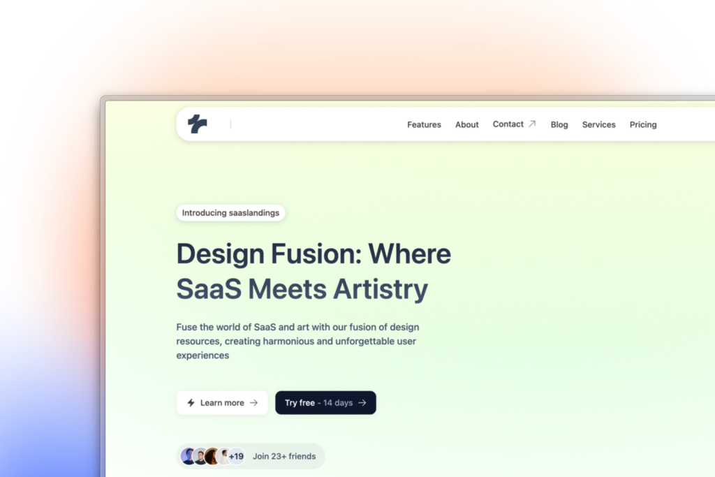
1. Hero Section (“above the fold”)
It’s the eye-catching top area that quickly tells visitors what you do and why they should care.

A focused hero with one headline, a supportive sub-line, and a single CTA keeps visitors from decision fatigue. Limiting clutter here is a proven best practice.
Why it matters: The hero forms the visitor’s first impression; pages with one clear CTA here convert dramatically better than those with competing actions.
Example copy: “Automate bookkeeping—save 10 hrs a week.”
Focusing the hero on a single CTA, mapping benefits, clarifying the process, and stacking social-proof elements (stats, testimonials, FAQs) can lift conversions by up to 220 % when compared with generic pages.
“Start with any of the 30 + pre-built, conversion-focused hero layouts inside Tailkits UI, then swap the hero image instantly to fit your brand.”
2 . Features
It breaks down what the product does so prospects can link functions to real-world outcomes.

Why it matters: A benefit-led feature list helps prospects connect product capabilities to personal wins, strengthening trust.
Example copy: • Real-time cash-flow graphs • AI receipt capture • One-click tax reports
Pro Tip: Limit yourself to 3–5 bullets with icons; clarity beats catalogues.
3 . How It Works
This visual walkthrough shows users exactly what happens after they click, easing them toward action.

Why it matters: A three-step explainer reduces cognitive load and removes hidden fears around “what happens next.”
Example copy: 1. Connect bank → 2. Review dashboard → 3. Export reports
Pro Tip: Format steps in equal-width columns so users grasp the flow at a glance.
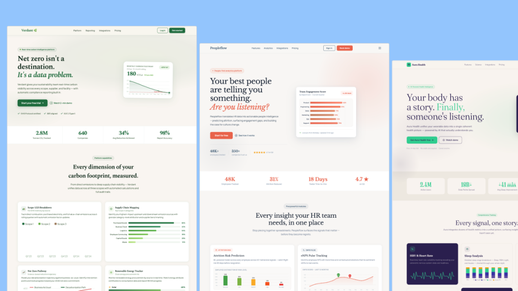
4 . Numbers / Stats
It highlights impressive metrics that reduce perceived risk and nudge visitors toward trust.

Why it matters: Specific, verifiable numbers (“12 000 businesses, $4 B processed”) boost credibility and shorten decision time.
Example copy: “Trusted by 12 392 founders—average time-to-value: 5 days.”
Pro Tip: Pair each metric with a micro-icon for quick visual scanning.
5 . Primary Call-to-Action
The primary CTA is a clear, clickable prompt that tells visitors the single next step to take.

Why it matters: Action-oriented, personalized CTAs (“Start my free trial”) out-pull generic buttons and keep focus on the goal.
Example copy: “Start your 14-day trial—no card needed.”
Pro Tip: Use high-contrast color and repeat the CTA after every major section.
6 . FAQ
An FAQ section answers common objections so visitors don’t leave the page to find information.
 Component")
Why it matters: Proactively answering objections slashes bounce and lifts conversion; Unbounce case studies show sizable gains after adding FAQs.
Example copy: “Is my data secure? Yes—256-bit encryption and SOC 2 compliance.”
Pro Tip: Display FAQs in an accordion to maintain a clean, scroll-friendly layout.
7 . Testimonial
Testimonials provide social proof by letting real customers vouch for your product’s results.

Why it matters: 36 % of top-performing landing pages feature testimonials; they remain a top trust signal.
Example copy: “‘Tailkits helped us boost qualified leads by 38 %.’ — Jane K., SaaS CEO”
Pro Tip: Include a headshot and quantifiable result to maximize believability.
8 . Pricing
The pricing table lays out plans and costs, helping users choose the option that fits their budget.

Why it matters: Transparent, tiered pricing prevents decision paralysis and improves conversions, especially when a “most popular” plan is highlighted.
Example copy: Starter $19/mo · Pro $49/mo · Growth $99/mo (best value)
Pro Tip: Anchor your ideal plan visually—Tailkits’ pricing tables come pre-styled for this.
9 . Footer
The footer wraps up the page with essential links, legal info, and a soft secondary CTA.

Why it matters: A well-structured footer reinforces trust (policies, badges) and offers a gentle secondary CTA, which can rescue hesitant visitors.
Example copy: “© 2025 Tailkits Inc. · Privacy · Terms · Careers · Join our newsletter”
Pro Tip: Add social-media icons and a small badge (“SSL Secured”) for extra reassurance.
Putting It All Together with Tailkits UI

Using a component library means you skip boilerplate HTML/CSS and go straight to optimization.
Tailkits delivers pre-built versions of every element on this list—drag a Hero, swap in your copy, bolt on a Trust-Badge row, and launch in hours, not weeks. Plus, utility-class naming keeps your codebase light for the page-speed edge highlighted above.
Explore Tailkits UI and start stitching these 20 elements together—your conversion rates (and shipping speed) will thank you.
Final thought
High-performing landing pages aren’t magic—they’re the sum of reliable, research-backed building blocks. Implement the twenty above, test relentlessly, and use Tailkits to handle the heavy UI lifting so you can focus on messaging and offers.
FAQ
What page-load time should I aim for?
Keep the page under 2 seconds—sites that hit this mark enjoy 30 %-plus higher conversion, while every extra second steadily erodes results.
How many form fields convert best?
Stick to 1 – 5 fields; Unbounce and Crazy Egg data show sharp drop-offs once you ask for more info.
Does adding video to the hero help?
Yes—landing pages featuring a short hero video have posted conversion lifts of up to 86 % in recent A/B tests.
Do trust badges or testimonials really matter?
Absolutely; adding visible testimonials and credibility badges consistently boosts trust and has driven measurable conversion jumps in case studies.

Yucel is a digital product creator and content writer with a knack for full-stack development. He loves blending technical know-how with engaging storytelling to build practical, user-friendly solutions. When he's not coding or writing, you'll likely find him exploring new tech trends or getting inspired by nature.