- Unlimited Export
- Code Editor
- Code Export
What is this Tailwind Box Shadow Generator?
The Tailwind Box Shadow Generator helps you create depth, elevation, and focus states for any UI element in seconds. Adjust X/Y offsets, blur, spread, color, opacity, and toggle the inset keyword with simple sliders.
See every tweak in a live preview, then copy the result as Tailwind’s arbitrary value syntax (for example: shadow-[0_10px_15px_-3px_rgba(0,0,0,0.1)]) or as plain CSS—whatever fits your workflow.
Why tailor shadows with Tailwind utilities?
Tailwind’s built‑in shadow utilities (shadow-sm, shadow-md, shadow-lg, etc.) cover common cases. When you need something hyper-specific, the square‑bracket “arbitrary value” syntax lets you drop in any custom shadow without leaving your HTML or design system context—no detour to a stylesheet. Faster iteration, fewer context switches.
Features ⚡️
A simple and effective online tool for generating CSS box-shadow styles.
Easy customization: Generate box-shadow styles instantly
User-friendly interface: Simple controls for adjusting shadow properties.
Color options: Choose from a variety of shadow colors.
Offset Controls: Adjust the horizontal and vertical shadow offsets.
Blur radius adjustment: Modify the blur radius for a softer or sharper shadow.
Spread radius control: Change the spread radius to expand or contract the shadow.
Inset option: Create inner shadows easily.
Hex/RGB color picker: Choose shadow colors in your preferred format.
How to Use the Tailwind Box Shadow Generator
Utilizing the generator is straightforward:
Access the Tool
Customize the Shadow:
Adjust the horizontal and vertical offsets to position the shadow.
Set the blur radius to define the shadow's softness.
Modify the spread radius to control the shadow's size.
Choose the shadow color and opacity to match your design palette.
Toggle the inset option if an inner shadow is desired.
Preview the Effect: Observe the real-time preview to ensure the shadow meets your expectations.
Copy the Code: Once satisfied, click the copy button to obtain the Tailwind CSS class or standard CSS code for integration into your project.
Ready-Made Tailwind CSS Box Shadows

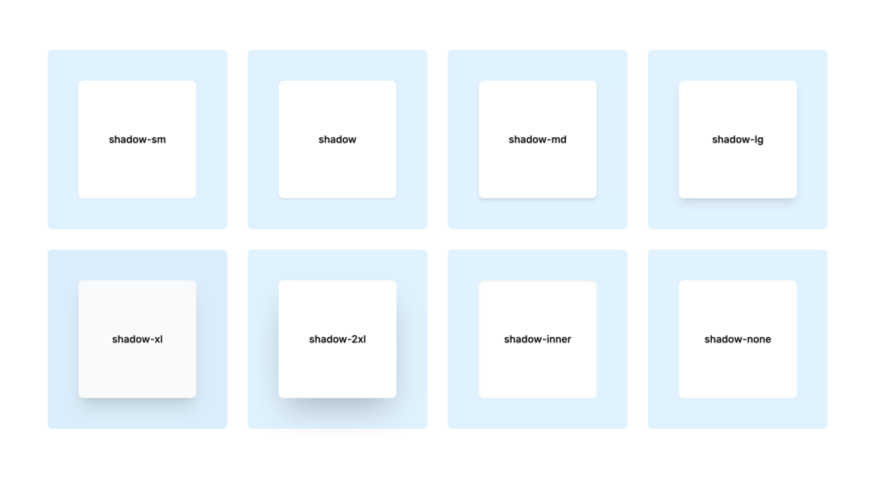
For quick implementation, the generator provides several predefined shadow classes:
shadow-sm: Applies a small shadow, ideal for subtle emphasis.shadow: Standard shadow suitable for general use.shadow-md: Medium shadow for moderate depth.shadow-lg: Large shadow for pronounced emphasis.shadow-xl: Extra-large shadow for significant depth.shadow-2xl: Intense shadow for strong emphasis.shadow-inner: Creates an inner shadow within the element.shadow-none: Removes any applied shadow.
These classes offer a quick way to apply common shadow effects without custom configurations.
Best Practices for Using Box Shadows
While box shadows enhance visual appeal, it's essential to use them judiciously:
Consistency: Maintain uniform shadow styles across similar elements to ensure a cohesive design.
Subtlety: Opt for subtle shadows to avoid overwhelming the user interface.
Performance: Be mindful of performance implications; excessive use of complex shadows can affect load times.
Accessibility: Ensure that shadows do not hinder readability or usability for users with visual impairments.
Tips for better UI shadows
Keep it subtle—realistic shadows are soft, slightly offset, and low‑opacity. Increase blur and reduce spread for elevated cards; use tight, darker inset shadows on inputs or pressed buttons. Maintain consistency across components and let shadows signal interactivity (hover, focus, active).
Tailwind vs. plain CSS output
Working in a Tailwind project? Copy the generated utility directly. Handoff to a non‑Tailwind codebase or a design tool? Grab the raw CSS. Same visual result—different delivery formats.
Performance & maintainability
Utility classes keep your CSS bundle lean and predictable. Arbitrary values are generated at build time (JIT), so you don’t bloat your stylesheet. Plus, keeping shadows in markup ensures quick audits and refactors as your design evolves.
Integrating Box Shadows into Tailwind CSS Projects
To incorporate the generated box shadows into your Tailwind CSS project:
Copy the Generated Class: Use the one-click copy feature to obtain the Tailwind CSS class.
Add to Your HTML: Paste the class into the
classattribute of the desired HTML element.Apply to Elements: Assign the class to the desired elements to apply the shadow effect.
This process ensures that the box shadows are applied consistently across your project.
FAQ
Is the Box Shadows Generator free to use?
Yes, the Box Shadows Generator is completely free to use.
What parameters does a CSS box-shadow use?
A box shadow is defined by X offset, Y offset, blur radius, spread radius, color, and optionally the inset keyword.
3. How do I generate custom shadows in Tailwind?
Use arbitrary values: shadow-[<x>_<y>_<blur>_<spread>_<rgba()>]. The underscores replace spaces so the class stays valid.
What’s the difference between drop-shadow and box-shadow in Tailwind?
box-shadow affects the element’s box; drop-shadow (a CSS filter) is applied to the rendered image of the element—useful for transparent PNGs/SVGs.
When should I use an inset shadow?
Use inset to make elements look pressed inward—think input fields, toggles, or recessed panels.
Do heavy shadows hurt performance?
Shadows themselves are inexpensive, but overusing complex multi-layer shadows can affect paint times on low-end devices. Keep them minimal and reuse presets. (Inference based on general CSS rendering practices; see MDN for property definition.)
Are Tailwind’s default shadow classes enough for most projects?
Often yes—shadow-sm through shadow-2xl cover many needs. But precise brand elevation or dramatic effects usually require custom values.
Can I make shadows responsive or state-based in Tailwind?
Yes. Prefix the class with modifiers like md:shadow-[...], hover:shadow-lg, or focus:shadow-[...] for breakpoints and states.