Shopal
213+ Tailwind E-commerce UI components

- Open Source
- Tailwind v3
- Responsive Design
What Is the Shopal UI Library?
Shopal is a curated collection of 213+ Tailwind CSS components designed for e-commerce and marketing websites.
✨ Features
213+ pre-designed Tailwind components
Fully responsive and mobile-optimized
Drag-and-drop editing within Shuffle Editor
Exportable code for HTML, React, and more
Regular updates with new components
Visual Studio Code extension support
Integration with Tailwind CSS, Bootstrap, Bulma, and Material-UI
📒 Included Components
Banners
Benefits sections
Breadcrumbs
E-commerce order components
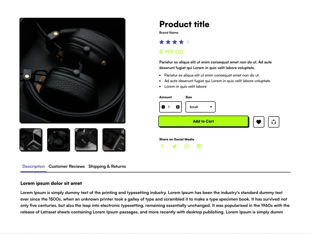
E-commerce product components
Footers
Hero sections
Instagram photo sections
Logo clouds
Horizontal navigations
Newsletters
Reviews
Sign-in/Sign-up forms
✅ Pros and ⚠️ Cons
Pros
Extensive component library for rapid development
User-friendly drag-and-drop interface
Supports multiple frameworks and export options
Regularly updated with new components
Ideal for e-commerce and marketing websites
Cons
Access to components requires a paid subscription
Some components may require additional customization for specific use cases
🔌 Integration
Tailwind CSS
Bootstrap
Bulma
Material-UI (React)
Visual Studio Code
GitHub, Vercel, Bitbucket for deployment
Other Shuffle Templates & UI Kits
When you subscribe to a Shuffle plan, you can access the drag-and-drop Tailwind website builder, 37+ Tailwind templates, and UI libraries.

Landing Page Templates
Tailwind website templates to help you build multipurpose marketing and landing page websites.


Admin & Dashboard Tailwind Templates
Tailwind dashboard templates to create web apps and admin panels.


E-Commerce Tailwind Templates
Tailwind e-commerce templates to create custom stores.

