Shadcn Components
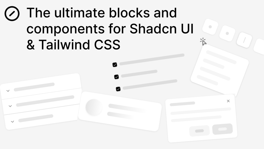
100+ shadcn/ui components for Tailwind & React.
- Open Source
- Tailwind CSS v4
What Is the Shadcn Components?
Shadcn Components is a curated set of copy-paste UI parts built for shadcn/ui, Tailwind CSS, and React. It focuses on practical, real-world blocks (not AI-generated) so you can drop them in and ship fast.
Features ✨

100+ battle-tested components & sections (cards, tables, heroes, nav, forms).
Built for shadcn/ui + Tailwind CSS with Radix under the hood.
Clean, editable React + TypeScript patterns that match shadcn/ui style.
Consistent spacing, states, and accessibility cues you expect from shadcn/ui
“Copy the code” workflow—no lock-in, just paste and customize.
Included Components 📒
Essentials: Button, Input, Select, Dialog, Dropdown, Pagination.
Data display: Cards, Tables (incl. TanStack variant), Badges, Avatars.
Layout blocks: Hero sections, Team sections, pricing, footers.
Utility patterns: Command palette, progress, breadcrumbs, toasts.
Pros and Cons
Pros ✅
Fits the shadcn/ui philosophy: copy, own, and evolve your code.
Cuts page-build time with ready sections and examples.
Works smoothly with Tailwind + React setups out of the box.
Good range from tiny atoms to full hero/section blocks.
Cons ⚠️
You still maintain the code—no packaged updates like classic UI kits.
Depth of patterns varies; complex app flows may need custom work.
Style alignment assumes Tailwind/shadcn stack (less ideal for non-Tailwind projects).
Integration
Stack: React + Tailwind CSS + shadcn/ui (Radix primitives)
Import style: Copy the component code, adjust variants, plug into your design tokens.
Data layer: Map props to your fetch/state; TanStack Table example ready for tables.
Routing: Works with Next.js/React Router; paste into app or pages.
Theming: Extend Tailwind config + shadcn tokens for brand colors/spacing.
FAQ
Is this an official shadcn/ui project?
No. it's an independent components site built for the shadcn/ui ecosystem.
Do I need Tailwind installed first?
Yes. These components are designed for Tailwind + shadcn/ui projects.
Can I use these with TypeScript?
Absolutely, the patterns align well with TS React setups.
Will it replace a full component library package?
It’s code-first: you copy and own it. Great for control, less for plug-and-play updates