HOT
HOTTailkits UI
NEWConsistent UI, zero hallucinations
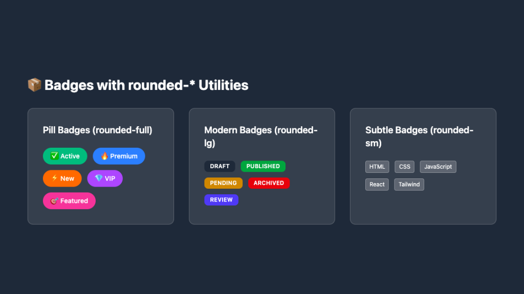
Get Tailwind badge components. Badges display numerical values or statuses next to icons or text, improving usability by drawing attention to updates.
HOTConsistent UI, zero hallucinations
 HOT
HOT12+ Shadcn Templates
Responsive, rounded badge components
Production-ready Tailwind components for React, Next.js, Vue & HTML. Responsive, accessible UI blocks optimized for Tailwind v4 with MCP integration.
200+ ready-to-use Tailwind CSS components with MCP integration. Let AI generate complete pages from your prompts — one command, production-ready UI.
Explore Components
Badges are small, versatile UI elements that convey additional information, statuses, or counts. Whether it's indicating a new feature, a notification count, or categorizing content, badges play a crucial role in enhancing user experience.
Badge components are typically small inline elements that display supplementary information. They can be used in various contexts, such as:
Notifications: Indicating unread messages or alerts.
Status Indicators: Showing the current state like active, inactive, or pending.
Labels: Categorizing items, such as tags on blog posts or products.
Counters: Displaying numerical data like follower counts or item quantities.
Using Tailwind CSS, developers can swiftly style these badges without writing extensive custom CSS. The utility classes provided by Tailwind allow for rapid customization, ensuring consistency and responsiveness across different devices.
Creating a basic badge with Tailwind is simple. Here's a step-by-step approach:
Structure: Start by adding a <span> or <div> element where the badge will reside.
Styling: Utilize Tailwind’s utility classes to style the badge's background, text, padding, border-radius, and typography.
Customization: Adjust colors, sizes, and other properties to match your design requirements.
<span class="bg-blue-100 text-blue-800 text-xs font-semibold mr-2 px-2.5 py-0.5 rounded">
  New
</span>While a basic badge serves its purpose, enhancing it with interactivity and responsiveness can significantly improve user experience.
Incorporating icons into badges can provide visual cues. For instance, a notification badge with a bell icon can instantly convey alerts.
<span class="flex items-center bg-red-100 text-red-800 text-xs font-semibold mr-2 px-2.5 py-0.5 rounded">
  <svg class="w-4 h-4 mr-1" fill="currentColor" viewBox="0 0 20 20">
    <!-- SVG path -->
  </svg>
  Alert
</span>Making badges interactive adds a layer of functionality. For example, badges that users can click to filter content or dismiss alerts.
<button class="flex items-center bg-green-100 text-green-800 text-xs font-semibold mr-2 px-2.5 py-0.5 rounded hover:bg-green-200">
  <span>Active</span>
  <svg class="w-4 h-4 ml-1" fill="currentColor" viewBox="0 0 20 20">
    <!-- SVG path -->
  </svg>
</button>Ensuring badges look good on all devices is crucial. Tailwind’s responsive utility classes make it easy to adjust badge sizes and styles based on screen size.
<span class="bg-purple-100 text-purple-800 text-xs md:text-sm font-semibold mr-2 px-2.5 py-0.5 rounded">
  Premium
</span>Tailwind CSS offers extensive customization options. Here’s how you can tailor badges to fit your design needs:
Tailwind provides a vast palette of colors. Choose colors that align with your brand or the context in which the badge is used.
<!-- Success Badge -->
<span class="bg-green-100 text-green-800 ...">Success</span>

<!-- Warning Badge -->
<span class="bg-yellow-100 text-yellow-800 ...">Warning</span>

<!-- Error Badge -->
<span class="bg-red-100 text-red-800 ...">Error</span>Adjust the size of badges to emphasize or de-emphasize them within the UI.
<!-- Small Badge -->
<span class="text-xs px-2 py-0.5 ...">Info</span>

<!-- Large Badge -->
<span class="text-lg px-4 py-1 ...">Info</span>Tailwind allows you to control the border-radius, making badges more or less rounded based on the design language.
<!-- Slightly Rounded -->
<span class="rounded-md ...">Rounded</span>

<!-- Fully Rounded (Pill Shape) -->
<span class="rounded-full ...">Pill</span>Adjusting the font size, weight, and style ensures the badge text is readable and aligns with the overall design.
<span class="font-bold text-sm ...">Bold Text</span>When designing badge components, accessibility should be a priority to ensure all users can interact with them effectively.
Ensure that the text color contrasts sufficiently with the background.
<span class="bg-blue-500 text-white ...">Accessible Badge</span>Use ARIA attributes to convey the purpose of badges to assistive technologies.
<span class="..." aria-label="New Notifications">New</span>Provide visual feedback when badges are interactive, enhancing usability for keyboard and screen reader users.
<button class="... focus:outline-none focus:ring-2 focus:ring-offset-2 focus:ring-blue-500">
  <span>Clickable Badge</span>
</button>While Tailwind CSS is efficient, optimizing badge components can further enhance performance, especially in large-scale applications.
Tailwind’s purge feature removes unused CSS, reducing file sizes. Ensure your configuration is set up to purge unused badge styles.
// tailwind.config.js
module.exports = {
  purge: ['./src/**/*.html', './src/**/*.js'],
  // other configurations
}Instead of creating unique badges for each instance, define reusable components or extend Tailwind classes to maintain consistency and reduce redundancy.
// tailwind.config.js
module.exports = {
  extend: {
    backgroundColor: {
      'badge-blue': '#ebf8ff',
      // other custom colors
    },
    textColor: {
      'badge-blue-text': '#2b6cb0',
      // other custom text colors
    },
  },
}If badges incorporate icons, consider lazy loading them or using SVG sprites to minimize the number of HTTP requests.
Here are a few tailored badge examples to inspire your designs:
Used to display the number of unread notifications.
<span class="relative inline-flex items-center justify-center px-2 py-1 text-xs font-bold leading-none text-red-100 bg-red-600 rounded-full">
  5
</span>Indicates the current status of an item, such as active or inactive.
<span class="px-3 py-1 text-sm font-semibold text-green-800 bg-green-100 rounded-full">
  Active
</span>Tags that categorize content, like blog post tags.
<span class="inline-block px-3 py-1 text-sm font-medium text-indigo-700 bg-indigo-100 rounded-full">
  Technology
</span>Displays a count, such as item quantities in a shopping cart.
<span class="inline-flex items-center justify-center w-6 h-6 text-xs font-bold text-white bg-yellow-500 rounded-full">
  3
</span>Adhering to best practices ensures your badges are effective, maintainable, and scalable.
Maintain consistency in badge styles across your application. Define a set of standard styles that can be reused, ensuring a unified look and feel.
Use colors that align with their intended meanings. For example, red for errors or alerts, green for success, and yellow for warnings.
Ensure badges are legible and appropriately sized across different devices. Utilize Tailwind’s responsive classes to adjust styles based on screen size.
Keep badges clean and uncluttered. Avoid overcrowding them with too much information or overly complex styles.
Always consider users with disabilities. Ensure badges are readable, navigable, and understandable by all users, including those using assistive technologies.
Tailwind’s flexibility allows for advanced customizations to meet specific design requirements.
Add subtle animations to badges to draw attention or indicate changes.
<span class="animate-pulse bg-blue-500 text-white px-2 py-1 rounded-full">
  Live
</span>Use gradient backgrounds for a modern and dynamic look.
<span class="bg-gradient-to-r from-purple-400 via-pink-500 to-red-500 text-white px-3 py-1 rounded-full">
  Trending
</span>Incorporate shadows to add depth.
<span class="bg-gray-200 text-gray-800 px-2 py-1 rounded-full shadow">
  New Arrival
</span>Provide feedback on hover or click, enhancing interactivity.
<button class="bg-teal-500 text-white px-3 py-1 rounded-full hover:bg-teal-600 focus:outline-none">
  Click Me
</button>Badges often complement other UI elements, enhancing their functionality and visual appeal.
Combine badges with buttons to indicate actions that require attention.
<button class="relative bg-blue-500 text-white px-4 py-2 rounded">
  Messages
  <span class="absolute top-0 right-0 inline-flex items-center justify-center w-4 h-4 text-xs font-bold text-red-100 bg-red-600 rounded-full">
    !
  </span>
</button>
Add badges to navigation links to show active states or notifications.
<a href="#" class="flex items-center text-gray-700 hover:text-gray-900">
  Inbox
  <span class="ml-2 inline-flex items-center justify-center px-2 py-1 text-xs font-bold text-white bg-green-500 rounded-full">
    12
  </span>
</a>Enhance card components by adding badges to highlight important information.
<div class="relative p-4 bg-white rounded shadow">
  <span class="absolute top-2 right-2 px-2 py-1 text-xs font-semibold text-white bg-indigo-500 rounded-full">
    New
  </span>
  <h3 class="text-lg font-bold">Product Title</h3>
  <p class="text-gray-600">Product description goes here.</p>
</div>
Tailwind CSS simplifies the creation of versatile and responsive badge components
You can find answers for commonly asked questions about components.
Badges are commonly used for notifications, status indicators, categorizing content, and displaying counts or numerical data across various UI elements.
Absolutely. Utilize Tailwind's gradient utility classes like bg-gradient-to-r along with color stops to create vibrant gradient badges.
Yes, you can add Tailwind’s animation utility classes or custom animations to badges to create engaging effects like pulsating or sliding.
To make a badge clickable, wrap it within a <button> or <a> tag and apply interactive Tailwind utility classes like hover:bg-color or focus:ring to provide feedback on interaction.