Tailwind CSS v4.1 has arrived, bringing a slew of new features and improvements for frontend developers and designers.
 This update might be a “minor” version, but it packs major enhancements – from long-awaited visual utilities to behind-the-scenes optimizations. In this post, we’ll explore the most significant additions in Tailwind 4.1, with examples of how to use them in real projects, and tips on making the most of these new capabilities. By the end, you’ll see why upgrading to v4.1 can level up your development workflow and design possibilities.
Why Tailwind CSS v4.1 Matters
Tailwind CSS has become a go-to CSS framework for rapidly building modern, responsive UIs with utility classes. Version 4.0 was a big leap that introduced a high-performance engine and a “CSS-first” configuration approach, embracing cutting-edge web platform features like cascade layers and custom properties
Tailwind CSS v4.1 builds on that solid foundation with a focus on new creative utilities and better developer experience. Some highlights include text shadow utilities (finally!), versatile CSS masking utilities, more variant selectors (for states like noscript or form validity), and tooling to make older browsers gracefully handle Tailwind’s modern CSS .
In short, v4.1 makes it easier to add polish to your designs (shadows, masks, fine-grained wrapping), adapt to user environments (input device variants, safe alignment), and manage your Tailwind usage (safely listing classes, excluding paths, etc.). Let’s dive into each of these new features with practical examples.
New Text Shadow Utilities (Finally!)
One of the most eye-catching additions in Tailwind CSS v4.1 is the introduction of text shadow utilities. Developers have been requesting these for years – in fact, the team joked that they’d been “threatening to add text shadows for at least the last six years” . Now they’re here, bringing the ability to easily apply subtle (or not-so-subtle) shadow effects to text.
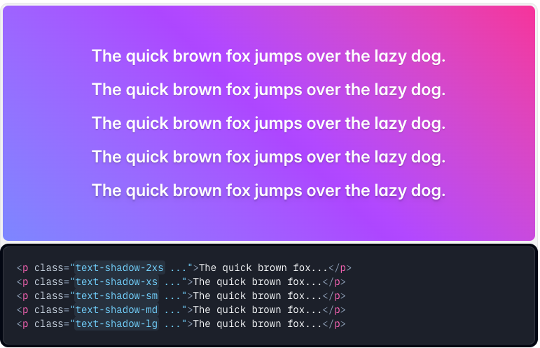
Tailwind’s default theme now includes five preset text-shadow sizes, from text-shadow-2xs up to text-shadow-lg .
These correspond to increasingly larger, more blurred shadow effects. For example, you might use a small shadow on headers to help them pop against a busy background:
<h1 class="text-3xl font-bold text-shadow-md">
  Welcome to Our Site
</h1>
<p class="mt-2 text-shadow-sm">
  Make your headlines stand out with subtle shadows.
</p>
In the code above, the heading gets a medium text shadow (text-shadow-md), and the paragraph gets a smaller shadow (text-shadow-sm). You can choose the size that looks best; Tailwind provides 2xs, xs, sm, md, and lg variants out of the box.
Customizing text shadow color: By default, the text shadows use a neutral black shadow. Tailwind 4.1 lets you change the shadow color using text-shadow-<color> utilities. For example, adding text-shadow-sky-300 will cast a sky-blue tinted shadow. This opens up creative effects like “embossed” text: using a light-colored shadow on dark text to create a raised look. You can even control the opacity of the shadow color by appending an opacity modifier.
For instance, text-shadow-lg/50 applies a large shadow at 50% opacity, equivalent to using text-shadow-lg plus a semi-transparent shadow color.
<!-- Embossed effect: dark text with a light text shadow -->
<button class="text-gray-900 text-shadow-2xs text-shadow-white/70 px-4 py-2">
  Embossed Button
</button>
In this snippet, the button text is dark gray (text-gray-900) with a very small white shadow (text-shadow-2xs and text-shadow-white/70). This yields a subtle highlight around the text, as if it’s embossed. The new text-shadow utilities are great for adding depth to headings, hero text, or any element where a touch of shadow can improve legibility or aesthetics.
Masking Elements with the New mask-* Utilities
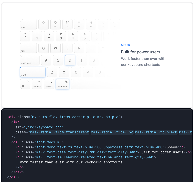
Another powerful visual feature in v4.1 is the mask utility API, which allows you to mask an element using images or gradients. In CSS, masking means using another image’s transparency as a stencil to show/hide parts of an element. Tailwind now provides a suite of mask-* utilities that make this complex technique much easier to use in your HTML.
Modern CSS supports using gradients or images as masks (via the mask-image property), but writing those by hand can be tricky – especially if you want to combine multiple masks. Instead of exposing raw mask-image directly, Tailwind 4.1 introduces composable mask utilities designed for common use cases.
For example, you can apply a linear gradient mask on one side of an element using classes like mask-t-from-50% or mask-b-to-80%, which mean “mask from the top starting at 50% opacity” or “mask to the bottom ending at 80% opacity,” respectively. This is more intuitive than figuring out the exact gradient stops yourself.
Here’s how you might use these mask utilities in practice:
<!-- Example: Apply a gradient mask from top (50% opacity) to bottom (transparent) on an image -->
<div class="mask-t-from-50% mask-b-to-0%">
  <img src="/images/photo.jpg" alt="Photo" class="w-full" />
</div>
In this code, the mask-t-from-50% and mask-b-to-0% classes work together to create a vertical gradient mask on the image. The image will gradually become transparent toward its bottom, allowing whatever background is behind the div to show through. You could use this effect to fade out an image or create a vignette.
Tailwind’s masking API also supports radial and conic gradient masks, and you can even combine multiple mask types on one element for complex effects.
For instance, you could mask an element with both a radial mask and a linear mask simultaneously by just adding multiple classes. An example from the Tailwind docs combines a bottom mask, a radial mask with custom size, and more.
The key point: the new mask-* utilities are composable – each one handles one aspect of the mask (like which side to fade, or a radial focal point), and Tailwind will merge them into a single mask-image definition behind the scenes.
This feature unlocks a ton of creative potential: think image reveals, fancy section transitions, or decorative text effects using image masks. Check out the official documentation for mask-image utilities for a full breakdown of all the options as there are more utilities (like mask-radial-* for radial gradients) than we can cover here. But even with just a few classes as shown above, you can achieve impressive visuals with minimal effort.
Fine-Grained Text Wrapping with overflow-wrap
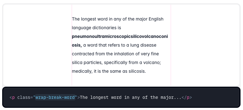
Tailwind CSS v4.1 adds new utilities to control text wrapping behavior, which is vital for preserving your layout when encountering long strings or words (like URLs or German compound words). The new overflow-wrap utilities are wrap-normal, wrap-break-word, and wrap-anywhere, corresponding to the CSS properties overflow-wrap: normal | break-word | anywhere (and related word-wrap synonyms)
wrap-break-word: This utility will break otherwise unbreakable words at arbitrary points to prevent overflow. It’s especially useful for very long words/URLs that would bust the layout. For example, applyingwrap-break-wordto a paragraph containing a super long token ensures it will wrap onto multiple lines if needed.wrap-anywhere: This is similar to break-word, but even more aggressive in that it allows breaking within a word when calculating the min-content size of the element. In practice, this means inside flex or grid containers,wrap-anywherecan prevent layouts from stretching out due to long words. It’s a solution for situations wherewrap-break-wordalone might not behave as expected in flexbox.
Here’s a demonstration:
<p class="wrap-break-word max-w-sm bg-gray-100 p-2">
  SupercalifragilisticexpialidociousSupercalifragilisticexpialidocious
</p>
<p class="wrap-anywhere max-w-sm bg-gray-100 p-2 mt-4">
  SupercalifragilisticexpialidociousSupercalifragilisticexpialidocious
</p>
In the first <p> (with wrap-break-word), the extremely long “word” will only break at normal word break points or if absolutely necessary at the end of the line. In the second <p> (with wrap-anywhere), the browser is allowed to break text anywhere to avoid overflow.
If these paragraphs are inside a flex container with constrained width, the wrap-anywhere version is less likely to overflow its container. Essentially, use wrap-anywhere for the toughest cases (like in flex items) where you want to guarantee no overflow, and wrap-break-word for standard long-word wrapping in block content.
There’s also wrap-normal to explicitly ensure normal wrapping (which is usually the default). These utilities give you fine control and can be critical for responsive design. By defending against “layout breaking” strings. you ensure your designs remain intact even with user-generated content or locales with long words.
Colored Drop Shadows for More Vibrant Effects
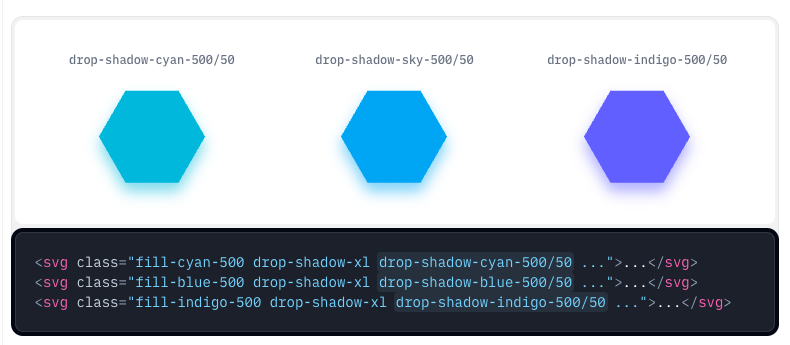
Tailwind already had a drop-shadow utility for applying a filter-based box-shadow to images or elements, but previously you couldn’t easily change the color of that shadow – it was always black at some opacity. In v4.1, colored drop-shadow support has been added. This means you can now create drop shadows in any color, similar to text and box shadows.
New utilities like drop-shadow-indigo-500 or drop-shadow-cyan-500/50 allow you to specify a color (and optional opacity fraction) for the drop shadow. The color values come from your theme palette, just like other color utilities. This is especially useful for designing more cohesive visuals – for example, giving an image a soft glow or shadow that matches your brand color scheme, instead of a generic gray/black shadow.
Using a colored drop shadow is straightforward. You simply add the color class alongside the base drop-shadow size utility. For example:
<!-- An image with a large, semi-transparent blue drop shadow -->
<img src="logo.png" alt="Logo" class="drop-shadow-xl drop-shadow-blue-500/50">
In this snippet, drop-shadow-xl applies a large shadow filter, and drop-shadow-blue-500/50 tints that shadow with a 50%-opacity blue (500 is a mid-range blue from the default palette). The result is the image appears to glow blue. You could omit the /50 to have a fully opaque blue shadow.
This feature was added alongside text shadows – as the team noted, “we thought we might as well add another feature we never got around to implementing”. There isn’t much new syntax to learn; it extends the existing drop-shadow filter utility with a color parameter.
If you want to see all the details, Tailwind’s documentation on drop-shadow has been updated, but the main takeaway is: you’re no longer limited to gray/black shadows. Colored shadows can make elements feel more integrated with a design’s color scheme or add a fun neon-like effect when used with bright colors.
Pointer and Any-Pointer Variants – Style for Touch vs. Mouse
Responsive design is not just about screen size – it’s also about input methods. Tailwind 4.1 introduces new variants that allow you to style elements based on the user’s pointing device. Meet the pointer-* and any-pointer-* variants.
pointer-fineandpointer-coarse: These correspond to CSS media queries for pointer precision. A “fine” pointer means a precise device like a mouse or trackpad; “coarse” means a less precise device like a touchscreen (think fat finger). Usingpointer-fine:orpointer-coarse:as a prefix on a utility lets you tailor styles for those scenarios. For example, on a coarse pointer (touch), you might want larger hit targets (more padding), whereas on a fine pointer (mouse), you can afford smaller, more compact UI elements.any-pointer-fineandany-pointer-coarse: These are similar, but they trigger if any of the user’s pointing devices match the criteria (the user might have both a touchscreen and a mouse, for instance).any-pointer-coarsewill be true on a hybrid device (like a laptop with a touchscreen) even if a mouse is present, whereaspointer-coarsewould be false if the primary input is a mouse. In short,any-pointer-*is a broader check.
Use case: Suppose you have a set of radio buttons or cards that should be larger and more spaced out on touch devices for easier tapping. You can do this:
<div class="grid grid-cols-4 gap-2 pointer-coarse:grid-cols-2 pointer-coarse:gap-4">
  <!-- grid items -->
</div>
In this example, on a normal desktop (pointer-fine scenario), it will show a 4-column grid with small gaps. But when the user is on a touchscreen (pointer-coarse scenario), Tailwind will apply the classes after pointer-coarse:, resulting in a 2-column grid with larger gaps (making each item bigger). You could similarly increase padding on buttons or form controls using pointer-coarse:px-4 etc., so that touch users get larger click areas.
For instance, a button optimized for touch vs mouse:
<button class="px-3 py-1 pointer-coarse:px-5 pointer-coarse:py-3 bg-blue-600 text-white">
  Submit
</button>
On a phone or tablet, this button will have extra padding (px-5 py-3), making it easier to tap, whereas on a laptop it will use the smaller padding (px-3 py-1). This approach is often more elegant than relying purely on screen size breakpoints, because it targets the actual input method directly.
Under the hood, Tailwind generates the appropriate @media (pointer: fine) or (pointer: coarse) CSS for these variants. The any-pointer- variants similarly use the CSS any-pointer media feature. This addition means you can finally adjust styles for touch vs mouse without writing custom media queries. It’s a big win for building more accessible, touch-friendly designs while still optimizing for desktop users.
(Tip: You can combine these with other variants as needed. For example, md:pointer-coarse:text-lg would apply larger text only on medium screens that are touch devices – though typically pointer vs coarse is already correlated with device type.)
Align Items to the Last Baseline
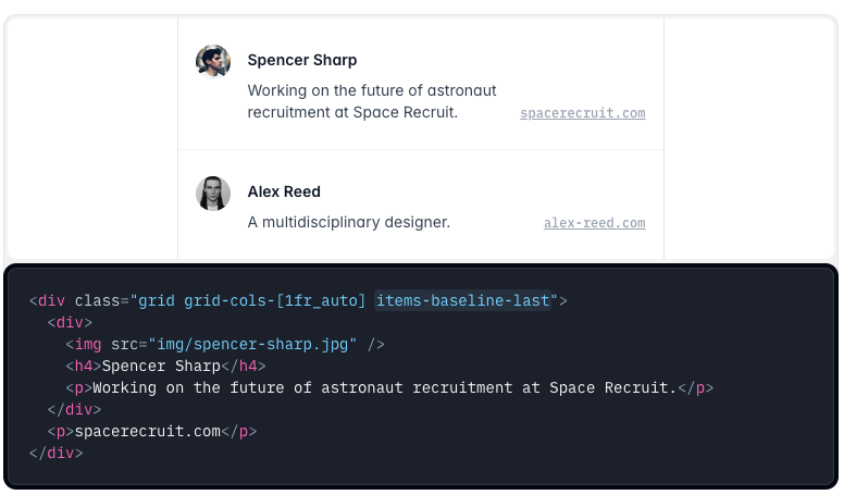
When working with text content, you might encounter a design where one element needs to align with the last line of text in another element (instead of the first line or overall bottom). This is common in bio layouts, chat UI, or anywhere you have varying text lengths. Tailwind v4.1 adds a utility to handle this: items-baseline-last for flex and grid containers, and a corresponding self-baseline-last for individual flex/grid items.
Normally, if you use items-baseline in a flex container, items will align to the first line’s baseline of the tallest element. With items-baseline-last, the alignment target is the baseline of the last line of text in the element. This subtle difference is useful when one item has multiple lines of text and you want others aligned to its bottom line, for a cleaner look.
Example: Imagine a two-column layout where the left column has a title and a multi-line paragraph, and the right column has just one line (like a link or a price). Using items-baseline-last on the container will align the single-line item on the right to the baseline of the last line of the paragraph on the left:
<div class="flex items-baseline-last gap-4">
  <div>
    <h4 class="font-semibold text-lg">Spencer Sharp</h4>
    <p>Working on the future of astronaut recruitment at Space Recruit.</p>
  </div>
  <p>spacerecruit.com</p>
</div>
In this snippet, the two <p> elements (one under the name, and one on the right) will line up along the same baseline – the bottom of the text in the left paragraph. Without items-baseline-last, using a normal items-baseline, the “spacerecruit.com” might align with the first line of the left paragraph instead, which would look misaligned since the left paragraph extends further down. Tailwind’s utility is essentially doing the CSS trick of aligning to the last line so you don’t have to manually adjust margins or line-heights.
If you only need one particular item in a container to follow this behavior, you can use self-baseline-last on that item alone. This gives you granular control, say if one flex child should align to another child’s last baseline but not affect siblings.
These new baseline alignment utilities help when fine-tuning typography-heavy layouts. They ensure elements align in a visually harmonious way, especially in mixed-content scenarios (images, headings, multiline text, etc.).
Safe Alignment: Keep Content Visible When Centering
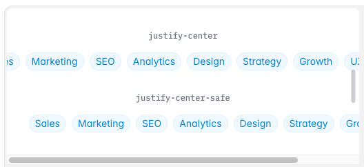
Centering content is a common desire in design, but it can introduce a UX problem: if the container is too small, centered content might overflow equally on both sides, making it invisible (clipped) on both the left and right. Tailwind v4.1 addresses this with “safe” alignment utilities. A safe alignment will switch the alignment from centered to one side once overflow is detected, ensuring the content remains at least partially visible.
The new classes work by adding the safe keyword to justify or align utilities. For example, instead of justify-center, you can use justify-center-safe. Similarly, items-center-safe could be used for cross-axis alignment. When applied, these will act like center alignment until the point where the content doesn’t fit; at that point, it safely aligns to the start (left/top) so that the overflowing part is only on one side.
When to use safe alignment?
Imagine a pagination control or a list of tags that is centered in its container. On a very narrow screen (or if the list grows too long), the centered items would overflow out of both sides of the container, and the user might not see the beginning or end of the content. Using a safe center alignment means if overflow happens, the content will stick to the left side (for example), so the beginning of the line is still visible to the user.
Here’s an example comparing normal vs safe centering:
<div class="flex justify-center border mb-4">
  <!-- This list might overflow equally on both sides when narrow -->
  <ul class="flex gap-2">
    <li>Sales</li><li>Marketing</li><li>Design</li><li>Support</li><li>Engineering</li>
  </ul>
</div>

<div class="flex justify-center-safe border">
  <!-- This list will align left (start) if it doesn't fit fully centered -->
  <ul class="flex gap-2">
    <li>Sales</li><li>Marketing</li><li>Design</li><li>Support</li><li>Engineering</li>
  </ul>
</div>
If you shrink the above container, the first <ul> (normal centered) will get cut off on both sides (you might only see the middle items). The second <ul> (using justify-center-safe) will instead overflow only on the right side – it will automatically align to the left edge when it can’t fit centered, so you can at least see “Sales, Marketing, Design…” and only the tail end gets hidden. This behavior can greatly improve the usability in edge cases where content length is unpredictable.
Tailwind’s safe alignment utilities apply to all the main alignment properties (justify-content, align-items, etc.), and you can use them in flexbox or grid layouts. It’s essentially a convenient way to access the CSS safe center value. Our tip: use safe alignment for centered content that might be dynamically sized or user-generated, to avoid the “vanishing content” issue when things overflow.
Improved Browser Compatibility
Tailwind CSS v4.0 embraced modern CSS features aggressively (like using new color formats, CSS @property, etc.), which was great for forward-looking projects but had an unintended side effect: older browsers could break in strange ways.
For example, some users on Safari 15 (released in 2021) reported that basic things like colors and shadows didn’t render at all with Tailwind 4.0. This was because some CSS features didn’t gracefully degrade – if a browser didn’t understand a new CSS function, it might ignore the whole block of styles.
In v4.1, the team put significant effort into making Tailwind degrade more gracefully on older browsers without sacrificing modern features on new browsers.
They implemented framework-specific fallbacks for various features so that, say, an older iOS Safari will at least show something reasonably styled, instead of missing colors or gradients.
Here are a few of the key compatibility improvements in Tailwind 4.1:
OKLCH colors fallback: Tailwind’s color system moved to OKLCH in v4.0 (a more modern color space). Now, colors defined in OKLCH automatically fallback to a format older Safari understands, so your fonts and backgrounds won’t disappear
@propertyusage removed when unsupported: Tailwind 4.0 used the CSS@propertyat-rule to register custom properties (for things like dynamic shadows, spacing scales, etc.). Older browsers like Safari < 16 and Firefox < 105 don’t support@property, causing those features to fail. Tailwind 4.1 detects this and avoids using@propertyon those browsers, so features like shadows, transforms, gradients, etc., still work albeit without the custom-property optimizations. In practice, your shadows and transforms will render correctly in Safari 15 now.Opacity-modified colors inline fallback: If you use color with an opacity (like
text-red-500/50), Tailwind normally uses CSS variables andcolor-mix()to implement it. v4.1 now outputs a fallback RGBA color for older browsers so the semi-transparent color shows up as expected.Gradients with unsupported interpolation: Tailwind allows specifying how color interpolation in gradients (like linear vs perceptual). If an older browser can’t handle the specified method, Tailwind now just falls back to the browser’s default gradient behavior, so at least a gradient shows up.
(And if you were wondering about the CSS content-visibility property or CSS @initial at-rule: Tailwind 4.1 doesn’t introduce specific utilities for those, but its general approach of using modern CSS and providing fallbacks extends to any similar features. The focus was on colors, properties, and gradients as listed above. Ensuring content remains visible and styles apply predictably was the goal – and that ties into the “safe” alignment and other strategies we’ve discussed.)
Safelisting Classes in CSS with @source inline (The “Classlists” Feature)
Tailwind’s build process works by scanning your source files for class names and generating only the CSS you use. But sometimes you know you’ll need a class that isn’t literally present in your HTML/JS files – for example, classes generated dynamically or coming from user content. In previous versions, you might use the safelist option in your tailwind.config to force include certain classes. In v4.1, there’s a much easier way: safelisting classes directly in your CSS using @source inline.
This is being referred to as the new “classlists” feature since it lets you define lists of classes to include. Here’s how it works:
In any of your Tailwind CSS files (like your main input.css where you include Tailwind’s base, components, utilities), you can add an @source inline("...") rule. Inside the quotes, list the classes or patterns of classes you want to guarantee are generated. For example:
@import "tailwindcss";

/* Safelist specific classes */
@source inline("underline bg-red-500 lg:bg-red-500");
In the above CSS, @source inline("underline bg-red-500 lg:bg-red-500") will ensure that the .underline utility, the .bg-red-500 utility, and its lg: variant are all included in the final CSS even if those classes don’t appear in any template. This is directly equivalent to what safelist in the config did, but now it’s co-located with your styles. It’s easier to maintain because you can see it alongside other CSS declarations, and it doesn’t require editing a JS config.
Crucially, Tailwind’s implementation of @source inline supports brace expansion for generating lots of classes from a pattern. Brace expansion is a syntax (inspired by Bash or GNU brace syntax) that lets you enumerate combinations. Tailwind uses it to avoid complex regexes. For example, the official docs show this powerful example:
@source inline("{hover:,}bg-red-{50,{100..900..100},950}");There’s also a way to exclude classes in a similar manner: @source not inline("...") will prevent Tailwind from generating certain classes. This might be used to trim out unwanted utilities if needed (though in most cases it’s not necessary unless a class is being picked up by mistake).
Tip: Because this feature lives in your CSS, you can put these directives near related custom utilities or in logical groupings. For example, if you have some dynamic classes for a component, you might include an @source inline in that component’s CSS file listing those dynamic classes. It helps keep the context together.
Other New Variants and Utilities
Tailwind CSS v4.1 comes with a grab-bag of other new variants and utilities to make your life easier. Here are some of the notable ones:
details-contentvariant: This variant targets the content portion of a<details>element (the element that is revealed when the dropdown is open). Previously, you could style the summary viaopen:, but styling the inner content wrapper wasn’t straightforward. Withdetails-content:, you can now apply utilities to that part. For example:<details class="details-content:pt-2">would add padding-top to the content area when the details is open. This is great for making prettier accordion/expandable sections without writing custom CSS. (Note: this works by selecting thedetails > *that is notsummary, essentially.)inverted-colorsvariant: Some operating systems or accessibility settings allow users to invert colors (for high contrast, etc.). The newinverted-colors:variant lets you adjust your design when OS-level color inversion is active. You might use it to disable certain shadows or borders that don’t make sense when colors are inverted. For example:<div class="shadow-xl inverted-colors:shadow-none">…</div>will remove the shadow if the user has enabled inverted colors mode.noscriptvariant: This one is straightforward but useful:noscript:applies styles when JavaScript is disabled in the browser. It’s essentially the CSS:not([js-enabled])approach but given as a utility variant. For instance, you can show a warning message if JS is off:<div class="hidden noscript:block">Please enable JavaScript</div>.In that example, the div is hidden normally, but becomesdisplay: blockin a noscript scenario. While you could always use a<noscript>HTML tag, doing it via Tailwind CSS means you can keep styling in your classes.user-valid/user-invalidvariants: If you’ve tried styling form inputs with:invalidor:valid, you might have encountered an issue: as soon as the page loads, an empty required field is:invalid– resulting in a red error state before the user even does anything. The newuser-invalidanduser-validpseudo-classes solve this by only applying once the user has interacted with the form (essentially they match:user-invalidwhich is a browser feature). Tailwind exposes these as utilities so you can do something like:<input required class="border user-invalid:border-red-500 user-valid:border-green-500" />. In this example, the border will turn green or red only after the user tries to submit or interact, not on initial load. It leads to a better UX for form validation states.
Those are the highlights, but there are even more little additions (for example, an :inverted-colors media variant and improvements to existing variants). One great thing is that all these new variants can be combined with group or peer modifiers as usual, where it makes sense. For example, you could have a parent with group and then in a child use group-noscript:hidden to hide something only when JS is off and some parent state is active, if that scenario arose. Or use peer-user-invalid: to style an error message next to an input when that input is invalid after user interaction (using a sibling selector). Tailwind’s variant system is very composable – v4.1 just feeds it more options.

Yucel is a digital product creator and content writer with a knack for full-stack development. He loves blending technical know-how with engaging storytelling to build practical, user-friendly solutions. When he's not coding or writing, you'll likely find him exploring new tech trends or getting inspired by nature.
