Tailwind UI Sticky Navigation
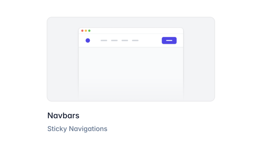
Build a sticky navbar in Tailwind UI to improve navigation and user experience.

Ever been on a website where the menu stays at the top, even as you scroll down? That's sticky navigation! In this guide, we'll show you how to make a sticky navbar with Tailwind UI.
This feature keeps important links always visible as visitors browse your site, making their experience better. Let's jump in and make your navbar stick to the top!
What Is Sticky Navigation and Why Use It?
Sticky navigation means a menu that stays at the top of the screen as users scroll down. Instead of disappearing when you move past the header, the navbar stays put, so users always have access to important links. This is handy for websites with a lot of content, where scrolling back up is a pain.
Benefits of Sticky Navigation
Sticky navigation has several perks:
Better User Experience: Users can access the menu without scrolling back up.
Higher Engagement: Easy-to-reach menus encourage visitors to explore more pages.
Improved Accessibility: Helps users who have trouble with excessive scrolling.
Brand Visibility: Your logo and branding stay visible all the time.
By adding sticky navigation, you're making your site easier to use, which can boost engagement and satisfaction.
Getting Started with Tailwind UI

Before we start building our sticky navbar, we need to set up Tailwind UI in our project. Tailwind UI is a set of ready-made, well-designed components that work smoothly with Tailwind CSS.
Step 1: Install Tailwind CSS
If you haven't yet, you need to install Tailwind CSS:
Set Up Your Project: If you're starting fresh, make a new project folder and initialize npm:
mkdir my-project
cd my-project
npm init -y
Install Tailwind CSS:
npm install tailwindcssCreate Tailwind Config File:
npx tailwindcss initSet Up Purge Option: In your
tailwind.config.js, add thepurgeoption to remove unused styles:module.exports = { purge: ['./src/**/*.html'], // other configurations... };
Step 2: Add Tailwind to Your CSS
Make a CSS file (like styles.css) and include these Tailwind directives:
@tailwind base;
@tailwind components;
@tailwind utilities;
Step 3: Build Your CSS
Run the Tailwind CLI to compile your CSS and make the final stylesheet:
npx tailwindcss -i ./styles.css -o ./output.css --watchThis command tells Tailwind to process your styles.css file into output.css and keep watching for changes.
Step 4: Add Tailwind UI Components
You can add Tailwind UI components directly to your project. They are paid, but they save time by giving you ready-made components you can tweak.
Get Tailwind UI: Go to the Tailwind UI website to get access.
Copy Component Code: Find a navbar component you like and copy the code.
Paste into Your Project: Add the component code to your HTML file where you want the navbar.
Now that we've set up Tailwind CSS and Tailwind UI, we can build our navbar.
Building a Basic Navbar

Let's start by making a simple navbar that isn't sticky.
<nav class="bg-white shadow">
  <div class="max-w-7xl mx-auto px-4">
    <div class="flex items-center justify-between h-16">
      <div class="flex items-center">
        <a href="#" class="text-xl font-bold text-gray-900">MyWebsite</a>
      </div>
      <div class="hidden md:block">
        <div class="ml-10 flex items-baseline space-x-4">
          <a href="#" class="text-gray-800 hover:text-gray-600 px-3 py-2 rounded-md text-sm font-medium">Home</a>
          <a href="#" class="text-gray-800 hover:text-gray-600 px-3 py-2 rounded-md text-sm font-medium">About</a>
          <a href="#" class="text-gray-800 hover:text-gray-600 px-3 py-2 rounded-md text-sm font-medium">Services</a>
          <a href="#" class="text-gray-800 hover:text-gray-600 px-3 py-2 rounded-md text-sm font-medium">Contact</a>
        </div>
      </div>
    </div>
  </div>
</nav>
Explanation:
Container Divs: We use
max-w-7xl mx-auto px-4to center the navbar content and limit its width.Flexbox Layout: The
flexclasses align the items in rows and columns.Navigation Links: Each link has styling for color, padding, and hover effects.
Responsive Design: The
hidden md:blockclass hides the menu on small screens.
This simple navbar gives us a good starting point to improve and customize.
Making the Navbar Sticky with Tailwind CSS

Now, let's change the navbar so it stays at the top when users scroll.
Step 1: Fix the Navbar Position
We'll use Tailwind's utility classes to position the navbar.
Update the <nav> element:
<nav class="bg-white shadow fixed top-0 left-0 right-0 z-50">
  <!-- Navbar content -->
</nav>
Explanation:
fixed: Makes the element stay in place when scrolling.top-0: Places the element at the top of the viewport.left-0andright-0: Stretch the navbar to full width.z-50: Keeps the navbar above other elements.
Step 2: Add Top Padding to the Body
Now that the navbar is fixed, it doesn't take up space in the flow, so content might go under it. To avoid this, we'll add padding to the top of the body.
<body class="pt-16">
  <!-- Rest of the content -->
</body>
Explanation:
pt-16: Adds top padding of 4rem to the body. Adjust this value based on your navbar's height.
Step 3: Make it Responsive
Update the responsive classes to handle different screen sizes:
<div class="md:flex md:items-center">
  <!-- Navbar content -->
</div>
This makes sure the navbar works well on different devices.
Customizing and Improving Your Sticky Navbar

A sticky navbar works, but we can make it better with some tweaks.
Adding a Mobile Hamburger Menu
On small screens, we can replace the full menu with a hamburger icon that shows a dropdown when clicked.
<div class="-mr-2 flex md:hidden">
  <button type="button" class="bg-gray-100 inline-flex items-center justify-center p-2 rounded-md text-gray-800 hover:text-gray-600 hover:bg-gray-200 focus:outline-none">
    <!-- Hamburger Icon -->
    <svg class="h-6 w-6" stroke="currentColor" fill="none" viewBox="0 0 24 24">
      <path stroke-linecap="round" stroke-linejoin="round" stroke-width="2"
        d="M4 6h16M4 12h16M4 18h16" />
    </svg>
  </button>
</div>
Explanation:
md:hidden: Hides this button on medium and larger screens.The button includes an SVG icon representing the hamburger menu.
Implementing the Mobile Menu
Add a menu that shows up when the hamburger icon is clicked.
<div class="md:hidden">
  <div id="mobile-menu" class="px-2 pt-2 pb-3 space-y-1 sm:px-3 hidden">
    <a href="#" class="block text-gray-800 hover:text-gray-600 px-3 py-2 rounded-md text-base font-medium">Home</a>
    <a href="#" class="block text-gray-800 hover:text-gray-600 px-3 py-2 rounded-md text-base font-medium">About</a>
    <a href="#" class="block text-gray-800 hover:text-gray-600 px-3 py-2 rounded-md text-base font-medium">Services</a>
    <a href="#" class="block text-gray-800 hover:text-gray-600 px-3 py-2 rounded-md text-base font-medium">Contact</a>
  </div>
</div>
Adding Interactivity with JavaScript:
const btn = document.querySelector('button');
const menu = document.getElementById('mobile-menu');

btn.addEventListener('click', () => {
  menu.classList.toggle('hidden');
});
This script toggles the hidden class on the mobile menu when you click the button.
Changing Navbar Style on Scroll
We can make the navbar look different after the user scrolls down.
JavaScript for Scroll Detection:
window.addEventListener('scroll', () => {
  const navbar = document.querySelector('nav');
  if (window.scrollY > 50) {
    navbar.classList.add('bg-gray-800', 'shadow-lg');
    navbar.classList.remove('bg-white');
  } else {
    navbar.classList.add('bg-white');
    navbar.classList.remove('bg-gray-800', 'shadow-lg');
  }
});
Explanation:
When the user scrolls more than 50 pixels down, the navbar background turns dark gray, and a larger shadow is added.
When they scroll back up, it goes back to white.
Adding Smooth Transition Effects
We can make it look smoother by adding transitions.
Modify the <nav> element:
<nav class="bg-white shadow fixed top-0 left-0 right-0 z-50 transition duration-300 ease-in-out">
  <!-- Navbar content -->
</nav>
Explanation:
transition duration-300 ease-in-out: Makes changes happen smoothly over 300 milliseconds.
Advanced Customization Options
To make your navbar stand out, try these advanced ideas.
Adding a Search Bar
You can add a search bar to your navbar for easy searching.
<div class="hidden md:block">
  <input type="text" placeholder="Search..." class="px-3 py-2 rounded-md bg-gray-100 text-gray-800 focus:outline-none focus:bg-white focus:border-gray-600">
</div>
Adding Dropdown Menus
Add dropdown menus for categories or extra links.
<div class="relative group">
  <button class="text-gray-800 hover:text-gray-600 px-3 py-2 rounded-md text-sm font-medium">
    Services
  </button>
  <div class="absolute left-0 hidden group-hover:block bg-white shadow-md">
    <a href="#" class="block px-4 py-2 text-gray-800 hover:bg-gray-100">Web Development</a>
    <a href="#" class="block px-4 py-2 text-gray-800 hover:bg-gray-100">Design</a>
    <a href="#" class="block px-4 py-2 text-gray-800 hover:bg-gray-100">SEO</a>
  </div>
</div>
Explanation:
The
groupclass lets the dropdown show when you hover over the parent.group-hover:blockshows the dropdown menu when hovering.
Adding Logo and Branding
Include your logo to promote your brand.
<div class="flex-shrink-0">
  <img class="h-8 w-8" src="path-to-logo.png" alt="Logo">
</div>
Place this within the navbar to display your logo.
Accessibility Tips
Make sure your sticky navbar is accessible to everyone.
Keyboard Navigation
Make sure users can use the keyboard to navigate.
Use proper HTML elements that can be focused.
Make focus styles visible so users know where they are.
Using ARIA Attributes
For things like dropdowns, use ARIA attributes to help assistive technologies.
<button aria-haspopup="true" aria-expanded="false">
  Menu
</button>
Update aria-expanded dynamically when the menu is opened or closed.
Contrast Ratios
Make sure text and backgrounds have enough contrast to be readable. Use tools like the WebAIM Contrast Checker to test your color choices.
Testing Your Sticky Navbar
Test your navbar on different browsers and devices.
Cross-Browser Testing
Try your site in all major browsers:
Chrome
Firefox
Safari
Edge
Look for any styling or functionality issues.
Mobile and Tablet Testing
Test on real devices or emulators to see how it works on different screens.
Make sure the mobile menu works.
Check touch interactions.
Look for layout issues.
Accessibility Testing
Use tools like Lighthouse and screen readers to check accessibility.
Common Problems and How to Fix Them
Even with planning, problems can happen. Here's how to fix common ones.
Navbar Doesn't Span Full Width
If the navbar isn't full width, make sure you've added left-0 and right-0 to the <nav> element.
Content Hides Behind Navbar
Make sure you've added enough padding to the top of the body, so content doesn't go under the navbar.
Elements Overlapping Navbar
If things overlap the navbar, try increasing the z-50 value or lowering other elements' z-index.
Other Ways to Make Sticky Navigation
Besides using position: fixed, there are other CSS options.
Using position: sticky
Modern browsers support position: sticky to make elements sticky.
Example:
<nav class="bg-white shadow sticky top-0">
  <!-- Navbar content -->
</nav>
Explanation:
sticky: Acts likerelativeuntil you scroll to its position, then it sticks.You don't need to add extra padding to the body.
Browser Support:
Works in modern browsers.
Check compatibility if you need to support older browsers.
Tips for Good Sticky Navbar Design
Making a sticky navbar isn't just about function; design counts too.
Consistency: Match the navbar's design to the rest of your site.
Simplicity: Don't overcrowd; prioritize important links.
Visual Hierarchy: Use fonts to show what's important.
Feedback: Add hover effects and other cues.
Accessibility: Make sure colors and interactions work for everyone.
By keeping these tips in mind, you can make a sticky navbar that works well and looks good.
Conclusion
Adding a sticky navbar with Tailwind UI makes your site easier to navigate. We went over building a basic navbar, making it sticky, and customizing it. We also talked about advanced features, accessibility, performance, and testing so your navbar gives users the best experience. Now it's your turn to use these steps and make a sticky navbar that shines!
FAQ
Can I add animations to the navbar when it becomes sticky?
Yes, you can use CSS transitions to animate style changes. Use the transition class in Tailwind to set which properties to animate and how long. Then, when you change properties like background-color or height via JavaScript or pseudo-classes, the changes will animate.
How can I make sure my sticky navbar works on all browsers?
Test your site on all major browsers. Using position: fixed gives the best support. If you use position: sticky, remember that some older browsers might not support it. You might need to use a polyfill or fallback styles.
Why is my sticky navbar overlapping content?
This happens because the fixed navbar is out of the normal flow, so content moves up. To fix it, add top padding to the body or main content equal to the navbar's height.
How do I make my navbar responsive with Tailwind UI?
Use Tailwind's responsive classes to adjust elements on different screen sizes. For example, use classes like md:flex or lg:hidden to control the layout at different breakpoints. Add a hamburger menu for mobile devices using md:hidden to hide the full menu on small screens.
Can I make the sticky navbar appear only after scrolling?
Yes, you can have the navbar show up after the user scrolls down a bit. You can add or remove classes based on the scroll position using JavaScript. window.addEventListener('scroll', () => { const navbar = document.querySelector('nav'); if (window.scrollY > 200) { navbar.classList.remove('hidden'); } else { navbar.classList.add('hidden'); } });

Yucel is a digital product creator and content writer with a knack for full-stack development. He loves blending technical know-how with engaging storytelling to build practical, user-friendly solutions. When he's not coding or writing, you'll likely find him exploring new tech trends or getting inspired by nature.
