Tailwind Tooltip Mastery for Improved User Interaction
Tailwind Tooltips explained
Ever wondered how some websites have those nifty little pop-ups that help you understand what a button or a link does without clicking it? Those are called tooltips, and they're a fantastic way to boost your website's usability.
Imagine making your users' lives easier with just a few lines of code! In this article, we'll dive into how to implement Tailwind tooltips to enhance your website's user experience. Whether you're a seasoned developer or a newbie, you'll find actionable tips and best practices to make your tooltips shine.
Creating Your First Tooltip
Basic Tooltip Structure
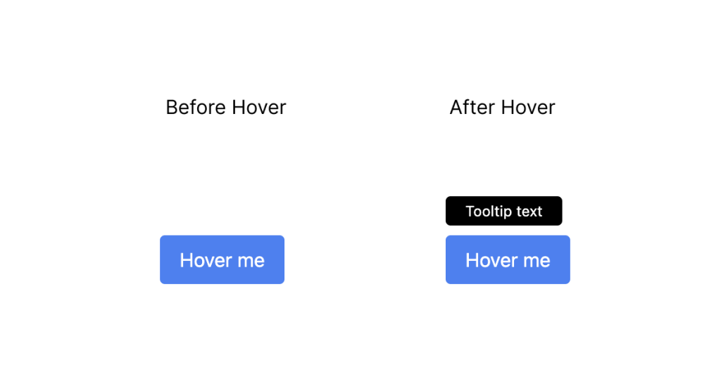
A tooltip is essentially a small box that appears when a user hovers over an element. Here’s a simple example:

<div class="relative group">
  <button class="bg-blue-500 text-white px-4 py-2 rounded">Hover me</button>
  <div class="absolute hidden group-hover:block bg-black text-white text-xs rounded py-1 px-4 bottom-full mb-2">
    Tooltip text
  </div>
</div>
Styling with Tailwind Classes
In the example above, we used Tailwind classes to style the button and tooltip. The hidden class hides the tooltip initially, and group-hover:block displays it when the button is hovered over.
Positioning the Tooltip
You can position the tooltip above, below, to the left, or to the right of the element. Adjust the positioning classes as needed. For example, to place the tooltip below the button:
<div class="relative group">
  <button class="bg-blue-500 text-white px-4 py-2 rounded">Hover me</button>
  <div class="absolute hidden group-hover:block bg-black text-white text-xs rounded py-1 px-4 top-full mt-2">
    Tooltip text
  </div>
</div>Advanced Tooltip Techniques
Adding Animations
Animations can make your tooltips more engaging. Tailwind's utility classes make this easy:
<div class="relative group">
  <button class="bg-blue-500 text-white px-4 py-2 rounded">Hover me</button>
  <div class="absolute hidden group-hover:block bg-black text-white text-xs rounded py-1 px-4 bottom-full mb-2 transition-opacity duration-300 opacity-0 group-hover:opacity-100">
    Tooltip text
  </div>
</div>
Responsive Tooltips
Ensure your tooltips look great on all devices by using responsive utility classes. For example, you can adjust the tooltip text size on smaller screens:
<div class="relative group">
  <button class="bg-blue-500 text-white px-4 py-2 rounded">Hover me</button>
  <div class="absolute hidden group-hover:block bg-black text-white text-xs md:text-sm rounded py-1 px-4 bottom-full mb-2">
    Tooltip text
  </div>
</div>
Customizing with Tailwind Plugins
Tailwind plugins offer additional customization options. For instance, you can use the @tailwindcss/typography plugin to enhance your tooltip text:
npm install @tailwindcss/typographyAdd the plugin to your tailwind.config.js:
module.exports = {
  // ...
  plugins: [
    require('@tailwindcss/typography'),
    // ...
  ],
}
Now you can use the prose class to style your tooltip text:
<div class="relative group">
  <button class="bg-blue-500 text-white px-4 py-2 rounded">Hover me</button>
  <div class="absolute hidden group-hover:block bg-black text-white text-xs prose rounded py-1 px-4 bottom-full mb-2">
    Tooltip text with enhanced typography
  </div>
</div>
Best Practices for Tailwind Tooltips
Keep It Simple
Tooltips should provide concise and clear information. Overloading them with too much text can overwhelm users. Aim for brevity and clarity.
Use Meaningful Content
Ensure the content of your tooltips is relevant and helpful. They should add value by providing additional context or instructions that improve the user experience.
Consider Accessibility
Accessibility is crucial for all web elements, including tooltips. Use ARIA attributes to make your tooltips accessible to screen readers. For example:
<button aria-describedby="tooltip1" class="bg-blue-500 text-white px-4 py-2 rounded">Hover me</button>
<div id="tooltip1" role="tooltip" class="absolute hidden group-hover:block bg-black text-white text-xs rounded py-1 px-4 bottom-full mb-2">
  Tooltip text
</div>
Testing and Feedback
Always test your tooltips on various devices and browsers to ensure they work smoothly. Gather feedback from users to identify any areas for improvement.
Conclusion
By following these guidelines, you'll be well-equipped to create Tailwind tooltips that look great and provide a seamless user experience.
Happy coding!
FAQ
What is a tooltip and why should I use it?
A tooltip is a small, informational pop-up that appears when a user hovers over an element. It helps provide additional context or instructions without cluttering the main interface.
Are Tailwind tooltips responsive?
Yes, you can use Tailwind's responsive utility classes to ensure your tooltips look great on all devices. Adjust font sizes, padding, and positioning based on screen size.
How can I make my tooltips accessible?
Use ARIA attributes like aria-describedby and role="tooltip" to make your tooltips accessible to screen readers. This ensures that all users, including those with disabilities, can benefit from the additional information provided by your tooltips.
Can I add animations to my tooltips?
Yes, Tailwind's utility classes make it easy to add animations to your tooltips. Use classes like transition-opacity, duration-300, and opacity-0 group-hover:opacity-100 to create smooth transitions.

Yucel is a digital product creator and content writer with a knack for full-stack development. He loves blending technical know-how with engaging storytelling to build practical, user-friendly solutions. When he's not coding or writing, you'll likely find him exploring new tech trends or getting inspired by nature.
