How to Make Static Dropdowns in Tailwind
Build static dropdowns in Tailwind CSS

Want to make a stylish dropdown menu without lots of custom CSS? You're in luck! With Tailwind CSS, building responsive and sleek static dropdowns is simple. In this guide, we'll show you how to create a static dropdown menu using Tailwind CSS. If you're new to Tailwind or just need a refresher, this guide has got you covered.
What Is a Static Dropdown Menu?
Dropdown menus are a key part of web design. They help organize links and options without crowding the page. A static dropdown menu works without JavaScript; it's made with just HTML and CSS. Using Tailwind CSS, you can build these menus easily with utility classes. This keeps your design functional and looking good.
Static dropdowns are great for simple navigation with minimal interaction. They use CSS to show and hide items, so they're lightweight and easy to set up. Tailwind CSS lets you create these menus fast with its utility-first styling approach.
Setting Up Tailwind CSS

Before we start, let's get your development environment ready. If you haven't set up Tailwind CSS yet, don't worry—it's easy. You'll need Node.js installed on your computer. Open your terminal and set up your project:
Create a new project folder and navigate into it:
mkdir tailwind-dropdown
cd tailwind-dropdown
Initialize npm:
npm init -yInstall Tailwind CSS:
npm install tailwindcssCreate the Tailwind config file:
npx tailwindcss initMake your CSS file (like
styles.css) and add the Tailwind directives:@tailwind base; @tailwind components; @tailwind utilities;Build your Tailwind CSS file:
npx tailwindcss -i ./styles.css -o ./output.css --watchThis command processes your
styles.cssfile and outputs the CSS tooutput.css. The--watchflag makes Tailwind rebuild the CSS when changes are detected.Link the CSS file in your HTML:
<link href="output.css" rel="stylesheet">
Now, Tailwind CSS is set up! You're ready to start building your dropdown menu.
Building the HTML Structure

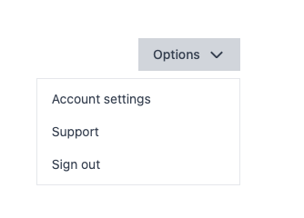
Now that your environment is set up, let's create the HTML for the dropdown menu. Here's how to structure your HTML:
<div class="relative inline-block text-left">
  <button
    class="inline-flex justify-center w-full px-4 py-2 bg-gray-300 text-sm font-medium text-gray-700"
  >
    Options
    <!-- Chevron icon -->
    <svg
      class="ml-2 w-5 h-5"
      xmlns="<http://www.w3.org/2000/svg>"
      fill="none"
      viewBox="0 0 24 24"
      stroke="currentColor"
    >
      <path stroke-linecap="round" stroke-linejoin="round" stroke-width="2"
        d="M19 9l-7 7-7-7" />
    </svg>
  </button>
  <div
    class="absolute right-0 mt-2 w-56 origin-top-right bg-white border border-gray-200"
  >
    <div class="py-1">
      <a
        href="#"
        class="block px-4 py-2 text-sm text-gray-700 hover:bg-gray-100"
      >
        Account settings
      </a>
      <a
        href="#"
        class="block px-4 py-2 text-sm text-gray-700 hover:bg-gray-100"
      >
        Support
      </a>
      <a
        href="#"
        class="block px-4 py-2 text-sm text-gray-700 hover:bg-gray-100"
      >
        Sign out
      </a>
    </div>
  </div>
</div>
Here's what's happening:
Container (
div): Positioned relatively withrelativeto contain the absolutely positioned dropdown menu. Theinline-blockclass helps with alignment.Button: This is what users click to open the dropdown. We've added a chevron icon for a visual cue.
Dropdown Menu (
div): Positioned absolutely withabsolute, so it pops up in relation to the container. Theright-0andmt-2classes position it properly.Menu Items: Each
atag is an option in the dropdown.
This HTML is the foundation of your static dropdown menu.

Styling the Dropdown with Tailwind CSS
Next, let's style the dropdown using Tailwind's utility classes:
Container (
relative inline-block text-left): This positions the dropdown correctly.Button Classes:
inline-flex: Makes the button an inline flex container.justify-center: Centers content inside the button.w-full: Sets the button's width to full.px-4 py-2: Adds padding.bg-gray-300: Sets the background color.text-sm font-medium text-gray-700: Styles the text.
Icon (
svgelement):ml-2 w-5 h-5: Adds left margin and sets the icon size.
Dropdown Menu Classes:
absolute right-0 mt-2 w-56: Positions the menu.origin-top-right: Sets the origin point for any transforms.bg-white border border-gray-200: Styles the background and border.
Menu Item Classes:
block px-4 py-2 text-sm text-gray-700 hover:bg-gray-100: Styles the links and adds a hover effect.
Using these classes, you get a polished look without writing custom CSS.
Customizing the Dropdown

Tailwind CSS lets you easily customize your dropdown to match your design.
Changing Colors
To change colors, adjust the utility classes:
Button Background Color:
<button class="bg-blue-500 text-white">
  <!-- Button content -->
</button>
Hover Effect on Menu Items:
<a class="hover:bg-blue-100">
  <!-- Menu item content -->
</a>
Adjusting Sizes and Spacing
Change padding and margin classes to resize and space elements:
Button Size:
<button class="px-6 py-3">
  <!-- Larger button -->
</button>
Menu Width:
<div class="w-64">
  <!-- Wider dropdown menu -->
</div>
Adding Rounded Corners and Shadows
Enhance the look with rounded corners and shadows:
Rounded Corners:
<div class="rounded-md">
  <!-- Dropdown with rounded corners -->
</div>
Box Shadows:
<div class="shadow-lg">
  <!-- Dropdown with shadow -->
</div>
Experiment with different combinations to get the style you like.
Adding Icons and Dividers
To make your dropdown more informative, add icons next to items or use dividers between groups.
Adding Icons
Use an icon library like Heroicons to add icons:
<a
  href="#"
  class="flex items-center px-4 py-2 text-sm text-gray-700 hover:bg-gray-100"
>
  <svg
    class="w-5 h-5 mr-2"
    fill="currentColor"
    xmlns="<http://www.w3.org/2000/svg>"
    viewBox="0 0 20 20"
  >
    <!-- SVG path -->
  </svg>
  Account settings
</a>
flex items-center: Aligns icon and text.w-5 h-5 mr-2: Sets icon size and adds margin.
Using Dividers
Add dividers to separate groups:
<div class="border-t border-gray-200"></div>Place this between items where you want separation.
Example:
<div class="py-1">
  <!-- First group -->
  <a class="flex items-center px-4 py-2 text-sm text-gray-700 hover:bg-gray-100">
    <!-- Item with icon -->
  </a>
  <!-- Divider -->
  <div class="border-t border-gray-200"></div>
  <!-- Second group -->
  <a class="flex items-center px-4 py-2 text-sm text-gray-700 hover:bg-gray-100">
    <!-- Another item -->
  </a>
</div>
These extras help organize your dropdown menu.
Making the Dropdown Responsive and Accessible

A good dropdown should work well on all devices and be accessible. Tailwind's utility classes help with this.
Responsiveness
Use responsive utility classes to adjust styles for different screen sizes:
Hide Dropdown on Small Screens:
<div class="hidden sm:block">
  <!-- Dropdown menu -->
</div>
Responsive Padding:
<button class="px-4 py-2 sm:px-6 sm:py-3">
  <!-- Button content -->
</button>
Accessibility
Make your dropdown accessible:
Use ARIA Attributes:
<button aria-haspopup="true" aria-expanded="false">
  <!-- Button content -->
</button>
Focus States:
Improve keyboard navigation:
<button
  class="focus:outline-none focus:ring-2 focus:ring-blue-500"
>
  <!-- Button content -->
</button>
Keyboard Navigation:
Ensure that interactive elements can be reached via the keyboard.
Screen Reader Support
Provide labels for screen readers:
<button aria-label="Options">
  <!-- Button content -->
</button>
By focusing on these details, you make your site better for everyone.
Common Issues and How to Avoid Them
When building dropdowns, you might run into some issues. Here's how to tackle them:
Positioning Issues
Problem: The dropdown isn't where you expect it.
Solution: Ensure the parent container has relative positioning, and the
dropdown menu uses absolute. This makes the dropdown position relative to the parent.
Z-Index Problems
Problem: The dropdown appears behind other elements.
Solution: Set a higher z-index on the dropdown:
<div class="absolute z-50">
  <!-- Dropdown content -->
</div>
Overflow Hidden
Problem: The dropdown is cut off by parent containers.
Solution: Check if parent elements have overflow: hidden. Change it
to overflow: visible if needed.
Hover States
Problem: Hover effects aren't working.
Solution: Check that you're using the correct hover classes and applying them to the right elements.
Responsiveness Issues
Problem: The dropdown doesn't display correctly on different devices.
Solution: Use responsive utility classes to adjust styles for different screen sizes.
By watching out for these issues, you can create a smooth, working dropdown menu.
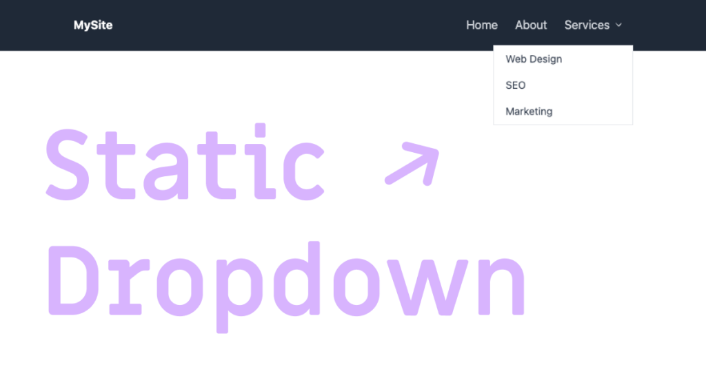
Adding the Dropdown to a Navigation Bar

You might want to include a dropdown in your site's navbar. Here's how to do it with Tailwind CSS.
Building the Navbar
First, set up your navigation bar:
<nav class="bg-gray-800 p-4">
  <div class="container mx-auto flex items-center justify-between">
    <div class="text-white font-bold">MySite</div>
    <div class="flex items-center">
      <!-- Other navigation links -->
      <a href="#" class="text-gray-300 hover:text-white px-3 py-2">Home</a>
      <a href="#" class="text-gray-300 hover:text-white px-3 py-2">About</a>
      <!-- Dropdown -->
      <div class="relative inline-block text-left">
        <button
          class="inline-flex items-center text-gray-300 hover:text-white px-3 py-2"
        >
          Services
          <svg
            class="ml-1 w-4 h-4"
            xmlns="<http://www.w3.org/2000/svg>"
            fill="currentColor"
            viewBox="0 0 20 20"
          >
            <path
              d="M5.23 7.21a.75.75 0 011.06.02L10 11.586l3.71-4.354a.75.75 0 111.14.976l-4.25 5A.75.75 0 0110 13a.75.75 0 01-.6-.29l-4.25-5a.75.75 0 01.08-1.05z"
            />
          </svg>
        </button>
        <!-- Dropdown Menu -->
        <div
          class="absolute right-0 mt-2 w-48 bg-white border border-gray-200"
        >
          <a href="#" class="block px-4 py-2 text-sm text-gray-700 hover:bg-gray-100">Web Design</a>
          <a href="#" class="block px-4 py-2 text-sm text-gray-700 hover:bg-gray-100">SEO</a>
          <a href="#" class="block px-4 py-2 text-sm text-gray-700 hover:bg-gray-100">Marketing</a>
        </div>
      </div>
    </div>
  </div>
</nav>
This code adds the static dropdown under the "Services" link.
Adjusting for Mobile Devices
To make it mobile-friendly, use responsive classes:
Hide Dropdown on Small Screens:
<div class="hidden md:block">
  <!-- Dropdown content -->
</div>
You can also add a "hamburger" menu for mobile navigation.
Static vs. Dynamic Dropdown Menus
You might be wondering whether to use a static or dynamic dropdown. Let's compare them.
Static Dropdown Menus
Made with HTML and CSS only.
No JavaScript needed.
Great for simple menus with minimal interaction.
Limited to hover or focus interactions.
Dynamic Dropdown Menus
Require JavaScript.
Allow for click events to open and close menus.
Can have animations and advanced features.
Better for complex menus with nested items.
Which One to Choose
Choose Static Dropdowns for simple menus that show on hover or focus.
Choose Dynamic Dropdowns when you need more control, like opening menus on click or adding animations.
Tips to Improve Your Static Dropdown
Consistent Styling: Use the same utility classes across your site for a consistent look.
Testing: Check your dropdown in different browsers and devices.
Clean HTML: Keep your HTML tidy and organized.
Updates: Watch for Tailwind CSS updates with new features.
Wrapping Up
Making a static dropdown menu with Tailwind CSS is simple and quick. Using utility classes, you can build a responsive, accessible, and stylish dropdown without custom CSS. So go ahead and add that cool navigation feature to your site—it's easier than you might think!
FAQ
Can I create a dropdown menu in Tailwind CSS without JavaScript?
Yes! You can build a static dropdown menu with just HTML and Tailwind CSS classes. But for features like opening and closing on click, you'll need JavaScript.
How do I make sure the dropdown is accessible?
Use ARIA attributes like aria-haspopup="true" and aria-expanded="false". Also, ensure focus states are visible using focus utility classes in Tailwind CSS. Make sure all interactive elements can be reached with the keyboard.
Can I animate the dropdown menu with Tailwind CSS?
Yes. Tailwind CSS has transition and animation utilities. Add classes like transition ease-out duration-200 to animate the dropdown: <div class="absolute right-0 mt-2 w-56 origin-top-right bg-white border border-gray-200 transition ease-out duration-200 transform opacity-0 scale-95 group-hover:opacity-100 group-hover:scale-100"> <!-- Dropdown content --> </div>
How do I make the dropdown appear on hover?
Use the group utility in Tailwind CSS. Wrap the button and menu in a div with class group, and apply group-hover:block to the dropdown menu:

Yucel is a digital product creator and content writer with a knack for full-stack development. He loves blending technical know-how with engaging storytelling to build practical, user-friendly solutions. When he's not coding or writing, you'll likely find him exploring new tech trends or getting inspired by nature.
