Building Responsive Tables with Tailwind CSS
Learn how to build responsive tables with Tailwind CSS easily

Have you ever struggled with HTML tables, trying to make them modern and adaptable to different devices? Making tables responsive can be tough for web developers. Tailwind CSS helps by providing utility classes that simplify styling tables. Let's see how to turn plain tables into stylish, responsive ones using Tailwind CSS.
Creating a Basic Table

Let's start with a simple table to see how Tailwind CSS classes work. Here's an example:
<table class="min-w-full border-collapse block md:table">
  <thead class="block md:table-header-group">
    <tr class="border border-gray-200 md:border-none block md:table-row">
      <th class="p-2 text-left font-medium md:border md:border-gray-200 block md:table-cell">Name</th>
      <th class="p-2 text-left font-medium md:border md:border-gray-200 block md:table-cell">Email</th>
      <th class="p-2 text-left font-medium md:border md:border-gray-200 block md:table-cell">Role</th>
    </tr>
  </thead>
  <tbody class="block md:table-row-group">
    <tr class="bg-gray-100 border border-gray-200 md:border-none block md:table-row">
      <td class="p-2 md:border md:border-gray-200 block md:table-cell">John Doe</td>
      <td class="p-2 md:border md:border-gray-200 block md:table-cell">[email protected]</td>
      <td class="p-2 md:border md:border-gray-200 block md:table-cell">Admin</td>
    </tr>
    <!-- More rows... -->
  </tbody>
</table>
What's Going On
Responsive Design: Using classes like
block md:tablemakes the table display as a block on small screens and as a table on medium and larger screens.Styling: Classes like
border,p-2for padding, andbg-gray-100for background color add basic styling to the table elements.Font Weight: The
font-mediumclass makes header text stand out.
Making Tables Responsive

We want our tables to look good on all screen sizes. Tailwind CSS has utilities to help with this.
Adding Horizontal Scroll
On small screens, tables might not fit. To handle this, wrap the table in a div with overflow-x-auto:
<div class="overflow-x-auto">
  <table class="min-w-full">
    <!-- Table content -->
  </table>
</div>
This way, users can scroll sideways if the table is too wide.
Using Display Classes
With Tailwind's responsive prefixes, you can set how table elements show up on different screen sizes:
block md:table: Shows as a block on small screens and as a table on medium and larger screens.block md:table-row: Same idea for table rows.block md:table-cell: For table cells.
By changing these classes, the table can rearrange on small devices, stacking cells vertically so they are easier to read.
Advanced Styling Tips
Making your tables look better can help users. Here are some ideas.
Alternating Row Colors
Using different background colors for rows can make data easier to read:
<tbody class="bg-white divide-y divide-gray-200">
  <tr class="bg-gray-50">
    <!-- Row content -->
  </tr>
  <tr>
    <!-- Row content -->
  </tr>
  <!-- More rows... -->
</tbody>
The bg-gray-50 class sets a light background for every other row.
Hover Effects
Adding a hover effect to rows gives users feedback:
<tr class="hover:bg-gray-100">
  <!-- Row content -->
</tr>
When someone hovers over a row, the background color changes slightly.
Sticky Header
To keep the table header visible while scrolling:
<thead class="bg-gray-50 sticky top-0">
  <!-- Header content -->
</thead>
The sticky class and top-0 keep the header at the top.
Adding Dividers
Adding borders or dividers can make the table clearer:
<table class="min-w-full divide-y divide-gray-200">
  <!-- Table content -->
</table>
The divide-y divide-gray-200 classes add lines between rows.
Styling for Dark Mode

Many users like dark mode. Tailwind CSS makes it easy:
<table class="min-w-full text-gray-900 dark:text-gray-100">
  <thead class="bg-gray-200 dark:bg-gray-800">
    <!-- Header content -->
  </thead>
  <tbody class="bg-white dark:bg-gray-900">
    <!-- Table content -->
  </tbody>
</table>
By adding the dark: prefix, styles change when dark mode is on.
Accessibility Tips
Making tables accessible helps all users.
Use Semantic HTML
Use the correct HTML elements like <table>, <thead>, <tbody>, <tr>, <th>, and <td> to structure your table.
Use ARIA Attributes
For complex tables, ARIA attributes can help:
<table role="table">
  <!-- Table content -->
</table>
Keyboard-Friendly
Make sure that interactive elements in the table can be used with a keyboard. This includes links, buttons, and form inputs.
Dealing with Large Tables
Big tables can slow down your site.
Use Pagination
Split data into pages to make it faster and easier to navigate:
<!-- Table content -->
<div class="flex justify-between mt-4">
  <button class="px-4 py-2 bg-gray-300">Previous</button>
  <button class="px-4 py-2 bg-gray-300">Next</button>
</div>
You can style pagination buttons with Tailwind CSS.
Virtual Scrolling
For very big data sets, you can use virtual scrolling to load only the rows that are visible.
You'll need JavaScript to manage loading rows as the user scrolls.
Tailwind CSS can style the part that's visible, but you might need extra code or libraries.
Alternative Layouts for Small Screens
On very small screens, tables can still be tricky.
Use Card Layout
Turn table rows into cards to make them easier to read:
<div class="block md:hidden">
  <div class="border rounded-lg shadow mb-4">
    <div class="p-4">
      <p><span class="font-medium">Name:</span> John Doe</p>
      <p><span class="font-medium">Email:</span> [email protected]</p>
      <p><span class="font-medium">Role:</span> Admin</p>
    </div>
  </div>
  <!-- More cards... -->
</div>
By stacking data, users can read and scroll through records easily.
Making Interactive Tables with Tailwind CSS

Sometimes, tables need to be interactive.
Adding Checkboxes
Add checkboxes to let users select rows:
<tr>
  <td class="p-2">
    <input type="checkbox" class="form-checkbox h-4 w-4 text-blue-600">
  </td>
  <!-- Other cells -->
</tr>
The form-checkbox class styles the checkboxes.
Sortable Columns
Show that columns can be sorted with icons and cursors:
<th class="px-4 py-2 cursor-pointer select-none">
  <div class="flex items-center">
    Name
    <svg class="ml-2 h-4 w-4 fill-current" viewBox="0 0 20 20">
      <!-- SVG path for sort icon -->
    </svg>
  </div>
</th>
Tailwind's flex classes help align text and icons.
Expandable Rows
Allow rows to expand and show more details:
<tr>
  <td class="p-2">
    <button class="focus:outline-none">
      <!-- Plus icon -->
    </button>
  </td>
  <!-- Other cells -->
</tr>
<tr class="hidden">
  <td colspan="5" class="p-4 bg-gray-50">
    <!-- Expanded content -->
  </td>
</tr>
Use JavaScript to show or hide the extra content. Tailwind CSS styles it.
Using Tailwind CSS with JavaScript Libraries
Tailwind CSS plays nicely with JavaScript libraries.
Using Alpine.js
Alpine.js adds interactivity with small code:
<table x-data="{ selected: [] }">
  <!-- Table content -->
</table>
With x-data and other Alpine.js directives, you can handle state and events.
Using DataTables
DataTables is a well-known jQuery plugin for enhancing tables:
You can customize it to use Tailwind CSS classes.
It adds features like search, sort, and pagination.
Enhancing Functionality with Plugins
You can use Tailwind CSS plugins to get more features.
With Flowbite
Flowbite has a set of Tailwind CSS components:
<table class="w-full text-sm text-left text-gray-500">
  <!-- Table content -->
</table>
Using Flowbite classes, you get pre-made components like advanced tables.
DaisyUI Components
DaisyUI offers Tailwind CSS components that focus on usability:
<table class="table w-full">
  <!-- Table content -->
</table>
These components have themes you can customize.
Customizing Tailwind CSS for Tables
You can adjust Tailwind CSS to match your design needs.
Extending the Theme
In tailwind.config.js, you can add custom styles:
module.exports = {
  theme: {
    extend: {
      colors: {
        'table-header': '#f5f5f5',
      },
    },
  },
};
Now you can use bg-table-header in your tables.
Creating Custom Classes
You can make reusable classes using Tailwind's @apply:
/* In your CSS file */
.table-cell {
  @apply p-2 md:border md:border-gray-200 block md:table-cell;
}
Use the .table-cell class on table cells for consistent styling.
Tips for Good Table Design
Here are some tips:
Make It Clear: Use clear headings and present data simply.
Use Spacing: Add padding to make the table easier to read.
Align Text: Consistent alignment makes scanning data easier.
Test Responsiveness: Check your table on different devices.
Think About Accessibility: Use proper HTML and ARIA attributes.
Performance Tips
Big tables can slow down your site.
Use Lazy Loading: Load data only when needed.
Do Server-Side Processing: For large datasets, handle sorting and searching on the server.
Optimize Files: Minify your CSS and JavaScript to load faster.
Cross-Browser Tips
Tailwind CSS works on modern browsers, but always test your tables.
Check Vendor Prefixes: Tailwind takes care of these, but custom CSS might need them.
Flexbox and Grid: Make sure layouts work even in older browsers.
Conclusion
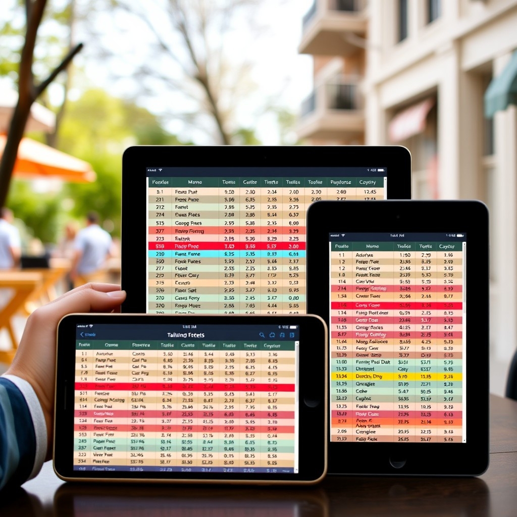
Tailwind CSS makes it easy to create responsive and stylish tables. By using its utility classes, your tables can look good and work well on any device. Whether you're making a simple table or an interactive data grid, Tailwind CSS has the tools you need.
FAQ
How do I make a table responsive with Tailwind CSS?
Wrap the table in a div with overflow-x-auto, and use responsive classes like block md:table to adjust the layout for different screen sizes.
Can I use Tailwind CSS with React to create tables?
Yes, you can use Tailwind CSS with React. Just add utility classes to your JSX elements to style your tables.
Are there pre-built table components for Tailwind CSS?
Yes! Libraries like Preline and DaisyUI have pre-built table components you can use.
How can I add pagination to my Tailwind CSS table?
Tailwind CSS doesn't handle pagination logic, but you can create pagination controls with its classes or use a JavaScript library to manage pagination.

Yucel is a digital product creator and content writer with a knack for full-stack development. He loves blending technical know-how with engaging storytelling to build practical, user-friendly solutions. When he's not coding or writing, you'll likely find him exploring new tech trends or getting inspired by nature.
