Tailwind Padding Explained
Learn how to control padding in Tailwind CSS
Ever look at a website and feel like everything's squished together or way too spaced out? Getting the spacing just right in web design is like arranging furniture—you want everything to feel balanced and comfortable.

Padding is the space inside an element, between the content and its border. Think of it as the cushion that lets your content breathe. Tailwind CSS makes controlling this spacing super easy with its utility classes. In this guide, we'll show you how to master padding in Tailwind CSS so your web projects look clean and feel great to use.
What Is Padding, and Why Does It Matter?
Before we jump into Tailwind, let's chat about what padding actually is. In web design, padding is the space inside an element's border. Imagine a button on a webpage—padding decides how much room there is between the text inside the button and its edges. If there's not enough padding, the text might stick to the sides, making it hard to read. Too much padding, and the button might look oversized.
Good padding improves readability, creates visual balance, and makes your site more user-friendly. It's one of those small details that make a big difference.
Understanding Tailwind's Approach to Padding

Tailwind CSS is a utility-first framework. That means it gives you a bunch of classes you can slap right onto your HTML to style elements, no custom CSS needed. For padding, Tailwind has classes that let you set padding for all sides of an element or just specific sides.
The Basic Padding Classes
Here's how the padding classes in Tailwind work:
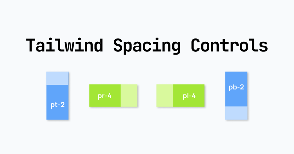
p-{size}: Sets padding on all sides.pt-{size}: Padding-top.pr-{size}: Padding-right.pb-{size}: Padding-bottom.pl-{size}: Padding-left.px-{size}: Padding-left and padding-right.py-{size}: Padding-top and padding-bottom.
The {size} is a value from Tailwind's spacing scale, which we'll talk about next.
Tailwind's Spacing Scale
Tailwind comes with a default spacing scale—a set of sizes you can use. These sizes are chosen to create a consistent look in your designs.
Here are some common sizes:
0—0px1—0.25rem(4px)2—0.5rem(8px)3—0.75rem(12px)4—1rem(16px)5—1.25rem(20px)6—1.5rem(24px)8—2rem(32px)10—2.5rem(40px)12—3rem(48px)16—4rem(64px)20—5rem(80px)24—6rem(96px)32—8rem(128px)40—10rem(160px)48—12rem(192px)56—14rem(224px)64—16rem(256px)
With this scale, you can keep your padding consistent throughout your project.
Examples
p-4: Adds1rem(16px) of padding to all sides.px-2: Adds0.5rem(8px) of padding to the left and right.py-6: Adds1.5rem(24px) of padding to the top and bottom.pt-8: Adds2rem(32px) of padding to the top.
Applying Padding in Your Projects

Let's see how to use these classes in real-life situations.
Creating a Button with Padding
<button class="px-4 py-2 bg-blue-500 text-white rounded">
  Click Me
</button>
In this example:
px-4adds1rem(16px) of padding to the left and right.py-2adds0.5rem(8px) of padding to the top and bottom.
Building a Card Component
<div class="max-w-sm p-6 bg-white shadow-md rounded-lg">
  <h2 class="text-xl font-bold mb-2">Card Title</h2>
  <p class="text-gray-700">This is some example text inside a card.</p>
</div>
Here, p-6 adds 1.5rem (24px) of padding all around the card, giving it a nice, roomy feel.
Responsive Padding with Tailwind

Your website needs to look good on all devices, from big desktop screens to tiny smartphones. Tailwind makes it easy to adjust padding based on the screen size.
Understanding Responsive Prefixes
Tailwind uses screen size prefixes to apply styles at specific breakpoints:
sm:— Small devices (640pxand up)md:— Medium devices (768pxand up)lg:— Large devices (1024pxand up)xl:— Extra-large devices (1280pxand up)2xl:— Double extra-large devices (1536pxand up)
Adjusting Padding Responsively
Suppose you want a container to have different padding on mobile and desktop devices.
<div class="p-4 md:p-8">
  <!-- Content here -->
</div>
On all devices,
p-4applies padding of1rem(16px).On medium devices and larger (
768pxand up),md:p-8increases the padding to2rem(32px).
This way, the content doesn't feel too cramped on small screens or too empty on big ones.
Example: Responsive Navigation Bar
<nav class="bg-gray-800 text-white px-4 py-2 md:px-8 md:py-4">
  <!-- Navigation items -->
</nav>
px-4 py-2: Base padding for all devices.md:px-8 md:py-4: More padding on medium devices and up.
Customizing Padding Values
Tailwind's spacing scale covers most needs, but sometimes you might need a padding value that's not on the scale.
Using Arbitrary Values
You can use custom values by wrapping them in square brackets.
p-[7px]: Adds7pxof padding to all sides.pl-[1.5rem]: Adds1.5remof padding to the left.py-[10%]: Adds padding of10%to the top and bottom.
Example
<div class="p-[3.5rem] bg-gray-100">
  <!-- Content here -->
</div>
This applies a padding of 3.5rem to all sides of the div.
Extending the Spacing Scale
For better consistency, you might want to add custom sizes to the spacing scale in your tailwind.config.js file.
module.exports = {
  theme: {
    extend: {
      spacing: {
        '18': '4.5rem', // Adds a new size called '18'
      },
    },
  },
};
Now you can use p-18 in your classes.
Side-Specific Padding

Sometimes you need to tweak padding on just one side of an element.
Practical Uses
Aligning Text: You might want extra padding on the left to line up text with other elements.
Creating Space Between Elements: Adding padding to the bottom of an element can create space between it and the next one.
Example
<div class="pr-6">
  <!-- Content with extra padding on the right -->
</div>
This adds 1.5rem (24px) of padding to the right side.
Combining Padding with Other Tailwind Utilities
Tailwind's utility classes let you style elements quickly by stacking classes.
Making a Hero Section
<section class="bg-blue-600 text-white py-12 text-center">
  <h1 class="text-4xl font-bold mb-4">Welcome to Our Website</h1>
  <p class="text-lg mb-8">We're glad to have you here.</p>
  <button class="px-6 py-2 bg-white text-blue-600 rounded">Get Started</button>
</section>py-12: Adds vertical padding to the section.px-6 py-2: Adds padding to the button.Other classes handle colors, text size, and alignment.
Tips
Consistency Matters: Use the same padding sizes for similar elements to keep a clean look.
Use Margin and Padding Together: Margins control the space outside an element, while padding controls the space inside.
Best Practices for Using Padding
Getting padding right can really improve your website's design.
Keep It Consistent
Stick to the spacing scale to keep your design cohesive. Random padding values can make the layout look uneven.
Start with Defaults
Begin with Tailwind's default padding values before using custom sizes. The defaults are designed to work well together.
Use Responsive Padding Wisely
Not every element needs different padding at different screen sizes. Focus on elements where the change will actually help the user.
Think About Accessibility
Padding affects how users interact with your site.
Clickable Elements: Make sure buttons and links have enough padding to be easily tapped on touch devices.
Content Readability: Enough padding around text makes it easier to read, especially on smaller screens.
Common Mistakes and How to Avoid Them

Even with a tool like Tailwind, it's easy to slip up. Here are some things to watch out for.
Using Too Many Custom Values
Using lots of arbitrary padding values can make your code hard to manage. Stick to the spacing scale when you can.
Forgetting About Responsiveness
Not adjusting padding for different screen sizes can result in a layout that looks good on one device but not on others.
Inconsistent Spacing
Mixing different padding sizes in similar components can make your design feel off. Establish a pattern and stick to it.
Confusing Padding and Margins
Remember that padding adds space inside an element, while margins add space outside. Using both without planning can lead to unexpected spacing.
Advanced Techniques
For those looking to up their Tailwind game, here are some advanced tips.
Creating Reusable Components
If you're repeating the same set of classes, consider creating a component or using the @apply directive in a CSS file.
/* In your CSS file */
.btn-primary {
  @apply px-4 py-2 bg-blue-500 text-white rounded;
}
Now you can use <button class="btn-primary">Click Me</button> in your HTML.
Using Tailwind Plugins
Tailwind has a bunch of plugins that can extend its functionality. For example, adding a plugin for custom spacing scales or additional utilities can boost your workflow.
Maintaining a Design System
If you're working on a big project, setting up a design system can help keep everything consistent. Document your spacing choices and make sure the whole team is on board.
Real-World Examples
Building a Blog Post Layout
<article class="max-w-2xl mx-auto p-6">
  <h1 class="text-3xl font-bold mb-4">Blog Post Title</h1>
  <p class="mb-6">By Author Name</p>
  <div class="prose">
    <!-- Blog content goes here -->
  </div>
</article>
Here, p-6 adds padding around the article to create whitespace. The mb- classes add space between elements.
Creating a Grid Layout
<div class="grid grid-cols-1 md:grid-cols-3 gap-4 p-4">
  <div class="bg-white p-4">Grid Item 1</div>
  <div class="bg-white p-4">Grid Item 2</div>
  <div class="bg-white p-4">Grid Item 3</div>
</div>p-4: Padding inside each grid item.gap-4: Space between grid items.
Troubleshooting Padding Issues
Padding Not Applying
Check Class Names: Make sure you're using the correct class (e.g.,
p-4, notpad-4).Verify Tailwind Is Loaded: Make sure Tailwind CSS is properly included in your project.
Unexpected Spacing
Inspect with DevTools: Use your browser's developer tools to see the computed styles.
Reset Margins and Padding: Some elements come with default styles. Use classes like
m-0orp-0to reset them.
Quick Reference Table
Class | Description |
|---|---|
| Padding of |
| Padding-top of |
| Padding-bottom of |
| Padding-left of |
| Padding-right of |
| Padding-left and padding-right of |
| Padding-top and padding-bottom of |
Wrapping Up
Padding is a key part of web design that affects how users see and interact with your site. Tailwind CSS makes it easy to add and adjust padding with its utility classes. By understanding and using these classes well, you can create clean, responsive designs without writing custom CSS.
Good spacing makes your content easier to read and more enjoyable. So take some time to play around with Tailwind's padding utilities, and see how your designs get even better.
FAQ
How can I reset padding to zero in Tailwind?
Use the p-0 class to remove all padding from an element. For side-specific padding, use pt-0, pr-0, pb-0, or pl-0.
What if I need negative padding in Tailwind CSS?
CSS doesn't support negative padding, but you might be thinking of negative margins, which are allowed. Tailwind provides negative margin classes like -mt-4 or -mx-2 for this purpose.
Can I combine padding utilities with other Tailwind classes?
Absolutely! Tailwind is designed for you to stack utility classes together. Combine padding with colors, text styles, layout utilities, and more to build your design right in your HTML.
How do I adjust padding for different screen sizes?
Use responsive prefixes: "sm:p-4": Applies on small screens and up. "md:p-6": Applies on medium screens and up.
What's the difference between margin and padding in Tailwind?
Padding (p) adds space inside the element, between the content and the border. Margin (m) adds space outside the element, affecting the distance between this element and others. Use padding to control the space within an element, and margin to control the space around it.
Is it possible to use custom padding values in Tailwind CSS?
Yes. You can use arbitrary values by writing them in brackets, like p-[10px]. Or you can extend the spacing scale in your tailwind.config.js to include custom values.

Yucel is a digital product creator and content writer with a knack for full-stack development. He loves blending technical know-how with engaging storytelling to build practical, user-friendly solutions. When he's not coding or writing, you'll likely find him exploring new tech trends or getting inspired by nature.
