Tailwind Media Queries
Tailwind media queries made simple (v4 ready)

Last updated: October 21, 2025
Tailwind handles “media queries” with responsive variants like sm: and md: on a mobile-first base. In v4, customize breakpoints in CSS with @theme variables (e.g., --breakpoint-md: 48rem) and target ranges using patterns like md:max-lg:*. For component-driven responsiveness, use container queries with @container and @md:.
What are Tailwind “media queries” in practice?
They’re responsive variants like sm:, md:, lg: that wrap utilities in breakpoint media queries. Tailwind is mobile-first; unprefixed classes apply to all sizes.
Example
<!-- base on mobile, scale up at md and lg -->
<p class="text-base md:text-lg lg:text-xl">...</p>What are the default Tailwind breakpoints (v3/v4)?
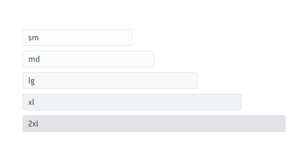
Defaults map to rem widths: sm 40rem (640px), md 48rem (768px), lg 64rem (1024px), xl 80rem (1280px), 2xl 96rem (1536px).
Prefix | Min width | Media query |
|---|---|---|
| 40rem / 640px |
|
| 48rem / 768px |
|
| 64rem / 1024px |
|
| 80rem / 1280px |
|
| 96rem / 1536px |
|
How do I target only a specific range (e.g., “only md”)?
Stack the range variant: md:max-lg:* applies between 48rem and 64rem only.
<div class="md:max-lg:flex">...</div>How do I customize breakpoints in Tailwind v4?
Define them in CSS with @theme variables like --breakpoint-* (use rem).
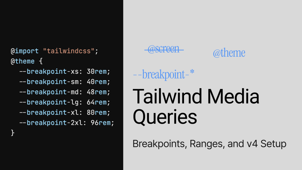
@import "tailwindcss";
@theme {
  --breakpoint-xs: 30rem;     /* new */
  --breakpoint-2xl: 100rem;   /* override default */
}
<div class="grid xs:grid-cols-2 2xl:grid-cols-6">...</div>Tip: keep all breakpoints in the same unit (rem) to avoid sorting/override surprises.
Can I remove or replace defaults entirely?
Yes—reset and define from scratch (v4):
@import "tailwindcss";
@theme {
  --breakpoint-*: initial;             /* reset */
  --breakpoint-tablet: 40rem;
  --breakpoint-laptop: 64rem;
  --breakpoint-desktop: 80rem;
}
What changed from v3 to v4 for media queries?
v4 is CSS-first: breakpoints move from tailwind.config.js to @theme; some directives like @screen are removed/deprecated in favor of variants and @theme. Keep using sm:, md: in markup.
Should I still use @screen?
No in v4: prefer responsive variants and @theme breakpoints. If you must write CSS rules, use standard @media with the --breakpoint-* variables you defined.
Example
/* v4-friendly custom CSS using theme vars */
@media (width >= var(--breakpoint-md)) {
  .card { /* custom rule */ }
}When are container queries better than viewport breakpoints?
Use container queries when component width—not viewport—should drive layout. Tailwind supports @container, @sm/@max-md container variants.
<div class="@container">
  <aside class="flex flex-col @md:flex-row @max-md:gap-3">...</aside>
</div>
Building faster? Explore Tailkits UI components to drop in ready-made sections once your Tailwind setup is fixed.
Add or override breakpoints in Tailwind v4
In Tailwind v4 you customize breakpoints with @theme (CSS variables), then use responsive variants (like md: or md:max-lg:) to apply utilities at or within ranges — no manual @media needed. See container queries if component width should drive layout.
What this does: Defines or changes Tailwind’s responsive breakpoints using the new v4 @theme CSS-first API.
Where to paste: Your main stylesheet that imports Tailwind (e.g., app.css, globals.css).
Why rem? Tailwind’s defaults use rem. Stick to one unit (preferably rem) so utilities are ordered predictably.
/* app.css */
@import "tailwindcss";

/* Tailwind v4: define your breakpoints with @theme */
@theme {
  /* Optional: wipe defaults if you want a totally custom set */
  /* --breakpoint-*: initial; */

  /* Add or override breakpoints (use rem for consistency) */
  --breakpoint-xs: 30rem;   /* ~480px */
  --breakpoint-sm: 40rem;   /* 640px (default) */
  --breakpoint-md: 48rem;   /* 768px (default) */
  --breakpoint-lg: 64rem;   /* 1024px (default) */
  --breakpoint-xl: 80rem;   /* 1280px (default) */
  --breakpoint-2xl: 96rem;  /* 1536px (default) */
  /* Example override:
     --breakpoint-2xl: 100rem;  // if you need a wider 2xl */
}
How you use it in markup: New/changed keys become variants: xs:…, 2xl:…, etc.
<div class="grid xs:grid-cols-2 2xl:grid-cols-6 gap-4">
  <!-- … -->
</div>
Target a single range in markup (the “only md” pattern)
What this does: Applies utilities only between two breakpoints — no custom CSS needed.
Where to paste: Anywhere in your HTML/MDX examples on the page.
Why it’s useful: You can say “this layout only on tablets” without writing @media by hand.
<!-- Only between md (≥48rem) and lg (<64rem) -->
<section class="p-4 md:max-lg:grid md:max-lg:grid-cols-2 md:max-lg:gap-6">
  <article class="bg-white/70 rounded-xl p-4">Card A</article>
  <article class="bg-white/70 rounded-xl p-4">Card B</article>
</section>
How it reads:
md:turns the class on at ≥ md.max-lg:turns it off at ≥ lg.
Stacked together → active only in the md..lg window. Docs: responsive variants and ranges.
How do I add a new breakpoint in Tailwind v4?
Define it with @theme using --breakpoint-* in your CSS
@import "tailwindcss";
@theme {
  --breakpoint-xs: 30rem; /* ~480px */
}
Common pitfalls and quick fixes
Shipping big CSS? Start with the CDN for quick tests, then optimize build.
“sm: means mobile” — It doesn’t; unprefixed is mobile, sm: is ≥ 640px.
Mixing px and rem in breakpoints — causes order issues; stick to rem.
Overusing custom CSS — prefer utilities + variants; add CSS sparingly

What Is Responsive Design?
Responsive design means building websites that adapt smoothly to different screen sizes. The goal is to provide a great viewing experience—easy to read and navigate with minimal resizing, panning, or scrolling. Without responsive design, a site might look fine on a desktop but turn into a jumbled mess on a phone.
In the past, developers wrote CSS media queries to style components at certain breakpoints. This often meant handling multiple CSS files or writing complex code.
How Tailwind CSS Simplifies Responsive Design
Tailwind CSS simplifies responsive design by letting you use utility classes directly in your HTML. Instead of writing separate CSS rules, you add responsive prefixes to your classes to style elements at different screen sizes. This keeps your code tidy and all in one place.
Tailwind's utility-first approach gives you small, reusable classes that you can mix to build any design. With responsive prefixes, you can apply these utilities based on the screen size.
Understanding Tailwind's Default Breakpoints
Tailwind comes with default breakpoints that match common device sizes. These breakpoints are mobile-first, meaning styles apply to all screen sizes unless specified otherwise. Here are the default breakpoints:
sm:
min-width: 640px(small screens like big smartphones)md:
min-width: 768px(medium screens like tablets)lg:
min-width: 1024px(large screens like laptops)xl:
min-width: 1280px(extra-large screens like desktops)2xl:
min-width: 1536px(huge monitors)
You use these breakpoints as prefixes in your class names. For example:
<div class="text-base md:text-lg lg:text-xl">
  <p>This text size adjusts with screen width!</p>
</div>
In this example:
On screens smaller than 768px, the text size is base.
From 768px and up (
md:), the text size becomes large.From 1024px and up (
lg:), the text size becomes extra large.
This approach makes it easy to create responsive styles without writing custom media queries.
Not sure about typography sizes at each breakpoint? See our Tailwind font-size guide
Customizing Breakpoints in Tailwind

Sometimes, the default breakpoints might not suit your project's needs. Tailwind lets you customize breakpoints in your tailwind.config.js file.
Adding Custom Breakpoints
To add a new breakpoint, edit the theme.screens section:
@import "tailwindcss";
@theme {
  --breakpoint-xs: 30rem;
  --breakpoint-sm: 40rem;
  --breakpoint-md: 48rem;
  --breakpoint-lg: 64rem;
  --breakpoint-xl: 80rem;
  --breakpoint-2xl: 96rem;
}
Usage
<div class="grid xs:grid-cols-2 2xl:grid-cols-6">...</div>Range Example
<section class="p-4 md:max-lg:grid md:max-lg:grid-cols-2">...</section>Modifying Existing Breakpoints
You can adjust existing breakpoints too:
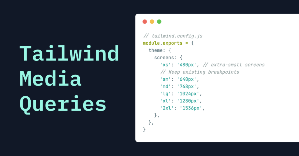
module.exports = {
  theme: {
    screens: {
      'sm': '600px', // change 'sm' breakpoint to 600px
      // Other breakpoints stay the same
    },
  },
}
Using Max-Width Breakpoints
If you want to apply styles up to a certain screen width, define max-width breakpoints:
module.exports = {
  theme: {
    screens: {
      'max-sm': { 'max': '639px' }, // Styles apply up to 639px
      // Other breakpoints
    },
  },
}
Use the max-sm: prefix to apply styles on small screens only.
Combining Min and Max Widths
You can target specific ranges by combining min and max values:
module.exports = {
  theme: {
    screens: {
      'md-only': { 'min': '768px', 'max': '1023px' },
    },
  },
}
Classes with the md-only: prefix apply between 768px and 1023px.
Using Custom Media Queries
Tailwind lets you define custom media queries using the raw key. This way, you can target specific conditions that standard breakpoints don't cover.
Targeting High-Resolution Screens
“In v4, define breakpoints with @theme and prefer variants. For special cases, write standard CSS @media using your --breakpoint-* values.”
@media (resolution >= 192dpi) { .retina\:shadow { box-shadow: ... } }Now, you can use the retina: prefix to style high-resolution screens.
Targeting Orientation
You can also target device orientation:
module.exports = {
  theme: {
    screens: {
      'portrait': { 'raw': '(orientation: portrait)' },
      'landscape': { 'raw': '(orientation: landscape)' },
    },
  },
}
Use the portrait: and landscape: prefixes to apply styles based on orientation.
Using the @screen Directive in Custom CSS Legacy (v3)
“In v4, use responsive variants and
@theme—@screenis removed.”

“@screen was removed/deprecated in v4; use variants + @theme or plain @media.” Here is a replacement snippet:
@media (width >= var(--breakpoint-md)) { .card{ padding:1.5rem } }Sometimes, you need to write custom CSS for specific components. Tailwind has the @screen directive to apply styles at certain breakpoints in your CSS files.
Here's how to use it:
/* In your CSS file */
@tailwind base;
@tailwind components;
@tailwind utilities;

.card {
  @apply p-4 bg-white shadow-md;

  @screen md {
    @apply p-6;
  }

  @screen lg {
    @apply p-8;
  }
}
In this example, the .card class has different padding at different screen sizes.
Building Responsive Layouts with Tailwind
Tailwind helps you build responsive layouts. Check out these examples.
Responsive Grid System
Creating a responsive grid is straightforward:
<div class="grid grid-cols-1 sm:grid-cols-2 lg:grid-cols-4 gap-4">
  <div class="bg-blue-200 p-4">Item 1</div>
  <div class="bg-blue-200 p-4">Item 2</div>
  <div class="bg-blue-200 p-4">Item 3</div>
  <div class="bg-blue-200 p-4">Item 4</div>
</div>
This grid adjusts the number of columns based on screen size:
1 column on small screens.
2 columns on small to medium screens.
4 columns on large screens and up.
Responsive Navigation Menu
Here's how to create a navigation menu that adapts to different devices:
<nav class="bg-gray-800 p-4">
  <div class="container mx-auto flex items-center justify-between">
    <div class="text-white text-xl">Brand</div>
    <ul class="hidden md:flex space-x-4">
      <li><a href="#" class="text-gray-300 hover:text-white">Home</a></li>
      <li><a href="#" class="text-gray-300 hover:text-white">Services</a></li>
      <li><a href="#" class="text-gray-300 hover:text-white">Contact</a></li>
    </ul>
    <div class="md:hidden">
      <!-- Mobile menu button -->
      <button class="text-gray-300 hover:text-white focus:outline-none">
        <!-- Icon -->
      </button>
    </div>
  </div>
</nav>
On mobile screens, the navigation links are hidden, and a menu button is shown.
On medium screens and up (
md:), the navigation links are visible, and the menu button is hidden.
Tips for Effective Responsive Design with Tailwind
Building responsive designs needs planning. Here are some tips:
Start with Mobile Design: Begin by designing for the smallest screens. This way, your core content is accessible to everyone.
Use Responsive Variants: Apply responsive prefixes to adjust styles at different breakpoints.
Optimize Images: Serve properly sized images for different devices to improve loading times.
Test on Multiple Devices: Check your design on various devices to confirm it looks and works as intended.
Keep It Simple: Avoid overcomplicating your design with too many breakpoints or custom media queries.
Keep Accessibility in Mind: Your site should be usable for people with disabilities. Use proper color contrasts and readable fonts.
Things to Avoid
“Mixing px/rem in breakpoints can cause order issues—stick to rem.”
“Remember mobile-first: unprefixed classes are the mobile styles.”
Conclusion
Creating responsive websites doesn't have to be complicated. Tailwind CSS offers a straightforward way to make designs that look great on any device. By using utility classes and responsive prefixes, you can easily adjust styles at different screen sizes. Tailwind's customization options let you tailor breakpoints to your project's needs. With these tools, you can focus on designing while Tailwind handles the heavy lifting.
FAQ
How do I target only mobile in Tailwind?
Use unprefixed utilities; prefixes apply at and above the breakpoint.
How do I add a custom breakpoint in v4?
Define --breakpoint-* in @theme (CSS). Use rem units.
Is @screen still valid?
It’s removed/deprecated in v4—use variants and @theme
Can I do “only md” without writing CSS?
Yes: stack md:max-lg:*
When should I use container queries?
When component width should control layout; use @container and @sm variants.
What are the default Tailwind breakpoints?
Mobile-first rem-based sizes: sm 40rem, md 48rem, lg 64rem, xl 80rem, 2xl 96rem. Unprefixed utilities = all sizes; prefixed ones apply at and above the breakpoint.
Should I use pixels or rems for breakpoints?
Use rems (and be consistent). Mixing units can change utility ordering and cause unexpected overrides.
When should I use container queries instead of breakpoints?
When the component’s own width (not the viewport) should control its layout. Mark a wrapper with @container, then use container variants like @md: inside.
How do range variants work in practice?
Tailwind provides max-* counterparts for each breakpoint to form ranges. Examples: max-md:hidden (below md), md:max-xl:flex (between md and xl).
What changed from v3 to v4 for responsive setup?
Configuration moved to CSS (@import "tailwindcss" + @theme), and @screen is gone. You now configure theme values (including breakpoints) via CSS variables.

Yucel is a digital product creator and content writer with a knack for full-stack development. He loves blending technical know-how with engaging storytelling to build practical, user-friendly solutions. When he's not coding or writing, you'll likely find him exploring new tech trends or getting inspired by nature.

