Tailwind Max Width: Your Guide to Responsive Layouts
Discover how Tailwind's max-width utilities help build responsive layouts easily.
Have you ever tried browsing a website on your phone and had to pinch and zoom just to read the text? Annoying, right? With so many people using mobile devices, making websites that work well on all screens is super important. Tailwind CSS, a utility-first CSS framework, gives you tools to create responsive designs easily. One of these tools is the max-width utility, which helps control the size of elements on different screen sizes.

In this guide, we'll show you how to use these utilities to build layouts that look great on any device, whether it's a small smartphone or a big desktop monitor. So grab your favorite code editor, and let's learn how max-width can take your web design to the next level!
What's Tailwind's Max-Width Utility?
Tailwind CSS gives you a bunch of utility classes to control the maximum width of elements. By setting a max-width, you make sure your content doesn't stretch too far, keeping your designs neat and easy to read. This is super helpful when you're working with responsive layouts where screen sizes can vary a lot.
But what does max-width actually do? In CSS, max-width sets the biggest width an element can have. That means the element can be any width up to that maximum, but it won't go past it. So, even if the parent container is larger, your element won't stretch beyond the max-width you've set. This gives you flexibility—your content can shrink or grow within limits, adapting to different screen sizes without getting too wide.
For example, paragraphs of text can be hard to read when they stretch across a very wide screen. By setting a max-width, you can make the text easier to read by limiting how wide the lines get. Tailwind makes this simple by offering utility classes that match common max-width values, so you can quickly apply consistent sizing across your project.
Predefined Max-Width Classes in Tailwind CSS

Tailwind provides several predefined max-width classes that you can use right away. These classes are made with responsive design in mind and cover a range of common width values.
Here's a quick list of some commonly used max-width classes:
max-w-xssets the max-width to 20rem (320px).max-w-smsets the max-width to 24rem (384px).max-w-mdsets the max-width to 28rem (448px).max-w-lgsets the max-width to 32rem (512px).max-w-xlsets the max-width to 36rem (576px).max-w-2xlsets the max-width to 42rem (672px).max-w-3xlsets the max-width to 48rem (768px).max-w-4xlsets the max-width to 56rem (896px).max-w-5xlsets the max-width to 64rem (1024px).max-w-6xlsets the max-width to 72rem (1152px).max-w-fullsets the max-width to 100%.
These classes let you set max-widths that match standard design breakpoints.
When to Use These Classes
max-w-xs(320px): Great for small elements like sidebars or narrow content blocks.max-w-sm(384px): Perfect for mobile devices or small components.max-w-md(448px): Commonly used for medium-sized content areas, like modals or small sections.max-w-lg(512px) andmax-w-xl(576px): Good for main content areas on smaller screens.max-w-2xl(672px) andmax-w-3xl(768px): Ideal for larger content sections on tablets or desktops.max-w-4xl(896px) andmax-w-5xl(1024px): Used for wide content areas on larger screens.max-w-6xl(1152px): Great for full-width content on big monitors.max-w-full: Makes the element expand to the full width of its parent container.
By picking the right max-width class, you can make your content look balanced and easy to read, no matter what device people are using.
Setting Custom Max-Width Values

Sometimes, the predefined max-width classes might not be just right for your design. Maybe you have specific guidelines that need special sizes. Tailwind CSS is very customizable, letting you define your own max-width values in your Tailwind configuration file.
Adding a Custom Max-Width Value
Here's how you can add a custom max-width:
// tailwind.config.js
module.exports = {
  theme: {
    extend: {
      maxWidth: {
        'custom': '50rem', // Adds a class 'max-w-custom' with value 50rem (800px)
      }
    }
  }
}
After adding this to your configuration file, you can use max-w-custom in your HTML to set an element's max-width to 800px.
Why Customize?
Making your own max-width values can help you:
Match Specific Design Needs: If your design needs exact measurements that don't match the default sizes.
Keep Things Consistent: Use the same custom class across your project to keep sizes uniform.
Improve Readability: For text-heavy content, you might find that a certain max-width gives the best reading experience.
Tips for Customization
Use Clear Names: When adding custom classes, give them names that make sense, like
max-w-articleormax-w-sidebar.Stick to the Same Units: Use the same units (like rem or px) throughout your configuration to avoid confusion.
Make It Responsive: Remember, you can still apply responsive prefixes to custom classes, like
md:max-w-custom.
Responsive Design with Tailwind's Max-Width

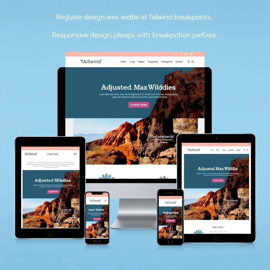
Tailwind lets you apply different max-widths at various breakpoints, making responsive design easy. You can add breakpoint prefixes to max-width classes to adjust the max-width on different screen sizes.
Understanding Breakpoints in Tailwind CSS
Tailwind's default breakpoints are:
sm: 640pxmd: 768pxlg: 1024pxxl: 1280px2xl: 1536px
You can use these breakpoints to apply styles based on the screen size.
Applying Responsive Max-Width Classes
For example:
<div class="max-w-full md:max-w-2xl lg:max-w-4xl">
  <!-- Your content here -->
</div>
In this example:
On small screens (less than 768px), the max-width is set to 100% (
max-w-full).On medium screens (
mdbreakpoint and up), the max-width changes tomax-w-2xl(672px).On large screens (
lgbreakpoint and up), the max-width becomesmax-w-4xl(896px).
How It Works
Mobile-First Approach: Tailwind CSS uses a mobile-first approach, meaning styles without prefixes apply to all screen sizes unless overridden by breakpoint prefixes.
Overriding Styles: At each breakpoint, you can override the previous styles by adding the breakpoint prefix.
Benefits of Responsive Max-Width
Better Usability: Elements adjust to the best widths for each device, improving the user experience.
Consistent Design: Keep a cohesive look across different devices.
Easy Development: Quickly adjust layouts without writing custom media queries.
Using Max-Width for Containers

A common use for max-width is to limit the width of container elements. Tailwind provides a container class that sets responsive max-widths automatically.
Understanding the container Class
The container class applies different max-width values at different breakpoints. It also centers the container by applying margin-left and margin-right of auto.
Example:
<div class="container mx-auto">
  <!-- Your content here -->
</div>
In this example:
The
containerclass sets responsive max-widths.The
mx-autoclass centers the container horizontally.
Default Container Max-Widths
By default, the container has the following max-widths:
None (mobile screens):
max-width: 100%sm:max-width: 640pxmd:max-width: 768pxlg:max-width: 1024pxxl:max-width: 1280px2xl:max-width: 1536px
Customizing the Container
If you need more control, you can customize the container in your configuration file:
// tailwind.config.js
module.exports = {
  theme: {
    container: {
      center: true, // Centers the container by default
      padding: '1rem', // Adds padding to the container
    },
  },
}
Combining the Container with Max-Width Classes
You can also combine the container class with custom max-widths:
<div class="container max-w-3xl mx-auto">
  <!-- Your content here -->
</div>
In this case, the container's max-width is overridden to max-w-3xl (768px), regardless of the screen size.
Why Use Max-Width with Containers?
Control Content Width: Stop content from stretching too wide on large screens.
Improve Readability: Keep line lengths manageable for text content.
Keep Design Consistent: Make sure layouts look similar across different devices.
max-w-md vs. max-w-screen-md: What's the Difference?

You might have seen classes like max-w-md and max-w-screen-md. They might look similar, but they do different things.
max-w-mdsets the max-width to a fixed value: 28rem (448px).max-w-screen-mdsets the max-width to the width of themdbreakpoint (768px).
When to Use max-w-md
Use max-w-md when you want to limit an element to a specific fixed width, no matter how big the screen gets beyond that.
When to Use max-w-screen-md
Use max-w-screen-md when you want the max-width to be equal to the screen width at the md breakpoint. This makes the element responsive, adjusting its width up to the medium breakpoint size.
Visual Difference
Imagine a full-screen container:
With
max-w-md, the container will never be wider than 448px, even on large screens.With
max-w-screen-md, the container can expand up to 768px on larger screens.
Practical Example
Suppose you have an image gallery that should be up to the medium screen size but shouldn't get wider.
<div class="max-w-screen-md mx-auto">
  <!-- Gallery content here -->
</div>
In this case, the gallery will expand up to 768px but won't exceed that width on larger screens.
Combining Max-Width with Other Tailwind Utilities
Max-width classes are often used along with other Tailwind utilities to create complex and responsive layouts.
Using Max-Width with Flexbox Classes
Tailwind offers a bunch of Flexbox utilities that, when combined with max-width, can create flexible and responsive layouts.
<div class="flex flex-wrap max-w-4xl mx-auto">
  <div class="w-full md:w-1/2">
    <!-- Content for the first column -->
  </div>
  <div class="w-full md:w-1/2">
    <!-- Content for the second column -->
  </div>
</div>
In this example:
The parent
divusesflexandflex-wrapto create a flexible layout.Each child
divadjusts its width based on the screen size.The
max-w-4xlclass limits the maximum width of the container.
Using Max-Width with Grid Classes
Similarly, Tailwind's Grid utilities can be used with max-width.
<div class="grid grid-cols-1 md:grid-cols-3 gap-4 max-w-screen-lg mx-auto">
  <div><!-- Grid item 1 --></div>
  <div><!-- Grid item 2 --></div>
  <div><!-- Grid item 3 --></div>
</div>
Here:
The grid layout adjusts from one column on small screens to three columns on medium screens.
The
max-w-screen-lgclass limits the container's width to thelgbreakpoint (1024px).
Benefits of Combining Utilities
Create Complex Layouts Easily: Tailwind's utilities work together smoothly.
Keep Responsiveness: Max-width constraints help layouts look good on all screen sizes.
Maintain Consistent Spacing: Using utilities like
gapkeeps spacing between elements consistent.
Common Issues and How to Avoid Them
While Tailwind's max-width utilities are powerful, there are some common mistakes to watch out for.
1. Making Elements Too Small
It's easy to set a max-width that's too small for some content, which can lead to awkward wrapping or overflow issues.
Solution:
Test your layouts on different screen sizes.
Use responsive max-width classes to adjust the max-width at different breakpoints.
2. Forgetting to Center Content
Setting a max-width doesn't automatically center the content, which can leave it stuck to one side.
Solution:
Use
mx-autoto center the element horizontally.Or use the
flexutilities to center content.
Example:
<div class="max-w-lg mx-auto">
  <!-- This content will be centered -->
</div>
3. Not Adjusting Max-Width for Readability
Long lines of text can be hard to read, while lines that are too short can disrupt the flow.
Solution:
Aim for an optimal line length (around 50-75 characters per line).
Adjust your max-width accordingly.
4. Ignoring the Parent Container's Width
Applying a max-width to a child element inside a parent with limited width might not have the desired effect.
Solution:
Be aware of the parent elements' sizes.
Adjust the parent container's width or max-width if needed.
Best Practices for Using Max-Width
To get the most out of Tailwind's max-width utilities, keep these best practices in mind.
1. Plan Your Layout
Before you start coding, sketch out your layout. Decide where constraints are needed and how content should flow on different devices.
2. Use Rem Units for Consistency
Tailwind uses rem units by default for sizing. This ensures that sizes scale based on the root font size, which can help with accessibility.
3. Use Responsive Prefixes
Don't hesitate to adjust max-widths at different breakpoints.
<div class="max-w-full sm:max-w-md lg:max-w-4xl">
  <!-- Content -->
</div>
4. Keep Content Readable
For text-heavy content, limit the max-width to improve readability. This often means setting a max-width that keeps line lengths within the optimal range.
5. Test on Different Devices
Always test your designs on various screen sizes. Tools like browser developer tools can simulate different devices.
6. Customize When It Helps
If you often need a specific max-width, add it to your configuration file. This keeps your code DRY (Don't Repeat Yourself) and consistent.
Real-World Examples of Max-Width Usage
To see how max-width can be used in real projects, let's look at some examples.
Example 1: Blog Post Layout
A typical blog post might benefit from a max-width to keep the text readable.
<article class="prose max-w-2xl mx-auto p-4">
  <!-- Blog post content -->
</article>
In this case:
The
proseclass applies Tailwind Typography styles.max-w-2xllimits the width to keep line lengths comfortable.mx-autocenters the content.p-4adds padding.
Example 2: Centered Login Form
A login form should be centered and not too wide.
<div class="max-w-sm mx-auto mt-10">
  <form>
    <!-- Form fields -->
  </form>
</div>
Here:
max-w-smkeeps the form compact.mx-autocenters the form.mt-10adds top margin to position the form vertically.
Example 3: Portfolio Gallery
A portfolio gallery that adjusts based on screen size.
<section class="max-w-screen-xl mx-auto">
  <div class="grid grid-cols-1 sm:grid-cols-2 md:grid-cols-3 gap-6">
    <!-- Portfolio items -->
  </div>
</section>
The container expands up to the
xlbreakpoint (1280px).The grid adjusts from one to three columns depending on the screen size.
gap-6keeps spacing between items consistent.
Wrapping Up
Setting the max-width of elements is key to creating responsive and user-friendly websites. With Tailwind CSS, you have powerful tools to fine-tune your layouts. By understanding how to use max-width classes effectively, you can build designs that look great on any screen.
Now that you know how it works, try using max-width utilities in your next project. You'll see how these simple classes can make a big difference in your design's flexibility and responsiveness.
FAQ
How do I set max-width to 100% in Tailwind?
Use the max-w-full class to set the max-width of an element to 100% of its parent container.
Can I use percentages for max-width in Tailwind CSS?
Tailwind's built-in max-width classes don't include percentage values except for max-w-full. But you can add custom values in your Tailwind configuration if needed.
How do I create a custom max-width value?
Add your custom value to the maxWidth section in your tailwind.config.js file. For example:
What's the difference between max-w-screen-md and max-w-md?
max-w-md sets the max-width to a fixed value (28rem or 448px), while max-w-screen-md sets it to the md breakpoint width (768px). Choose based on whether you need a fixed size or a breakpoint-related size.
Is it possible to set min-width and max-width together?
Yes, you can combine min-width and max-width classes in Tailwind to define a range of allowed widths for an element: class="min-w-sm max-w-lg"
Is there a way to apply different max-widths without changing the content's alignment?
Yes, you can adjust max-widths without affecting alignment by making sure centering classes like mx-auto are applied.

Yucel is a digital product creator and content writer with a knack for full-stack development. He loves blending technical know-how with engaging storytelling to build practical, user-friendly solutions. When he's not coding or writing, you'll likely find him exploring new tech trends or getting inspired by nature.
