Tailwind Forms
Build responsive Tailwind forms effortlessly using utility classes

Designing forms can be tricky. Making them functional and stylish isn't always simple. But there's a tool that makes it smoother: Tailwind CSS. Tailwind provides utility classes that simplify form styling. Whether you're creating a basic contact form or a detailed survey, Tailwind helps you build forms that look great on any device. Let's see how you can use Tailwind CSS to create beautiful and responsive forms without the hassle.
Understanding Tailwind CSS Forms
Tailwind CSS offers a new way to handle styling. Instead of giving you pre-designed components, it provides utility classes you can mix and match to build any design you want. For forms, this means you have complete control over every element's look and feel. No need to override default styles or fight with the framework. You can add classes directly in your HTML to control padding, margins, borders, colors, and more. This approach makes styling easier and keeps things consistent in your app. By using Tailwind's utility classes, all your forms will have a uniform appearance, which looks professional.

Setting Up Tailwind Forms
Before styling your forms with Tailwind, you need to set up your environment. Make sure you have Node.js and npm installed. If you're new to Tailwind CSS, install it using npm:
npm install tailwindcssThen, create a configuration file:
npx tailwindcss initThis command creates a tailwind.config.js file in your project's root directory. You can customize your Tailwind setup here.
For form styling, Tailwind has an official plugin called @tailwindcss/forms. This plugin resets default form styles and applies minimal styling so forms look consistent across browsers.
Install the forms plugin:
npm install @tailwindcss/formsInclude the plugin in your Tailwind configuration file:
// tailwind.config.js
module.exports = {
  // other configurations
  plugins: [
    require('@tailwindcss/forms'),
    // other plugins
  ],
}
With the plugin installed and configured, Tailwind will reset your form elements, giving you a clean slate for your custom styles.
Styling Form Elements

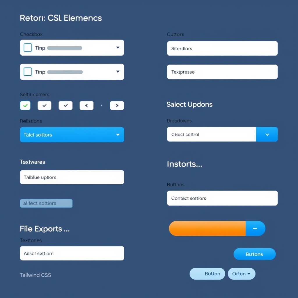
Now you're ready to style your form elements. Tailwind's utility classes let you apply styles directly in your HTML. Here's how to style different types of form elements: text inputs, checkboxes, radio buttons, select dropdowns, textareas, file inputs, and buttons.
Text Inputs
Text inputs are common in forms. With Tailwind, you can style them by adding classes directly to the input element.
Basic example:
<input type="text" class="border border-gray-300 p-2 rounded" placeholder="Your name">Explanation:
borderadds a border.border-gray-300sets the border color to light gray.p-2adds padding.roundedmakes the corners slightly rounded.
Customize these classes to match your design. To make the input full-width with larger padding:
<input type="text" class="border border-gray-400 p-4 rounded-lg w-full" placeholder="Your name">Change border and background colors:
<input type="text" class="border border-blue-500 bg-blue-100 p-2 rounded" placeholder="Your name">Handling Focus States
Add visual feedback when inputs are focused:
<input type="text" class="border border-gray-300 p-2 rounded focus:outline-none focus:ring-2 focus:ring-blue-500">focus:outline-noneremoves the default outline.focus:ring-2adds a 2-pixel ring.focus:ring-blue-500sets the ring color.
Disabled and Read-only States
Style inputs when they're disabled or read-only.
Disabled input:
<input type="text" class="border border-gray-300 p-2 rounded disabled:bg-gray-100" placeholder="Your name" disabled>disabled:bg-gray-100sets the background color when disabled.
Read-only input:
<input type="text" class="border border-gray-300 p-2 rounded readonly:bg-gray-200" placeholder="Your name" readonly>readonly:bg-gray-200changes the background color when read-only.
Validation States
Style inputs based on validation:
<input type="text" class="border border-gray-300 p-2 rounded invalid:border-red-500 invalid:text-red-600" required>invalid:border-red-500gives a red border when invalid.invalid:text-red-600changes text color when invalid.
Checkboxes and Radio Buttons

Checkboxes and radio buttons can be tricky to style. Tailwind's forms plugin helps standardize their appearance across browsers.
To style a checkbox:
<input type="checkbox" class="form-checkbox text-indigo-600">form-checkboxis from the forms plugin.text-indigo-600sets the color when checked.
For radio buttons:
<input type="radio" class="form-radio text-pink-500">Adjust size with h- and w- classes:
<input type="checkbox" class="form-checkbox h-6 w-6 text-green-500">
<input type="radio" class="form-radio h-4 w-4 text-red-500">
Custom Checkboxes and Radio Buttons
To create custom checkboxes or radio buttons, hide the default input and use a custom element:
<label class="inline-flex items-center">
  <input type="checkbox" class="form-checkbox h-0 w-0 opacity-0" checked>
  <span class="ml-2 h-4 w-4 border border-gray-300 rounded bg-white checked:bg-blue-500"></span>
  <span class="ml-2 text-gray-700">Option</span>
</label>
The actual checkbox is hidden using
h-0,w-0, andopacity-0.A custom
spanrepresents the checkbox visually.
Be cautious with this method as it can impact accessibility. Make sure the custom controls are accessible to screen readers and keyboard users.
Select Dropdowns
Style select dropdowns with Tailwind's utility classes:
<select class="border border-gray-300 p-2 rounded">
  <option>Select an option</option>
  <option value="1">Option One</option>
  <option value="2">Option Two</option>
  <option value="3">Option Three</option>
</select>
Styling select elements is limited due to browser restrictions, but you can adjust the border, padding, background color, and text.
To create a custom select with a custom arrow icon:
<div class="relative">
  <select class="block appearance-none w-full bg-white border border-gray-300 p-2 pr-8 rounded leading-tight focus:outline-none focus:border-blue-500">
    <!-- Options here -->
  </select>
  <div class="pointer-events-none absolute inset-y-0 right-0 flex items-center px-2 text-gray-700">
    <!-- Down Arrow SVG Icon -->
    <svg class="fill-current h-4 w-4" viewBox="0 0 20 20">
      <path d="M7 7l3-3 3 3M7 13l3 3 3-3" />
    </svg>
  </div>
</div>
The select has extra right padding (
pr-8) for the arrow icon.The arrow icon is an SVG placed absolutely inside the container.
Textareas
Textareas are multi-line text inputs. Style them like text inputs:
<textarea class="border border-gray-300 p-2 rounded w-full h-32" placeholder="Your message"></textarea>w-fullmakes it full width.h-32sets the height (adjust as needed).
File Inputs
Styling file inputs can be challenging due to browser limitations. Create a custom file input using Tailwind and some CSS:
<label class="block">
  <span class="sr-only">Choose file</span>
  <input type="file" class="block w-full text-sm text-gray-500
    file:mr-4 file:py-2 file:px-4
    file:rounded-full file:border-0
    file:text-sm file:font-semibold
    file:bg-blue-50 file:text-blue-700
    hover:file:bg-blue-100
  "/>
</label>
Use the
file:prefix to style the file input button.
Buttons
Buttons are essential for forms. Tailwind lets you create buttons that stand out.
Basic submit button:
<button type="submit" class="bg-blue-500 hover:bg-blue-700 text-white font-bold py-2 px-4 rounded">
  Submit
</button>bg-blue-500sets the background color.hover:bg-blue-700changes color on hover.text-whitesets text color.font-boldmakes the text bold.py-2 px-4adds padding.roundedmakes corners rounded.
For a secondary button:
<button type="button" class="bg-gray-200 hover:bg-gray-400 text-gray-800 font-semibold py-2 px-4 border border-gray-400 rounded shadow">
  Cancel
</button>
Disabled Buttons
Style a disabled button:
<button type="submit" class="bg-blue-500 text-white font-bold py-2 px-4 rounded opacity-50 cursor-not-allowed" disabled>
  Submit
</button>opacity-50reduces opacity.cursor-not-allowedchanges the cursor.The
disabledattribute disables the button.
Customizing Form Behaviors

Tailwind lets you tweak form behaviors for a better user experience.
Focus States
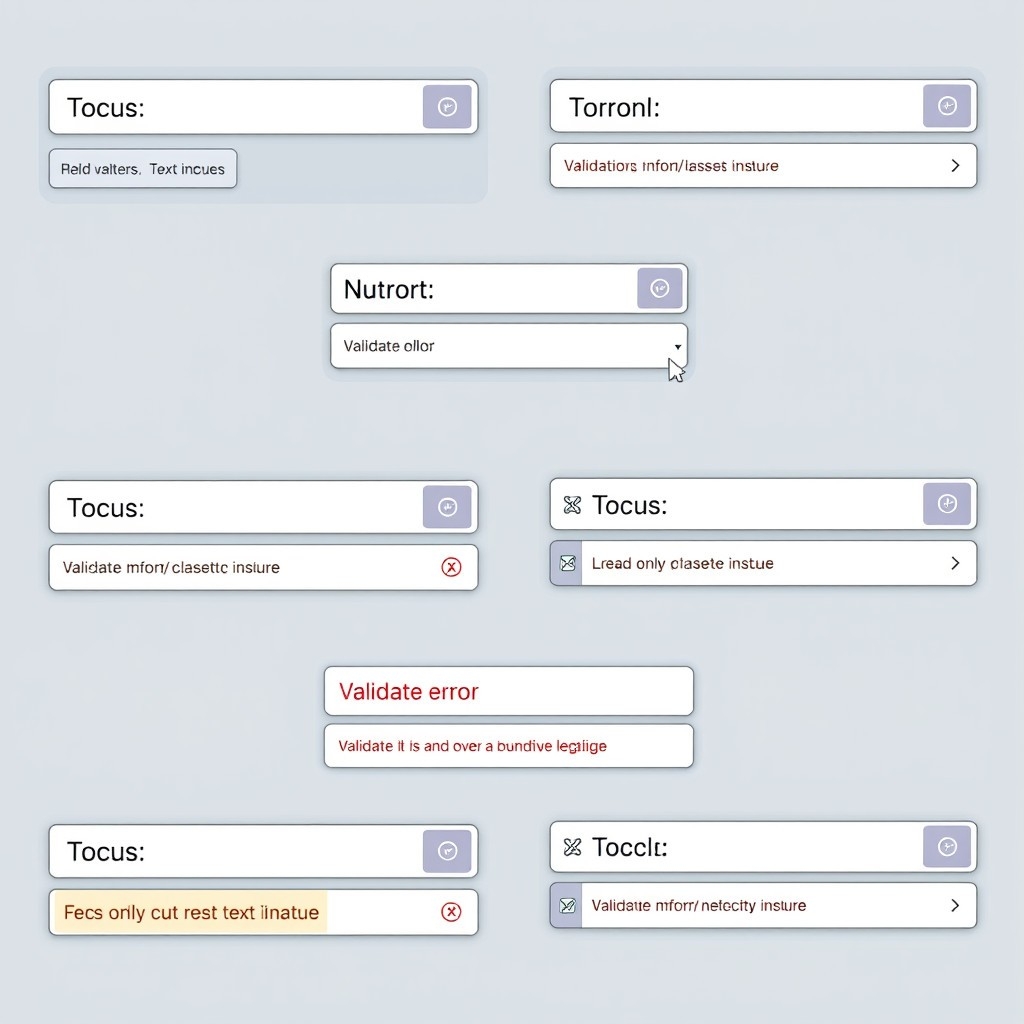
Consistent focus states improve accessibility and user experience. Use the focus: prefix to style elements when focused.
Remove the default outline and add a custom focus ring:
<input type="email" class="border border-gray-300 p-2 rounded focus:outline-none focus:ring-2 focus:ring-blue-500">focus:outline-noneremoves the default outline.focus:ring-2adds a 2-pixel ring.focus:ring-blue-500sets the ring color.
Add focus states to buttons:
<button class="bg-green-500 text-white p-2 rounded focus:outline-none focus:ring-2 focus:ring-green-700">
  Save
</button>
Error States
Displaying error states helps users fix validation errors. Change input styling and display error messages.
Example:
<div>
  <input type="password" class="border border-red-500 p-2 rounded">
  <p class="text-red-500 text-sm mt-1">Password is required.</p>
</div>
The input has a red border to show an error.
An error message appears below the input.
Use your JavaScript framework to apply these classes conditionally. In React:
<input
  type="password"
  className={`border p-2 rounded ${hasError ? 'border-red-500' : 'border-gray-300'}`}
/>
Success States
Show success states when validation passes:
<input type="text" class="border border-green-500 p-2 rounded">border-green-500gives the input a green border.
Responsive Forms
Make sure your forms work well on all screen sizes. Tailwind provides responsive utility classes to adjust styles at different breakpoints.
Example:
<input type="text" class="border border-gray-300 p-2 rounded w-full md:w-1/2">w-fullsets full width on small screens.md:w-1/2changes the width to half on medium screens and larger.
Use these responsive classes on form elements and containers.
Form Grid Layouts
Create responsive form layouts using Flexbox or Grid utilities.
Using Flexbox
<div class="flex flex-col md:flex-row md:space-x-4">
  <div class="mb-4 md:mb-0 md:flex-1">
    <label class="block text-sm font-medium text-gray-700">First Name</label>
    <input type="text" class="mt-1 border border-gray-300 p-2 rounded w-full">
  </div>
  <div class="md:flex-1">
    <label class="block text-sm font-medium text-gray-700">Last Name</label>
    <input type="text" class="mt-1 border border-gray-300 p-2 rounded w-full">
  </div>
</div>
On small screens, fields stack vertically.
On medium screens and above, fields are side by side.
Using Grid
<div class="grid grid-cols-1 md:grid-cols-2 gap-4">
  <div>
    <label class="block text-sm font-medium text-gray-700">Email</label>
    <input type="email" class="mt-1 border border-gray-300 p-2 rounded w-full">
  </div>
  <div>
    <label class="block text-sm font-medium text-gray-700">Phone</label>
    <input type="tel" class="mt-1 border border-gray-300 p-2 rounded w-full">
  </div>
</div>grid-cols-1sets one column on small screens.md:grid-cols-2changes to two columns on medium screens and larger.gap-4adds space between items.
Best Practices for Accessible Forms

Building accessible forms ensures all users can use them effectively, including those with disabilities.
Here are some best practices:
Use Semantic HTML Elements
Use proper HTML elements for form controls (
input,textarea,select).Use
buttonelements for actions, not links styled as buttons.
Always Provide Labels
Labels help users understand what information is needed and are crucial for screen reader users.
<label for="username" class="block text-sm font-medium text-gray-700">Username</label>
<input id="username" type="text" class="mt-1 border border-gray-300 p-2 rounded w-full">
To hide the label visually but keep it accessible, use the sr-only class:
<label for="username" class="sr-only">Username</label>
<input id="username" type="text" placeholder="Username" class="border border-gray-300 p-2 rounded w-full">
Use Placeholder Text Wisely
Placeholders should not replace labels. They can provide examples or brief instructions but may not be enough for accessibility.
Indicate Required Fields
Clearly mark required fields.
<label for="email" class="block text-sm font-medium text-gray-700">
  Email address <span class="text-red-500">*</span>
</label>
<input id="email" type="email" class="mt-1 border border-gray-300 p-2 rounded w-full" required>
Group Related Controls
Use fieldsets and legends to group related controls, like radio buttons or checkboxes.
<fieldset class="border border-gray-300 p-4 rounded">
  <legend class="text-lg font-medium text-gray-700">Choose your interests</legend>
  <div>
    <label class="inline-flex items-center">
      <input type="checkbox" class="form-checkbox" name="interests" value="sports">
      <span class="ml-2">Sports</span>
    </label>
  </div>
  <div>
    <label class="inline-flex items-center">
      <input type="checkbox" class="form-checkbox" name="interests" value="music">
      <span class="ml-2">Music</span>
    </label>
  </div>
</fieldset>
Ensure Keyboard Navigation
All form controls should be usable via keyboard.
Check that focus order is logical.
Provide Feedback
Use ARIA attributes to announce validation errors to screen readers.
Make sure error messages are linked to the relevant form control.
Test with Screen Readers
Use screen readers like NVDA or VoiceOver to test your forms.
Conclusion
Designing forms doesn't have to be difficult. With Tailwind CSS, you have powerful tools that make styling forms easy and efficient. Using utility classes, you can apply consistent styling across your form elements, create responsive layouts for all screen sizes, and ensure your forms are accessible to everyone. Whether you're experienced or just starting out, Tailwind helps you bring your form designs to life with minimal effort. Give it a try and see how Tailwind CSS can improve your next project.
FAQ
How do I install the Tailwind CSS forms plugin?
Install it via npm: npm install @tailwindcss/forms Then include it in your tailwind.config.js file.
How do I make my forms responsive with Tailwind?
Use Tailwind's responsive utilities like md:w-1/2 to adjust widths at different screen sizes. Apply responsive prefixes to any utility class to change styles based on screen size.
Can I use Tailwind CSS with React, Vue, or Angular forms?
Yes, Tailwind CSS works with any JavaScript framework. Apply the utility classes in your JSX (for React) or templates (for Vue/Angular) just like in regular HTML.
How do I customize colors in Tailwind for my forms?
Customize colors by editing your tailwind.config.js file. Tailwind lets you define custom color palettes to use throughout your project.
Does Tailwind CSS support dark mode for forms?
Yes, Tailwind has built-in support for dark mode. Use the dark: prefix to style elements differently when dark mode is active.

Yucel is a digital product creator and content writer with a knack for full-stack development. He loves blending technical know-how with engaging storytelling to build practical, user-friendly solutions. When he's not coding or writing, you'll likely find him exploring new tech trends or getting inspired by nature.
