Tailwind CSS Field Sizing Guide
Optimize form fields using Tailwind CSS
Understanding Field Sizing in Tailwind CSS

Tailwind CSS offers utility classes to control the sizing behavior of form controls through the field-sizing property. This property determines how form elements like <input>, <textarea>, and <select> adjust their size based on content.

field-sizing: content
Allows the form control to adjust its size based on its content. This is useful when you want the input to expand or shrink depending on the text entered.
Example:
<input type="text" class="field-sizing-content border p-2" placeholder="Type here..." />In this example, the input field will grow or shrink as the user types, adapting to the content length.
field-sizing: fixed
Keeps the form control at a fixed size, regardless of its content. This is the default behavior for most form elements.
Example:
<input type="text" class="field-sizing-fixed w-64 border p-2" placeholder="Fixed size" />Here, the input field maintains a width of 16rem (w-64), no matter the content length.

Responsive Design with Field Sizing

Tailwind's utility classes can be combined with responsive prefixes to adjust field sizing based on screen size.
Example:
<input type="text" class="field-sizing-content md:field-sizing-fixed w-full md:w-64 border p-2" placeholder="Responsive input" />In this case, the input field will adjust its size based on content on small screens and switch to a fixed width on medium and larger screens.
Why Field Sizing Matters
Form elements like <input>, <textarea>, and <select> are crucial to user interaction. Proper sizing ensures that these elements:
Adapt to content: Using
field-sizing: content, a form control can shrinkwrap to its content until it reaches a minimum or maximum limit.Improve usability: A well-sized field reduces user errors and enhances overall interaction, especially when text length or user input is variable.
Keep design consistency: Consistent sizing across form elements creates a professional look and feel, regardless of the device or screen size.
The field-sizing CSS property is a new tool designed to help form elements behave more dynamically without relying on heavy JavaScript solutions.
How Field-Sizing Works
By default, most form controls have a fixed size. With Tailwind CSS’s field-sizing utilities, you can choose between two options:
field-sizing-fixed: Keeps the form element at a fixed size regardless of its content.field-sizing-content: Allows the element to adjust its size to fit the content, up to defined limits (usually with min-width or max-width).
A Quick Code Example
Below are two examples demonstrating each type of field-sizing behavior:
Example 1: Field Sizing Based on Content
<div class="p-4">
  <label for="dynamic-input" class="block mb-2 font-medium">Dynamic Input:</label>
  <input id="dynamic-input" type="text" placeholder="Type something..." class="field-sizing-content w-auto border rounded px-2 py-1" />
</div>
In this example, the input will adjust its width based on the content entered by the user. If no minimum width is set, it starts small and grows with more text.
Example 2: Fixed Field Sizing
<div class="p-4">
  <label for="fixed-input" class="block mb-2 font-medium">Fixed Input:</label>
  <input id="fixed-input" type="text" placeholder="Fixed size" class="field-sizing-fixed w-64 border rounded px-2 py-1" />
</div>
Here, the input remains fixed at a width defined by w-64 (which is 16rem by default) regardless of the content, ensuring uniformity in layouts.
Use Case Scenarios
Dynamic Form Fields
Imagine a search bar where the input field should expand when a long search query is entered but remain compact otherwise. Using field-sizing-content allows the search input to dynamically adjust, providing a cleaner design with minimal wasted space.
Responsive Design
For responsive layouts, you might have a form where the input fields should adapt to different screen sizes. By combining field-sizing-content with Tailwind’s responsive width classes (like w-full on mobile and w-1/2 on larger screens), you ensure that the form is user-friendly on any device.
Handling Select Elements
Field sizing is also beneficial for <select> elements. When using field-sizing-content, the width of a drop-down adjusts to the selected option’s text length. This feature is particularly useful for forms with options that vary significantly in length.
Code Example with Responsive and Dynamic Fields
Here’s a more advanced snippet combining responsive utilities with field sizing:
<div class="max-w-md mx-auto p-6">
<form>
<div class="mb-4">
<label for="username" class="block text-sm font-medium text-gray-700">Username</label>
<input id="username" type="text" placeholder="Enter username" class="field-sizing-content w-full border rounded px-3 py-2 focus:outline-none focus:border-blue-500" />
</div>
<div class="mb-4">
<label for="bio" class="block text-sm font-medium text-gray-700">Bio</label>
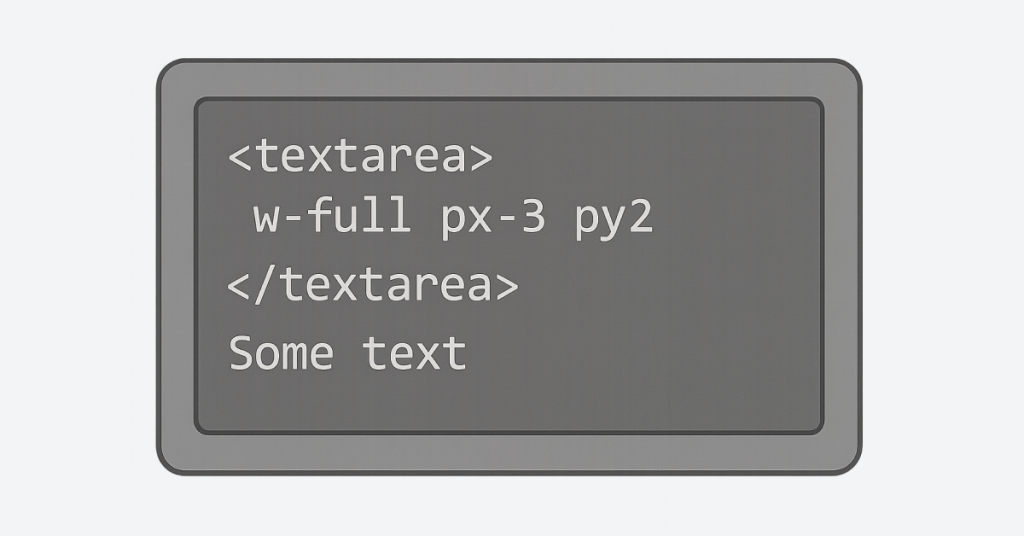
<textarea id="bio" rows="1" placeholder="Tell us about yourself" class="field-sizing-content w-full border rounded px-3 py-2 focus:outline-none focus:border-blue-500"></textarea>
</div>
<div class="mb-4">
<label for="options" class="block text-sm font-medium text-gray-700">Favorite Fruit</label>
<select id="options" class="field-sizing-content border rounded px-3 py-2 focus:outline-none focus:border-blue-500">
<option>Apple</option>
<option>Banana</option>
<option>Cherry</option>
<option>Dragonfruit</option>
</select>
</div>
<button type="submit" class="w-full bg-blue-500 text-white rounded py-2 hover:bg-blue-600">Submit</button>
</form>
</div>In this example:
The
w-fullutility ensures the inputs span the full width of their container on small screens.The
field-sizing-contentutility makes inputs dynamically adjust to content.Focus states are managed with Tailwind’s focus classes, enhancing user feedback.
By using field-sizing effectively, you can create dynamic, responsive forms that adjust to user input while maintaining a clean and consistent design across your website. This approach not only improves usability but also simplifies your CSS, taking full advantage of Tailwind’s utility-first design philosophy.
FAQ
Q1: What does field-sizing: content do?
It allows form controls to adjust their size based on the content they contain.
Is field-sizing supported in all browsers?
As of now, field-sizing is a newer CSS property and may not be supported in all browsers. It's essential to check browser compatibility before using it in production.
Can I use field-sizing with <textarea> elements?
Yes, field-sizing can be applied to <textarea> elements to make them adjust their height based on content.
How do I combine field-sizing with Tailwind's width utilities?
You can use field-sizing alongside width utilities like w-full or w-64 to control the sizing behavior of form controls.