Tailwind Custom Fonts
Learn to configure and apply Tailwind custom fonts easily

Integrating custom fonts into your Tailwind CSS project can transform the look and feel of your website in just a few simple steps. In this guide, we’ll walk through everything you need to know—from configuring your project to applying best practices for a smooth experience.
Intro
When building websites, typography plays a huge role in setting the tone. A well-chosen font can make your content more readable, build brand identity, and provide that extra spark to your design. Tailwind CSS, being a utility-first framework, makes it simple to implement custom fonts without getting tangled in complex CSS files.

Why Custom Fonts Matter
Before diving into the nuts and bolts, let’s quickly cover why you might want to use custom fonts:
Unique Identity: Custom fonts help your site stand out from the crowd, reinforcing your brand’s identity.
Improved Readability: The right font can make content easier to read, which is especially important for long-form articles or blog posts.
Enhanced Aesthetics: A well-chosen font elevates the overall design, creating a polished, professional look.
User Engagement: Engaging typography can capture users’ attention and encourage them to explore your content further.
Using Tailwind CSS, you can quickly switch between fonts using utility classes, keeping your markup clean and your style consistent.
Getting Started with Tailwind and Custom Fonts

Start with the official installation guide if you haven’t set up Tailwind CSS in your project yet. Once your project is running, you’re ready to add some custom fonts!
Tools You’ll Need
Tailwind CSS: The CSS framework for rapid UI development.
A Text Editor: Something like VS Code will do great.
A Web Browser: For testing and viewing your changes live.
Font Files or a CDN Link: Depending on whether you’re hosting fonts locally or using a service like Google Fonts.
Step 1: Choosing Your Font
Your journey begins with selecting the perfect font. There are many options out there—from free Google Fonts to premium typefaces you purchase online. For this guide, we’ll cover both methods: using a CDN link for web fonts and hosting your own font files locally.
Using Google Fonts
Google Fonts is a popular choice because it’s easy to integrate and offers a wide variety of typefaces. If you’re planning on using a Google Font, head over to Google Fonts and pick the one that suits your style.
Hosting Fonts Locally
If you have a specific font file (like a .woff2 or .ttf file), you might prefer hosting it yourself. This can give you more control over performance and load times, and it ensures your design isn’t affected if an external service goes down.
Step 2: Adding the Font to Your Project
Option A: Using a CDN (Google Fonts)
Get the Link:
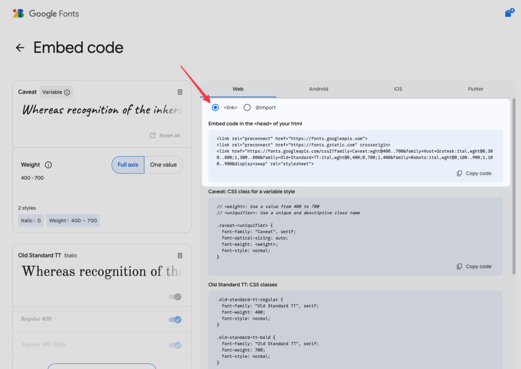
Once you’ve chosen your Google Font, click on “Select this style” and copy the provided
<link>tag. It usually looks something like this:<link href="<https://fonts.googleapis.com/css2?family=Roboto:wght@400;700&display=swap>" rel="stylesheet">

Include It in Your HTML:
Paste the link into the
<head>section of your HTML file (for example, in yourindex.htmlif you’re working on a static site). This will load the font when your site loads.Configure Tailwind:
Open your
tailwind.config.jsfile and extend the theme’sfontFamilyproperty:module.exports = { theme: { extend: { fontFamily: { roboto: ['Roboto', 'sans-serif'], }, }, }, plugins: [], }Now you can use the
font-robotoclass in your HTML to apply the font.
Option B: Hosting Fonts Locally
Place Your Font Files:
Create a folder in your project’s
publicdirectory calledfonts(if it doesn’t already exist) and place your font files there. For example:public/fonts/MyCustomFont.woff2 public/fonts/MyCustomFont.woffDefine the Font with @font-face:
In your main CSS file (typically
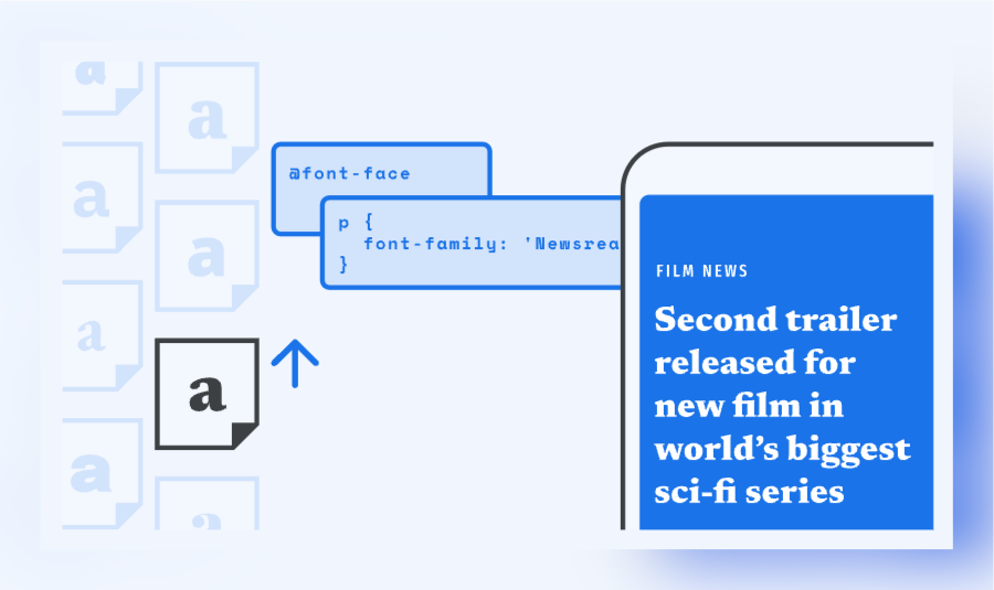
app.cssor a separatefonts.css), add an@font-facerule:@font-face { font-family: 'MyCustomFont'; font-style: normal; font-weight: 400; font-display: swap; src: url('/fonts/MyCustomFont.woff2') format('woff2'), url('/fonts/MyCustomFont.woff') format('woff'); }The
font-display: swap;property ensures that text remains visible during webfont load.Configure Tailwind to Use Your Custom Font:
Update your
tailwind.config.jsfile to include your new font:module.exports = { theme: { extend: { fontFamily: { custom: ['MyCustomFont', 'sans-serif'], }, }, }, plugins: [], }Now you can apply your custom font using the
font-customutility class.
Step 3: Using the Custom Fonts in Your HTML
With your font now available, it’s time to use it in your markup. Here’s how you might apply it to your elements:
<body class="font-custom">
  <header class="p-4 bg-gray-200">
    <h1 class="text-4xl font-bold">Welcome to My Website</h1>
    <p class="text-lg">Discover how custom fonts can transform your design.</p>
  </header>
  <main class="p-6">
    <p class="mb-4">
      Typography is a key part of design. With Tailwind CSS, switching fonts is as simple as adding a class.
    </p>
    <button class="px-4 py-2 bg-blue-600 text-white rounded">
      Get Started
    </button>
  </main>
</body>
Using these utility classes makes it straightforward to switch fonts without writing custom CSS for each element.
Step 4: Update Your Tailwind Setup
Responsive Typography
Tailwind CSS makes it super easy to create responsive typography. By combining your custom font classes with responsive utility classes, you can ensure your text looks great on any device. For example:
<h1 class="font-custom text-3xl sm:text-4xl md:text-5xl lg:text-6xl">
  Responsive Heading
</h1>
This example shows how you can adjust the size of your headings based on the screen size—no extra CSS required.
Integrating with the Typography Plugin
If you want to take your typographic styles a step further, consider using the Tailwind CSS Typography Plugin. This plugin provides a set of prose classes that optimize the typography of long-form content, making it ideal for blogs and articles.
To install the plugin:
Install the Plugin:
npm install @tailwindcss/typographyAdd It to Your Configuration:
module.exports = {
  theme: {
    extend: {
      // your fontFamily configuration here
    },
  },
  plugins: [
    require('@tailwindcss/typography'),
  ],
}
Use the Prose Class: Wrap your long-form content in a container with the
proseclass:<article class="prose"> <h1>Blog Title</h1> <p>This is a sample paragraph that demonstrates the enhanced typography provided by Tailwind’s typography plugin.</p> </article>
Best Practices and Tips
Performance Matters
When working with custom fonts, performance is key. Here are some quick tips:
Optimize Font Files: Make sure you’re using modern formats like
.woff2for better compression and faster load times.Subset Your Fonts: If you’re only using a subset of characters, consider subsetting your font files to reduce their size.
Use
font-display: swap: This ensures that text remains visible while your custom font loads, reducing the chance of a flash of invisible text.
Maintain a Clean Configuration
Keep your tailwind.config.js file well-organized by grouping your customizations logically. Use comments to mark sections for font configurations, color schemes, and other custom utilities. This not only helps you keep track of changes but also makes it easier for others to understand your setup.
Test Across Devices
Fonts can render differently on various devices and browsers. Make sure to test your website on multiple platforms to ensure that your typography remains consistent and legible. Tools like BrowserStack or even physical device testing can help you catch any discrepancies early on.
Keep It Simple
While it’s tempting to experiment with many different fonts, remember that consistency is key. Stick to one or two primary typefaces for your site to avoid visual clutter. Use variations (like bold or italic) sparingly to maintain a clean, professional look.
Common Issues
Even with a solid plan, things can go wrong. Here are some common issues you might encounter and how to fix them:
Fonts Not Loading
Check File Paths: If you’re hosting fonts locally, double-check the file paths in your
@font-facedeclarations. A small typo can prevent the font from loading.Browser Cache: Sometimes your browser might cache an old version of your CSS. Try clearing your cache or using a private browsing window.
Network Issues: For CDN-hosted fonts, ensure your internet connection is stable and that the URL is correct.
CSS Specificity Problems
Utility Classes Overridden: If your custom font isn’t applying, inspect the element using your browser’s developer tools. You may have a more specific CSS rule overriding your Tailwind class. In such cases, consider adjusting your CSS or refactoring conflicting rules.
Slow Page Loads
Font Size: Large font files can slow down your site. Consider using a tool like Font Squirrel to compress and optimize your fonts.
Lazy Loading: For projects with many custom fonts, implement lazy loading to ensure only the necessary fonts load initially.
Additional Subtopics to Consider
Advanced Font Techniques
Once you’re comfortable with basic custom font integration, you might explore some advanced techniques:
Variable Fonts: These allow multiple styles within a single font file. Tailwind CSS can easily support variable fonts, giving you more flexibility without increasing file sizes.
Dynamic Font Loading: Use JavaScript libraries or browser APIs to load fonts dynamically based on user interaction or viewport size.
Custom Font Icons: Beyond text, consider using custom fonts for icons. Icon fonts can reduce the number of HTTP requests and integrate seamlessly with Tailwind’s utility classes.
Integrating with Frameworks
Tailwind CSS works well with modern frameworks like React, Vue, and Next.js. Each of these frameworks offers slightly different methods for handling assets:
React and Next.js: Use built-in methods or packages like
next/fontto manage custom fonts efficiently.Vue: Vue projects can leverage similar configurations in their CSS files, with Tailwind’s utility classes providing a consistent design language across your application.
Conclusion
Custom fonts are a simple yet powerful way to enhance your website’s design, and with Tailwind CSS, the process is straightforward. Whether you choose to load fonts from a CDN or host them locally, following these steps will help you achieve a consistent, engaging typography style that aligns with your brand.
FAQ
How do I add custom fonts to my Tailwind CSS project?
You can add custom fonts by defining them in your CSS (using an @font-face rule or a CDN link) and then extending the fontFamily configuration in Tailwind.
Can I use both locally hosted fonts and Google Fonts?
Yes, you can mix both methods by hosting fonts in your public folder or by linking to external font services like Google Fonts.
What benefits do custom fonts bring to my design?
Custom fonts enhance your site's unique identity, improve readability, and contribute to a more engaging visual experience.
How can I optimize custom font loading for better performance?
Ensure you use modern font formats, optimize file sizes, and set appropriate font-display properties to keep your site fast and user-friendly

Yucel is a digital product creator and content writer with a knack for full-stack development. He loves blending technical know-how with engaging storytelling to build practical, user-friendly solutions. When he's not coding or writing, you'll likely find him exploring new tech trends or getting inspired by nature.

