Creating websites that look great on any device is more important than ever. Whether you’re building a blog, an e-commerce site, or a portfolio, the text on your mobile site needs to be readable, well-balanced, and visually appealing.

What Is Tailwind CSS and Why Use text-sm?
Tailwind CSS is a utility-first framework that lets you style HTML elements quickly by applying pre-defined classes. Instead of writing long custom CSS files, you add classes like text-sm, bg-blue-500, or p-4 directly into your markup. This speeds up development and enforces design consistency throughout your project.

Why text-sm for Mobile?
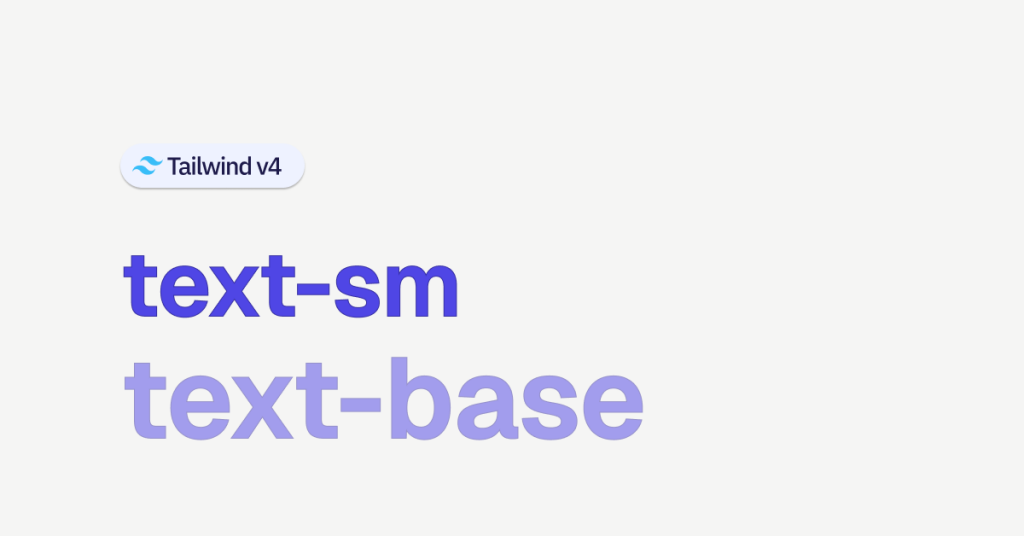
For mobile devices, screen real estate is limited. Tailwind’s text-sm class sets the font size to a smaller, more refined value (around 0.875rem by default) which is perfect for mobile screens. Using text-sm on mobile:
Enhances Readability: It avoids overly large text that might overwhelm the screen.
Promotes Consistency: It creates a baseline for typography that can be scaled up with responsive modifiers.
Improves User Experience: Smaller text that fits neatly within a mobile layout allows users to focus on the content without constant scrolling or zooming.

Responsive Typography in Tailwind CSS
Tailwind follows a mobile-first approach. This means that when you apply a class like text-sm, it is optimized for the smallest screens. As the screen size increases, you can easily adjust text sizes using responsive prefixes. For example:
<p class="text-sm md:text-base lg:text-lg">
  This paragraph starts with text-sm on mobile, scales to text-base on medium screens, and text-lg on large screens.
</p>
In this snippet:
Mobile devices:
text-smis applied by default.Medium screens: When the viewport width reaches the
mdbreakpoint (768px by default), the text size changes totext-base.Large screens: At the
lgbreakpoint (1024px), the text further scales totext-lg.
This mobile-first strategy ensures your typography is optimized for every device.
Code Examples and Use Cases
1. Basic Example (Reference: Tailwind CSS Docs)
Let’s start with a basic example Suppose you want to display a paragraph using the default font sizes:
<div class="p-4">
  <p class="text-xs">Extra Small Text</p>
  <p class="text-sm">Small Text</p>
  <p class="text-base">Base Text</p>
  <p class="text-lg">Large Text</p>
  <p class="text-xl">Extra Large Text</p>
</div>
This simple snippet shows the progression of text sizes. For mobile designs, text-sm is especially useful when you want to display more content without crowding the screen.
2. Mobile-First Layout for a Blog Post
Imagine you’re building a blog. On mobile devices, you need to ensure that your text is readable while still leaving room for images and interactive elements. Here’s how you might set up your blog post content using Tailwind’s text-sm as the default for body text:
<article class="max-w-xl mx-auto p-4">
  <h1 class="text-2xl font-bold mb-4 md:text-3xl">My Mobile-Optimized Blog Post</h1>
  <p class="text-sm leading-relaxed mb-4 md:text-base">
    Lorem ipsum dolor sit amet, consectetur adipiscing elit. Nullam vehicula, nibh non fermentum mollis, sapien justo cursus libero, at pretium dui leo in libero.
  </p>
  <p class="text-sm leading-relaxed mb-4 md:text-base">
    Sed ut perspiciatis unde omnis iste natus error sit voluptatem accusantium doloremque laudantium.
  </p>
  <a href="#" class="text-blue-600 hover:underline text-sm md:text-base">Read more...</a>
</article>
In this example:
The body text uses
text-smon mobile for a compact look.On medium and larger screens, the text increases to
text-basefor improved readability.The heading is also responsive, scaling from
text-2xltotext-3xl.
3. E-Commerce Product Details
For an e-commerce website, product descriptions must be concise and fit within the product card on mobile devices. Consider the following code:
<div class="max-w-sm border rounded-lg overflow-hidden shadow-lg p-4">
  <img class="w-full h-48 object-cover" src="product.jpg" alt="Product Image">
  <h2 class="mt-4 text-lg font-semibold text-gray-800 md:text-xl">Stylish Sneakers</h2>
  <p class="mt-2 text-sm text-gray-600 leading-snug md:text-base">
    These stylish sneakers combine comfort and durability, making them perfect for everyday wear.
  </p>
  <div class="mt-4">
    <span class="text-sm text-green-700 md:text-base">$49.99</span>
    <button class="ml-2 bg-blue-500 hover:bg-blue-700 text-white text-sm md:text-base py-1 px-2 rounded">
      Buy Now
    </button>
  </div>
</div>
In this scenario:
Product details (title, description, price) use text-sm on mobile for a neat layout.
With responsive classes (
md:text-base), the text size increases on larger screens.The use of Tailwind CSS utilities makes it straightforward to maintain consistency in typography and spacing.
4. Dashboard or Admin Panel Interface
For an admin dashboard, clarity and efficient use of space are crucial. Tables, forms, and panels can benefit from using text-sm to ensure that data is displayed compactly on smaller screens. For instance:
<div class="p-4 overflow-x-auto">
  <table class="min-w-full divide-y divide-gray-200">
    <thead>
      <tr>
        <th class="px-4 py-2 text-left text-xs font-medium text-gray-500 uppercase tracking-wider md:text-sm">
          Name
        </th>
        <th class="px-4 py-2 text-left text-xs font-medium text-gray-500 uppercase tracking-wider md:text-sm">
          Status
        </th>
        <th class="px-4 py-2 text-left text-xs font-medium text-gray-500 uppercase tracking-wider md:text-sm">
          Role
        </th>
      </tr>
    </thead>
    <tbody class="bg-white divide-y divide-gray-200">
      <tr>
        <td class="px-4 py-2 text-xs text-gray-900 md:text-sm">Alice Johnson</td>
        <td class="px-4 py-2 text-xs text-green-500 md:text-sm">Active</td>
        <td class="px-4 py-2 text-xs text-gray-900 md:text-sm">Administrator</td>
      </tr>
      <!-- More rows as needed -->
    </tbody>
  </table>
</div>
Here:
The table headers and content use text-sm for mobile, ensuring that the dashboard remains compact.
With responsive modifiers, text increases slightly on medium screens, making the data easier to read without compromising the layout.
Customizing Tailwind's Default Font Sizes
While the default Tailwind CSS font sizes are designed to work for most projects, you might sometimes need to tweak them. Tailwind allows you to customize your font sizes by extending the configuration file. For example, to create custom sizes like xxs or xxl, update your tailwind.config.js as follows:
module.exports = {
  theme: {
    extend: {
      fontSize: {
        xxs: '0.625rem',  // 10px
        xxl: '1.75rem',   // 28px
      },
    },
  },
};
After customizing, you can use your new classes directly in your HTML:
<p class="text-xxs">This is extra extra small text.</p>
<p class="text-xxl">This is extra extra large text.</p>
This flexibility lets you adhere to your brand’s typography guidelines and achieve a unique design tailored to your needs.
Best Practices for Mobile Typography
To get the most out of Tailwind CSS and ensure that your typography is optimized for mobile, here are some best practices:
Prioritize Clarity and Legibility
Contrast: Ensure text contrasts well against its background.
Spacing: Use line height and letter spacing utilities (like
leading-relaxedortracking-wide) to make text easier to read.Responsive Adjustments: Use responsive classes such as
md:text-baseto make sure text scales up nicely on larger screens.
Consistent Hierarchy
Scale: Stick to a set of text sizes (text-xs, text-sm, text-base, etc.) to maintain a clear hierarchy.
Emphasis: Use font weights (
font-bold,font-semibold) and decoration (underline,italic) sparingly to draw attention where needed.
Use Real Devices for Testing
Browser Tools: DevTools are great, but always test on actual devices.
User Feedback: Gather feedback from real users to see if the text size meets their needs in everyday use.
Accessibility
Size: Ensure that text remains legible even for users with visual impairments.
Contrast Ratio: Follow accessibility guidelines for color contrast to make sure your text is readable.
Real-World Examples
A News Website
For a news website where users need to quickly scan headlines and summaries, text-sm can be used to present information compactly. Imagine the homepage of a news site:
<section class="p-4">
  <header>
    <h1 class="text-2xl font-bold md:text-3xl">Daily News</h1>
  </header>
  <article class="mt-4">
    <h2 class="text-lg font-semibold text-gray-800 md:text-xl">
      Breaking: Major Event Unfolds
    </h2>
    <p class="text-sm text-gray-600 leading-snug md:text-base">
      A major event has just taken place, and our reporters are on the scene to bring you the latest updates.
    </p>
    <a href="#" class="text-blue-600 hover:underline text-sm md:text-base">Read Full Story</a>
  </article>
</section>
This layout uses text-sm for body text and call-to-action links on mobile, ensuring that the content is accessible without overwhelming the small screen. As users switch to larger devices, the text size increases with responsive classes for enhanced readability.
A Mobile App Landing Page
Consider a landing page for a mobile app where concise information is key. Here’s how text-sm can be effectively used:
<div class="bg-gray-100 p-6 md:p-10">
  <h1 class="text-xl font-bold text-center md:text-3xl">
    Discover Our New App
  </h1>
  <p class="mt-4 text-sm text-center leading-relaxed md:text-base">
    Our app offers a seamless experience on the go. Enjoy intuitive navigation and clear, concise text that adjusts perfectly to your screen size.
  </p>
  <div class="mt-6 flex justify-center">
    <button class="bg-blue-500 hover:bg-blue-700 text-white text-sm font-medium py-2 px-4 rounded md:text-base">
      Download Now
    </button>
  </div>
</div>
In this example, text-sm is used for the description and button text on mobile. This allows the design to remain crisp and uncluttered while ensuring that all important information is accessible at a glance.
E-Commerce Product Card
For an online store, product cards need to display product names, prices, and brief descriptions succinctly. Using text-sm helps keep the design neat:
<div class="max-w-sm border rounded-lg shadow p-4">
  <img src="product.jpg" alt="Product Image" class="w-full h-48 object-cover">
  <h2 class="mt-4 text-lg font-semibold md:text-xl">Elegant Watch</h2>
  <p class="mt-2 text-sm text-gray-600 leading-snug md:text-base">
    A sleek, modern watch that fits any style. Crafted with precision and designed for comfort.
  </p>
  <div class="mt-4 flex items-center justify-between">
    <span class="text-sm text-green-600 md:text-base">$129.99</span>
    <button class="bg-blue-500 hover:bg-blue-700 text-white text-sm font-semibold py-1 px-3 rounded md:text-base">
      Add to Cart
    </button>
  </div>
</div>
This product card uses text-sm for descriptions and pricing on mobile devices. The consistent scaling with responsive classes ensures that the design is user-friendly across all screen sizes.
Tailwind CSS’s text-sm class is an excellent tool for creating mobile-friendly, responsive text layouts. By setting a compact font size as the default for mobile, you ensure that your content is accessible and aesthetically pleasing without sacrificing design integrity.
The mobile-first approach lets you build a strong foundation, then effortlessly scale text sizes on larger screens using responsive modifiers.
FAQ
When should I use text-sm in my project?
Use text-sm as your default for mobile layouts and adjust with responsive classes for larger screens.
What does text-sm do in Tailwind CSS?
It sets the font size to a small value (around 0.875rem by default), ideal for mobile devices.
How does text-sm improve responsive design?
Starting with text-sm on mobile helps maintain a compact layout that scales up smoothly using responsive prefixes.
Can I customize the text-sm size?
Yes, you can update the font size in your Tailwind configuration file to better match your design needs.

Yucel is a digital product creator and content writer with a knack for full-stack development. He loves blending technical know-how with engaging storytelling to build practical, user-friendly solutions. When he's not coding or writing, you'll likely find him exploring new tech trends or getting inspired by nature.