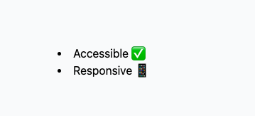
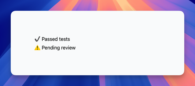
Tailwind CSS List Styles
Learn how to customize lists with Tailwind CSS
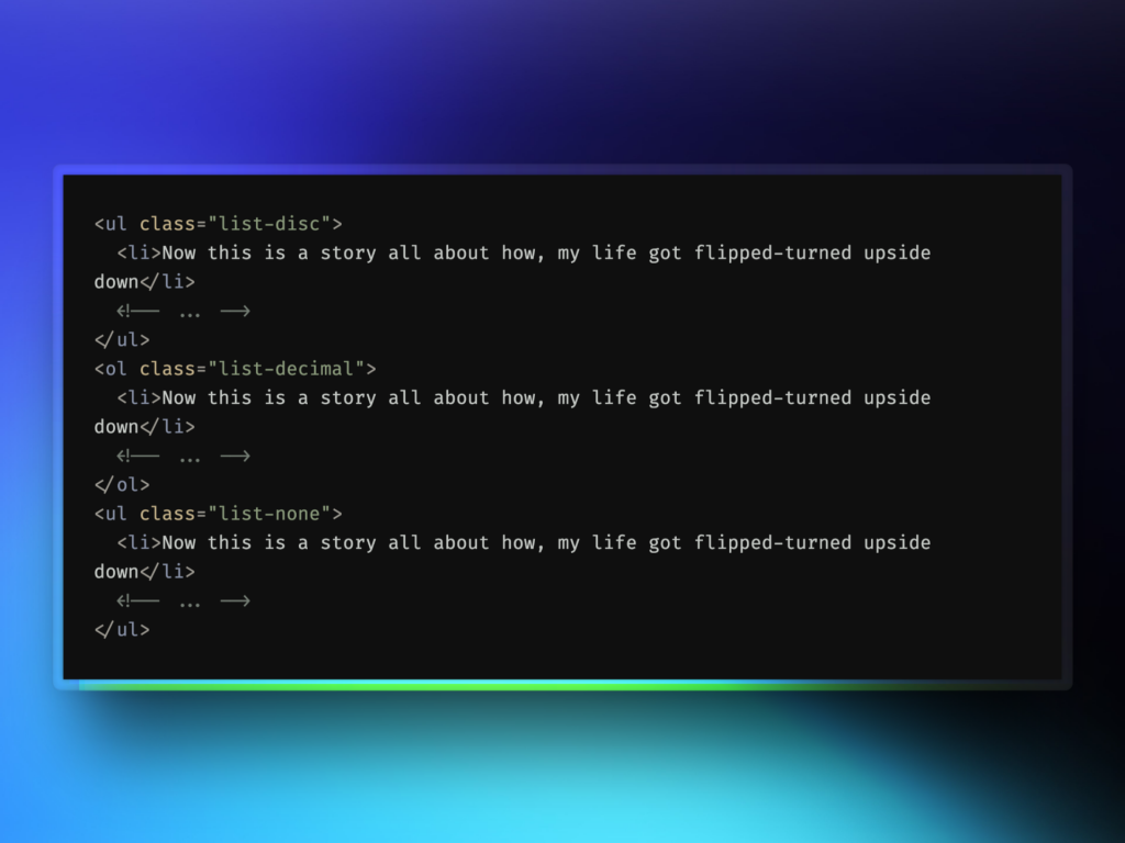
Lists are a basic part of web design. They organize information, making it easier for users to read and understand content. But lists don't have to be boring. With Tailwind CSS, you can turn plain lists into stylish, eye-catching elements. This guide will show you how to use Tailwind CSS to style your lists. You'll learn how to make lists that look great and improve the user experience. Let's get started!
Quick Review of HTML Lists
Before we get into styling, let's quickly review HTML lists. There are two main types:
Unordered Lists (
<ul>
): These show items with bullet points. The order doesn't matter.Ordered Lists (
<ol>
): These show items with numbers. The order matters.
Each list has list items (<li>
). Here's how they look in code:
<!-- Unordered List -->
<ul>
<li>Item One</li>
<li>Item Two</li>
<li>Item Three</li>
</ul>
<!-- Ordered List -->
<ol>
<li>First Step</li>
<li>Second Step</li>
<li>Third Step</li>
</ol>
Knowing these basics helps us apply styles with Tailwind CSS.
Using Tailwind CSS to Style Lists
Tailwind CSS is a utility-first CSS framework. It provides small, reusable classes that you can use to style your elements directly in your HTML. For lists, Tailwind CSS offers several classes to control their appearance.
List Style Types
The main classes for list styles are:
list-none
list-disc
list-decimal
Removing List Markers with list-none
If you want a list without any markers, use the list-none
class. Here's how:
<ul class="list-none">
<li>No marker here</li>
<li>Still no marker</li>
<li>Marker-free item</li>
</ul>
This will render a list without bullet points or numbers.
Using Bullet Points with list-disc
To display bullet points, apply the list-disc
class:
<ul class="list-disc">
<li>Item with bullet</li>
<li>Another bullet point</li>
<li>Yet another bullet</li>
</ul>
This adds the traditional bullet points to your list items.
Numbered Lists with list-decimal
For numbered lists, use the list-decimal
class:
<ol class="list-decimal">
<li>First item</li>
<li>Second item</li>
<li>Third item</li>
</ol>
This will render a list with numbers.
Controlling Marker Position
Tailwind CSS allows you to control the position of list markers relative to the content. The classes for this are:
list-inside
list-outside
Markers Inside with list-inside
When you use list-inside
, the markers are placed inside the content flow:
<ul class="list-disc list-inside">
<li>Marker is inside</li>
<li>Text wraps under the marker</li>
<li>Clean alignment</li>
</ul>
This aligns the marker with the text, which can be helpful for certain designs.
Markers Outside with list-outside
The list-outside
class positions the markers outside the content flow:
<ul class="list-disc list-outside">
<li>Marker is outside</li>
<li>This is the default</li>
<li>Traditional look</li>
</ul>
This is how lists usually appear in browsers by default.
Customizing List Markers
Sometimes, the default markers aren't enough. You might want to use custom symbols or icons. While Tailwind CSS doesn't have specific classes for custom markers, you can still achieve this with a bit of extra code.
Using the ::before Pseudo-element
You can use the ::before
pseudo-element along with Tailwind CSS classes to insert custom content before each list item.
Example: Using Checkmarks as Markers
Here's how you can add checkmarks as list markers:
<ul class="list-none">
<li class="relative pl-6 before:absolute before:left-0 before:content-['✔']">
Task completed
</li>
<li class="relative pl-6 before:absolute before:left-0 before:content-['✔']">
Another completed task
</li>
<li class="relative pl-6 before:absolute before:left-0 before:content-['✔']">
All tasks are done
</li>
</ul>
In this example:
We use
list-none
to remove default markers.The
relative
class makes the list item a positioned element.We add left padding (
pl-6
) to make room for the custom marker.The
before
classes add the checkmark before the content.
Using Emojis or Icons as Markers
You can also use emojis or icon fonts:
<ul class="list-none">
<li class="relative pl-6 before:absolute before:left-0 before:content-['🔥']">
Hot topic
</li>
<li class="relative pl-6 before:absolute before:left-0 before:content-['⭐']">
Featured item
</li>
</ul>
This approach can make your lists more engaging.
Styling Individual List Items
Tailwind CSS makes it easy to style each list item separately. You can add utility classes directly to the <li>
elements.
Changing Text Color and Style
Here's how you might style list items differently:
<ul class="list-disc">
<li class="text-red-500 font-bold">Important notice</li>
<li class="text-green-500">Regular update</li>
<li class="text-blue-500 italic">Optional info</li>
</ul>
In this example:
The first item is bold and red.
The second item is green.
The third item is blue and italic.
Adding Hover Effects
You can add hover effects to list items:
<ul class="list-disc">
<li class="hover:text-purple-500 cursor-pointer">Hover over me</li>
<li class="hover:text-orange-500 cursor-pointer">Hover over me too</li>
</ul>
This changes the text color when you hover over an item. Adding cursor-pointer
changes the cursor to show it's interactive.
Responsive List Styling
Tailwind CSS makes it easy to create responsive designs. You can adjust list styles for different screen sizes.
Changing List Styles at Breakpoints
You might want your list to have different styles on mobile and desktop. Here's how:
<ul class="list-disc sm:list-decimal md:list-none">
<li>Responsive item one</li>
<li>Responsive item two</li>
<li>Responsive item three</li>
</ul>
In this example:
On small screens (
sm
), the list uses numbers.On medium screens (
md
), the list has no markers.Otherwise, it uses bullet points.
Adjusting Spacing for Different Devices
You can change the spacing between list items based on screen size:
<ul class="space-y-2 sm:space-y-4 md:space-y-6">
<li>Item with adaptive spacing</li>
<li>Another item</li>
<li>Yet another item</li>
</ul>
This increases the vertical space between items as the screen size increases.
Improving Lists with Icons and Images
Incorporating icons or images can make your lists more engaging and informative.
Using Font Awesome or Other Icon Sets
You can integrate popular icon libraries into your lists.
Example with Font Awesome
<ul class="list-none">
<li class="flex items-center">
<i class="fas fa-check text-green-500 mr-2"></i>
Verified item
</li>
<li class="flex items-center">
<i class="fas fa-times text-red-500 mr-2"></i>
Unverified item
</li>
</ul>
In this example:
We use Font Awesome icons next to each item.
The
flex
class aligns the icon and text horizontally.The margin class
mr-2
adds space between the icon and text.
Adding Images to List Items
You can include images in your list items:
<ul class="list-none">
<li class="flex items-center">
<img src="avatar1.jpg" alt="Avatar 1" class="w-6 h-6 rounded-full mr-2">
User One
</li>
<li class="flex items-center">
<img src="avatar2.jpg" alt="Avatar 2" class="w-6 h-6 rounded-full mr-2">
User Two
</li>
</ul>
This adds user avatars next to the names.
Animated and Interactive Lists
Making lists interactive can make them more engaging.
Adding Hover Effects to Markers
You can animate the list markers themselves:
<ul class="list-disc">
<li class="group">
<span class="group-hover:text-blue-500">Interactive item one</span>
</li>
<li class="group">
<span class="group-hover:text-blue-500">Interactive item two</span>
</li>
</ul>
In this example, the text color changes when you hover over each item.
Using Transition Classes
Tailwind CSS provides classes for smooth transitions:
<ul class="list-disc">
<li class="transition duration-300 ease-in-out transform hover:scale-105">
Zoom on hover
</li>
<li class="transition duration-300 ease-in-out transform hover:scale-105">
Another zoom effect
</li>
</ul>
This makes the items slightly enlarge when hovered over.
Avoiding Common Errors
When customizing lists, there are some common mistakes to watch out for.
Forgetting to Reset Default Styles
Browsers apply default styles to lists. If you notice unexpected behavior, reset these styles:
<ul class="list-none m-0 p-0">
<li>List without default margins and padding</li>
</ul>
The m-0
and p-0
classes remove default margins and padding.
Inconsistent Styling Across Browsers
Different browsers may render lists differently. Test your lists in multiple browsers to make sure they look consistent.
Overcomplicating Custom Markers
While adding custom markers can improve your design, overdoing it can make the list hard to read. Keep it simple, and make sure the markers serve a purpose.
Tips for Better List Styling
Here are some tips to help you make the most of Tailwind CSS when styling lists.
Use Semantic HTML
Always use the appropriate list elements. This helps with accessibility and SEO.
Keep It Readable
Make sure your lists are easy to read. Use enough spacing and avoid clutter.
<ul class="list-disc pl-5 space-y-2">
<li>Easy to read item</li>
<li>Another readable item</li>
<li>Clear and concise</li>
</ul>
Be Consistent
Use consistent styles throughout your site. This helps users understand and navigate your content.
Test Responsiveness
Check how your lists look on different devices. Adjust your styles as needed to provide a good experience for all users.
Exploring More Tailwind CSS Utilities for Lists
Tailwind CSS offers many utilities that can improve your lists even further.
Controlling List Item Alignment
You can align list items horizontally or vertically using Flexbox utilities.
Horizontal Lists
To create a horizontal list:
<ul class="flex space-x-4">
<li>Home</li>
<li>About</li>
<li>Contact</li>
</ul>
This displays the list items side by side with horizontal spacing.
Centering List Items
To center list items:
<ul class="flex justify-center">
<li class="mx-2">Item One</li>
<li class="mx-2">Item Two</li>
<li class="mx-2">Item Three</li>
</ul>
The justify-center
class centers the list within its container.
Controlling List Item Order
You can change the order of list items using order-*
classes:
<ul class="flex">
<li class="order-3">Third</li>
<li class="order-1">First</li>
<li class="order-2">Second</li>
</ul>
This will display the items in the order: First, Second, Third.
Conclusion
Styling lists with Tailwind CSS opens up many possibilities. From basic bullet points to interactive, animated lists, you have the tools to make your content shine. Experiment with different styles and find what works best for your project. Keep usability and accessibility in mind. With the tips and techniques from this guide, you're ready to create lists that are both functional and stylish.
FAQ
How can I remove the default list styles in Tailwind CSS?
Use the list-none class to remove default markers like bullet points and numbers.
Is it possible to use custom symbols for list markers?
Yes, you can use the '::before' pseudo-element along with Tailwind classes to insert custom symbols.
How do I change the position of list markers?
Apply the list-inside or list-outside class to control marker positioning relative to the content.
Can I style list items individually?
Absolutely! Add Tailwind utility classes directly to the <li> elements to style them individually.
Yucel is a digital product maker and content writer specializing in full-stack development. He is passionate about crafting engaging content and creating innovative solutions that bridge technology and user needs. In his free time, he enjoys discovering new technologies and drawing inspiration from the great outdoors.