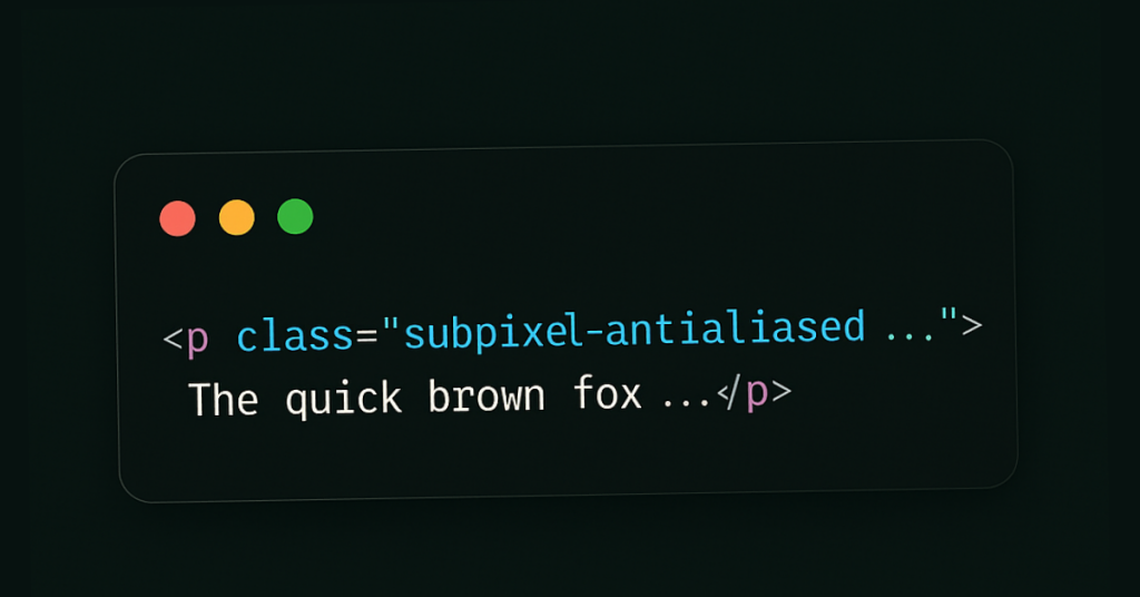
Tailwind CSS Font Smoothing Explained
Improve text clarity with Tailwind CSS
Font smoothing involves anti-aliasing techniques that reduce the jagged edges of text, making it appear smoother. Different operating systems and browsers handle font rendering differently, so having control over font smoothing can lead to more consistent typography across platforms.

What is font smoothing?
Digital glyphs rarely align to the pixel grid, so renderers blend edge pixels with intermediate shades (anti-aliasing) to fake curves . Sub-pixel rendering goes deeper, addressing the red, green, and blue sub-pixels individually; that effectively triples horizontal resolution and dramatically sharpens stems on LCD panels.
A short history
ClearType (Microsoft, 1998) uses RGB sub-pixels and custom colour filters; it shipped in Windows XP and became the default in Vista
Quartz (Apple) long prioritised glyph shape over grid-fitting, embracing sub-pixel rendering until Retina displays reduced the need.
FreeType & Linux introduced filter variations and “Harmony” to dodge ClearType patents.
While the underlying tech differs, every major desktop OS now supports both grayscale anti-aliasing and sub-pixel modes. Mobile operating systems often default to grayscale to avoid colour fringing when users rotate devices.
Browser & CSS controls
There is no standard CSS property that works everywhere; the unofficial font-smooth shorthand only applies in a few engines. Instead we reach for vendor prefixes:
/* Grayscale anti-aliasing */
-webkit-font-smoothing: antialiased;
-moz-osx-font-smoothing: grayscale;

/* Let the system choose (sub-pixel on most LCDs) */
-webkit-font-smoothing: auto;
-moz-osx-font-smoothing: auto;
Chrome ignores -webkit-font-smoothing on Windows and Linux; Firefox limits -moz-osx-font-smoothing to macOS. That inconsistency is why utility classes are handy – they centralise caveats.
Tailwind CSS to the rescue
Tailwind exposes two classes:
Class | Injected CSS | Effect |
|---|---|---|
|
| Uses grayscale anti-aliasing – lighter, thinner strokes |
|
| Leaves system defaults (sub-pixel on low-DPI displays) |
Example
<h1 class="text-3xl font-bold antialiased">
  Smooth heading on a dark hero banner
</h1>

<p class="subpixel-antialiased">
  Body copy remains crisp on light backgrounds.
</p>
Tailwind utilities are responsive-ready, so you can lighten text only on larger screens if needed:
<p class="antialiased md:subpixel-antialiased">
  Grayscale below md, sub-pixel above.
</p>
5. When should you switch modes?
Scenario | Recommended class | Reason |
|---|---|---|
Light-on-dark UI where text feels too bold |
| Grayscale drops per-channel intensity, slimming strokes |
Standard dark-on-light reading text |
| Keeps maximal sharpness on low-DPI screens |
Animated elements that trigger WebKit quirks | Force | Prevents page-wide smoothing swap during transforms |
macOS high-DPI (Retina) | Either; difference is less visible | Pixel density masks color fringing |
Tip 💡 Apply smoothing at the component level, not globally, so Windows/Linux users aren’t left with properties their browser ignores.
6. Performance & accessibility considerations
GPU cost is minimal; font rasterisation happens once, then text is cached in a glyph atlas. Switching classes doesn’t re-rasterise until repaint.
Colour fringing can harm readability for users with colour-vision deficiencies. Provide a “standard smoothing” fallback toggle in accessibility settings.
Text weight: designers often increase
font-weightto compensate for thin grayscale text; test real devices rather than relying solely on design tools.
7. Going beyond the built-ins
Need global control? Extend Tailwind in tailwind.config.js:
module.exports = {
  theme: {
    extend: {
      fontSmooth: {
        'grayscale': 'antialiased',
        'auto': 'auto',
      }
    }
  },
  plugins: [
    ({ addUtilities, theme }) => {
      addUtilities({
        '.font-grayscale': {
          '-webkit-font-smoothing': 'antialiased',
          '-moz-osx-font-smoothing': 'grayscale',
        },
        '.font-auto': {
          '-webkit-font-smoothing': 'auto',
          '-moz-osx-font-smoothing': 'auto',
        },
      })
    }
  ]
}
Now team-mates can write class="font-grayscale" while keeping utilities semantic.
8. Testing checklist
Low-DPI laptop (1366 × 768) with Windows ClearType on/off.
macOS Retina in both light and dark mode.
Linux with sub-pixel settings toggled via FontConfig.
Rotate a device 90 ° to test vertical sub-pixel layouts.
Check colour-blind simulators for fringing.
Conclusion
Font smoothing lives at the intersection of display hardware, OS rasterisers, browser quirks, and design intent. Tailwind CSS shields you from most complexity with two intuitive classes; knowing why and when to use them lets you deliver text that is legible, performant, and aesthetically consistent across the ever-expanding device landscape.

Yucel is a digital product creator and content writer with a knack for full-stack development. He loves blending technical know-how with engaging storytelling to build practical, user-friendly solutions. When he's not coding or writing, you'll likely find him exploring new tech trends or getting inspired by nature.

