Centering Elements in Tailwind CSS
Master centering elements in Tailwind CSS with step-by-step techniques
Ever tried to center something on your webpage and found it harder than expected? You're not alone! Centering elements can be tricky. But here's the good news: Tailwind CSS makes it much easier.

In this guide, we'll explore how to center elements using Tailwind CSS. We'll cover centering elements horizontally, vertically, and both at once. We'll also look at centering text and images, handling responsive designs, and thinking about accessibility. Let's jump in!
Why Centering Matters in Web Design
Centering elements isn't just for aesthetics. It creates balance and draws attention to important parts of your page. When you center key elements like headlines or buttons, you grab the user's focus. This can enhance the user experience and boost engagement.
For example, centering a signup form can make it stand out, encouraging more visitors to fill it out. Centered text can also improve readability, especially on smaller screens.
In responsive design, centering helps your content look good on all devices. Whether someone is on a desktop, tablet, or smartphone, centered elements keep your layout consistent.
Horizontal Centering Techniques

Centering elements horizontally is a common task in web design. Tailwind CSS offers several ways to do this.
Centering Block-Level Elements with mx-auto
To center a block-level element like a <div>, use the mx-auto class. This sets the left and right margins to auto, centering the element within its parent.
<div class="container mx-auto">
  <div class="bg-blue-500 w-1/2">
    <!-- Your content here -->
  </div>
</div>
How It Works:
The mx-auto class applies margin-left: auto; and margin-right: auto;. This tells the browser to evenly distribute the horizontal space on both sides of the element. Make sure your element has a set width; otherwise, it will stretch to fill the parent container.
Centering Inline Elements with text-center
For inline elements like links or buttons, you can center them by applying text-center to the parent container.
<div class="text-center">
  <a href="#" class="btn btn-primary">Click Me</a>
</div>
Here, the text-center class aligns inline elements to the center.
Using Flexbox to Center Elements Horizontally
Flexbox is a powerful layout tool. You can center elements horizontally by making the parent a flex container and using justify-center.
<div class="flex justify-center">
  <div class="bg-green-500 w-1/2">
    <!-- Your content here -->
  </div>
</div>
How It Works:
The flex class turns the parent into a flex container. The justify-center class aligns items horizontally to the center.
Vertical Centering Techniques

Centering elements vertically used to be challenging, but with Tailwind CSS, it's much simpler.
Centering Elements Vertically with items-center
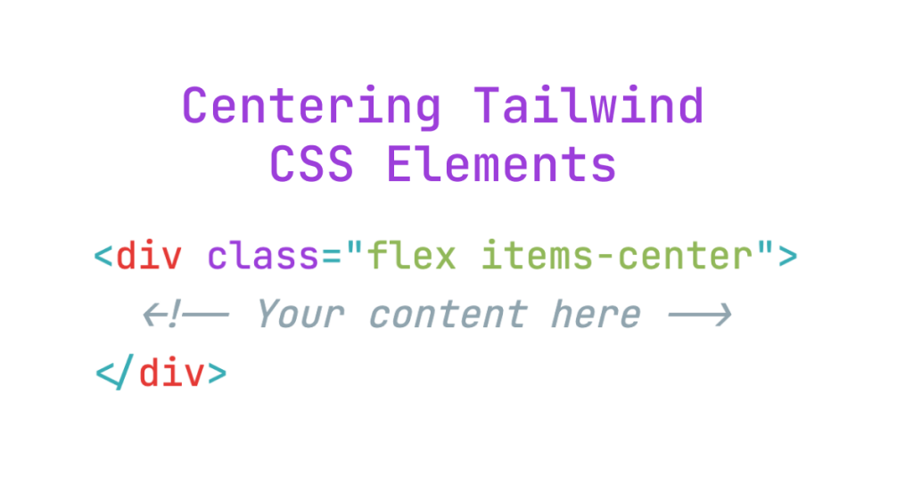
To center elements vertically, make the parent a flex container and use items-center.
<div class="flex items-center" style="height: 500px;">
  <div class="bg-red-500 w-full">
    <!-- Your content here -->
  </div>
</div>
How It Works:
The items-center class aligns items vertically within the flex container. Remember to set a height on the parent container so there's vertical space to center within.
Centering with flex-col and justify-center
If your flex container has a column direction, you can center elements vertically using justify-center.
<div class="flex flex-col justify-center" style="height: 500px;">
  <div class="bg-yellow-500">
    <!-- Your content here -->
  </div>
</div>
In this case, justify-center centers items along the main axis, which is vertical when using flex-col.
Centering Both Horizontally and Vertically
Sometimes you need to center an element both horizontally and vertically. Tailwind CSS makes this easy by combining classes.
Using Flexbox to Center in Both Directions
You can center an element in both directions by using Flexbox and combining items-center and justify-center.
<div class="flex items-center justify-center" style="height: 500px;">
  <div class="bg-purple-500 w-1/2">
    <!-- Your content here -->
  </div>
</div>
Using CSS Grid with place-items-center
CSS Grid offers a simple way to center elements in both directions using the grid and place-items-center classes.
<div class="grid place-items-center" style="height: 500px;">
  <div class="bg-pink-500">
    <!-- Your content here -->
  </div>
</div>
The place-items-center class aligns items to the center along both the horizontal and vertical axes in a grid container.
Centering Absolutely Positioned Elements
For elements that are absolutely positioned, you can center them using Tailwind's utility classes.
<div class="relative" style="height: 500px;">
  <div class="absolute inset-0 flex items-center justify-center">
    <!-- Your content here -->
  </div>
</div>
How It Works:
By setting inset-0, the absolute element fills the parent container. Then, making it a flex container allows you to center its child elements.
Centering Text with Tailwind CSS

Aligning text is another common task. Tailwind provides helpful classes for this.
Centering Text Horizontally with text-center
Use the text-center class to center text within its container.
<p class="text-center">
  This text is centered horizontally.
</p>
Centering Text Vertically with Flexbox
To center text vertically within a container, use Flexbox.
<div class="flex items-center" style="height: 100px;">
  <p>This text is centered vertically.</p>
</div>
Centering Text Both Horizontally and Vertically
Combine the previous techniques to center text in both directions.
<div class="flex items-center justify-center" style="height: 100px;">
  <p>This text is centered both horizontally and vertically.</p>
</div>
Centering Images

Centering images works much like centering other elements.
Centering an Image Horizontally with mx-auto
To center an image horizontally, use mx-auto.
<img src="image.jpg" alt="Image" class="mx-auto">Make sure to set the width of the image if it's a block-level element.
Centering an Image Vertically with Flexbox
To center an image vertically, use a flex container with items-center.
<div class="flex items-center" style="height: 300px;">
  <img src="image.jpg" alt="Image">
</div>
Centering an Image in Both Directions
Combine the horizontal and vertical centering techniques.
<div class="flex items-center justify-center" style="height: 300px;">
  <img src="image.jpg" alt="Image">
</div>
Centering Forms and Input Elements
Forms are crucial in web design. Centering them can improve user experience.
Centering a Form Horizontally with mx-auto
Use mx-auto to center a form block.
<form class="w-1/2 mx-auto">
  <!-- Form fields -->
</form>
Centering Form Elements Vertically with Flexbox
To center form elements vertically, wrap them in a flex container with items-center.
<div class="flex items-center" style="height: 400px;">
  <form>
    <!-- Form fields -->
  </form>
</div>
Centering Buttons
Buttons can be centered using mx-auto if they are block-level.
<button class="block mx-auto">Submit</button>Or by using text-center on the parent container.
<div class="text-center">
  <button>Submit</button>
</div>Centering in Responsive Design
Tailwind CSS makes it easy to create responsive designs that center elements differently at various screen sizes.
Using Responsive Utility Classes
You can apply different classes at different breakpoints using prefixes like sm:, md:, lg:, and so on.
<div class="flex flex-col sm:flex-row sm:items-center">
  <!-- Content -->
</div>
In this example, on small screens, the layout is a column. On medium screens and larger, it becomes a row with centered items.
Centering Elements Conditionally
You can change centering behavior based on screen size.
<div class="flex items-start md:items-center">
  <!-- Content -->
</div>
Here, items are aligned to the start on small screens and centered on medium screens and larger.
Common Mistakes and How to Fix Them
Even with Tailwind CSS, centering can sometimes go wrong. Here are some common mistakes and how to avoid them.
Forgetting the flex or grid Class
Classes like justify-center and items-center only work when the parent container has flex or grid.
<!-- Incorrect -->
<div class="items-center justify-center">
  <!-- Content -->
</div>

<!-- Correct -->
<div class="flex items-center justify-center">
  <!-- Content -->
</div>
Not Setting a Height for Vertical Centering
When centering vertically, you need to set a height on the parent container.
<!-- Incorrect -->
<div class="flex items-center">
  <!-- Content -->
</div>

<!-- Correct -->
<div class="flex items-center" style="height: 500px;">
  <!-- Content -->
</div>
Missing Width or Height on Absolute Elements
For absolute elements centered with m-auto, you must define both the width and height.
<!-- Incorrect -->
<div class="absolute inset-0 m-auto">
  <!-- Content -->
</div>

<!-- Correct -->
<div class="absolute inset-0 w-32 h-32 m-auto">
  <!-- Content -->
</div>
Troubleshooting Centering Issues
If your centering isn't working, here are some steps you can take.
Check Your Parent Container
Make sure the parent container has the correct classes. If you're using justify-center or items-center, the parent needs to be a flex or grid container.
Verify Element Dimensions
Ensure your element has defined dimensions if needed. For example, mx-auto centers an element with a set width.
Inspect with Browser Tools
Use your browser's developer tools to inspect the element. You can see the applied styles and check for any overrides or conflicts.
Advanced Tips for Centering
Here are some advanced techniques to up your centering game.
Combining Flex and Grid Layouts
You can mix flex and grid layouts to achieve complex designs.
<div class="grid grid-cols-2">
  <div class="flex items-center justify-center">
    <!-- Content -->
  </div>
  <div class="flex items-center justify-center">
    <!-- Content -->
  </div>
</div>
Customizing Tailwind Configurations
You can adjust your Tailwind configuration to add custom spacing, breakpoints, or other utilities that help with centering.
Using Tailwind Plugins
Tailwind CSS has various plugins that can add more utilities or components. These can help with centering in more complex layouts.
Conclusion
Centering elements on a webpage doesn't have to be hard. With Tailwind CSS, you have powerful tools at your fingertips. Whether you're centering text, images, or entire sections, Tailwind makes it straightforward. By learning how to use the available classes, you can create balanced and visually appealing layouts with ease. So next time you need to center something, remember these techniques. Happy coding!
FAQ
How do I center content in a grid layout?
Use grid and place-items-center.
Do I need to set a height to center items vertically?
Yes, you can use the inset-0, m-auto, and defined dimensions.
What's the difference between justify-center and items-center?
In Flexbox, justify-center centers items along the main axis (horizontal by default), while items-center centers items along the cross axis (vertical by default).
Can I center elements responsively?
Yes, use responsive prefixes like sm:, md:, lg: to apply centering at different screen sizes.
Can I center an absolutely positioned element with Tailwind CSS?
Yes, you can use the inset-0, m-auto, and defined dimensions.
How can I center text vertically in Tailwind CSS?
Make the parent a flex container with items-center and set a height.
How do I center a div horizontally in Tailwind CSS?
Use the mx-auto class to center a block-level element with a defined width.

Yucel is a digital product creator and content writer with a knack for full-stack development. He loves blending technical know-how with engaging storytelling to build practical, user-friendly solutions. When he's not coding or writing, you'll likely find him exploring new tech trends or getting inspired by nature.
