Mastering Tailwind CSS Aspect Ratios
Understand and apply Tailwind CSS's aspect ratio utilities
When building user interfaces, one of the trickier parts of front-end work is ensuring that images, videos, and other media maintain consistent proportions across different screen sizes. Nobody enjoys those awkwardly stretched or squished visuals that throw off an otherwise beautifully balanced layout. That’s where Tailwind CSS’s aspect ratio utilities come into play.

They allow you to confidently lock in proportions without resorting to cumbersome padding hacks or unpredictable inline styles.
In this comprehensive guide, we’ll explore everything you need to know about using Tailwind CSS’s aspect ratio utilities. We’ll cover how to get started, the underlying concepts, practical examples, responsive techniques, customization options, and advanced tips.
Understanding Aspect Ratios
Before diving into the specifics of Tailwind’s utilities, it helps to understand what aspect ratios are and why they’re important. An aspect ratio is simply the proportional relationship between an element’s width and its height. Common examples include 16:9 (for widescreen videos), 1:1 (square images), and 4:3 (classic photo and video formats).
When you maintain a steady aspect ratio, you ensure that your content always looks correct, regardless of the device or layout changes. For instance, if you embed a YouTube video set to a 16:9 ratio, it will remain that shape whether it’s viewed on a large desktop display, a tablet, or a phone. Without fixed aspect ratios, you might get unpredictable scaling as your layout responds to changes, resulting in letterboxing, black bars, or warped images.
Why Use Tailwind CSS for Aspect Ratios?
Before the CSS aspect-ratio property became widely supported, designers often struggled with maintaining aspect ratios using manual padding hacks or positioning tricks. Tailwind CSS, by leveraging modern CSS features and providing a set of handy utilities, simplifies this process. Instead of writing custom CSS rules or fidgeting with complex calculations, you can apply a single class to ensure your element always follows a consistent proportion.
The benefits of using Tailwind’s aspect ratio utilities include:
Simplicity: One class can lock in the desired ratio, freeing you from messy inline styles.
Consistency: It’s easy to apply the same ratio to multiple elements, maintaining a unified look throughout your design.
Responsiveness: Tailwind’s responsive prefixing system lets you adjust aspect ratios at different breakpoints, ensuring your layout remains flexible.
Using Tailwind’s Aspect Ratio Utilities
Tailwind’s aspect ratio utilities provide a simple syntax. They typically follow the pattern aspect-{ratio}, where {ratio} is a simplified numeric representation. For example:
aspect-squarefor a 1:1 ratioaspect-videofor a 16:9 ratio
These are built-in shortcuts for common ratios. If you need a custom ratio, you can define it in the tailwind.config.js file.
To apply an aspect ratio to an element, wrap your content inside a container that has the aspect ratio utility class. For instance, suppose you want a video placeholder that’s always 16:9:
<div class="aspect-video bg-gray-200">
  <!-- Your video element or iframe goes here -->
</div>
This ensures that the wrapper maintains a 16:9 ratio, and any child element inside it will scale accordingly.
Common Aspect Ratios and Their Use Cases
While there are countless aspect ratios, some common ones pop up frequently in design:
Square (1:1): Perfect for user avatars, gallery thumbnails, or logos.
Utility:
aspect-squareWidescreen Video (16:9): Ideal for YouTube embeds, hero sections with background videos, and modern content blocks.
Utility:
aspect-videoClassic Photography (4:3): Still widely used for various images, older video formats, and certain design elements.
Utility: You’d create a custom ratio since it’s not included by default (more on that shortly).
By mixing and matching these utilities, you can ensure that your images and videos consistently display with the intended proportions.
Responsive Design with Aspect Ratios
A key strength of Tailwind is how effortlessly it supports responsive design. As you might know, Tailwind uses prefix modifiers like sm:, md:, lg:, and xl: to alter styles at different breakpoints. Aspect ratio utilities are no exception.
Let’s say you want a square image on small screens but switch to a 16:9 ratio on larger displays. You can write:
<div class="aspect-square sm:aspect-video bg-gray-200">
  <!-- Content here -->
</div>
On smaller devices, the container remains square. Once the viewport surpasses the sm breakpoint, it shifts to a 16:9 ratio. This level of responsiveness helps ensure that your layout adapts elegantly as your audience views it on phones, tablets, laptops, and big screens.
Working with Images
Images are one of the most common elements that benefit from a locked-in ratio. For example, you might have a grid of product photos. By default, images might vary in size, leading to a messy layout. With aspect ratio classes, you can create a visually coherent grid:
<div class="grid grid-cols-2 gap-4">
  <div class="aspect-square bg-gray-200">
    <img src="path-to-image.jpg" alt="Product" class="object-cover w-full h-full" />
  </div>
  <div class="aspect-square bg-gray-200">
    <img src="path-to-another-image.jpg" alt="Product" class="object-cover w-full h-full" />
  </div>
  <!-- Repeat as needed -->
</div>
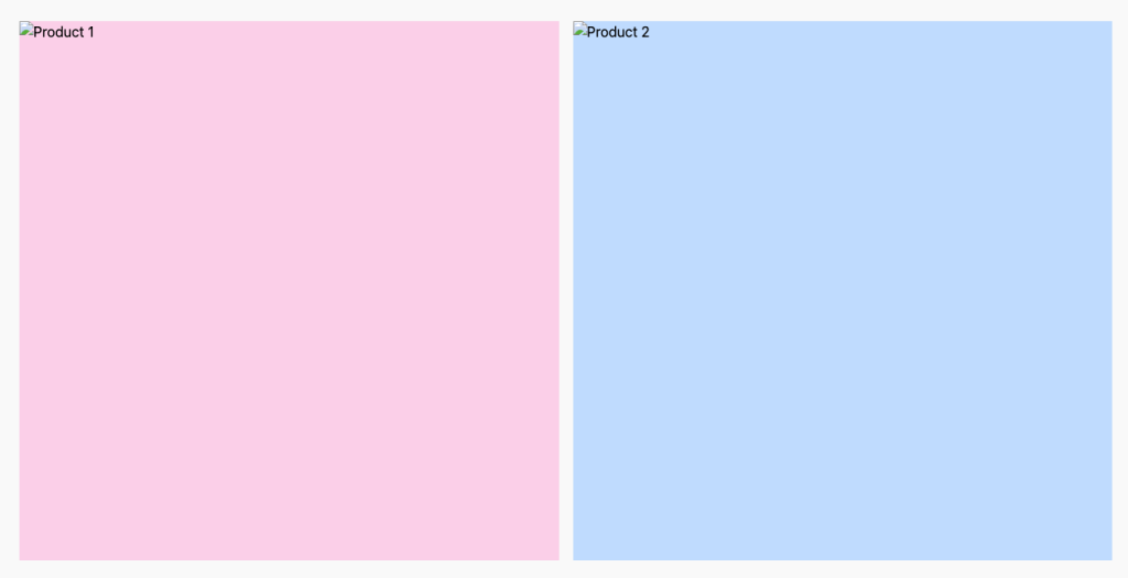
Output

Here, each product image is displayed in a perfect square frame, ensuring a tidy presentation. The object-cover class ensures the image scales and crops to fill the available space while maintaining its natural aspect ratio internally. Combined with the parent’s locked-in aspect ratio, this approach prevents odd stretching and gives you a uniform look.
Embedding Videos
Videos, especially responsive iframes from platforms like YouTube or Vimeo, often pose challenges when it comes to consistent scaling. Traditionally, designers resorted to padding tricks, like applying padding-top: 56.25% for 16:9 videos. Tailwind’s aspect ratio utilities cut out this guesswork:
<div class="aspect-video">
  <iframe
    src="<https://www.youtube.com/embed/VIDEO_ID>"
    allowfullscreen
    class="w-full h-full">
  </iframe>
</div>
This snippet ensures the video always displays at 16:9, with no letterboxing or funky layout shifts. It’s a clean, semantic approach that’s much easier to manage than manual CSS tweaks.
Customizing Aspect Ratios
While Tailwind gives you a couple of handy default aspect ratio utilities out of the box, you might need something more specific. Suppose you need a 4:3 ratio for a series of images. You can add custom aspect ratios in your tailwind.config.js file:
// tailwind.config.js
module.exports = {
  theme: {
    extend: {
      aspectRatio: {
        '4/3': '4 / 3',
        '3/2': '3 / 2',
        '21/9': '21 / 9', // for example
      }
    }
  }
}
After extending the configuration, you can use these new classes just like the built-in ones:
<div class="aspect-[4/3] bg-gray-200">
  <!-- Content here -->
</div>
This flexibility lets you cater to any design requirement, no matter how unusual the ratio may be.
Combining Aspect Ratios with Other Utilities
One of Tailwind’s core strengths is how easily you can combine different utilities. Aspect ratios work seamlessly alongside other classes that control layout, typography, spacing, and more.
A common pattern is pairing aspect ratio with object-fit classes, like object-cover or object-contain, to ensure that images adapt gracefully within their locked ratio. For example:
<div class="aspect-square bg-gray-100">
  <img src="photo.jpg" alt="A scenic view" class="object-cover w-full h-full rounded-lg" />
</div>
Here, the image not only maintains a square shape, but also appears neatly cropped and fits beautifully within a rounded frame. Layering aspect ratio with hover effects, transitions, or border utilities can further enhance the aesthetic appeal of your media elements.
Accessibility Considerations
While aspect ratios help control the visual presentation of media, it’s important to remember accessibility. Ensure that any content you place within a container has proper alt attributes for images and accessible controls or captions for videos.
Locking in aspect ratios won’t automatically solve accessibility issues, but it can prevent certain pitfalls. For example, when an iframe’s dimensions are inconsistent, users might struggle to see interactive elements like play buttons. A stable ratio ensures the interface is predictable, which can help users with assistive devices navigate more easily.
Performance Considerations
From a performance standpoint, using aspect ratio utilities is generally lightweight. Tailwind’s approach relies on modern CSS features that don’t significantly bloat your stylesheets. The real performance gains come from not needing complex JavaScript or polyfills to maintain proportions. Without the need for layout shifts or recalculations, your pages can feel more stable and responsive.
Still, keep an eye on the file sizes of images or videos themselves. Aspect ratios won’t shrink large media files. Optimizing your images and using responsive loading techniques (like srcset) ensures you’re delivering the best performance to all users. Combining well-optimized media with consistently applied aspect ratios results in a smooth user experience.
Real-World Examples
Article Thumbnails:
Imagine a blog section with a grid of article cards. Each card features a thumbnail image. Without a fixed aspect ratio, your layout might look uneven, with images of varying proportions. Applying a uniform ratio, like
aspect-[4/3], ensures the grid is cohesive, helping readers focus on the content rather than misaligned visuals.Video Galleries:
For video collections—think educational platforms, entertainment portals, or tutorials—ensuring every video is displayed at the same ratio can prevent a chaotic mishmash. With
aspect-video, all your clips line up perfectly, creating a polished, professional appearance.Portfolio Websites:
Artists, photographers, and designers often rely on galleries to showcase their work. By applying different aspect ratios depending on the media type—square for profile images, wide formats for panoramic shots—you highlight each piece effectively, giving visitors an intuitive browsing experience.
Troubleshooting and Tips
Ensure Parent Elements Have Defined Width:
Aspect ratio utilities work best when the parent container has a defined width. If you’re embedding something in a fluid layout, the element will scale naturally. Just remember that the container itself needs some kind of dimension, even if it’s just based on the screen’s width.
Use
object-fitto Control Media Behavior:If images look distorted, consider adding
object-coverorobject-containto ensure they scale gracefully within the locked ratio. This can transform a stretched image into a neatly cropped, visually appealing result.Test Across Devices:
Don’t assume one aspect ratio works for every screen size. Use Tailwind’s responsive modifiers to tweak ratios at different breakpoints. For instance, keep a square ratio on mobile to maximize space, and switch to a widescreen ratio on larger displays to show more detail.
Conclusion
Mastering aspect ratios in Tailwind CSS is a powerful way to bring visual harmony to your designs. Instead of wrestling with manual padding hacks or unpredictable scaling, you can now reliably control the shape and feel of your media elements. From images to videos, simple squares to cinematic widescreens, Tailwind’s aspect ratio utilities offer a friendly, flexible approach.
By learning to apply aspect ratio classes, experimenting with responsive breakpoints, and integrating these techniques into real-world layouts, you’ll gain greater control over how your content is presented. The end result? A polished, professional, and visually consistent interface that scales effortlessly across devices. Embrace these utilities as part of your Tailwind toolkit, and watch your designs shine with confidence and style.
FAQ
Is it possible to adjust aspect ratios for different screen sizes?
Absolutely. By using responsive modifiers (like sm: or md:) you can change aspect ratios at various breakpoints.
Can I use custom aspect ratios beyond the defaults?
Yes, you can extend the Tailwind configuration to add custom ratios like 4/3 or 3/2.
What is Tailwind CSS’s aspect ratio utility used for?
It’s used to maintain consistent proportions of elements like images or videos, preventing them from stretching oddly.
Do I need to write custom CSS to control aspect ratios with Tailwind?
No, you can apply predefined classes like aspect-square or aspect-video to manage proportions without extra CSS.

Yucel is a digital product creator and content writer with a knack for full-stack development. He loves blending technical know-how with engaging storytelling to build practical, user-friendly solutions. When he's not coding or writing, you'll likely find him exploring new tech trends or getting inspired by nature.
