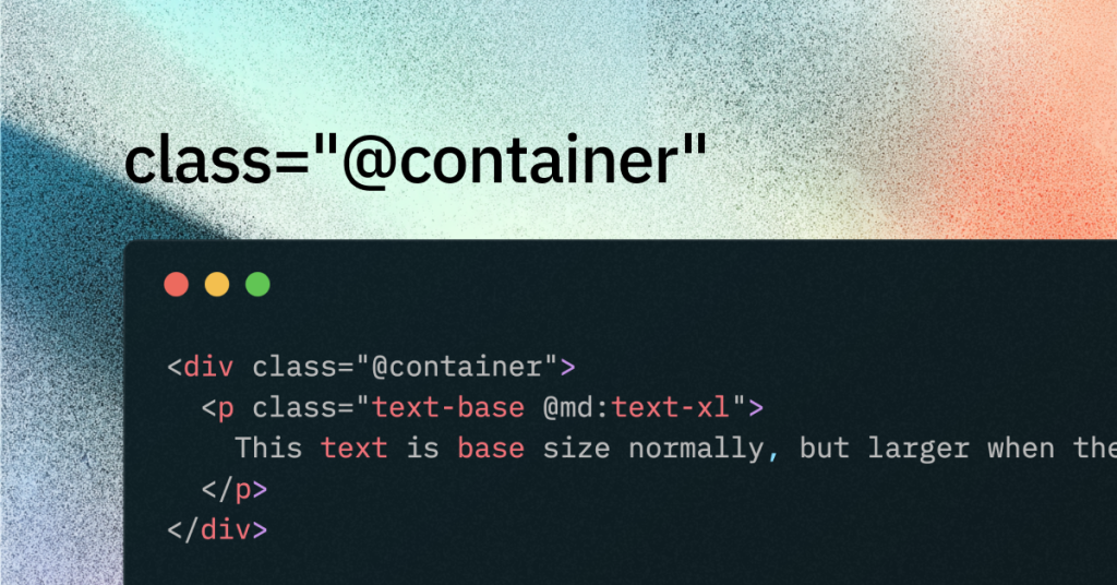
Tailwind Container Queries
Tailwind v4 container queries in practice

Last updated: October 21, 2025
TL;DR
Container queries let components respond to their parent’s width using @container and @-prefixed variants like @sm:. In Tailwind v4 they’re built-in, including @max-* for max-width queries; in Tailwind v3.2–v3.3 use the official plugin
What are container queries in Tailwind?
They style children based on the size of a specific ancestor, not the viewport. This enables portable, reusable components that adapt inside any layout.
Quick definition: container queries are a standards feature of CSS; Tailwind simply exposes them ergonomically with
@containerand@variants.
How do I enable container queries in v4?
Add @container to a parent and use @sm:, @md:, etc. on descendants. Tailwind v4 ships this in core.
<section class="@container p-6">
  <div class="grid grid-cols-1 gap-4 @sm:grid-cols-2 @lg:grid-cols-4">
    <!-- cards -->
  </div>
</section>
For viewport breakpoints see our media queries guide→ Tailwind Media Queries
How do I use container queries in v3.2–v3.3?
Install the official plugin and enable it in tailwind.config.js. v4 no longer needs this plugin.
npm i -D @tailwindcss/container-queries// tailwind.config.js
module.exports = {
plugins: [require('@tailwindcss/container-queries')],
}When should I use container queries vs media queries?
Use container queries for component micro-layouts; use media queries for page-level layout and device features. Mixing both produces flexible, layered responsiveness.
Can I target max widths or custom sizes?
Yes—v4 includes @max-* variants and supports arbitrary values like @[500px]:. Use real component breakpoints rather than guessing.
<div class="@container">
  <article class="prose @max-md:prose-sm @[480px]:prose-base">
    <!-- content -->
  </article>
</div>
Do named containers help in complex layouts?
Yes—naming containers lets you scope which ancestor controls which child. This avoids clashes when multiple containers exist. (Concept from CSS container queries; supported via container-name in CSS.)
<section class="@container [container-name:card]">
  <div class="@sm/card:grid @lg/card:grid-cols-3">...</div>
</section>What is the difference between .container and @container?
.container is a layout utility that sets max-widths; @container creates a query context for component responsiveness. They solve different problems.
Practical starter example (copy-paste)
A card grid that expands by container width, not viewport. Drop this inside any layout and it adapts correctly.
<section class="@container mx-auto max-w-none p-6">
  <div class="grid grid-cols-1 gap-6 @sm:grid-cols-2 @lg:grid-cols-3 @max-md:gap-4">
    <article class="rounded-lg border p-4">...</article>
    <article class="rounded-lg border p-4">...</article>
    <article class="rounded-lg border p-4">...</article>
  </div>
</section>
Check out helpful articles and guides from us
Browser support snapshot
Modern browsers support size container queries; provide sensible base styles for older browsers. See MDN for details on size, style, and scroll-state queries.
Best Practices for Using Container Queries
Use for Component-Level Adjustments:
Container queries excel at “micro-layout” changes within components. Use them to fine-tune elements based on available space, while relying on media queries for overall page layout.Plan Your Container Structure:
Only mark key components—like cards, navbars, or sidebars—as containers. Avoid overusing the@containerclass to keep your code simple and maintainable.Stick to Media Queries When Appropriate:
Use media queries for changes that depend on the viewport. Reserve container queries for adjustments driven by a parent element’s size.Avoid Over-Nesting Containers:
Keep the hierarchy simple; each component should generally respond to one container. If nesting is needed, use named containers to clarify which ancestor influences which child.Provide Fallbacks for Older Browsers:
Ensure your base styles work without container queries for older browsers. This guarantees graceful degradation when container queries aren’t supported.Consider Performance:
Use container queries judiciously. Modern browsers handle them well, but don’t declare every element as a container if it’s not necessary.Focus on Maintainability:
Document your container query breakpoints and naming conventions. Consistent practices make it easier for your team to manage responsive designs.
By applying these best practices, you’ll enhance your Tailwind CSS designs with flexible, efficient, and maintainable container queries.
FAQ
Do container queries replace media queries?
No. Use container queries for component-level changes and media queries for viewport or feature conditions like dark mode or print.
Can I query height with Tailwind’s container queries?
Width is the primary path today. Style queries exist in CSS, but height workflows in Tailwind typically need custom CSS.
What is @max-* and how is it useful?
It lets you target “at or below” a container size. Example: @max-md:hidden when a card column shrinks.
Is there a good mental model or deep-dive?
Yes—CSS-Tricks and MDN have excellent guides and examples. Great for patterns and caveats.

Yucel is a digital product creator and content writer with a knack for full-stack development. He loves blending technical know-how with engaging storytelling to build practical, user-friendly solutions. When he's not coding or writing, you'll likely find him exploring new tech trends or getting inspired by nature.

