Tailwind Breakpoints
Tailwind’s responsive breakpoints with an up‑to‑date table

TL;DR – Tailwind ships with five mobile‑first breakpoints (
sm,md,lg,xl,2xl). Jump to the full table or try the interactive demo.
What are Tailwind breakpoints?
Breakpoints are the screen‐width thresholds where Tailwind starts or stops applying a utility. Prefixing a class with a screen key — for example md:flex — wraps that rule in a @media (min‑width: 768px) query, so it takes effect from that width upward. Unprefixed utilities apply to all screens. That’s the entire idea in one sentence.
Full breakpoint table (2025)
Key | Min‑width (px) | Min‑width (rem)(root = 16 px) | Typical devices |
|---|---|---|---|
| 640 px | 40 rem | Large phones, small tablets |
| 768 px | 48 rem | Tablets, netbooks |
| 1024 px | 64 rem | Laptops, small desktops |
| 1280 px | 80 rem | Desktops |
| 1536 px | 96 rem | Large / 4K monitors |
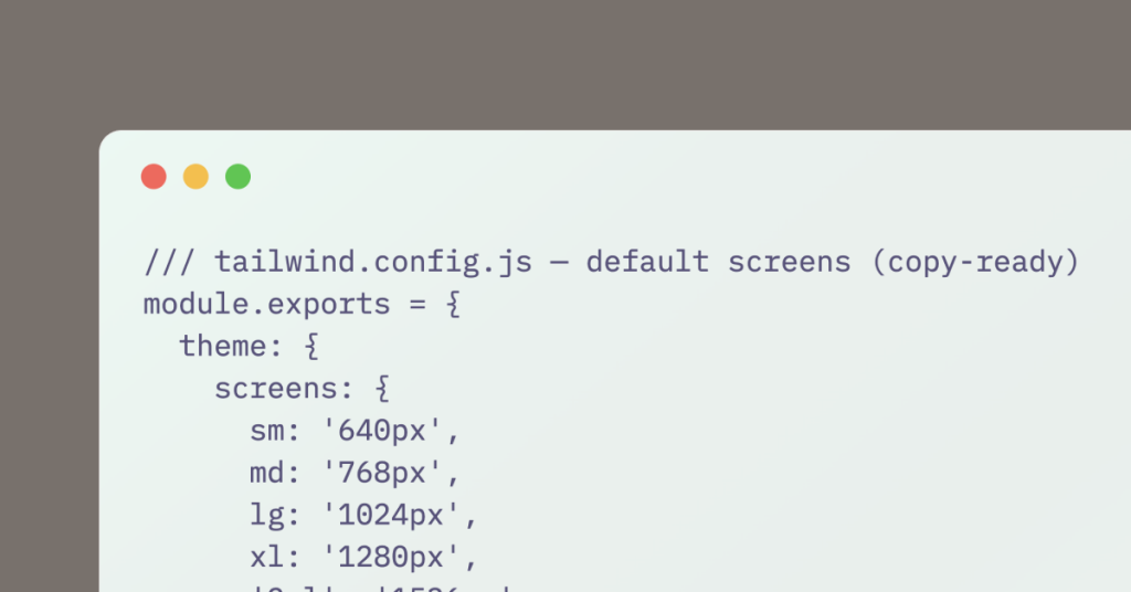
/// tailwind.config.js — default screens (copy‑ready)
module.exports = {
  theme: {
    screens: {
      sm: '640px',
      md: '768px',
      lg: '1024px',
      xl: '1280px',
      '2xl': '1536px',
    },
  },
};
ℹ️ Tip — Use
max‑*:if you need a downward media query. In Tailwind v4 themax-sm:hiddenpattern replaces the oldsm:max‑hack.
Interactive “resize me” demo
The box changes background (and font size) as you drag the browser width across each breakpoint. Copy it into Tailwind Play or your own project to see it live.
Common breakpoint recipes
1. Hide nav, show burger
<!-- Desktop nav -->
<nav class="hidden md:flex gap-6">…</nav>

<!-- Mobile burger -->
<button class="md:hidden p-2">
  <svg …>…</svg>
</button>
2. 2‑column → 1‑column card grid
<ul class="grid grid-cols-1 sm:grid-cols-2 gap-6">…</ul>3. Image left on desktop, top on mobile
<article class="flex flex-col lg:flex-row gap-6">
  <img class="w-full lg:w-1/3" src="…" alt="">
  <div class="flex-1">…</div>
</article>
4. Sticky footer only above md
@layer utilities {
  .md:sticky-footer {
    @apply md:min-h-screen md:flex md:flex-col;
  }
}
5. Swap logo sizes
<img src="logo.svg" class="h-6 lg:h-8 2xl:h-10" alt="Logo">
Yucel is a digital product creator and content writer with a knack for full-stack development. He loves blending technical know-how with engaging storytelling to build practical, user-friendly solutions. When he's not coding or writing, you'll likely find him exploring new tech trends or getting inspired by nature.

