Tailwind Bold Text and Beyond
Learn to balance design emphasis using bold text in Tailwind CSS.
Introduction
In the realm of web design, typography plays a pivotal role in shaping user experience. The way text is presented can significantly impact readability, comprehension, and the overall aesthetic of a website. Tailwind CSS, a utility-first CSS framework, offers developers a flexible and efficient way to style text directly within HTML using predefined classes. One common requirement in typography is the use of bold text to emphasize important content. This article delves into how to use bold text in Tailwind CSS and explores strategies for balancing emphasis in design to create harmonious and effective web interfaces.

Using Bold Text in Tailwind CSS
Tailwind CSS simplifies the application of font weights with a range of utility classes. To make text bold, you use the font-bold class directly on the HTML element:
<p class="font-bold">This text is bold.</p>But Tailwind doesn't stop at just bold and normal weights. It provides a spectrum of font weight utilities that allow for nuanced typographic expression:
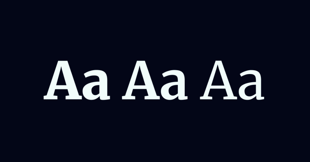
font-thin(100)font-extralight(200)font-light(300)font-normal(400)font-medium(500)font-semibold(600)font-bold(700)font-extrabold(800)font-black(900)
By leveraging these classes, you can create a typographic hierarchy that guides users through your content logically and aesthetically.
Examples:
Making Text Semi-Bold
<p class="font-semibold">This text is semi-bold.</p>Applying Different Font Weights
<h1 class="font-black text-3xl">Main Heading</h1>
<h2 class="font-bold text-2xl">Subheading</h2>
<p class="font-light text-base">Normal paragraph text.</p>
Balancing Emphasis in Design
While bold text is a powerful tool for emphasis, overusing it can lead to visual clutter and diminish its effectiveness. Striking the right balance is essential for creating designs that are both engaging and user-friendly.
1. Establish a Clear Hierarchy
A well-defined typographic hierarchy helps users navigate content intuitively. Utilize different font sizes and weights to differentiate between headings, subheadings, and body text.
Example:
<h1 class="font-extrabold text-4xl">Main Title</h1>
<h2 class="font-semibold text-2xl">Section Title</h2>
<p class="font-normal text-base">Body text goes here.</p>
2. Use Bold Text Strategically
Reserve bold text for key pieces of information that require immediate attention, such as:
Headlines and titles
Important dates and times
Calls to action (CTAs)
Alerts and warnings
Avoid bolding entire paragraphs, as this can overwhelm readers.
3. Complement with Other Typographic Styles
Combine bold text with other styling options to enhance emphasis without relying solely on weight.
Italics: Use
italicandnot-italicclasses.<p class="font-bold italic">Bold and italicized text.</p>Underline: Use
underlineandno-underline.<a href="#" class="font-medium underline">Underlined link text.</a>Letter Spacing: Adjust spacing with
tracking-tight,tracking-normal,tracking-wide, etc.<p class="font-light tracking-wider">Text with wider letter spacing.</p>
4. Consider Color and Contrast
Color can be a powerful tool for emphasis when used appropriately.
Text Color: Use
text-{color}classes to change text color.<p class="font-bold text-red-600">Important notice in red.</p>Background Color: Highlight text with background colors using
bg-{color}classes.<span class="bg-yellow-200 font-semibold">Highlighted text.</span>
Ensure sufficient contrast between text and background for readability.
5. Responsive Typography
Tailwind's responsive utilities allow you to adjust typography based on screen size, ensuring optimal readability on all devices.
Example:
<p class="text-base sm:text-lg md:text-xl font-medium">
  Responsive text size with medium weight.
</p>
Customizing Font Weights
If the default font weights don't meet your design needs, you can customize them in your tailwind.config.js file.
Example:
// tailwind.config.js
module.exports = {
  theme: {
    extend: {
      fontWeight: {
        hairline: '100',
        'extra-bold': '800',
      },
    },
  },
};
Now, you can use font-hairline and font-extra-bold in your classes.
Best Practices for Emphasis in Design
Consistency: Apply bold text consistently throughout your design to maintain visual coherence.
Moderation: Use bold sparingly to highlight the most critical information.
Accessibility: Ensure that emphasis techniques do not hinder readability for users with visual impairments.
Testing: Preview your designs on different devices and screen sizes to ensure that emphasis remains effective.
Conclusion
Bold text is a fundamental aspect of typographic design, serving as a tool for emphasis and hierarchy. With Tailwind CSS, implementing bold and varied font weights is straightforward, thanks to its extensive set of utility classes. However, the key to effective design lies not just in the ability to style text, but in making thoughtful choices about when and how to apply these styles.
By balancing the use of bold text with other typographic and design techniques, you can create aesthetically pleasing and user-friendly interfaces. Remember, the goal is to enhance user experience by guiding attention and improving readability, not to overwhelm the user with excessive emphasis.
Experiment with Tailwind's utilities to find the perfect balance for your project, and keep in mind the overarching principles of good design: clarity, consistency, and purpose.

Yucel is a digital product creator and content writer with a knack for full-stack development. He loves blending technical know-how with engaging storytelling to build practical, user-friendly solutions. When he's not coding or writing, you'll likely find him exploring new tech trends or getting inspired by nature.