Tailwind's Align Self: Position Elements Easily
Discover how to align items individually in flex and grid layouts using Tailwind's align-self utilities

Have you ever struggled to align a single item differently in a flex or grid layout? You're not alone! When I first started with Tailwind CSS, getting elements to line up just right was tricky. It's frustrating when one stubborn item won't cooperate. That's where Tailwind's align-self utilities come in handy. They let you control individual elements with ease. Let's see how you can use this feature to make your designs even better.
What Is align-self in CSS?
Before we jump into Tailwind, let's understand what align-self does in CSS. Aligning elements is key to creating clean and user-friendly layouts. The align-self property lets you adjust the alignment of a single flex or grid item, overriding the parent container's align-items setting.
In simple terms, if you have a container where all items are centered vertically, but you want one item to stick to the top or bottom, align-self lets you do that without affecting the others.
Here's how it looks in CSS:
.item {
  align-self: flex-start; /* Options: flex-end, center, baseline, stretch */
}
Knowing this basic concept helps you use Tailwind's utility classes effectively.
Tailwind's align-self Utilities
Tailwind CSS makes aligning items easier by providing utility classes that match the align-self values in CSS. You can adjust the alignment of individual items right in your HTML, speeding up your workflow.
Here are the classes you can use:
self-auto: The item follows the parent'salign-itemsvalue.self-start: Aligns the item to the start of the cross axis.self-center: Centers the item along the cross axis.self-end: Aligns the item to the end of the cross axis.self-stretch: Stretches the item to fill the container (the default for many elements).self-baseline: Aligns the item's baseline with its siblings.
These classes are simple but powerful tools in your Tailwind toolkit.
How to Use align-self Classes

Using these classes is easy. Just add the class you want to the HTML element you're aligning differently.
Example:
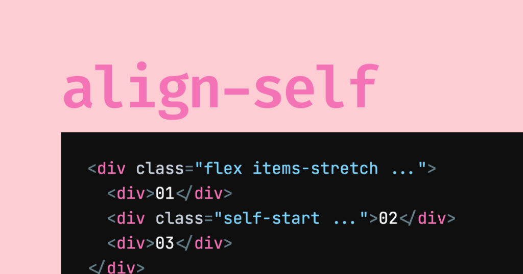
<div class="flex">
  <div class="self-start">Aligned to start</div>
  <div class="self-center">Centered</div>
  <div class="self-end">Aligned to end</div>
</div>
In this example, each item inside the flex container has its own alignment, separate from the others.
Practical Examples with align-self
Let's look at some real-world examples of how align-self can improve your layouts.
Building a Flexible Navigation Bar
Suppose you're creating a navigation bar with a logo on the left, menu items in the center, and a login button on the right, but you want the login button slightly lower than the other items.
<nav class="flex items-center p-4 bg-gray-800 text-white">
  <div class="mr-auto">Logo</div>
  <ul class="flex space-x-4">
    <li><a href="#">Home</a></li>
    <li><a href="#">About</a></li>
    <li><a href="#">Contact</a></li>
  </ul>
  <button class="ml-auto self-end bg-blue-500 px-4 py-2 rounded">Login</button>
</nav>
Here, the self-end class aligns the login button at the bottom of the navbar, adding a subtle visual touch.
Creating a Feature Section
Say you're making a feature section with images and text, and you want the images to align differently from the text blocks.
<div class="grid grid-cols-1 md:grid-cols-3 gap-4 p-4">
  <div class="self-center">
    <img src="feature1.png" alt="Feature 1">
  </div>
  <div class="col-span-2">
    <h2 class="text-xl font-bold">Feature One</h2>
    <p class="mt-2 text-gray-700">Description of feature one highlighting its benefits.</p>
  </div>
  <!-- Repeat for more features -->
</div>
Here, self-center centers the image vertically next to the text block, creating a balanced look.
Responsive Design with align-self
Tailwind's responsive design features let you change alignment based on screen size.
<div class="flex flex-col md:flex-row items-start md:items-center p-4">
  <div class="md:self-end">
    <img src="product.png" alt="Product Image">
  </div>
  <div class="mt-4 md:mt-0 md:ml-4">
    <h3 class="text-2xl font-semibold">Product Name</h3>
    <p class="mt-2">Brief description of the product with key features.</p>
  </div>
</div>
In this case, on small screens, the image and text stack vertically, and the image aligns to the start. On medium screens and up, the image aligns to the end, sitting next to the text.
Advanced Alignment Techniques

Let's look at some advanced ways to use alignment with Tailwind CSS.
Aligning Items in Complex Layouts
When working with nested flex or grid containers, alignment can get tricky. Tailwind provides utilities to handle these situations.
Example of Nested Flex Containers:
<div class="flex">
  <div class="flex-1 bg-gray-100 p-4">
    <div class="flex flex-col h-full">
      <div class="self-start">Top Item</div>
      <div class="self-center my-auto">Middle Item</div>
      <div class="self-end">Bottom Item</div>
    </div>
  </div>
  <div class="flex-1 bg-gray-200 p-4">
    <!-- Other content -->
  </div>
</div>
Here, we're using self-start, self-center, and self-end within a vertical flex container to position items at the top, middle, and bottom.
Aligning Text and Icons
When combining text and icons, alignment ensures everything looks neat.
Example:
<button class="flex items-center bg-green-500 text-white px-4 py-2 rounded">
  <svg class="w-6 h-6" fill="none" stroke="currentColor" /* SVG attributes */></svg>
  <span class="ml-2">Button Text</span>
</button>
Using items-center on the button aligns the icon and text vertically, creating a clean look.
Combining Alignment with Positioning
Sometimes, you may need to combine alignment utilities with positioning utilities like absolute or relative.
Example:
<div class="relative h-64">
  <img src="background.jpg" alt="Background Image" class="w-full h-full object-cover">
  <div class="absolute inset-0 flex items-end">
    <h2 class="text-white p-4 bg-black bg-opacity-50">Overlay Text at Bottom</h2>
  </div>
</div>
Here, we're placing text at the bottom of an image using flex alignment within an absolutely positioned container.
align-self vs. justify-self vs. place-self

Understanding the difference between these properties helps you control your layout.
align-self vs. justify-self
align-selfadjusts alignment along the cross axis (vertical in a row flex layout).justify-selfadjusts alignment along the main axis (horizontal in a row flex layout).
In Tailwind, justify-self is mainly used in grid layouts because flex items can't use justify-self.
Available justify-self classes:
justify-self-autojustify-self-startjustify-self-centerjustify-self-endjustify-self-stretch
Using place-self in Tailwind
place-self sets both align-self and justify-self at the same time. Tailwind offers these classes:
place-self-autoplace-self-startplace-self-centerplace-self-endplace-self-stretch
Using place-self saves time when you want the same value for both axes.
Practical Application
In a grid layout:
<div class="grid grid-cols-2 gap-4">
  <div class="place-self-center bg-blue-100 p-4">Centered Item</div>
  <div class="justify-self-end bg-blue-200 p-4">Aligned End Horizontally</div>
  <div class="align-self-end bg-blue-300 p-4">Aligned End Vertically</div>
</div>
This example shows how you can control each item's alignment on both axes independently.
Common Issues and How to Fix Them
Even with these tools, you might run into issues. Here's how to handle some common challenges.
Confusing the Axes
In flexbox, the main axis is horizontal by default (unless you change flex-direction), and the cross axis is vertical.
Tip: Always know your container's layout mode (flex or grid) and the direction of the axes.
Overusing Utility Classes
It's tempting to pile on utility classes, but this can clutter your HTML.
Tip: If you're adding many classes, consider creating custom classes using Tailwind's @apply directive in your CSS files.
Ignoring Accessibility
Alignment can affect the readability and usability of your site.
Tip: Make sure that alignment choices don't hinder users, especially those with disabilities. Keep your layout logical and easy to navigate.
Forgetting Browser Support
Not all browsers support every feature equally.
Tip: Test your design in different browsers to ensure alignment stays consistent.
Tips for Effective Alignment in Tailwind CSS
To get the most out of Tailwind's alignment utilities, keep these pointers in mind:
Plan Your Layout: Sketch your design first to see where alignment is needed.
Use Developer Tools: Inspect elements and test different alignments in your browser's dev tools.
Stay Consistent: Consistent alignment creates a cohesive user experience.
Learn from Examples: Check out Tailwind's documentation and community resources for ideas.
Combine with Other Utilities: Use spacing utilities like
mt-,mb-,ml-, andmr-to fine-tune your layout.Responsive Design: Use Tailwind's responsive classes to adjust alignments for different screen sizes.
Alignment in Responsive Design
Tailwind makes it easy to adjust alignment based on screen size, which is essential for mobile-friendly designs.
Example:
<div class="grid grid-cols-1 lg:grid-cols-3 gap-4">
  <div class="lg:self-start">
    <img src="profile.jpg" alt="Profile Picture" class="rounded-full">
  </div>
  <div class="lg:col-span-2">
    <h3 class="text-2xl font-semibold">Username</h3>
    <p class="mt-2">User bio sharing interesting facts and background information.</p>
  </div>
</div>
On smaller screens, the image and text stack vertically. On larger screens, they sit side by side, and the image aligns to the start.
Best Practices for Using align-self
To make sure your layouts are effective and easy to maintain, consider these tips:
Use Classes Purposefully: Only apply alignment classes when needed.
Keep It Simple: Simple layouts are easier for users to understand.
Test on Multiple Devices: Check your design on various devices to ensure alignment holds up.
Consider Accessibility: Make sure alignment doesn't hinder usability.
Document Your Choices: Comment your code or keep notes to explain why certain alignment classes are used.
Wrapping Up
Tailwind CSS gives you the power to create complex, responsive layouts without writing lots of CSS. By mastering align-self and how it works with other alignment properties, you gain precise control over individual elements. Next time you're arranging components on your page, remember you have these handy tools to bring your vision to life.
Happy coding!
FAQ
Can align-self be used with inline elements in Tailwind?
No, align-self affects flex and grid items, which are block-level elements. Inline elements won't respond to align-self because they aren't part of flex or grid layouts.
How does align-self: baseline work in Tailwind?
The self-baseline class aligns the item's baseline with the baseline of its parent container. This is useful when you have text or elements of different sizes, and you want their baselines to line up.
How do I debug alignment issues in Tailwind?
Use your browser's developer tools to inspect the computed styles of elements. Look at properties like display, align-items, and align-self to see how they're affecting your items. Since Tailwind's utility classes map directly to CSS properties, it's easier to find and fix issues.
Can I use align-self with Tailwind's custom breakpoints?
Absolutely! Tailwind lets you apply different classes at different breakpoints. You can adjust align-self for various screen sizes by prefixing the class with the breakpoint, like sm:self-start or lg:self-end.
What is the default value of align-self in Tailwind?
By default, elements have self-stretch, which means they stretch to fill the container along the cross axis unless specified otherwise.
How does align-self interact with flex-direction?
The effect of align-self depends on the flex container's flex-direction. If the direction is row, align-self aligns items vertically. If the direction is column, it aligns items horizontally.

Yucel is a digital product creator and content writer with a knack for full-stack development. He loves blending technical know-how with engaging storytelling to build practical, user-friendly solutions. When he's not coding or writing, you'll likely find him exploring new tech trends or getting inspired by nature.
