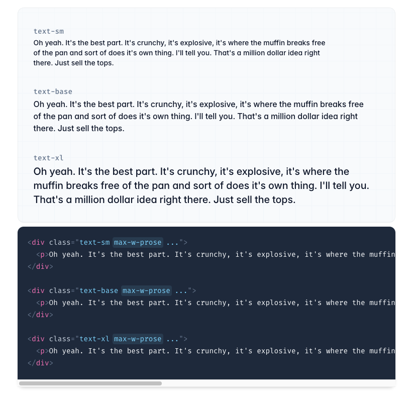
How to Style Beautiful Typography with Tailwind Prose
Learn to style beautiful typography with Tailwind Prose for better content.
Typography plays a pivotal role in web design, affecting not only readability but also the overall aesthetic of your site. Tailwind CSS, a popular utility-first CSS framework, offers a powerful plugin called @tailwindcss/typography (commonly referred to as Tailwind Prose) that simplifies the process of styling rich text content like blog posts and articles.
In this guide, we'll explore how to use Tailwind Prose to create beautiful, responsive typography for your web projects.
What is Tailwind Prose?
Tailwind Prose is an official plugin for Tailwind CSS that provides a set of sensible typographic defaults out of the box. It adds a prose class that applies typographic styles to your content, ensuring consistency and readability without the need to write custom CSS.

Benefits of using Tailwind Prose:
Consistency: Provides a uniform styling for text elements.
Customizable: Easily tweak styles to match your design.
Responsive: Adjusts typography for different screen sizes.
Dark Mode Support: Automatically adapts styles for dark mode.
Setting Up Tailwind Prose
Before you can use Tailwind Prose, you need to install it and include it in your Tailwind configuration.
Step 1: Install the Plugin
Using npm, install the typography plugin:
npm install @tailwindcss/typographyStep 2: Configure Tailwind
Add the plugin to your tailwind.config.js file:
// tailwind.config.js
module.exports = {
  //...
  plugins: [
    require('@tailwindcss/typography'),
  ],
};
Basic Usage
Once installed, you can start using the prose class to style your content.
Applying the Prose Class
Wrap your rich text content inside a container with the prose class:
<div class="prose">
  <h1>Welcome to My Blog</h1>
  <p>This is a sample paragraph demonstrating the default typography styles provided by Tailwind Prose.</p>
  <h2>Subheading</h2>
  <p>More content goes here...</p>
</div>
Result: Your content will now have beautifully styled typography without any additional effort.
Limiting Prose Width
By default, the prose class sets a max-width to ensure optimal line lengths. If you want your content to span the full width, you can override this:
<div class="prose max-w-full">
  <!-- Content -->
</div>
Customizing Typography Styles
Tailwind Prose is highly customizable, allowing you to adjust styles to fit your brand or design system.
Customizing in Tailwind Config
You can extend the default typography styles in your tailwind.config.js file:
// tailwind.config.js
module.exports = {
  //...
  theme: {
    extend: {
      typography: {
        DEFAULT: {
          css: {
            color: '#333',
            a: {
              color: '#1a56db',
              '&:hover': {
                color: '#0d3a97',
              },
            },
            h1: {
              color: '#1e1e1e',
            },
            // Add more customizations as needed
          },
        },
      },
    },
  },
  plugins: [require('@tailwindcss/typography')],
};
Using Custom Variants
You can create custom variants for different styling needs:
// tailwind.config.js
module.exports = {
  //...
  theme: {
    extend: {
      typography: {
        blue: {
          css: {
            '--tw-prose-body': '#2563eb',
            '--tw-prose-headings': '#1e3a8a',
            '--tw-prose-links': '#1d4ed8',
            // Customize other elements as desired
          },
        },
      },
    },
  },
  plugins: [require('@tailwindcss/typography')],
};
Usage:
<div class="prose prose-blue">
  <!-- Content -->
</div>
Responsive Typography
Tailwind Prose works seamlessly with Tailwind's responsive utilities.
Adjusting Typography at Different Breakpoints
You can change typography styles based on screen size:
<div class="prose sm:prose-sm lg:prose-lg">
  <!-- Content -->
</div>
This allows you to, for example, use larger text on larger screens for better readability.
Custom Responsive Styles
Define responsive typography styles in your Tailwind config:
// tailwind.config.js
module.exports = {
  //...
  theme: {
    extend: {
      typography: {
        sm: {
          css: {
            fontSize: '14px',
          },
        },
        lg: {
          css: {
            fontSize: '18px',
          },
        },
      },
    },
  },
  plugins: [require('@tailwindcss/typography')],
};
Dark Mode Support
Tailwind Prose can adapt your typography for dark mode automatically.
Enabling Dark Mode
First, enable dark mode in your Tailwind config:
// tailwind.config.js
module.exports = {
  darkMode: 'class', // or 'media'
  //...
};
Customizing Dark Mode Styles
Extend the typography theme with dark mode styles:
// tailwind.config.js
module.exports = {
  //...
  theme: {
    extend: {
      typography: (theme) => ({
        DEFAULT: {
          css: {
            // Default styles
          },
        },
        dark: {
          css: {
            color: theme('colors.gray.300'),
            '[class~="lead"]': {
              color: theme('colors.gray.400'),
            },
            a: {
              color: theme('colors.blue.400'),
            },
            strong: {
              color: theme('colors.white'),
            },
            // Customize other elements
          },
        },
      }),
    },
  },
  plugins: [require('@tailwindcss/typography')],
};
Applying Dark Mode Classes
In your HTML, include the dark mode variant:
<div class="prose dark:prose-dark">
  <!-- Content -->
</div>
Toggling Dark Mode:
Use the dark class on a parent element to activate dark mode styles:
<body class="dark">
  <!-- Content -->
</body>
Conclusion
Tailwind Prose provides an effortless way to implement beautiful, responsive typography in your web projects. By leveraging its built-in styles and customization options, you can ensure your content is not only readable but also visually appealing across all devices and themes.
Next Steps:
Explore the official documentation for more advanced features.
Experiment with custom styles to match your brand identity.
Combine Tailwind Prose with other plugins for a comprehensive styling solution.
By integrating Tailwind Prose into your workflow, you're well on your way to creating stunning, content-rich websites with minimal effort.

Yucel is a digital product creator and content writer with a knack for full-stack development. He loves blending technical know-how with engaging storytelling to build practical, user-friendly solutions. When he's not coding or writing, you'll likely find him exploring new tech trends or getting inspired by nature.
