Smooth Transitions with Tailwind CSS
A detailed guide on creating smooth transitions with Tailwind CSS
Smooth transitions make interfaces feel polished and responsive. Tailwind CSS provides utility classes that eliminate repetitive CSS and help you integrate transitions into your project right from the start. Below are examples and use cases showing how to bring interactions to life using Tailwind’s transition classes.
Basic Setup
First, ensure Tailwind is installed and configured in your project. Once that’s in place, you can leverage classes like transition, duration-200, and ease-in-out directly in your markup.
Example basic button with a hover transition:
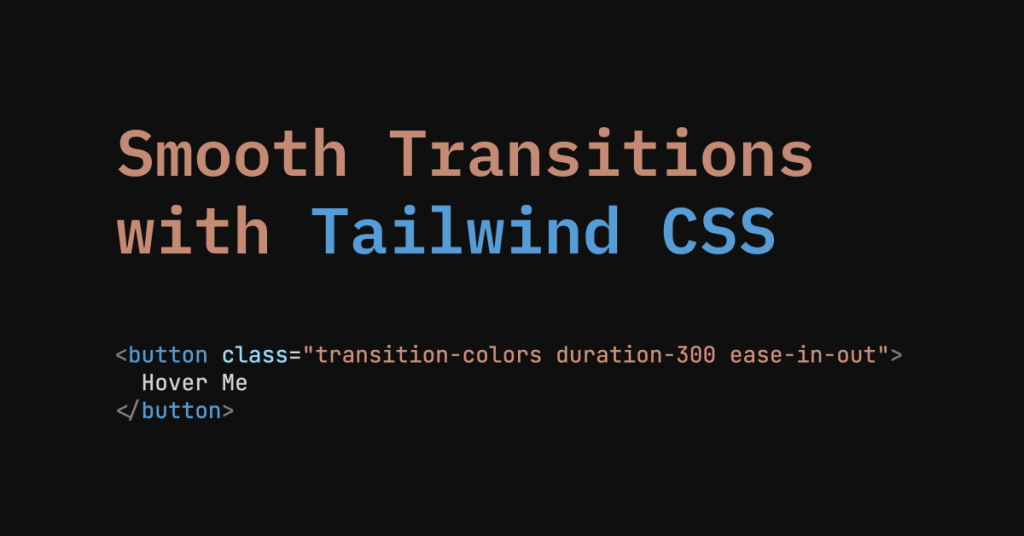
<button class="transition-colors duration-300 ease-in-out bg-blue-500 hover:bg-blue-600 text-white font-bold py-2 px-4 rounded">
  Hover Me
</button>
What this does:
transition-colors: Applies transitions to color changes.duration-300: Sets transition length to 300ms.ease-in-out: Applies a gradual acceleration and deceleration easing.
When hovered, the button smoothly shifts from bg-blue-500 to bg-blue-600.
Common Use Cases
Hover States:
Highlight interactive elements, like buttons or links, to help users recognize clickable items.
Focus and Active States:
Indicate keyboard focus and pressing states with subtle animations. This helps accessibility and improves clarity.
Modals and Sidebars:
Animate modals or off-canvas menus to slide in or fade out, offering a more fluid navigation experience.
Theming and Dark Mode Toggles:
Fade between light and dark backgrounds to avoid abrupt flashes that distract from the content.
Transitioning Colors and Opacity
Tailwind provides transition-colors, transition-opacity, and transition-all utilities. For color changes, transition-colors is perfect. For fading elements, consider transition-opacity.
Example fading an element on hover:
<div class="transition-opacity duration-300 opacity-100 hover:opacity-50 bg-gray-300 h-32 w-32 flex items-center justify-center">
  Hover
</div>
When hovered, this box fades to half opacity, creating a gentle feedback effect.
Transform and Motion
Transitions are not only about colors. Use transform, scale, and translate classes alongside transitions for more dynamic interactions.
Example scaling a card on hover:
<div class="transition-transform duration-200 ease-out transform hover:scale-105 bg-white shadow-md rounded p-4">
  <h3 class="text-lg font-semibold">Card Title</h3>
  <p class="text-gray-700">Some content here</p>
</div>
Hovering slightly enlarges the card, making it feel more interactive.
Slide-In Panels and Drawers
Use transitions to animate side panels without writing custom keyframes:
<!-- Sidebar (hidden state) -->
<div class="fixed top-0 left-0 h-full w-64 bg-gray-800 text-white transform -translate-x-full transition-transform duration-300" id="sidebar">
  <!-- Sidebar content -->
</div>

<!-- Toggle Sidebar Button -->
<button
  class="bg-blue-500 text-white px-4 py-2 rounded"
  onclick="document.getElementById('sidebar').classList.toggle('-translate-x-full')"
>
  Toggle Sidebar
</button>
When toggling the class, the sidebar glides in or out because -translate-x-full moves it off-screen and removing that class brings it back, all animated by transition-transform duration-300.
Dropdown Menus
Dropdowns can benefit from smooth transitions. Combine transition-opacity with conditional classes that show or hide the menu.
Example dropdown in a Vue-like syntax:
<div class="relative" x-data="{ open: false }">
  <button @click="open = !open" class="bg-green-500 text-white px-4 py-2 rounded">
    Menu
  </button>

  <div
    x-show="open"
    x-transition:enter="transition-opacity duration-200"
    x-transition:enter-start="opacity-0"
    x-transition:enter-end="opacity-100"
    x-transition:leave="transition-opacity duration-200"
    x-transition:leave-start="opacity-100"
    x-transition:leave-end="opacity-0"
    class="absolute mt-2 bg-white rounded shadow-lg py-2 w-48"
  >
    <a href="#" class="block px-4 py-2 hover:bg-gray-100">Option 1</a>
    <a href="#" class="block px-4 py-2 hover:bg-gray-100">Option 2</a>
    <a href="#" class="block px-4 py-2 hover:bg-gray-100">Option 3</a>
  </div>
</div>
Here, the dropdown fades in and out smoothly thanks to Tailwind’s transition-opacity classes combined with framework transitions.
Responsive Variants
Tailwind allows different transitions at different breakpoints:
<button class="transition-colors duration-150 sm:duration-200 md:duration-300 ease-in-out bg-purple-500 hover:bg-purple-700 text-white font-bold py-2 px-4 rounded">
  Responsive Transition
</button>
On small screens (
sm:), the duration is slightly longer than on the base.On medium (
md:) and larger, the transition runs even longer, providing a different feel depending on the user’s device.
Dark Mode Transitions
Toggle dark mode without a harsh color switch:
<div class="transition-colors duration-300 bg-white dark:bg-black min-h-screen text-black dark:text-white">
  <header class="p-4">
    <button
      class="bg-gray-300 dark:bg-gray-700 text-black dark:text-white py-2 px-4 rounded"
      onclick="document.documentElement.classList.toggle('dark')"
    >
      Toggle Dark Mode
    </button>
  </header>
</div>
When toggling dark mode, the background and text fade smoothly.
Component-Level Defaults
When building components, include transitions by default:
<!-- Card Component -->
<div class="transition-shadow transition-transform duration-200 hover:shadow-lg hover:-translate-y-1 bg-white rounded p-4">
  <h3 class="text-lg font-semibold">Default Transitioned Card</h3>
  <p class="text-gray-700">This card is always ready to animate.</p>
</div>
This ensures consistent animation behavior everywhere the component is used.
Tips for Choosing Durations and Easing
Short Durations: Quick interactions feel more responsive.
Longer Durations: Better for large elements entering or leaving the screen.
Easing Functions:
ease-outfeels natural for incoming elements, whileease-in-outcan work well for hover effects.
Balancing Performance and Style
Stick to animating properties like transform and opacity for smoother performance. Avoid complex layout shifts that might cause jarring effects.

What's New: Tailwind CSS v4 Transitions
Tailwind CSS v4 introduced a dedicated transition-behavior utility group with two new classes — transition-discrete and transition-normal — plus expanded bracket notation for custom durations and delays. Here's what changes and what stays the same.
transition-discrete vs transition-normal
Class | CSS equivalent | Best for |
|---|---|---|
|
| Numeric properties (opacity, transform, color) |
|
| Discrete properties (display, visibility, pointer-events) |
The problem transition-discrete solves: In v3, toggling hidden on an element would make it disappear instantly — the opacity transition had nothing to animate because the element was already display: none. transition-discrete delays that flip until the end of the animation, so the fade-out plays before the element is removed from the layout.
Visibility toggle (before v4):
<!-- v3: the fade-out never plays — element vanishes immediately -->
<div class="transition-opacity duration-300 opacity-0 hidden">
  Content
</div>
Visibility toggle (v4 with transition-discrete):
<!-- v4: opacity fades out, THEN display flips to none -->
<input type="checkbox" id="toggle" class="peer sr-only">
<div class="transition-discrete duration-300 opacity-0 peer-checked:opacity-100">
  Now you see me
</div>
Bracket Notation for Multiple Values
v4 expands bracket support so you can pass comma-separated values for entering and leaving states separately:
<!-- 1s to enter, 500ms to leave -->
<div class="duration-[1s,500ms] ease-in-out transition-opacity ...">
  Staggered timing
</div>
@starting-style: Enter Transitions Without JavaScript
v4 also ships @starting-style support as a variant, letting you define an element's initial state for entry animations — no JS class-toggling required:
<div class="opacity-0 starting:opacity-0 opacity-100 transition-opacity duration-500">
  Fades in on mount
</div>
v3 to v4 Upgrade Notes for Transitions
Most transition utilities are unchanged. What you do need to know:
Config format: Replace
tailwind.config.jswith CSS-first config using@theme. Custom durations move fromtheme.extend.transitionDurationto-duration-*CSS variables.Import: Replace
@tailwind base/components/utilitieswith a single@import "tailwindcss".Browser floor: v4 requires Safari 16.4+, Chrome 111+, Firefox 128+. If you support older browsers, stay on v3.4.
transitionandtransition-colorsnow includeoutline-color— a minor addition unlikely to break anything.
The automated upgrade tool handles most of this: run npx @tailwindcss/upgrade and it migrates config, directives, and class names automatically.
Transitions Examples
Tip: drop these straight into CodePen/Play for instant previews.
1. Color-fade button (beginner)
<button class="transition-colors duration-300 ease-in-out
              bg-teal-500 hover:bg-teal-600 text-white py-2 px-4 rounded">
  Hover me
</button>
Shows the transition-colors utility highlighted in Tailwind docs.
2. Card zoom on hover (intermediate)
<div class="w-64 overflow-hidden rounded-lg shadow group">
  <img src="https://placekitten.com/400/300"
       alt="Cute cat"
       class="transition-transform duration-500 ease-out group-hover:scale-105">
</div>
Combines transition-transform with scaling for a subtle depth effect.
3. Accordion slide in React (advanced)
import { useState } from "react";

export default function Accordion() {
  const [open, setOpen] = useState(false);
  return (
    <div className="max-w-md mx-auto">
      <button
        onClick={() => setOpen(!open)}
        className="bg-indigo-500 text-white px-4 py-2 rounded">
        Toggle
      </button>

      <div className={`overflow-hidden transition-[max-height] duration-500 ease-in-out
                       ${open ? 'max-h-40' : 'max-h-0'}`}>
        <p className="p-4 bg-gray-50">
          I smoothly reveal!
        </p>
      </div>
    </div>
  );
}
4. Dark-mode background fade (Vanilla JS)
<button id="toggle" class="mt-8 px-4 py-2 bg-gray-800 text-white rounded">
  Toggle dark mode
</button>

<script>
  const btn = document.getElementById('toggle');
  btn.addEventListener('click', () =>
    document.documentElement.classList.toggle('dark'));
</script>

<style>
  /* Tailwind v3+ dark mode classes */
  html {
    transition: background-color 0.3s ease, color 0.3s ease;
  }
</style>
Matches Tailwind’s dark-mode strategy and showcases the importance of adding transition to the root element for global theme shifts
Final Thoughts
Tailwind CSS transitions bring interfaces to life with minimal configuration. Use them for hover states, menus, dark mode toggles, and more. Experiment with durations, easing, and properties until interactions feel organic and welcoming. By integrating these classes into components, you create a cohesive, dynamic experience that enhances user perception and engagement.
FAQ
How do I enable transitions in Tailwind CSS?
Add the appropriate transition classes to your elements, then pair them with state classes like hover or focus.
Can I apply transitions to multiple properties at once?
Yes, combine transition classes that target different properties, such as colors and opacity, for a unified effect.
How do I control the duration of transitions?
Choose from predefined durations like 150ms or 300ms, or set custom values in the configuration file. eg: duration-300
Do transitions work with dark mode toggles?
Yes, they help fade backgrounds and text colors smoothly when switching between themes.
1. How do I change the speed of a transition in Tailwind CSS?
Use the duration-{time} utility—e.g. duration-300 for 300 ms—or an arbitrary value like duration-[750ms] when you need something custom. If you want the same timing everywhere, add a new key under theme.extend.transitionDuration in tailwind.config.js and reference it with duration-fast (or whatever name you choose).

Yucel is a digital product creator and content writer with a knack for full-stack development. He loves blending technical know-how with engaging storytelling to build practical, user-friendly solutions. When he's not coding or writing, you'll likely find him exploring new tech trends or getting inspired by nature.