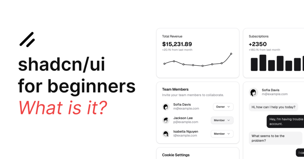
Imagine building a house: plain HTML is your basic bricks, React is your toolkit for interactivity, and Next.js is a full construction system that makes everything run smoothly. Now, shadcn/ui is like a set of stylish, ready-made interior pieces—customizable UI components that instantly upgrade your website.

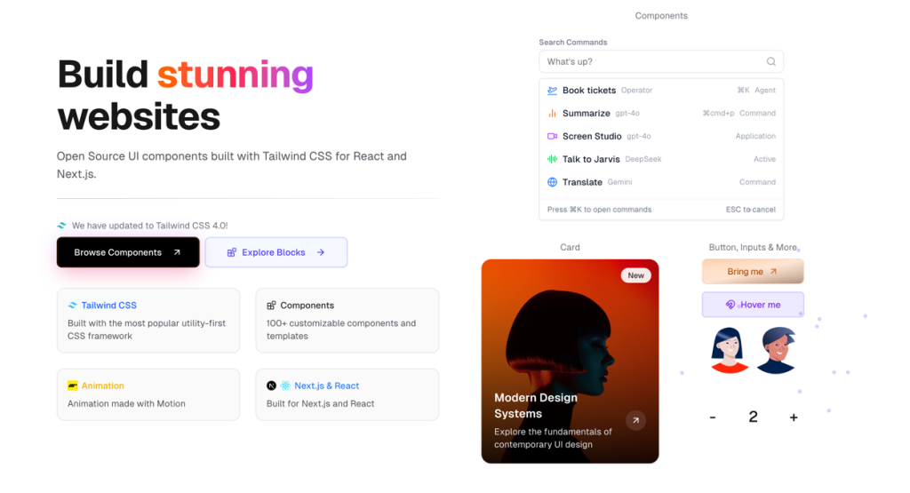
Built with Tailwind CSS and Radix UI, shadcn/ui helps you create beautiful, accessible interfaces in your React or Next.js projects.
The Basics: Plain HTML, React, Next.js, and shadcn/ui
Plain HTML and Tailwind CSS
Plain HTML is like the foundation of a building. You write the basic structure using HTML, and if you want to style it, you might use a CSS framework like Tailwind CSS. For example, here’s a simple button created with HTML and Tailwind:
<button class="bg-blue-500 hover:bg-blue-600 text-white font-bold py-2 px-4 rounded">
  Click me
</button>
This code gives you a button with a blue background, white text, and rounded corners. Tailwind CSS makes styling quicker with utility classes. However, while this works well, you’re responsible for every detail, including handling interactive states (such as loading or disabled states) or ensuring proper accessibility.
React and Next.js
React takes things a step further by letting you build reusable components. You could wrap that button in a React component, making it easier to use throughout your project:
// MyButton.jsx
export default function MyButton({ children }) {
  return (
    <button className="bg-blue-500 hover:bg-blue-600 text-white font-bold py-2 px-4 rounded">
      {children}
    </button>
  );
}
With this component, you can import and use <MyButton> wherever you need it in your application. Next.js, which is built on React, adds extra features like server-side rendering and routing, allowing you to build a fully functional website or web application.
Enter shadcn/ui
shadcn/ui is different. It’s not another framework—it’s a toolkit of pre-designed, customizable components. Instead of writing all the code from scratch for every interactive element, shadcn/ui gives you components that already include best practices for accessibility, state management, and customization.

This means that you can quickly drop these components into your project and spend more time on the unique features of your application rather than reinventing common UI elements.

How shadcn/ui works?
Let’s say you want a beautiful, responsive button that’s accessible and comes with various style variants (like outline, ghost, etc.). With shadcn/ui, you’d do something like this:
import { Button } from "@/components/ui/button";

export default function HomePage() {
  return (
    <div className="p-4">
      <Button variant="outline">Click me</Button>
    </div>
  );
}
In this example, the <Button> component from shadcn/ui is a ready-made, well-structured element. It’s built on top of Tailwind CSS (for styling) and Radix UI (to ensure it meets accessibility guidelines). You can easily change its variant, add loading states, or even extend its functionality—all without having to code these features from scratch.
Additional Examples: Building a Card Component
Imagine you want to create a card that displays some content along with a button. With plain HTML and Tailwind CSS, you might write:
<div class="max-w-sm rounded overflow-hidden shadow-lg p-4 bg-white">
  <img class="w-full" src="image.jpg" alt="Sunset in the mountains">
  <div class="px-6 py-4">
    <div class="font-bold text-xl mb-2">Card Title</div>
    <p class="text-gray-700 text-base">
      Some interesting content goes here. This is a description of the card.
    </p>
  </div>
  <div class="px-6 py-4">
    <button class="bg-blue-500 hover:bg-blue-600 text-white font-bold py-2 px-4 rounded">
      Learn More
    </button>
  </div>
</div>
This works, but every time you need a card, you have to copy this code and tweak it. With shadcn/ui, you might have a Card component that encapsulates the styling and functionality:
import { Card, CardHeader, CardTitle, CardContent, CardFooter, Button } from "@/components/ui/card";

export default function InfoCard() {
  return (
    <Card className="max-w-sm">
      <CardHeader>
        <CardTitle>Card Title</CardTitle>
      </CardHeader>
      <CardContent>
        <p>
          Some interesting content goes here. This is a description of the card.
        </p>
      </CardContent>
      <CardFooter>
        <Button variant="primary">Learn More</Button>
      </CardFooter>
    </Card>
  );
}
This component-based approach ensures consistency across your project. You can customize the Card component once, and every instance of it will automatically use those updates.
Handling States and Variants
One of the best things about shadcn/ui is how it handles different states (like loading or disabled) and style variants.
For example, you might want a button that shows a loading spinner when an action is in progress. With your own custom code, you’d need to manage state and update the UI accordingly:
import { useState } from "react";

export default function LoadingButton() {
  const [loading, setLoading] = useState(false);

  function handleClick() {
    setLoading(true);
    // Simulate async action
    setTimeout(() => setLoading(false), 2000);
  }

  return (
    <button
      onClick={handleClick}
      className={`bg-blue-500 hover:bg-blue-600 text-white font-bold py-2 px-4 rounded ${loading && "opacity-50"}`}
      disabled={loading}
    >
      {loading ? "Loading..." : "Submit"}
    </button>
  );
}
With shadcn/ui, the Button component may already include built-in support for loading states. All you need to do is pass a prop:
import { Button } from "@/components/ui/button";

export default function SubmitButton() {
  return (
    <Button loading={true} variant="primary">
      Submit
    </Button>
  );
}
This not only saves time but also ensures that all buttons across your project behave consistently.
Pre Built shadcn/ui Components
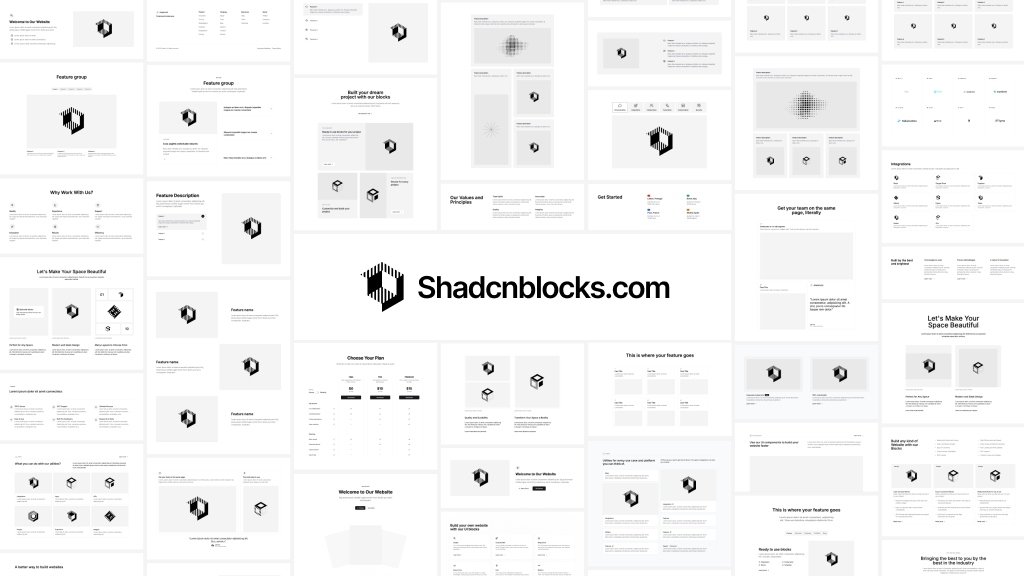 Shadcnblocks
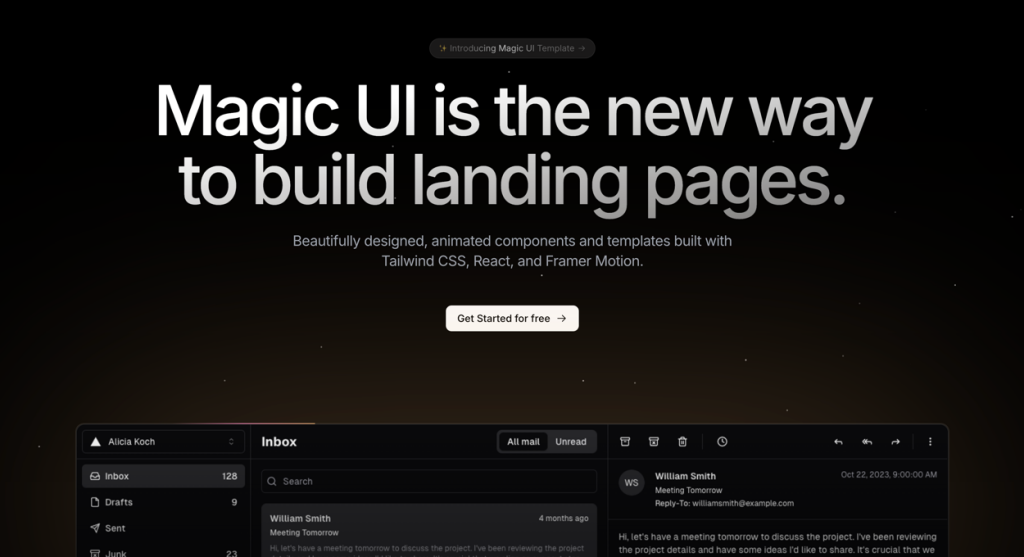 Magic UI Pro
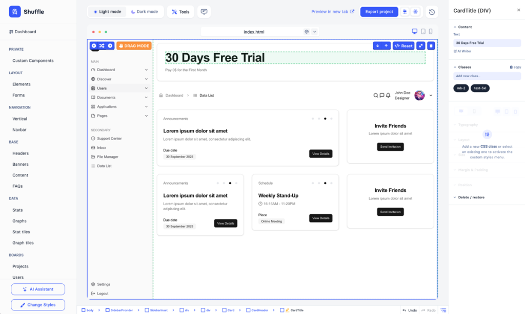 shadcn ui Dashboard Template
 KokonutUI
More Examples: Form Components and Alerts
Building a Form with shadcn/ui
Forms are another area where shadcn/ui shines. Instead of manually managing form validation and error messages, shadcn/ui provides pre-built form components that integrate with libraries like React Hook Form.
Here’s a simple example of a login form using shadcn/ui:
import { useForm } from "react-hook-form";
import { Button } from "@/components/ui/button";
import { Input } from "@/components/ui/input";
import { Form, FormField, FormItem, FormLabel, FormControl, FormMessage } from "@/components/ui/form";

export default function LoginForm() {
  const form = useForm();

  const onSubmit = (data) => {
    console.log("Form Data:", data);
  };

  return (
    <Form onSubmit={form.handleSubmit(onSubmit)}>
      <FormField name="username" control={form.control} render={({ field }) => (
        <FormItem>
          <FormLabel>Username</FormLabel>
          <FormControl>
            <Input placeholder="Enter username" {...field} />
          </FormControl>
          <FormMessage />
        </FormItem>
      )} />
      <FormField name="password" control={form.control} render={({ field }) => (
        <FormItem>
          <FormLabel>Password</FormLabel>
          <FormControl>
            <Input type="password" placeholder="Enter password" {...field} />
          </FormControl>
          <FormMessage />
        </FormItem>
      )} />
      <Button type="submit" variant="primary">Login</Button>
    </Form>
  );
}
This example demonstrates how shadcn/ui not only provides basic input fields and buttons but also wraps them in a form system that handles validation and error messaging. You can easily extend this form with additional fields and custom styling.
Alert and Notification Components
Another common UI element is an alert or notification. In plain HTML and Tailwind, you might create an alert like this:
<div class="bg-red-100 border border-red-400 text-red-700 px-4 py-3 rounded relative" role="alert">
  <strong class="font-bold">Error!</strong>
  <span class="block sm:inline">Something went wrong.</span>
</div>
With shadcn/ui, you could have an Alert component that encapsulates this design:
import { Alert, AlertTitle, AlertDescription } from "@/components/ui/alert";

export default function ErrorAlert() {
  return (
    <Alert variant="destructive">
      <AlertTitle>Error!</AlertTitle>
      <AlertDescription>
        Something went wrong. Please try again.
      </AlertDescription>
    </Alert>
  );
}
This component not only uses consistent styling but also makes it simple to swap out different types of alerts (for example, success or warning alerts) by simply changing a variant prop.
Why Choose shadcn/ui?
Consistency and Best Practices
By using shadcn/ui, you ensure that every component follows consistent design and accessibility guidelines. Each component is built with a focus on usability and performance. Since the source code for these components is included in your project, you have full control over customization while still benefiting from community-tested design patterns.
Faster Development
Imagine the time saved when you no longer have to write every interactive element from scratch. With shadcn/ui, you can quickly assemble pages and features by reusing high-quality, pre-built components. This rapid development process is especially beneficial when working on projects with tight deadlines or when you’re iterating on design prototypes.
Easy Integration with Tailwind CSS
For developers already familiar with Tailwind CSS, shadcn/ui is a natural fit. The components are styled using Tailwind’s utility classes, which means you can extend or override styles effortlessly. Whether you want to tweak colors, spacing, or responsive behavior, Tailwind’s utility-first approach gives you the flexibility to do so.
Scalability and Customization
Because shadcn/ui components are simply pieces of code you integrate into your project, they scale as your application grows. You can customize them extensively—if you need a slightly different button style or a modified form layout, you can adjust the component code directly without waiting for an update from a third-party library.
Use Cases
Let’s take a look at a few scenarios where shadcn/ui could be a game changer:
Dashboard Applications:
When building an admin dashboard, consistency and clarity are paramount. With shadcn/ui, you can create cards, charts, alerts, and forms that all share the same design language, making your dashboard look cohesive and professional.E-Commerce Sites:
An e-commerce website often requires many custom components such as product cards, modals, and notifications. Using shadcn/ui, you can quickly prototype these elements and then tweak them to fit your brand’s style.SaaS Platforms:
SaaS applications typically have complex forms, notifications, and interactive components. shadcn/ui’s pre-built components, coupled with their robust accessibility features, can help create a smooth user experience while reducing development overhead.Landing Pages:
Even for static sites or landing pages, using shadcn/ui can add that extra polish. Components like hero sections, call-to-action buttons, and image cards can be assembled quickly and styled to match your design vision.
Recap
In summary, shadcn/ui offers a fresh and efficient way to handle UI development. By providing a set of high-quality, customizable, and accessible components built on top of Tailwind CSS and Radix UI, it allows developers to focus on what makes their application unique—while still ensuring a consistent, polished look across the board.
FAQ
What is shadcn/ui?
It’s a library of premium, customizable UI components built on Tailwind CSS and Radix UI for React and Next.js projects.
How is shadcn/ui different from plain HTML or custom React components?
Instead of manually coding every style and interactive feature, shadcn/ui offers ready-to-use components that follow best practices for design and accessibility.
Can I use shadcn/ui with React and Next.js?
Yes, it integrates seamlessly with both, enhancing your projects with consistent and accessible UI elements.
What are the benefits of using shadcn/ui?
It speeds up development, ensures design consistency, provides built-in accessibility, and is fully customizable to fit your project’s needs.

Yucel is a digital product creator and content writer with a knack for full-stack development. He loves blending technical know-how with engaging storytelling to build practical, user-friendly solutions. When he's not coding or writing, you'll likely find him exploring new tech trends or getting inspired by nature.