How to Set Accent Colors in Tailwind
Tailwind CSS accent color customization guide

Want to add some flair to your form controls like checkboxes and radio buttons? Tailwind CSS makes it a breeze with accent colors.
These handy utilities let you style up your forms with minimal effort. In this guide, we’ll walk through the basics, dive into some advanced tricks, and answer a few common questions.
What Are Accent Colors?

Accent colors are all about giving your form elements—like checkboxes, radio buttons, and range sliders—a custom color vibe. Tailwind CSS uses the accent-color property behind the scenes, and with its utility classes, you can apply these colors in a snap. It’s perfect for making your forms match your site’s style or just look a little less boring.
Basic Usage: Adding Accent Colors
Getting started is crazy easy. Just slap an accent-{color} class on your form control, where {color} is any color from your Tailwind setup.
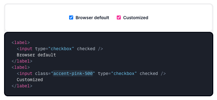
Here’s a quick example:
<input type="checkbox" class="accent-blue-500">Boom! Your checkbox now rocks a blue accent color. You can swap blue-500 for any Tailwind color like accent-pink-300 or accent-gray-700. Play around and see what fits your vibe!
Advanced Customization: Make It Your Own
What if Tailwind’s default colors aren’t your thing? No worries—you can add your own custom colors! Just tweak your tailwind.config.js file to include whatever shades you’re feeling.
Here’s how:
Open up
tailwind.config.js.Add your custom color under
theme.extend.colors. Like this:
// tailwind.config.js
module.exports = {
  theme: {
    extend: {
      colors: {
        'funky-purple': '#9b5de5',
      },
    },
  },
};
Use it in your HTML:
<input type="radio" class="accent-funky-purple">Now your radio button’s got that funky purple glow. You can totally match it to your brand or just go wild with something unique.
Tips for Using Accent Colors Effectively
Consistency is Key
When choosing accent colors, it’s important to maintain consistency across your website. This means selecting colors that complement your overall color scheme and using them uniformly for similar interactive elements.
Consider User Accessibility
Make sure that your accent colors provide enough contrast against your background. This is not only crucial for design but also for accessibility. Tools like WebAIM's Contrast Checker can help ensure your colors meet accessibility standards.
Experiment and Iterate
Don’t be afraid to experiment with different colors and see what works best for your design. Tailwind CSS makes it very easy to swap out accent colors, so you can quickly test different options without a lot of overhead.
Use Custom Configurations
As mentioned earlier, if you have a brand color or a specific palette in mind, customize your Tailwind configuration. This will make it easier to apply your unique style consistently across your entire project.
Summary
Tailwind CSS accent colors offer a simple yet powerful way to customize form elements, ensuring that they not only look great but also contribute to an accessible and user-friendly interface. By using utility classes like accent-blue-500 or even custom classes from your Tailwind configuration, you can seamlessly integrate accent colors into your design.
As you continue to experiment with Tailwind CSS, remember to:
Maintain consistency with your color choices.
Ensure sufficient contrast for accessibility.
Customize your configuration to reflect your brand’s personality.
Test different combinations to find the perfect balance.
FAQ
What form controls work with accent colors?
You can use them on checkboxes, radio buttons, and range inputs—pretty much anything that supports the accent-color property in CSS.
Can I use my own custom colors?
Yes! Add them to your Tailwind config under theme.extend.colors, and they’ll work with the accent- utility.
Can I change the accent color on hover or focus?
The accent- utility sets the base color, but you can pair it with stuff like hover:accent-red-500. For fancier state changes, you might need a bit of custom CSS though.

Yucel is a digital product creator and content writer with a knack for full-stack development. He loves blending technical know-how with engaging storytelling to build practical, user-friendly solutions. When he's not coding or writing, you'll likely find him exploring new tech trends or getting inspired by nature.

