Understand row-span Attribute in Tailwind Tables
Learn how the row span attribute works
When you build web interfaces, creating clean and organized layouts is key. One technique to achieve that is using row span—merging table or grid cells vertically. In this post, we’ll explain how the row span concept works in HTML and Tailwind CSS, share code examples straight from the official docs, and answer common questions on the topic.

What Is Row Span?
In HTML, a table is made up of rows (<tr>) and cells (<td> for data or <th> for headers). By default, each cell occupies a single row. The rowspan attribute allows you to make a cell cover more than one row. For instance, if you set <td rowspan="3">, that cell will stretch vertically across three rows.
This feature is especially helpful when you have data that spans multiple rows. Instead of repeating information, you merge cells for a cleaner, more organized table layout.

How Tailwind CSS Enhances Row Span
Tailwind CSS is a utility-first framework that gives you a collection of classes to quickly style your content. While HTML’s rowspan attribute manages how many rows a cell spans, Tailwind offers utility classes—especially in its grid module—to control row spans in grid layouts.
The official Tailwind documentation provides classes such as row-span-2, row-span-3, or even responsive utilities to manage how elements span rows in a grid. Although these classes are primarily for CSS Grid, the principles can often inspire how you structure and style HTML tables.
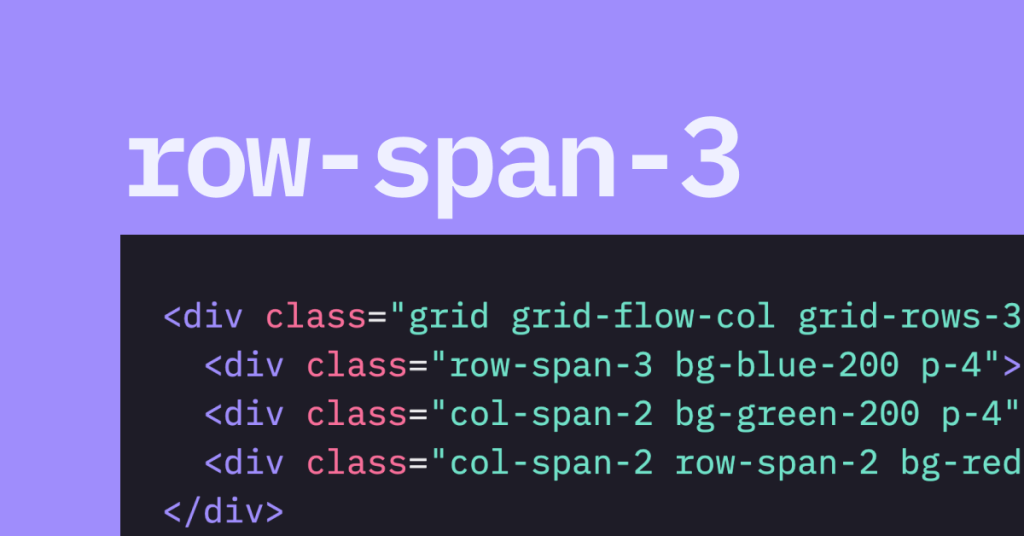
For example, here’s a simple Tailwind grid that uses row-span classes (from the official docs):
<div class="grid grid-flow-col grid-rows-3 gap-4">
  <div class="row-span-3 bg-blue-200 p-4">01</div>
  <div class="col-span-2 bg-green-200 p-4">02</div>
  <div class="col-span-2 row-span-2 bg-red-200 p-4">03</div>
</div>
In this grid, the first item spans three rows, the second item spans two columns, and the third item spans two rows. This approach is very similar in concept to merging cells in a table using rowspan.
Combining HTML Tables with Tailwind Styling
Let’s look at how you might use HTML’s native rowspan attribute alongside Tailwind’s utility classes to style a table. Imagine a table displaying project data where one project name applies to several rows of tasks.
Example: Merging Cells in an HTML Table with Tailwind
In this example:
HTML’s
rowspanattribute is used to merge cells in the "Project" column.Tailwind utility classes (like
border,p-2,bg-blue-50, andbg-gray-100) are used to style the table for a clean, modern look.The resulting table is both semantically correct and visually appealing.
Using Tailwind Grid Utilities for Row Spanning
While HTML tables use the rowspan attribute, Tailwind’s grid system offers similar utilities for grid layouts. This can be helpful if you decide to build your layout using CSS Grid instead of traditional tables.
Example: Tailwind Grid with Row Spanning
This snippet demonstrates how an element can span multiple rows in a grid layout using Tailwind’s row-span-3 and row-span-2 classes. The syntax follows the official docs from Tailwind, ensuring consistency and responsiveness.
Responsive Row Span with Tailwind
Tailwind also makes it easy to adjust how elements span rows on different devices. For example, you might want an element to span three rows on mobile but four rows on larger screens. You can do this with responsive prefixes.
Example: Responsive Row Span
<div class="grid grid-flow-col grid-rows-3 gap-4">
  <div class="row-span-3 md:row-span-4 bg-purple-200 p-4">
    Responsive Item (3 rows on mobile, 4 rows on md+ screens)
  </div>
  <div class="col-span-2 bg-yellow-200 p-4">Item 2</div>
  <div class="col-span-2 row-span-2 bg-pink-200 p-4">Item 3</div>
</div>
Here, the md:row-span-4 class tells Tailwind to make that element span four rows on medium screens and larger, while it spans three rows by default.
Best Practices for Using Row Span with Tailwind
To ensure your layout is both functional and beautiful, keep these tips in mind:
Plan Your Layout:
Sketch out your design before coding. Identify which cells or grid items need to span multiple rows.Combine Semantic HTML with Utility Classes:
Use HTML attributes likerowspanfor tables and Tailwind classes for styling. This separation of structure and style makes your code easier to maintain.Test Responsiveness:
Utilize Tailwind’s responsive utilities to adapt your layout for different screen sizes. Always preview your design on mobile, tablet, and desktop views.Keep Accessibility in Mind:
Whether using tables or grids, ensure your layout remains accessible. Use proper table headings and captions, and maintain a clear visual hierarchy.
Row span is a powerful tool for organizing data—whether you’re working with HTML tables or Tailwind grids. By merging cells vertically, you can create a cleaner, more readable layout that groups related information together. Tailwind CSS enhances this process by providing utility classes that simplify styling and responsive design.
FAQ
What does the rowspan attribute do in HTML tables?
It makes a table cell cover multiple rows, reducing repetition and clutter in your data.
How can I apply row span styles in a Tailwind grid?
Use utilities like row-span-2 or row-span-3 to control how many rows an element spans.
Is it possible to combine HTML’s rowspan attribute with Tailwind CSS classes?
Yes! You can merge cells with rowspan in your HTML and style them with Tailwind classes for a polished look.
Can Tailwind’s row span classes be made responsive?
Yes, by using responsive prefixes like md:row-span-4, you can change the span based on screen size.

Yucel is a digital product creator and content writer with a knack for full-stack development. He loves blending technical know-how with engaging storytelling to build practical, user-friendly solutions. When he's not coding or writing, you'll likely find him exploring new tech trends or getting inspired by nature.