Scalable Vector Graphics (SVG) are awesome because they let your images stay crisp at any size. But sometimes, getting the width just right can be tricky—especially when you're building a responsive website. In this post, we'll walk through simple ways to set and adjust your SVG width so it fits perfectly on any device.

Why SVG Width Matters
When you set an SVG's width correctly, you make sure it scales nicely on all screen sizes. A fixed or improperly sized SVG might look too big or too small on different devices, which can throw off your design. By controlling the width, you keep your graphics looking sharp and your layout in check.

Basic Techniques to Set SVG Width
Using the width Attribute
The easiest way is to use the width attribute directly on your <svg> element. For example, you might write:
<svg width="200" height="100" viewBox="0 0 200 100">
  <!-- Your SVG content here -->
</svg>
This tells the browser to display the SVG at 200 pixels wide. If you need it to be responsive, you can use percentages instead.
Making Your SVG Responsive
If you want your SVG to adjust automatically based on its container, try setting the width to 100%. This way, the SVG fills the available space:
<svg width="100%" height="auto" viewBox="0 0 200 100">
  <!-- Your SVG content here -->
</svg>
Using "100%" for the width lets the browser calculate the best size based on its container, which is great for responsive designs.
Using CSS for More Control
Sometimes you might want to control the SVG's width with CSS instead of directly in the HTML. This can be especially useful if you need to override default settings:
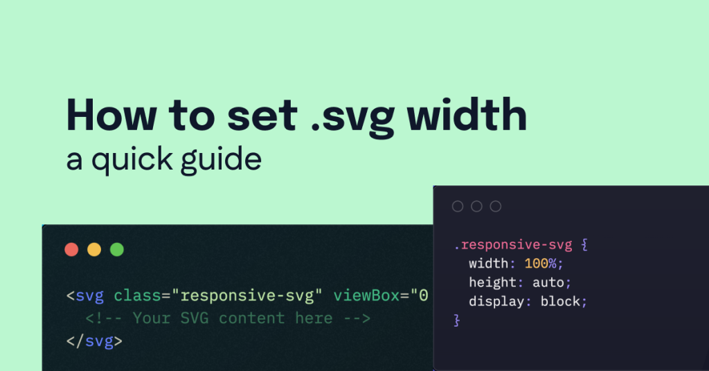
<svg class="responsive-svg" viewBox="0 0 200 100">
  <!-- Your SVG content here -->
</svg>
And in your CSS, you can add:
.responsive-svg {
  width: 100%;
  height: auto;
  display: block;
}
This way, your SVG will always fit its container, and you can easily adjust it using media queries or other CSS techniques.
Real-World Example
Imagine you're designing a website header with a logo in SVG format. You want the logo to resize as the browser window changes. You could use the following HTML and CSS:
HTML:
<header>
  <svg class="logo" viewBox="0 0 300 100">
    <!-- Logo content goes here -->
  </svg>
</header>
CSS:
.logo {
  width: 100%;
  max-width: 300px; /* Ensure it doesn't get too big on larger screens */
  height: auto;
}
With this setup, the logo will scale down smoothly on smaller screens while maintaining its aspect ratio, ensuring that it always looks great.
Setting the SVG width properly is a key step in ensuring your graphics are responsive and look great on any device. Whether you use the width attribute directly or manage it through CSS, the goal is to maintain a balance between design flexibility and performance. With these simple techniques and examples, you’re now ready to optimize your SVGs for modern web design.
FAQ
What does the SVG width attribute do?
It defines the horizontal size of the SVG element, determining how wide it appears on the screen.
How can I make my SVG responsive?
Set the width to a percentage like "100%" and height to "auto" so it adjusts based on its container.
What happens if I don’t set an SVG width?
The browser may use a default size, which might not fit your design or be responsive.
Can I control SVG width using CSS?
Yes, you can override the inline width by applying CSS rules to the SVG element.

Yucel is a digital product creator and content writer with a knack for full-stack development. He loves blending technical know-how with engaging storytelling to build practical, user-friendly solutions. When he's not coding or writing, you'll likely find him exploring new tech trends or getting inspired by nature.