Tailwind Font Size: How do you change and customise text sizes?
Change and customise Tailwind font sizes
 TL;DR: Use
 text-{size} (e.g., text-sm to text-9xl) to quickly set font size. Use the / shorthand (e.g., text-lg/7) to set both size and line-height. Use arbitrary values like text-[18px] for precision. For a brand font scale, extend theme.fontSize in tailwind.config.js. For fluid resizing, use clamp() or a plugin.
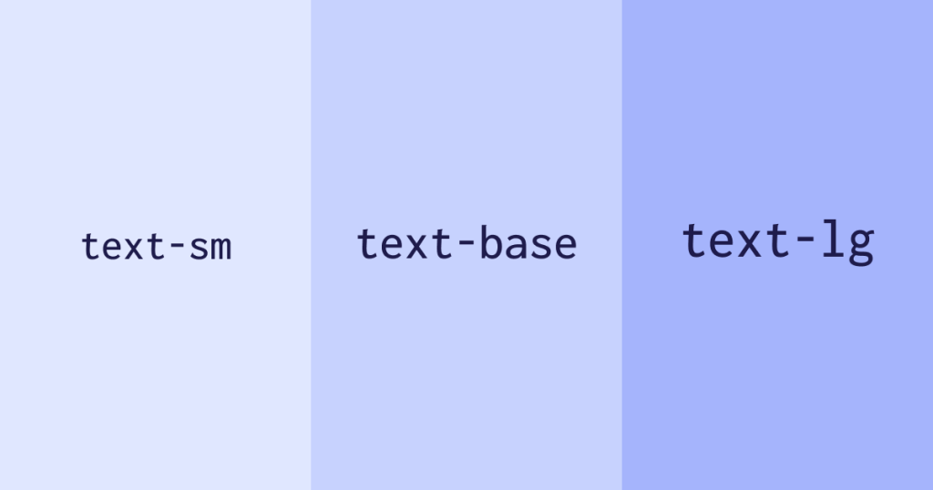
1. What’s the fastest way to change font size in Tailwind?
Use utilities like text-sm, text-base, text-xl, up to text-9xl. They apply font-size (and default line-height) instantly.
<p class="text-base">Body text</p>
<h2 class="text-2xl">Section heading</h2> 
2. How do you set size and line-height together?
Use the slash shorthand: text-lg/7, text-sm/6, etc. This sets both font-size and line-height in one class.
<p class="text-lg/7">Comfortable leading with size</p> 3. Can I use exact pixel/REM values in class names?
Yes, use arbitrary values like text-[18px] for precise control. You can also use CSS-variables via text-(length:--my-size).
<h3 class="text-[18px]">Exact 18px</h3>
<h3 class="text-(length:--hero-size)">Via CSS variable</h3>
4. How do I create a custom font scale in tailwind.config.js?
Extend or replace theme.fontSize to define your own steps (with optional line-height/letter-spacing) to tailor typography to your brand.
// tailwind.config.js
export default {
  theme: {
    extend: {
      fontSize: {
        tiny: ['0.75rem', { lineHeight: '1.1' }],
        base: ['1rem',   { lineHeight: '1.6' }],
        hero: ['3rem',   { lineHeight: '1.05', letterSpacing: '-0.02em' }],
      },
    },
  },
}
5. What’s the best way to make font sizes responsive (fluid/clamp)?
Use clamp() in text-[…] utilities to scale font-size smoothly between a min & max viewport size. Alternatively use a fluid typography plugin.
<h1 class="text-[clamp(1.75rem,3vw,3rem)]">Fluid headline</h1> 6. What sizes does Tailwind include by default?
From text-xs (0.75 rem / 12px) up to text-9xl (8 rem / 128px) in default config.
Class | rem | px | Typical use |
|---|---|---|---|
text-xs | 0.75 | 12 | Captions, notes |
text-sm | 0.875 | 14 | UI labels |
text-base | 1 | 16 | Body copy |
text-lg | 1.125 | 18 | Dense body, sub-heading |
text-xl | 1.25 | 20 | Section heading |
text-2xl | 1.5 | 24 | Article title |
text-3xl | 1.875 | 30 | Hero subtitle |
text-4xl | 2.25 | 36 | Hero heading |
text-5xl | 3 | 48 | Landing hero |
text-6xl | 3.75 | 60 | Priority call-out |
text-7xl | 4.5 | 72 | Display headline |
text-8xl | 6 | 96 | Jumbo display |
text-9xl | 8 | 128 | Ultra display/splash |
7. What are practical size picks for headings, body and UI?
Body text:
text-base/7ortext-lg/7for comfortable readabilityH2 headings:
text-2xl/8 md:text-3xl/9H1:
text-4xl/none md:text-5xl/none(tightly spaced for display)Captions/UI hints:
text-xs/5
Pair these with your custom scale if you’ve defined one intailwind.config.js.
Explore real-world size usage in our UI Components page, grab ready sections from Free UI Sections, and get started quickly with Tailwind CSS CDN Setup (v4). Pair sizes with brand fonts in our Tailwind Custom Fonts guide, and polish headings with the Tailwind Box Shadow Generator.
FAQ
How do I quickly change font size in Tailwind?
Add `text-{size}` like `text-base`, `text-xl`, up to `text-9xl`.
How do I set size and line-height together?
Use `text-{size}/{lineHeight}` such as `text-lg/7`.
Can I use exact values like 18px?
Yes,`text-[18px]` or `text-(length:--my-size)` for CSS variables.
How do I make font sizes fluid?
Use `clamp(min, preferred, max)` inside `text-[…]` to scale with viewport.
How do I create a custom font scale?
Extend `theme.fontSize` in `tailwind.config` and define defaults for leading.

Yucel is a digital product creator and content writer with a knack for full-stack development. He loves blending technical know-how with engaging storytelling to build practical, user-friendly solutions. When he's not coding or writing, you'll likely find him exploring new tech trends or getting inspired by nature.