Designing Custom 404 Error Pages with Tailwind CSS
How to create a custom 404 error page in Tailwind
Have you ever clicked on a link, only to find yourself staring at an annoying "404 Error" page?
It’s like taking a wrong turn on a road trip! But what if that error page could be a delightful detour instead of a dead end? With Tailwind CSS, you can design custom 404 error pages that not only inform users about the missing content but also keep them engaged and smoothly redirect them back to where they want to be.
You can turn that pesky error into a positive user experience. Let’s start!
Why Create a Custom 404 Error Page?
A custom 404 error page is more than just a digital "oops." It's an opportunity to:
Enhance User Experience: Keep visitors on your site longer by providing helpful navigation links.
Strengthen Brand Identity: Use this page to showcase your brand's personality and design consistency.
Improve SEO: Reduce bounce rates and keep users engaged, signaling to search engines that your site is valuable.
Step-by-Step Guide to Designing a Custom 404 Error Page with Tailwind CSS
Setting Up Tailwind CSS (if you haven't done so yet)
Install Tailwind CSS
You can install Tailwind CSS via npm:
npm install tailwindcssConfigure Tailwind CSS
Create a tailwind.config.js file:
npx tailwindcss initAdd Tailwind to Your CSS
Add the following lines to your CSS file:
@tailwind base;
@tailwind components;
@tailwind utilities;
Step 1: Layout Design
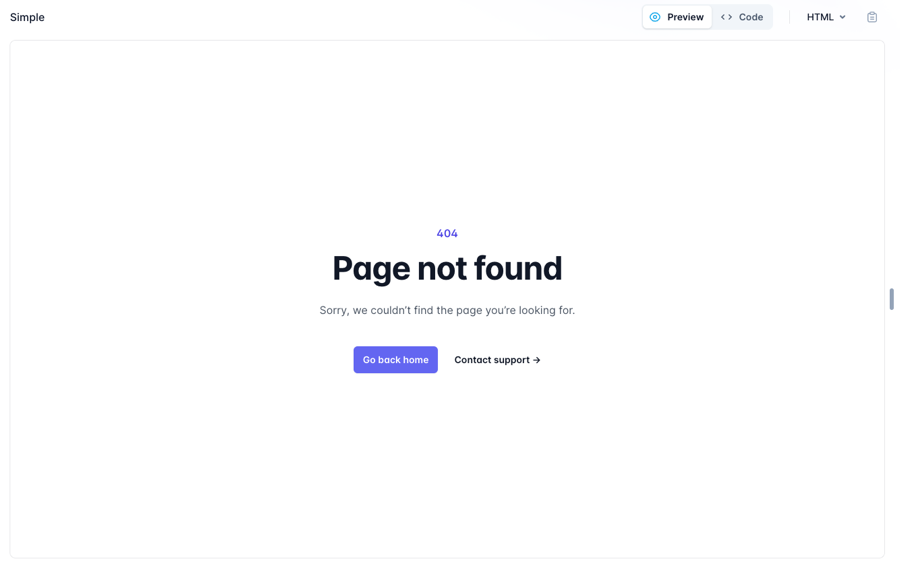
Custom 404 Page from Tailwind UI
Your custom 404 page should be simple, informative, and aligned with your brand’s style. Here’s a basic layout idea:
Header: A catchy message like "Oops! Page Not Found."
Body: Brief explanation or fun message. Include a search bar or site navigation.
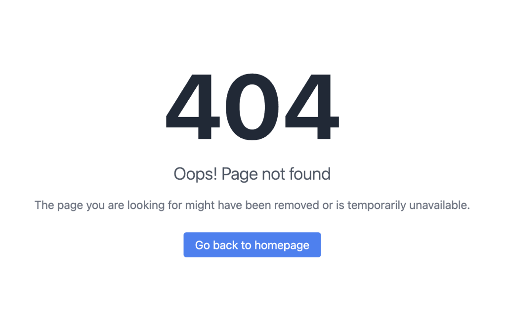
The page you are looking for might have been removed or is temporarily unavailable.
CTA: Go back to homepage
Footer: Links to popular pages or contact information.
<!DOCTYPE html>
<html lang="en">
<head>
    <meta charset="UTF-8">
    <meta name="viewport" content="width=device-width, initial-scale=1.0">
    <title>404 - Page Not Found</title>
    <script src="https://cdn.tailwindcss.com"></script>
</head>
<body class="bg-gray-100 h-screen flex items-center justify-center">
    <div class="text-center">
        <h1 class="text-9xl font-bold text-gray-800">404</h1>
        <p class="text-2xl font-light text-gray-600 mt-4">Oops! Page not found</p>
        <p class="text-gray-500 mt-4 mb-8">The page you are looking for might have been removed or is temporarily unavailable.</p>
        <a href="/" class="px-4 py-2 bg-blue-500 text-white rounded hover:bg-blue-600 transition duration-300">
            Go back to homepage
        </a>
    </div>
</body>
</html>
Step 2: HTML Structure
Let’s create another basic HTML structure for your 404 page:
<!DOCTYPE html>
<html lang="en">
<head>
    <meta charset="UTF-8">
    <meta name="viewport" content="width=device-width, initial-scale=1.0">
    <link href="/path/to/tailwind.css" rel="stylesheet">
    <title>404 Not Found</title>
</head>
<body class="bg-gray-100 flex items-center justify-center h-screen">
    <div class="text-center">
        <h1 class="text-4xl font-bold text-gray-800">404</h1>
        <p class="text-xl text-gray-600">Oops! Page Not Found</p>
        <a href="/" class="mt-4 inline-block bg-blue-500 text-white py-2 px-4 rounded">Go Home</a>
    </div>
</body>
</html>
Step 3: Styling with Tailwind CSS
Tailwind allows you to easily adjust your design with utility classes. Here’s how you can enhance the page:
Background and Text Colors: Use Tailwind’s color utilities to match your brand.
Responsive Design: Ensure the page looks good on all devices with Tailwind’s responsive utilities.
Animation: Add subtle animations for a modern touch.
Step 4: Adding Interactivity
Consider adding interactive elements like:
Search Bar: Help users find what they’re looking for.
Return to Previous Page Button: A convenient way back to where they came from.
Best Practices for Custom 404 Error Pages
Keep It Simple: Don’t overwhelm users with too many options.
Stay On-Brand: Use consistent design elements.
Provide Guidance: Offer clear navigation options.
Bonus: 404 Page Examples
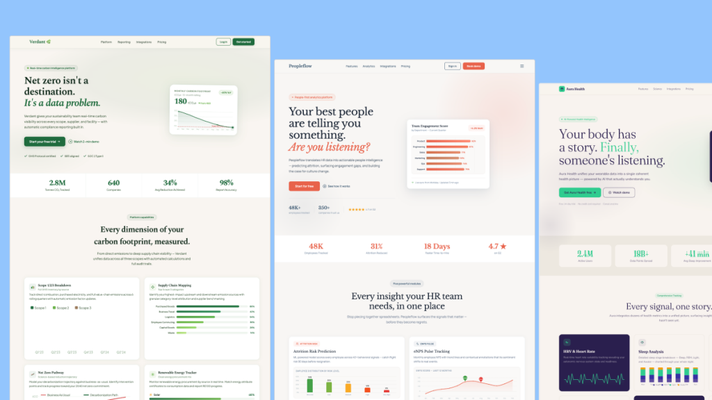
To wrap up our discussion on designing custom 404 error pages with Tailwind CSS, here are a few resources for inspiration and ready-made components so you can get started quickly.
Conclusion
Creating a custom 404 error page with Tailwind CSS is a fantastic way to enhance your website’s user experience and maintain your brand’s identity. By following the steps outlined above, you can turn a potential frustration into a delightful experience
Remember, every interaction on your site is an opportunity to engage and impress your visitors. Don’t let a simple error page miss a chance to connect with your audience.
FAQ
Why is a 404 error page important for my website?
A 404 error page helps inform visitors that the page they're looking for doesn't exist. It’s important because it keeps users engaged and guides them back to other valuable parts of your website, reducing bounce rates and improving overall user experience.
Will a custom 404 page affect my SEO?
Yes, it can positively impact your SEO. A well-designed 404 page can reduce bounce rates by keeping visitors on your site, which signals to search engines that your site is valuable and user-friendly.
What should I avoid on a 404 error page?
Avoid cluttering the page with too much information or too many links. Keep it simple, clear, and on-brand. Ensure that the page loads quickly and that all links are functional, as this will enhance the user experience.

Yucel is a digital product creator and content writer with a knack for full-stack development. He loves blending technical know-how with engaging storytelling to build practical, user-friendly solutions. When he's not coding or writing, you'll likely find him exploring new tech trends or getting inspired by nature.
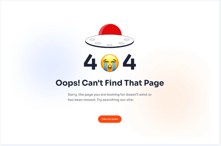
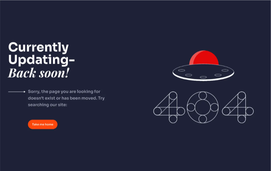
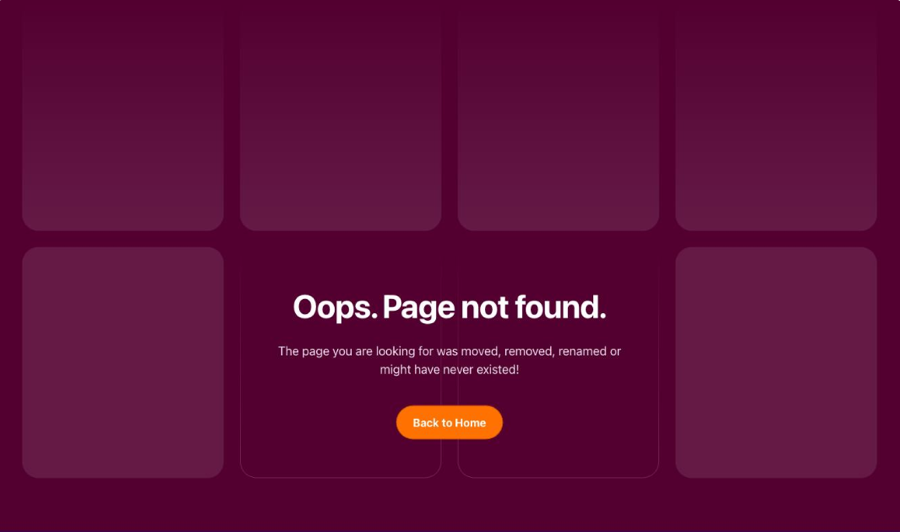
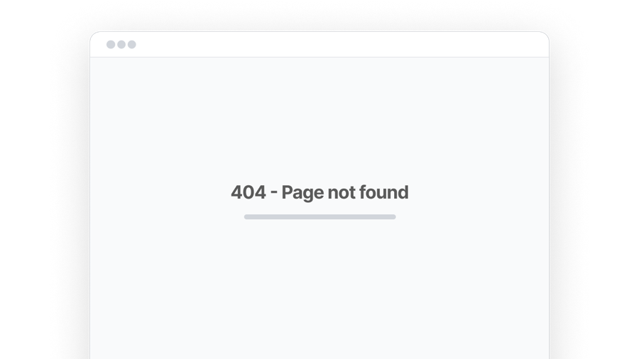 Windstatic Error Pages - (Free Examples)