In this comprehensive blog post, we’ll explore the power of CSS Auto Grid Layouts, focusing on techniques like auto-placement, auto-fit, and auto-fill. You’ll discover how these features can help you build efficient, flexible layouts that adapt seamlessly to any screen size.

Packed with practical tips and real-world code examples, this guide will empower both novice and experienced developers to elevate their web design skills. By the end, you’ll have a solid grasp of auto grid techniques and be ready to implement them in your next project.
CSS Grid: A Game-Changer for Web Layouts
Before diving into the specifics of auto grid layouts, let’s set the stage with a brief overview of CSS Grid. Introduced as a native CSS module, Grid is a two-dimensional layout system that allows developers to define rows and columns within a container. Unlike its predecessor, Flexbox, which excels in one-dimensional layouts (either rows or columns), Grid shines when you need precise control over both axes simultaneously. This makes it ideal for creating everything from simple galleries to intricate dashboard interfaces.
At the heart of this blog post is the concept of auto grid layouts, a subset of CSS Grid features that leverages automation to streamline design. These techniques—auto-placement, auto-fit, and auto-fill—enable layouts that dynamically adjust to content and viewport changes, making them indispensable for modern web development. Let’s break them down step by step.

Auto-Placement: Letting the Browser Do the Work
One of the standout features of CSS Grid is its ability to automatically place items within a grid without requiring you to specify their exact positions. This is known as auto-placement, and it’s a game-changer for layouts with dynamic or unpredictable content—think blog post lists, product cards, or user-generated galleries.
Imagine you’re building a grid with three columns, defined like this:
.grid-container {
  display: grid;
  grid-template-columns: repeat(3, 1fr);
  grid-gap: 10px;
}
And your HTML looks like this:
<div class="grid-container">
  <div class="item">Item 1</div>
  <div class="item">Item 2</div>
  <div class="item">Item 3</div>
  <div class="item">Item 4</div>
  <div class="item">Item 5</div>
</div>
Here, repeat(3, 1fr) creates three equal-width columns, each taking up one fraction of the available space. With five items, the browser automatically places the first three in the first row and the remaining two in a second row. This behavior is governed by the grid-auto-flow property, which defaults to row. You can switch it to column for a vertical flow, but for most layouts, the row-based approach feels natural.
Auto-placement shines when you don’t know how many items you’ll have. For instance, if a CMS generates content dynamically, you won’t need to manually assign grid positions—Grid handles it for you. This reduces code complexity and makes your layouts more adaptable to future changes.
Auto-Fit and Auto-Fill: Building Responsive Grids
While auto-placement is powerful, the real magic of auto grid layouts lies in the auto-fit and auto-fill keywords, used within the repeat() function. These tools take responsiveness to the next level by allowing the grid to adjust the number of tracks (columns or rows) based on the container’s size and the content within it.
The Difference Between Auto-Fit and Auto-Fill
Both auto-fit and auto-fill work with the grid-template-columns or grid-template-rows properties, often paired with minmax() to define flexible track sizes. However, they behave differently when the number of grid items is less than the potential number of tracks:
auto-fill: Creates as many tracks as can fit within the container without overflowing, even if some tracks remain empty. The empty tracks retain their defined size, which can leave unused space.auto-fit: Also creates as many tracks as can fit, but collapses empty tracks, allowing the remaining items to expand and fill the available space.
Let’s see this in action with an example:
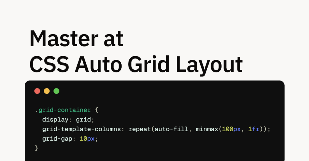
.grid-container {
  display: grid;
  grid-template-columns: repeat(auto-fill, minmax(100px, 1fr));
  grid-gap: 10px;
}
If the container is 350px wide, and each column must be at least 100px (per minmax(100px, 1fr)), the grid calculates that three columns fit (since 3 × 100 = 300 < 350, but 4 × 100 = 400 > 350). With auto-fill and two items, the layout creates three columns, each approximately 116.67px wide (350px ÷ 3). The two items occupy the first two columns, and the third column remains empty but still takes up space in the grid’s calculation.
Now, switch to auto-fit:
.grid-container {
  display: grid;
  grid-template-columns: repeat(auto-fit, minmax(100px, 1fr));
  grid-gap: 10px;
}
With the same 350px container and two items, auto-fit initially considers three columns. However, because the third column is empty, it collapses, removing it from the layout. The two items then split the 350px evenly, each becoming approximately 175px wide. This makes auto-fit ideal for responsive designs where you want items to grow and fill the space when there’s room.
Practical Examples: Auto Grid in Action
Let’s put these concepts into practice with two real-world examples that showcase the versatility of auto grid layouts.
Example 1: Responsive Image Gallery
A common use case for auto grid layouts is an image gallery that adjusts to different screen sizes. Here’s how to build one:
HTML:
<div class="gallery">
  <img src="image1.jpg" alt="Image 1">
  <img src="image2.jpg" alt="Image 2">
  <img src="image3.jpg" alt="Image 3">
  <img src="image4.jpg" alt="Image 4">
</div>
CSS:
.gallery {
  display: grid;
  grid-template-columns: repeat(auto-fit, minmax(200px, 1fr));
  grid-gap: 15px;
}

.gallery img {
  width: 100%;
  height: auto;
  object-fit: cover;
}
In this setup, each image column is at least 200px wide, but can grow to take up more space (up to 1fr). On a 1000px-wide screen, the grid creates four columns (since 4 × 200 = 800 < 1000), with each column expanding to 235px (1000px ÷ 4, accounting for gaps). On a smaller 500px screen, it drops to two columns, each 242.5px wide. The auto-fit keyword ensures that the layout adapts fluidly, collapsing unused columns as needed.
Example 2: Dashboard with Cards
For a more complex layout, let’s create a dashboard with cards that resize based on the viewport:
HTML:
<div class="dashboard">
  <div class="card">Card 1: Overview</div>
  <div class="card">Card 2: Stats</div>
  <div class="card">Card 3: Alerts</div>
  <div class="card">Card 4: Settings</div>
</div>
CSS:
.dashboard {
  display: grid;
  grid-template-columns: repeat(auto-fit, minmax(250px, 1fr));
  grid-gap: 20px;
}

.card {
  background-color: #f5f5f5;
  padding: 20px;
  border-radius: 8px;
  box-shadow: 0 2px 4px rgba(0, 0, 0, 0.1);
}
Here, each card has a minimum width of 250px. On a wide screen (e.g., 1200px), the grid fits four columns, each 280px wide (after gaps). On a narrower screen (e.g., 600px), it reduces to two columns, each 290px wide. This flexibility ensures the dashboard remains usable and visually appealing across devices.
Practical Tips for Mastering Auto Grid Layouts
To get the most out of auto grid layouts, consider these actionable tips:
Leverage
minmax()for Flexibility: Useminmax(min, max)to set a range for track sizes. For example,minmax(150px, 1fr)ensures columns are at least 150px wide but can grow proportionally, balancing readability and responsiveness.Use
grid-gapfor Clean Spacing: Instead of adding margins to grid items, applygrid-gap(orgap) to the container. This maintains consistency and simplifies your CSS.Enhance with Media Queries: While auto grid is responsive by nature, media queries can refine the layout further. For instance, reduce the
minmax()minimum size on smaller screens for tighter layouts.Test with Real Content: Auto layouts depend on content size, so test with varied item lengths (e.g., long titles or tall images) to ensure the grid behaves as expected.
Optimize for Performance: Keep your grid simple where possible—overly complex auto-flow rules can slow rendering, especially with many items.
Common Pitfalls and How to Avoid Them
Even with its power, CSS Auto Grid Layouts can trip up developers. Here are some pitfalls to watch for:
Missing
display: grid: Without this declaration, your grid properties won’t apply. Always double-check your container’s display value.Overriding Auto-Placement: If you mix explicit item positioning (e.g.,
grid-column: 1 / 3) with auto-placement, the flow might behave unexpectedly. Test thoroughly to ensure harmony.Ignoring Content Overflow: If grid items have fixed heights or widths larger than their cells, they can overflow. Use
overflow: hiddenor adjustminmax()values to contain them.Misjudging Empty Tracks: With
auto-fill, empty tracks can create unexpected gaps. Switch toauto-fitwhen you want items to expand fully.
Conclusion
Mastering CSS Auto Grid Layouts is a must for any web developer aiming to create modern, responsive designs. Auto-placement simplifies dynamic content management, while auto-fit and auto-fill provide the flexibility to adapt layouts to any screen size.
By combining these techniques with smart use of minmax(), consistent spacing via grid-gap, and careful testing, you can craft layouts that are both efficient and visually stunning.
FAQ
What is the difference between auto-fit and auto-fill in CSS Grid?
Auto-fill creates as many tracks as possible, leaving empty ones if there are fewer items. auto-fit collapses empty tracks, letting items expand to fill the space.
How can I center items in a grid layout using auto-placement?
Use justify-content: center and align-content: center on the grid container to center the entire grid and its auto-placed items.
Can I use auto grid layouts with older browsers?
Yes, but older browsers like Internet Explorer may need fallbacks (e.g., Flexbox) or feature queries (@supports) for compatibility.
How do I handle grid items of different sizes in an auto layout?
Set consistent sizes with grid-auto-rows or grid-auto-columns, and use align-self or justify-self to adjust individual item alignment.

Yucel is a digital product creator and content writer with a knack for full-stack development. He loves blending technical know-how with engaging storytelling to build practical, user-friendly solutions. When he's not coding or writing, you'll likely find him exploring new tech trends or getting inspired by nature.