A Simple Guide to Using `col-span` in Tailwind CSS
A simple guide to using `col-span` in Tailwind CSS for grid layouts.
Building grid layouts in Tailwind CSS can sometimes feel overwhelming, especially when dealing with the col-span utility. But don't worry—once you understand how it works, it becomes a powerful tool for your designs. In this guide, we'll break down how to use col-span in Tailwind CSS to create flexible and responsive grid layouts. Let's jump in!

Getting to Know Tailwind CSS Grid Basics

Before we get into col-span, let's quickly cover the basics of Tailwind's grid system. Tailwind CSS offers utility classes that let you create CSS Grid layouts without writing any custom CSS. The grid system works by defining grid containers and then deciding how the child elements are placed inside the grid.
A grid layout is made up of rows and columns. By using classes like grid, grid-cols-[number], and gap-[number], you can control the overall layout structure. Tailwind's grid utilities make it easy, so you can focus on design instead of getting bogged down with complicated CSS.
Basics of Grid Containers
grid: Makes a<div>a grid container.grid-cols-[number]: Sets how many columns the grid has.gap-[number]: Adds space between grid items.
Example:
<div class="grid grid-cols-3 gap-4">
  <!-- Grid items go here -->
</div>
Here, the grid container has three columns and a gap of 1rem (because gap-4 equals 1rem by default).
What is col-span in Tailwind CSS?

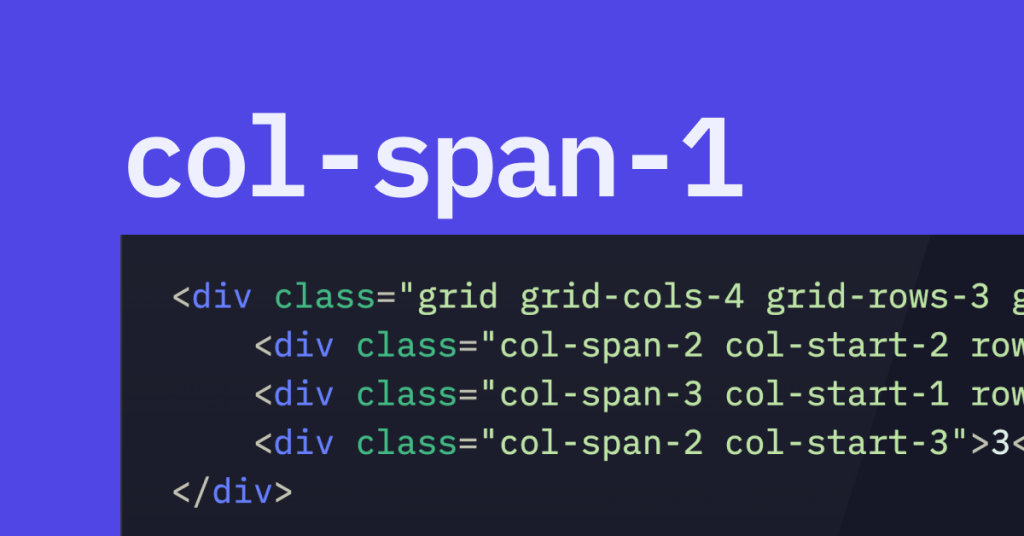
The col-span utility tells how many columns a grid item should cover in a grid layout. If you have a grid with several columns and want an element to stretch across multiple columns, use col-span.
By default, Tailwind's grid divides into 12 equal columns, but you can change this if you like. With col-span classes, you control the width of an element by specifying how many columns it should span. This gives you precise control over your layout without writing custom CSS.
How col-span Maps to CSS
The col-span-[number] class sets the grid-column property in CSS. For example, col-span-3 becomes grid-column: span 3 / span 3;, which tells the grid item to span three columns.
How to Use col-span Classes in Tailwind CSS

Adding col-span to your layout is easy. Here's how to do it:
Set up a grid container: Add the
gridclass to the parent container.Define the number of columns: Use
grid-cols-[number]to set how many columns the grid has. For example,grid-cols-12makes a grid with 12 columns.Apply
col-spanto grid items: Addcol-span-[number]to grid items to set how many columns they span.
Example:
<div class="grid grid-cols-12 gap-4">
  <div class="col-span-6 bg-gray-200">First block</div>
  <div class="col-span-6 bg-gray-400">Second block</div>
</div>
In this example, both blocks span six columns each, splitting the grid evenly.
Breakdown of the Example
grid: Makes the<div>a grid container.grid-cols-12: Sets the grid to have 12 columns.gap-4: Adds space between items.col-span-6: Each child spans six out of the 12 columns.
Responsive Design with col-span
Tailwind CSS makes responsive design easy. You can change the column span for different screen sizes using responsive prefixes like sm:, md:, lg:, xl:, and 2xl:. This helps your layout adapt on various devices.
Example:
<div class="grid grid-cols-12 gap-4">
  <div class="col-span-12 md:col-span-8 lg:col-span-6 bg-blue-200">
    Responsive Content
  </div>
  <div class="col-span-12 md:col-span-4 lg:col-span-6 bg-blue-400">
    More Content
  </div>
</div>
Here's what's happening:
On small screens, both divs span all 12 columns and stack on top of each other.
On medium screens (
md:), the first div spans 8 columns, the second spans 4.On large screens (
lg:), both divs span 6 columns each.
About Responsive Prefixes
col-span-12: Default span on all screens unless changed.md:col-span-8: Changes the span to 8 on medium screens and up.lg:col-span-6: Changes the span to 6 on large screens and up.
By using these prefixes, you can make layouts that adjust smoothly across screen sizes.
More Ways to Use col-span

Making Asymmetrical Layouts
Sometimes you want elements of different sizes in your grid.
Example:
<div class="grid grid-cols-4 gap-4">
  <div class="col-span-2 bg-green-200">Larger Block</div>
  <div class="col-span-1 bg-green-400">Small Block</div>
  <div class="col-span-1 bg-green-600">Another Small Block</div>
</div>
Here, the first block spans two columns, while the others span one each, creating an asymmetrical layout.
Overlapping Grid Items
You can create overlapping items by using negative margins or positioning utilities with col-span.
Example:
<div class="grid grid-cols-3 gap-4 relative">
  <div class="col-span-2 bg-purple-200">Base Block</div>
  <div class="col-span-2 bg-purple-400 -mt-8 ml-8 absolute">Overlapping Block</div>
</div>
In this example, the second block overlaps the first one, creating a layered effect.
Nesting Grids
You might need grids within grid items for complex layouts.
Example:
<div class="grid grid-cols-2 gap-4">
  <div class="col-span-1 bg-red-200">
    <div class="grid grid-cols-2 gap-2">
      <div class="bg-red-400">Nested Item 1</div>
      <div class="bg-red-600">Nested Item 2</div>
    </div>
  </div>
  <div class="col-span-1 bg-red-800">Main Item</div>
</div>
Here, the first grid item contains another grid, allowing for more detailed designs.
Using col-span with row-span

Tailwind also lets you control the row span with row-span-[number]. This is handy when you want an element to cover multiple rows.
Example:
<div class="grid grid-cols-3 grid-rows-3 gap-4">
  <div class="col-span-2 row-span-2 bg-red-200">Larger Area</div>
  <div class="bg-red-400">Block 1</div>
  <div class="bg-red-600">Block 2</div>
  <div class="bg-red-800">Block 3</div>
</div>
In this grid:
The first div spans two columns and two rows, taking up a larger space.
The other divs fill the rest of the grid.
Customizing Grid Templates
If the default columns don't work for you, you can customize them in your Tailwind config file (tailwind.config.js).
Example:
// tailwind.config.js
module.exports = {
  theme: {
    extend: {
      gridTemplateColumns: {
        'custom-layout': '200px 1fr 2fr',
      },
    },
  },
};
You can now use grid-cols-custom-layout in your HTML:
<div class="grid grid-cols-custom-layout gap-4">
  <div class="bg-yellow-200">Fixed Width Column</div>
  <div class="bg-yellow-400">Flexible Column</div>
  <div class="bg-yellow-600">Larger Flexible Column</div>
</div>
This creates a grid with columns of specific widths, giving you more control.
Tips for Using col-span
Plan Your Layout: Sketch your grid on paper or use a design tool to see how many columns you need and how elements will span them.
Use Standard Classes: Stick with Tailwind's predefined
col-spanclasses for consistency.Use Responsive Prefixes: Make your designs adaptable by setting different
col-spanvalues for different screen sizes.Test on Various Devices: Check your layouts on different screen sizes to see if they look good everywhere.
Combine with Other Utilities: Mix
col-spanwith other Tailwind utilities likerow-span,order, and alignment classes for complex layouts.Watch Total Spans: Make sure the sum of your
col-spanvalues doesn't go over the total number of columns in your grid.
Troubleshooting col-span Issues
Elements Not Aligning Right
If your grid items aren't aligning as you expect, check these:
Grid Container: Did you add the
gridclass to the parent container?Column Definitions: Did you set
grid-cols-[number]to the correct number of columns?Column Spans: Are your
col-spanvalues adding up correctly within the grid?
Overlapping or Collapsing Items
Overlaps or collapses might happen if:
Negative Margins: You're using negative margins that change the layout.
Wrong Spans: The
col-spanvalues make items occupy the same grid cells.
Responsive Problems
If your layout isn't adapting on different screen sizes:
Responsive Prefixes: Are you using the right responsive prefixes (
sm:,md:,lg:, etc.)?Breakpoint Settings: Check your Tailwind config to see if custom breakpoints are affecting your layout.
FAQ
How do I use col-span in Tailwind CSS?
Add the class col-span-[number] to your grid item, where [number] is how many columns you want it to span. For example, col-span-4 makes the element span four columns.
How do I use col-span in Tailwind CSS?
Add the class col-span-[number] to your grid item, where [number] is how many columns you want it to span. For example, col-span-4 makes the element span four columns.
Can I use fractions or percentages with col-span?
col-span uses integer values for the number of columns. If you need fractional widths, adjust your grid template columns to use fractions (e.g., grid-cols-3 with col-span-2 for a two-thirds width).
What's the difference between col-span and col-start?
col-span: Sets how many columns an element spans. col-start and col-end: Define the starting and ending grid lines for an item. They give you more precise control over placement.
How do I customize the number of grid columns in Tailwind CSS?
Change the gridTemplateColumns in your Tailwind config file to set custom column counts or sizes. This lets you make grids that fit your design needs.
Can I make elements span different columns on different screen sizes?
Yes! Use responsive prefixes like sm:, md:, lg:, etc., to set different col-span values for different screen sizes. For example, col-span-12 md:col-span-6 changes the span based on screen width.
What does 'span' mean in grid layouts?
In grid layouts, 'span' refers to how many columns or rows an element covers. The col-span class sets how many columns a grid item spans.
How can I create two columns in Tailwind CSS?
Set your grid container to grid grid-cols-2. Each child element will then occupy one column by default, or you can adjust their spans with col-span-1 or col-span-2.
What is the maximum col-span value in Tailwind CSS?
By default, the maximum col-span value is the number of columns you've defined in your grid. So if you have grid-cols-12, then col-span-12 is the maximum.

Yucel is a digital product creator and content writer with a knack for full-stack development. He loves blending technical know-how with engaging storytelling to build practical, user-friendly solutions. When he's not coding or writing, you'll likely find him exploring new tech trends or getting inspired by nature.
