How to Create Background Blur Effects in Tailwind CSS
Learn to create background blur effects in Tailwind CSS for modern web designs.

Last updated: 24 July 2025 • Compatible with Tailwind v4.1
TL;DR — Every example below is tested on Tailwind CSS v4.1. Learn how to craft polished background‑blur effects with the
blurandbackdrop-blurutilities, customize the intensity using the new CSS‑first@themeAPI, and avoid performance pitfalls — all with copy‑paste code.
Why Use Background Blur?
Background blur separates foreground content from busy imagery, adds depth, and delivers that trendy “frosted‑glass” vibe. When combined with subtle overlays, blur directs focus without sacrificing context.
Quick‑Start Cheat Sheet (v4‑ready)
Utility | Effect | CSS produced |
|---|---|---|
| Small content blur |
|
| Default blur |
|
| Large blur |
|
| Medium background blur |
|
Custom (v4 syntax) |
|
|
Tip: Combine
backdrop-blur-*with semi‑transparent overlays likebg-black/40for sharper contrast.
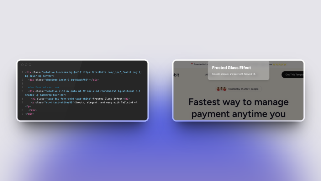
Basic Example: Frosted Glass Card

<div class="relative h-screen bg-[url('/img/hero.jpg')] bg-cover bg-center">
  <div class="absolute inset-0 bg-black/50"></div>

  <!-- Frosted card -->
  <div class="relative z-10 max-w-md mx-auto mt-32 p-8 backdrop-blur-md bg-white/30 rounded-2xl shadow-lg">
    <h1 class="text-3xl font-bold text-white">Frosted Glass Effect</h1>
    <p class="mt-4 text-white/80">Smooth, elegant, and easy with Tailwind v4.</p>
  </div>
</div>
How It Works
Background image stretches full‑screen.
A semi‑transparent overlay (
bg-black/50) darkens the image.The card uses
backdrop-blur-mdto blur everything behind it, whilebg-white/30adds a subtle tint to keep text legible.
Blurring the Whole Page Behind a Modal
<!-- Backdrop -->
<div class="fixed inset-0 bg-black/40 backdrop-blur-sm flex items-center justify-center">
  <!-- Modal -->
  <div class="bg-white p-6 rounded-lg w-full max-w-lg">
    <h2 class="text-2xl font-semibold mb-2">Modal Title</h2>
    <p class="text-gray-600">Your content goes here.</p>
  </div>
</div>
The backdrop-blur-sm class soft‑focuses the page, drawing the eye to the modal while preserving overall context.
Customizing Blur Values in Tailwind v4
Tailwind CSS v4 introduces CSS‑first configuration. Instead of a tailwind.config.js file, you can extend design tokens directly inside any CSS file using the @theme at‑rule:
/* styles.css */
@import "tailwindcss";

@theme {
  /* Custom blur tokens */
  --blur-xs: 2px;
  --backdrop-blur-xxl: 72px;
}
Now you can use blur-xs and backdrop-blur-xxl utilities right in your markup:
<div class="backdrop-blur-xxl ..."></div>Legacy projects: Prefer the old JavaScript config? Create a
tailwind.config.jsfile and useexport default { theme: { extend: { blur: { xs: '2px' } } } }— still fully supported in v4.
Performance & Accessibility (v4 improvements)
Faster builds: Tailwind v4’s new Oxide engine compiles incremental rebuilds in microseconds, so experimenting with heavy blur is no longer a productivity drag. citeturn4view0
Scope your blur to specific components rather than entire pages for better runtime performance, especially on low‑powered devices.
Graceful fallback: Use feature queries (
@supports) or provide solid‑color overlays ifbackdrop-filterisn’t supported.
Real‑World Ideas
Use Case | Utility Stack |
|---|---|
Sticky translucent navbar |
|
Spotlight hero image |
|
Glassmorphic pricing card |
|
Next Steps
Try these classes instantly in Tailwind Play (v4 defaults pre‑loaded).
Need production‑ready glassmorphic blocks? Explore Tailkits and drop them straight into your project.
Happy coding with Tailwind CSS v4!
FAQ
Can I combine backdrop blur with other filter effects in Tailwind CSS?
Yes, Tailwind CSS provides utilities for other filter effects like brightness, contrast, and grayscale. You can combine them by applying multiple classes to the same element.
Does using backdrop blur affect performance?
Using backdrop-filter can impact performance, especially on large elements or complex layouts, because it requires the browser to render layers behind the element. Use it judiciously and test performance on target devices.
How can I animate the blur effect using Tailwind CSS?
You can use Tailwind CSS's animation utilities to animate blur effects. Define keyframes for blur transitions and apply them using the animate- classes.
Can I use custom blur values not provided by Tailwind CSS?
Yes, you can customize blur values in your tailwind.config.js file under the theme.extend.backdropBlur or theme.extend.blur sections.

Yucel is a digital product creator and content writer with a knack for full-stack development. He loves blending technical know-how with engaging storytelling to build practical, user-friendly solutions. When he's not coding or writing, you'll likely find him exploring new tech trends or getting inspired by nature.

