Tailwind Height Made Easy
Discover how to use Tailwind height utilities to create perfectly sized, responsive elements in your web projects

Trying to figure out how to control the height of elements in Tailwind CSS? Many people find it tricky! Tailwind provides lots of tools to manage height, and using them well can really improve your designs. Let's look at how Tailwind's height utilities work so you can size your components perfectly.
Tailwind's Height Utilities
Tailwind CSS offers many classes to set element heights. They're easy to use and flexible. You can set fixed heights, percentages, viewport heights, and more. Knowing how these classes work gives you control over your layout.
Fixed Height Classes
Fixed height classes in Tailwind are simple. They have set values that match specific sizes in pixels or rem units. For example:
h-1sets the height to0.25rem(4px).h-2sets the height to0.5rem(8px).h-64sets the height to16rem(256px).
Use these classes when you need elements to have exact sizes.
Custom Height Values
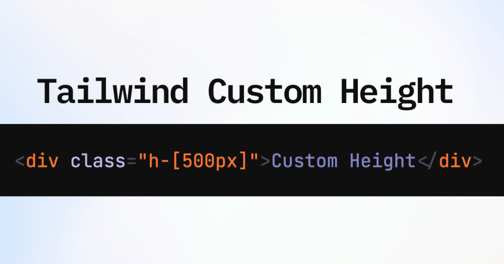
You can also set custom heights in Tailwind using arbitrary values. Just use square brackets:
<div class="h-[500px]">Custom Height</div>This lets you set heights not included in the default sizes.
Setting Percentages and Fractional Heights

Sometimes you want an element's height to be a percentage of its parent or to fill space. Tailwind has classes for this too.
Percentage Heights
Use these classes to set height percentages:
h-1/2sets the height to 50%.h-1/3sets the height to 33.333%.h-fullsets the height to 100% of the parent container.
Example:
<div class="h-1/2 bg-green-200">Half Height</div>Fractional Heights
Fractional heights help when creating grids or dividing space equally between elements.
<div class="h-1/4 bg-yellow-200">Quarter Height</div>Using Viewport Height Units
Viewport units let elements adapt to the user's screen size. Tailwind has classes to use these units easily.
Full Viewport Height
h-screensets an element's height to 100% of the viewport.
This is great for making full-page sections or backgrounds.
<section class="h-screen bg-blue-500">Full Screen Section</section>Dynamic Viewport Units
Starting from Tailwind CSS v3.4, you can use dynamic viewport units with custom values:
<div class="h-[50dvh] bg-purple-200">Half Viewport Height Adjusted for UI</div>Dynamic viewport units like dvh adjust for UI elements like browser address bars, keeping sizes consistent across devices.
Working with Min-Height and Max-Height

Setting minimum and maximum heights can prevent layout problems and help with responsiveness.
Minimum Height
min-h-0sets the minimum height to zero.min-h-fullsets it to 100% of the parent.min-h-screensets it to 100% of the viewport height.
Example:
<div class="min-h-screen bg-indigo-200">Minimum Screen Height</div>Maximum Height
max-h-0restricts the element to zero height.max-h-fullallows it to grow to the full height of the parent.max-h-screenlimits it to the viewport height.
Example:
<img src="image.jpg" class="max-h-64" alt="Responsive Image">Use max-h to make sure images or content don't get too big, keeping your layout tidy.
Vertical Centering with Tailwind
Centering content vertically can make your design look better. Tailwind makes this easy with Flexbox.
Using Flexbox for Vertical Alignment
Use height classes with Flexbox to center content vertically and horizontally.
<div class="h-screen flex items-center justify-center">
  <p class="text-2xl">Centered Content</p>
</div>flexenables Flexbox on the container.items-centercenters items vertically.justify-centercenters items horizontally.
This way, your content stays centered no matter the screen size.
Height in Flexbox and Grid Layouts
Knowing how height works in Flexbox and Grid layouts helps you build complex designs.
Flex Items and Height
In a flex container, items can stretch to fill space.
<div class="flex h-64">
  <div class="flex-1 bg-red-200">Flex Item 1</div>
  <div class="flex-1 bg-green-200">Flex Item 2</div>
</div>flex-1allows the flex items to grow and fill the container equally.
Grid Items and Height
Grid layouts let you control rows and columns precisely.
<div class="grid grid-rows-2 h-64">
  <div class="row-span-1 bg-yellow-200">Grid Item 1</div>
  <div class="row-span-1 bg-blue-200">Grid Item 2</div>
</div>
Change grid-rows and row-span to control how grid items' heights are distributed.
Animating Height Changes

Adding transitions to height changes makes things smoother for users.
Using Transition Utilities
Tailwind gives you classes to animate changes.
<div class="h-16 overflow-hidden transition-all duration-500 hover:h-64 bg-gray-300">
  <p>Hover over this box to expand its height.</p>
</div>transition-allapplies transitions to all properties.duration-500sets the transition duration to 500ms.hover:h-64changes the height on hover.
This makes a smooth animation when the height changes.
Aspect Ratios and Height
Keeping aspect ratios is important for things like images and videos.
Using the Aspect-Ratio Plugin
Tailwind's aspect-ratio plugin lets you set an element's ratio.
<div class="aspect-w-16 aspect-h-9">
  <iframe src="<https://www.youtube.com/embed/dQw4w9WgXcQ>" class="w-full h-full"></iframe>
</div>aspect-w-16andaspect-h-9set a 16:9 ratio.The inside element adjusts to keep this ratio.
This makes sure embedded content scales properly on different devices.
Practical Examples of Tailwind Height Usage
Let's see some real-world examples where controlling height is important.
Creating a Fixed Header
To make a fixed header that stays at the top, you need to set the height precisely.
<header class="fixed top-0 w-full h-16 bg-gray-800">
  <!-- Navigation -->
</header>
Building a Responsive Grid
When making grids, you might want items to be the same height:
<div class="grid grid-cols-2 gap-4">
  <div class="h-48 bg-red-200">Item 1</div>
  <div class="h-48 bg-blue-200">Item 2</div>
</div>
Designing a Full-Height Sidebar
A sidebar that goes the full height of the screen improves usability.
<aside class="h-screen w-64 bg-gray-700">
  <!-- Sidebar content -->
</aside>
Responsive Hero Section
Create a hero section that adjusts its height on different devices.
<section class="h-screen md:h-[80vh] bg-cover bg-center" style="background-image: url('hero.jpg');">
  <!-- Hero content -->
</section>
On small screens, the section fills the screen height.
On medium and bigger screens, it's 80% of the screen height.
Advanced Height Management Techniques

Sometimes you need advanced methods to manage heights.
Using CSS Variables with Tailwind
You can use CSS variables to create dynamic height values.
<div class="h-[calc(100vh-4rem)]">
  <!-- Content that fills the viewport minus 4rem -->
</div>
This helps when you have a fixed header or footer and need to adjust the content area.
Creating Custom Height Utilities
If you often use certain height values, adding custom utilities can make your work easier.
In your tailwind.config.js:
module.exports = {
  theme: {
    extend: {
      height: {
        '128': '32rem',
        'screen-75': '75vh',
      }
    }
  }
}
Now you can use h-128 and h-screen-75 in your HTML.
<div class="h-128 bg-pink-200">Custom Height</div>
<div class="h-screen-75 bg-teal-200">75% Viewport Height</div>
Tips for Effective Height Management
Here are some tips for managing heights well.
Use Relative Units: When possible, use percentages or viewport units for responsiveness.
Test on Multiple Devices: Always check how height adjustments affect layout on different screens.
Combine Utilities: Don't hesitate to combine
min-h,h, andmax-hfor precise control.Use Flex and Grid: Use these layout systems to manage heights well.
Watch for Content Overflow: Make sure your content fits within the set heights or handle overflow properly.
Trivia
What's the difference between h-full and h-screen?
h-fullsets the height to 100% of the parent element.h-screensets the height to 100% of the viewport height.
Use h-full when you want an element to fill its container, and h-screen when you want it to fill the entire screen.
Common Height-Related Challenges and Solutions
Dealing with heights can sometimes cause problems. Here are some common issues and solutions.
Overflow Issues
Content might overflow its container if the height is too small.
Solution:
Use
overflow-auto,overflow-hidden, oroverflow-scrollto handle overflow.Adjust the height or use
min-hto fit the content.
Full Height Sections Not Filling the Screen
Sometimes h-screen doesn't fill the viewport because of parent constraints.
Solution:
Make sure parent elements have
min-h-screenorh-full.Check that the
htmlandbodyelements haveh-full.
Inconsistent Heights Across Browsers
Different browser UI elements can affect viewport heights.
Solution:
Use dynamic viewport units like
dvhin newer versions of Tailwind.Test across different devices and adjust accordingly.
Controlling Line Height in Tailwind

Adjusting line height makes text easier to read and can improve how your design looks.
Using Line Height Utilities
Tailwind provides leading-{size} utilities to control line height:
leading-noneremoves extra space between lines.leading-tightreduces space.leading-normalkeeps the default spacing.leading-looseincreases space.
Example:
<p class="leading-relaxed">
  This is a paragraph with relaxed line height, making it easier to read longer blocks of text.
</p>
Custom Line Heights
You can also define custom line heights:
<p class="leading-[3rem]">
  This paragraph has a custom line height of 3rem.
</p>
Handling Height in Complex Layouts
Complex layouts may need a mix of height strategies.
Multi-Column Layouts
In multi-column layouts, keeping equal heights can be important.
<div class="flex">
  <div class="w-1/2 h-auto bg-gray-200">
    <!-- Content -->
  </div>
  <div class="w-1/2 h-auto bg-gray-300">
    <!-- Content -->
  </div>
</div>
Using h-auto makes columns adjust their height based on content, keeping things balanced.
Sticky Footers
Creating a footer that sticks to the bottom of the page when content is short.
<body class="min-h-screen flex flex-col">
  <main class="flex-grow">
    <!-- Main content -->
  </main>
  <footer class="h-16 bg-gray-800">
    <!-- Footer content -->
  </footer>
</body>flex-colsets a vertical flex layout.flex-growallows the main content to expand and fill available space.
Testing Height Adjustments Across Devices
Responsive design is important in modern web development.
Use Browser DevTools: Simulate different devices and screen sizes.
Check for Overflows: Make sure that content doesn't spill out of containers on small screens.
Adjust Breakpoints: Tailwind's default breakpoints can be customized to match your project's needs.
Conclusion
By mastering height utilities in Tailwind CSS, you can create great-looking and functional layouts. Whether you're building a simple webpage or a complex app, knowing how to control element heights is important. Try different classes, test your designs, and you'll find that Tailwind makes height management easy and flexible.
FAQ
How do viewport units like dvh differ from vh?
The dvh unit adjusts for dynamic UI elements like browser address bars, providing more consistent sizing across devices compared to vh.
Can I set max-height and min-height in Tailwind?
Yes, Tailwind provides max-h-{size} and min-h-{size} utilities. Use these to constrain the maximum or minimum height of an element.
How do I adjust the line height in Tailwind?
Use leading-{size} classes to control line height. For example, leading-tight reduces space between lines, while leading-loose increases it.
Is it possible to animate height changes in Tailwind?
Yes, with the help of transition utilities like transition-all and setting different heights on hover or focus states.
How do I make an element fill the remaining screen height?
You can use h-screen to set the element's height to the full viewport height. Combine it with min-h-screen if needed.
How do I set a fixed height in Tailwind?
You can set a fixed height using classes like h-16, h-32, etc., which correspond to specific rem values. For example, h-64 sets the height to 16rem (256px).
Can I use custom height values in Tailwind?
Yes. Tailwind allows you to specify arbitrary values using square brackets. For example, h-[500px] sets the height to 500 pixels.
How can I set the height to fit the content in Tailwind?
By default, elements will adjust their height based on content. If you need to override a previously set height, you can use h-auto to revert to automatic height based on content.

Yucel is a digital product creator and content writer with a knack for full-stack development. He loves blending technical know-how with engaging storytelling to build practical, user-friendly solutions. When he's not coding or writing, you'll likely find him exploring new tech trends or getting inspired by nature.
