Drag-and-drop shadcn/ui page composer that installs pages with the shadcn CLI
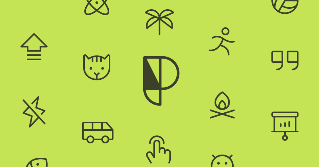
Phosphor Icons
Free MIT icon set: 1,512 icons in six weights, from Thin to Duotone
FreeDesign
phosphoricons.comExplore the product
AT A GLANCE
- Website
- phosphoricons.com
- Pricing
- Free
- Categories
- Design
- Listed
- Mar 2026
- Updated
- Nov 2026
Details about Phosphor Icons
KEY POINTS
- React package
- Figma plugin
Short verdict: Phosphor is a free, MIT-licensed family of 1,512 icons, each drawn in six weights from Thin to Duotone, so one set can cover a dense dashboard and a bold landing page. Its React components take Tailwind classes as they are, and nothing on the website sits behind an account or a paywall. The trade-off is size: every React icon carries all six weights, so our 10-icon test bundle came out at 31.8 KB minified, more than four times Lucide's. The set has also not grown since March 2024. It suits teams that want weight options for free and can live with 1,512 icons; teams counting kilobytes should import single-weight SVGs instead.
How we reviewed it: On 22 November 2026 we searched and browsed phosphoricons.com in Chromium, installed @phosphor-icons/react 2.1.10 with an empty npm cache (Node.js 22.23, npm 10.9) and bundled the same 10 icons we use for every icon library with esbuild 0.28.2. We rendered them on a local page with the Tailwind CSS 4.1 browser build and checked colors, sizes and the accessibility tree in Chrome. Icon counts come from the npm packages, release dates from npm and stars from GitHub on the same day. We did not test the Vue, Flutter, Swift and Elm packages or the Figma, Sketch and Penpot plugins.
What you get for free
| Price | Free, with no paid tier. Phosphor asks for donations through Buy Me a Coffee, Ko-fi, Open Collective and Patreon. |
|---|---|
| License | MIT: commercial and client work allowed; keep the copyright and permission notice with copies of the icons. License text |
| Icons | 1,512 icons in Thin, Light, Regular, Bold, Fill and Duotone, by our count of @phosphor-icons/core 2.1.1 and the React package. The site's "9,072 icons" counts every weight; the GitHub README still says 1,248. |
| Formats | SVG (also "raw" SVG with the original strokes), PNG, data URI, Unicode code point and an icon font |
| Packages | Official: React, Vue, web components, web font, Flutter, SwiftUI, Elm and the raw SVG assets. Svelte and React Native ports are community projects, and there is no Angular package. |
| Design tools | Figma plugin and community file, Sketch plugin, Penpot plugin |
| Versions | @phosphor-icons/react 2.1.10, 22 May 2025; @phosphor-icons/core 2.1.1, 29 March 2024 (npm) |
| Project health | 7.8k GitHub stars on the main repository, last commit 26 August 2026; 7.78 million npm downloads of the React package from 9 to 15 November 2026. Source on GitHub |
What we found
Six weights from one drawing
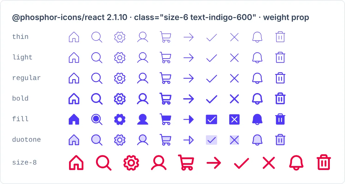
Every icon comes in six weights, and the React weight prop switches between them. Thin and Light suit small, dense interfaces; Bold and Fill hold up on buttons and mobile tab bars. Check one detail before switching a whole interface: in the Fill weight, Check and X become marks inside a filled square, and Duotone puts a 20% opacity square behind them, so the shape changes, not only the thickness.
Tailwind classes work without Phosphor props
The components default to fill="currentColor" and a 1em size, and pass className to the SVG, so size-6 text-indigo-600 gave us 24 px indigo icons with no Phosphor props at all. By default the icons carry no aria-hidden, role or title: Chrome listed all 70 icons on our page as unnamed images. Add aria-hidden="true" to decorative icons; the alt prop adds a <title> to icons that carry meaning.
Every React icon ships all six weights
Because the weight is chosen at runtime, each component holds six sets of paths. One icon bundled to 2,960 bytes minified, and each further icon added about 3.2 KB: our 10 came to 31,798 bytes (8,175 gzipped). The same 10 icons as Regular SVG files from @phosphor-icons/core total 4,988 bytes (1,639 gzipped), and they use currentColor too. If you only need one or two weights, an SVG loader or Phosphor's sprite-sheet plugin (@phosphor-icons/unplugin, which we did not test) keeps the other weights out of your bundle.
The README flags two more React details. Importing from the package root can make some bundlers transpile all 9,000+ modules in development, so it suggests per-icon paths or Next.js optimizePackageImports. React Server Components should import from @phosphor-icons/react/ssr, which we used to render our test page.
Search and copy without an account
On phosphoricons.com, "settings" returned 12 icons (gears, faders, sliders, toggles, user-gear icons and a wrench) and "shopping cart" returned 2. "Chart" returned 74, but only 12 have "chart" in their name; the rest include loose matches such as 19 chat bubbles and 17 batteries. Each icon opens a panel to download or copy SVG, raw SVG and PNG, copy a data URI or the Unicode code point, and copy snippets for React, Web, Vue, Flutter, Elm and Swift. Nothing asked us to sign in.
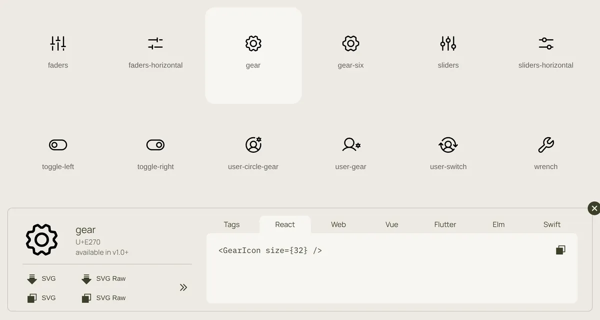
GearIcon name in the React tab.A finished set rather than a growing one
The icon catalog, @phosphor-icons/core, was last released on 29 March 2024, and the 1,512 icons on the site match it. Recent work has gone into the packages instead: React 2.1.8 (May 2025) added an Icon suffix to every component, so House became HouseIcon, and kept the old names as deprecated aliases. A banner on the site warns that other packages may rename icons too. New icons are requested through GitHub issues, with no date for the next release.
Output and build
Measured on 22 November 2026, one run each:
| What we measured | Result |
|---|---|
| Install, empty npm cache | 4 packages (React and React DOM come in as peers), 5.4 s, 66 MB on disk; the package is 33.0 MB unpacked in 9,089 files |
| 10 icons, React package | 31,798 bytes minified, 8,175 gzipped |
| 1 icon, React package | 2,960 bytes minified, 1,060 gzipped |
| 10 icons as Regular SVG files | 4,988 bytes, 1,639 gzipped |
| Icon font, Regular weight only | 78 KB of CSS (12 KB gzipped) plus a 147 KB WOFF2 file |
| Colors | currentColor; text-* and size-* work |
| Accessibility defaults | No aria-hidden, role or title; alt adds a title |
The 10 icons were House, MagnifyingGlass, Gear, User, ShoppingCart, ArrowRight, Check, X, Bell and Trash, bundled with esbuild (--bundle --minify --format=esm, React external). On a marketing page, 8 KB gzipped is minor. In an app with a hundred icons the cost of carrying every weight adds up, and the single-weight SVGs come to about a fifth of the gzipped size.
What you still have to do
Choose how you import. Decide between the React package (all weights, switchable at runtime) and single-weight SVGs before your icon count grows.
Accessibility. Add
aria-hidden="true"to decorative icons andaltoraria-labelto the ones that carry meaning.Names. Use the
Icon-suffixed names in new code; the old names still work but are deprecated.Missing icons. Search for the icons your product needs most before you commit. If one is missing, the README explains how to draw a custom icon on Phosphor's 256 × 256 grid.
Pros and cons
Pros
Six consistent weights for every icon, switched with one prop.
Free under MIT, with no account, paywall or attribution beyond the license notice.
currentColorandclassNamepass-through, so Tailwind'ssize-*andtext-*work as written.Official packages for React, Vue, web components, a web font, Flutter, SwiftUI and Elm, plus Figma, Sketch and Penpot plugins.
Cons
Every React icon carries all six weights: 31.8 KB minified for our 10 icons.
No new icons since March 2024, and 1,512 is fewer than Tabler's 6,545 or Hugeicons' 6,000+ free icons.
No
aria-hiddenby default.The Fill weight changes some shapes, and site search returns loose matches.
How Phosphor compares
Lucide has 2,095 icons in one stroke style under the ISC license and sets
aria-hiddenby default. Our 10 icons bundled to 7.2 KB minified (2.9 KB gzipped). Choose it for a smaller bundle and more icons if you don't need weights.Tabler Icons offers 6,545 MIT icons in outline and filled versions with an adjustable stroke; our 10 came to 4.2 KB minified. Choose it for breadth.
Hugeicons gives away 6,000+ MIT icons in one style, Stroke Rounded, and its 10-icon bundle was 7.6 KB minified. Its other nine styles cost $99 a year per seat.
Heroicons, from the makers of Tailwind CSS, has 316 MIT icons in outline, solid, 20 px and 16 px versions, and 7.0 KB minified for our 10. Enough for a small Tailwind interface.
See all design tools, including the other icon libraries we reviewed.
Who should use Phosphor
Use it if you want one free icon family with real weight choices, build with React, Vue or plain HTML, and the 1,512 icons cover your product; move to the single-weight SVGs once bundle size matters. Look elsewhere if you need thousands of icons, regular additions or the smallest React output without extra setup.
FAQ
Is Phosphor Icons free for commercial projects?
Yes. Phosphor is MIT-licensed, so you can use it in commercial and client projects at no cost; keep the copyright and permission notice with any copies of the icons you redistribute. There is no paid tier.
How many icons does Phosphor have?
1,512, each in six weights. The 9,072 shown on phosphoricons.com counts every weight separately; we counted 1,512 icons per weight in @phosphor-icons/core 2.1.1 and in the React package 2.1.10.
Does Phosphor work with Tailwind CSS?
Yes. The React components default to currentColor and pass className to the SVG, so classes such as size-6 and text-indigo-600 work without Phosphor props. We tested this with Tailwind CSS 4.1.
Why is the Phosphor React bundle larger than other icon libraries?
Each icon component contains all six weights so the weight prop can switch them at runtime. Our 10 icons bundled to 31.8 KB minified; the same icons as single-weight SVG files from @phosphor-icons/core were 5.0 KB.
Can I use Phosphor in Next.js Server Components?
Yes. Import from @phosphor-icons/react/ssr, which does not use React context; we rendered our test icons from it with react-dom/server. Icons from that entry cannot inherit defaults from IconContext.
Get new tools like Phosphor Icons weekly
Every Monday: the templates, components and tools added to Tailkits that week, each checked by an editor. Free, unsubscribe in one click.
17 new in the last 30 days313 products reviewed so farSee what you get
KEEP EXPLORING
More design tools