
70+ animated shadcn/ui components for Next.js
Annnimate
132 GSAP animation components in React, Vue and HTML, with an MCP server

annnimate.comExplore the product
AT A GLANCE
- Website
- annnimate.com
- Pricing
- Paid
- Categories
- ComponentsDesign
- Listed
- Nov 2026
- Updated
- Nov 2026
Details about Annnimate
KEY POINTS
- Copy & paste
- Animated
Short verdict: Annnimate sells 132 GSAP animation components, each in React, Vue and plain HTML, from €240 a year. The three we pulled through its MCP server built in a Next.js 16 app without a single change and worked with default motion settings. With reduced motion turned on, Text Reveal hides its paragraph for good, and its cleanup code switches off every other scroll animation on the page when you navigate away. Annnimate suits studios and freelancers who build motion-heavy brand sites and read the code before they ship it; if you want a one-time purchase, Tailwind classes or accessible app components out of the box, look at the alternatives below.
How we reviewed it: On 15 November 2026 we pulled three components through Annnimate's MCP server with a Library account: Text Reveal from the free Starter Pack, and Circular Slider and Floating Navbar from the paid library. We saved them as the Installation page describes, in a Next.js 16.4.6 app with React 19.3.1, gsap 3.15.1 and @gsap/react 2.1.2, ran a production build and drove the pages in Chromium at 820 and 1,280 px with Playwright, with and without reduced motion. We measured the JavaScript each page loads and ran Lighthouse 12.8.2 on three pages of annnimate.com. We did not build the Vue or HTML versions, the Kits or the other 129 components. Prices, counts and terms come from Annnimate's pricing page, FAQ, Terms (updated 5 November 2026) and Black Friday page that day.
Disclosure: Annnimate has a Category Spotlight on the Tailkits Components page from 15 to 22 November 2026, and our links to annnimate.com carry a Tailkits referral tag (atp=tailkits), so Tailkits may earn a commission if you buy through them.
What you get for €240 a year
| Price | Solo, one developer: €240 a year or €87 a quarter. Studio, 2 to 20 seats: €432 a year or €156 a quarter for two seats, with each extra seat cheaper. Prices are in euros, and some countries see regional prices. |
|---|---|
| Black Friday 2026 | 35% off for Annnimate's email list from 19 November and 25% off for everyone from 20 November, until 1 December, on Library plans and both Kits (not Packs), per its Black Friday page. |
| Kits | Reveal (13 components) and Menu (10 components), €149 each, one-time. Not part of the Library; members get 20% off. |
| Free | A Starter Pack of 19 components by email, and a live preview of every component without an account. |
| Size | 132 components, the same number of component pages as in the site's sitemap, in seven menu categories: buttons, scroll, UI components, experimental, shaders, menus and sections. The pricing page counted 12 new ones in the previous 30 days. |
| Formats | React (a JSX file and a CSS file), Vue 3 single-file components and HTML, CSS and JavaScript for every component. You copy the files from the site or through the MCP server; there is no npm package. |
| Stack | GSAP 3.13 or later, plus @gsap/react for React. A few WebGL components also need three.js. Styles are plain CSS, not Tailwind classes. |
| License | Unlimited commercial and client projects on every plan, and code you copied keeps working after you cancel. No reselling as a library, template, theme or course, and no AI training, per the Terms. |
| Refund | 14 days on the first Library payment, unless the account has taken more than 25 components. Kits and Packs are final sale. |
| Maker | Good Fella Studio GmbH, a studio registered in Germany. The home page names Coca-Cola and Powerade among the brands it builds motion for. |
What we found
The files build in Next.js 16 as they are
Setup is one command, npm install gsap @gsap/react, then two files per component: a JSX file and the stylesheet it imports. Each React file starts with "use client" and registers its GSAP plugins behind a window check, so all three rendered from server pages and the production build passed. With default motion settings they worked: one click on the Circular Slider's arrow turned the ring by exactly one card, 45 degrees for our eight cards, and the navbar folded into its pill when we scrolled down.
The MCP server answers with the whole component: source, a usage example, the GSAP plugins it needs and every option. Check the file names before your agent pastes it: the Text Reveal file comes back as TextReveal.jsx while its usage example imports ./text-reveal, so save it under the docs' name, text-reveal.jsx. All three components came as JavaScript, although the FAQ says the components ship with full TypeScript types.
Reduced motion can hide your content
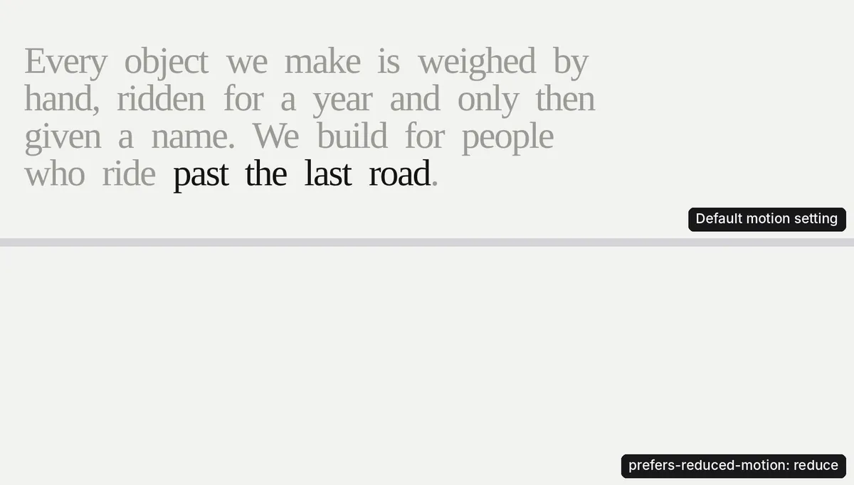
The FAQ says the components fall back "to a calm, usable state" when a visitor turns motion down. Floating Navbar does: with reduced motion on, it switched to the docked pill at once instead of animating. Text Reveal does not. Its paragraph starts hidden by an inline style until GSAP reveals it, and with reduced motion the script returns before that step, so the text never appears. It also disappeared from Chromium's accessibility tree, which is what screen readers read. The Vue file returns at the same point, and Annnimate's own preview of Text Reveal kept its paragraph hidden when we turned on reduced motion.
Circular Slider falls back to a plain row of cards you can scroll sideways, but its arrow buttons do nothing in that mode: a click moved neither the ring nor the row.
One cleanup line stops other scroll animations
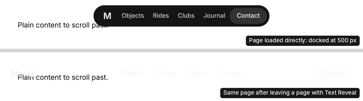
When Text Reveal unmounts, its cleanup runs ScrollTrigger.getAll().forEach((st) => st.kill()), which stops every ScrollTrigger on the page, not only its own. We put Floating Navbar in a shared Next.js layout and Text Reveal on the home page. Loaded directly, our About page docked the navbar at 500 px of scroll. Reached from the home page through a client-side link, it had no ScrollTriggers left and the navbar stayed open, its light text over our white content. With that one line deleted, the navbar kept working after the same navigation in both of our runs, and Text Reveal's own trigger was still removed, by the useGSAP hook it already uses. The Vue version reverts only its own animations.
Each stylesheet brings the demo with it
All three stylesheets load the Switzer font, and two also Geist Serif, from /fonts/ paths that are not part of the download, so our pages logged a 404 error for each font and the text fell back to the next font in each stack. Text Reveal's wrapper is a full-screen section (min-height: 100vh) on a 12-column grid with its own background and padding, and Circular Slider defaults to the full viewport height. Classes are prefixed (text_reveal_wrap, fnb_wrap) and colors are per-component CSS variables, so nothing clashes with Tailwind, but nothing follows your Tailwind theme either: you restyle each component in its own CSS file.
Two terms to read before you subscribe
Annnimate's Terms say a subscription "runs for an initial 12-month term" and can then be canceled at the end of any month, while the pricing page sells a quarterly plan and says you can cancel any time. And the FAQ says components can "ride along inside a theme or starter" you sell, while the Terms forbid redistributing them "as part of any other component library, code marketplace, template, theme, or course material". If you plan to pay quarterly or to sell templates, get Annnimate's answer in writing first.
Bundle size and the annnimate.com site
Each component loads GSAP and the plugins it uses, so the first one on a page costs the most. JavaScript per page in our production build, after gzip:
| Test page | JavaScript |
|---|---|
| Blank page | 132 KB |
| Text Reveal (ScrollTrigger, SplitText) | 180 KB |
| Circular Slider (Draggable, InertiaPlugin, MotionPathPlugin) | 184 KB |
| Floating Navbar (ScrollTrigger, CustomEase) | 186 KB |
| All three on one page | 209 KB |
One component added 48 to 54 KB, and all three together 77 KB, because they share GSAP's core. Lighthouse measures Annnimate's own site instead: one run per page on 15 November 2026, except the home page, which we ran twice (the second run is shown).
| Page | Performance | Accessibility | Best practices | SEO |
|---|---|---|---|---|
| Home, mobile | 45 | 96 | 100 | 100 |
| Home, desktop | 57 | 96 | 100 | 100 |
| Circular Slider page, mobile | 52 | 97 | 100 | 100 |
| Circular Slider page, desktop | 79 | 100 | 100 | 100 |
| Pricing, mobile | 66 | 96 | 100 | 100 |
| Pricing, desktop | 94 | 96 | 100 | 100 |
Both home page runs hit Lighthouse's time limit with the main thread still busy, and total blocking time passed 140 seconds on mobile, so those scores are incomplete. The Circular Slider page shifts its layout while it loads (CLS 0.63 on mobile, 0.36 on desktop). The accessibility deductions are low-contrast text, small touch targets on mobile and an ARIA role that the React, Vue and HTML format links do not allow. The home page's structured data still lists the retired Pro and Team plans at €199 and €300.
What you still have to build
Reduced-motion states. Visible text in Text Reveal, working arrows in the slider, and the same check for every other component you copy.
A safe cleanup. Delete the line in Text Reveal that kills every ScrollTrigger.
Your fonts and layout. Remove the demo
@font-facerules and full-screen wrapper styles, and map each component's CSS variables to your design tokens.Your own images. The slider and navbar examples load demo photos from Annnimate's CDN; a comment in them says the photos come from Arqe and need your own Arqe plan.
Types. TypeScript projects have to type the JavaScript files themselves.
Pros and cons
Pros
Every component comes in React, Vue and HTML; the animation libraries we compare below are React only.
The React files built in Next.js 16 from server pages without changes, and their timing, easing and scroll start are props.
The MCP server hands an agent the full source with its options, so it does not have to guess GSAP code.
Live previews with adjustable options are free without an account, and 19 components are free to use.
Cons
Reduced-motion handling varies: Floating Navbar gets it right, Text Reveal hides its text and the slider's arrows stop working.
Text Reveal's cleanup stops every other ScrollTrigger on the page.
Stylesheets carry demo fonts that 404 and demo layout you have to strip, in plain CSS rather than Tailwind.
A subscription in euros, with Kits sold separately, and Terms and FAQ that disagree on the minimum term and on template sales.
How Annnimate compares
React Bits Pro is the closest paid option: 230 animated React components plus blocks and templates, from a one-time $129, per its site. Choose it if you build only in React and would rather pay once. Motion Primitives is free and open source, built for React, Next.js and Tailwind CSS on Motion, and suits small interface animations in an app. SmoothUI is also free, with 228 animated React primitives and components on Motion and Tailwind, per its site. Annnimate is the one to pick for GSAP, for Vue or plain HTML projects, and for scroll-driven page sections rather than app widgets. See all animated components.
Who should buy Annnimate
Buy Annnimate if you build brand, agency or campaign sites with scroll-driven motion in React, Vue or plain HTML and can read GSAP code: it saves the hardest part of that work, for any number of clients. For accessible app components that drop in unchanged, Tailwind styling or a one-time price, pick one of the alternatives above.
FAQ
Is Annnimate a one-time purchase?
No. The Library is a subscription: Solo costs €240 a year or €87 a quarter for one developer, and Studio starts at €432 a year for two seats. The Reveal and Menu Kits are one-time purchases at €149 each and are not included in the Library.
Can I use Annnimate components in client projects?
Yes. Every plan covers unlimited commercial and client projects, and components you copied keep working after you cancel. The Terms forbid reselling them as a library, template, theme or course, while the FAQ allows them inside a template you sell, so ask Annnimate before you sell one.
Does Annnimate work with Tailwind CSS?
Yes, side by side, but it does not use it. Each component ships its own plain CSS file with prefixed class names and CSS variables, so it does not clash with Tailwind, and you restyle it in that file rather than with utility classes.
Is there a free version of Annnimate?
Partly. A Starter Pack of 19 components comes free by email, in React, Vue and HTML, and every component has a free live preview. The rest of the 132 components need a Library plan. There is no trial, only a 14-day refund on the first payment, which ends once the account has taken more than 25 components.
Does Annnimate have a Black Friday deal?
Yes. In 2026 Annnimate's email list gets 35% off from 19 November and everyone else 25% off from 20 November, both until 1 December, with a code at checkout. It applies to the quarterly and yearly Library plans and both Kits, not Packs, and lasts the whole first year on a yearly plan.
KEEP EXPLORING
More components