Free animated React components and blocks for shadcn/ui and Tailwind CSS 4
Spell UI
33 free animated React components via the shadcn CLI, with WebGL effects
FreeComponents
spell.shExplore the product
AT A GLANCE
- Website
- spell.sh
- Pricing
- Free
- Categories
- Components
- Listed
- Mar 2026
- Updated
- Nov 2026
Details about Spell UI
KEY POINTS
- Animated
- Open source
- Copy & paste
- Tailwind CSS v4
Short verdict: Spell UI is a free, MIT-licensed collection of 33 animated React components, from text effects and playful buttons to WebGL light rays and a 3D book, installed one file at a time with the shadcn CLI. The three we installed worked and stayed small, but Light Rays broke our production build until we added the three.js types, and none of the components respects the reduced-motion setting: our test headline blurred in exactly the same way with it switched on. Development has slowed, with no commits in the 30 days before our test and the last component fix in June 2026. It suits a landing page, launch page or portfolio that needs one or two signature effects. Pick a larger, actively maintained library if you need many components, page blocks or accessible motion defaults.
How we reviewed it: On 22 November 2026 we added Light Rays, Words Stagger and Exploding Input with npx shadcn@latest add to a Next.js 16.4.6 app set up with shadcn CLI 4.23.0 (React 19.3, Tailwind CSS 4), built pages from the docs' usage examples and ran a production build. We used each component at 1,280 and 390 px, in light and dark mode, with reduced motion on and off, while logging network requests. We counted the components in the docs and the registry, searched the source of all 33 for reduced-motion handling and network calls, and ran Lighthouse 12.8.2 once on two spell.sh pages. We did not try the other 30 components in an app or the MCP setup with a coding agent.
What Spell UI includes
| Price | Free, with no paid tier and no account needed. The site shows Carbon ads; its sign-in serves a sponsor program the maintainer took offline in August 2026. |
|---|---|
| License | MIT. License |
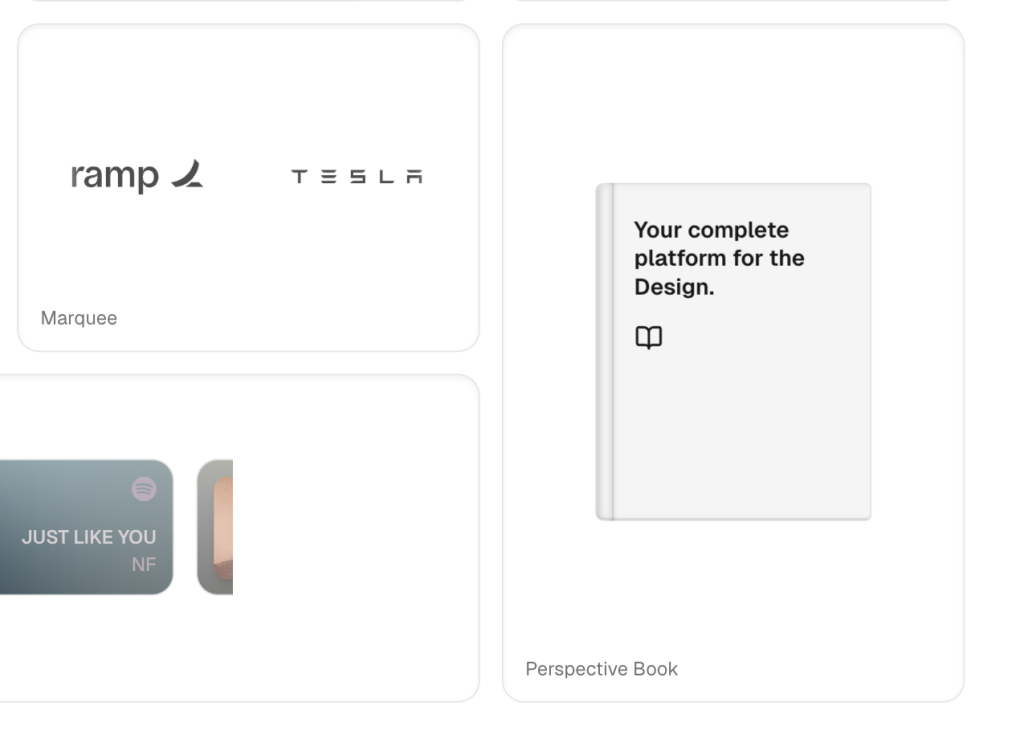
| Size | 33 components in the docs and in the registry: 10 text animations, 4 buttons, 4 inputs, 2 spinners, 2 WebGL backgrounds, a tilt card and 10 others, including a line chart, a 3D book, a marquee, a QR code, a tweet embed and a Spotify card. |
| Stack | React and Tailwind CSS 4; the site runs Tailwind CSS 4.1.13, and some components use Tailwind CSS 4 utilities. Nine components use Motion and Light Rays uses three.js; a few others bring small packages such as react-tweet or qrcode. |
| Install | shadcn CLI with the @spell namespace, or copy one file by hand. shadcn's registry index rates @spell healthy, with 99.7% availability over 30 days. The MCP page sets up shadcn's own MCP server with the @spell registry; there is no Spell-specific server. |
| Activity | 153 commits since 13 September 2025, none in the 30 days before our test; latest commit 10 October 2026. About 1,400 GitHub stars, per the site. |
What we found
One file per component
Installing is light. npx shadcn@latest add @spell/light-rays resolved the namespace without setup, added it to components.json and wrote one file to components/ in about 4.5 seconds. Words Stagger (93 lines) brought Motion, Exploding Input (403 lines) needed no package, and Light Rays (401 lines) brought three.js. Nothing in globals.css changed.
Light Rays then stopped our production build: the registry installs three but not @types/three, so TypeScript rejected the import and next build failed. Adding the type package fixed it.
The effects work, with a few catches
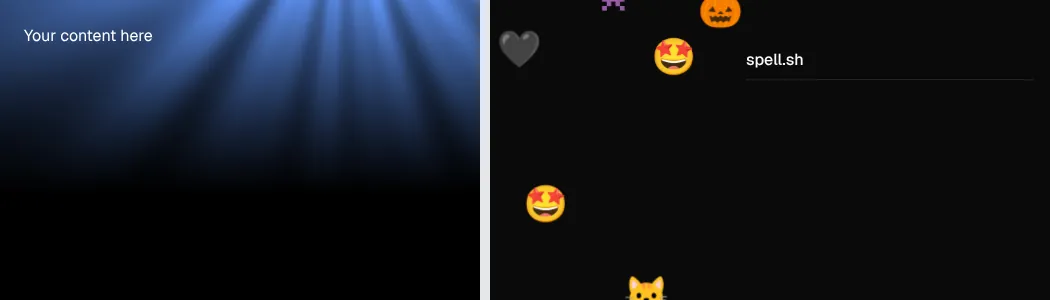
Light Rays drew its WebGL rays on a 688 by 300 px canvas. Its background is black by default whatever your theme, which a prop changes, and it renders at a pixel ratio of 1 on every screen. Its code redraws on every animation frame for as long as it is mounted, with no pause when it scrolls out of view. Exploding Input threw three emoji per keystroke, 15 for "hello", and removed them within 3.5 seconds. Words Stagger revealed our headline word by word, from a 10 px blur and zero opacity to sharp text in about 1.5 seconds. At 390 px none of the three caused sideways scrolling, and none made a network request.
No reduced-motion support
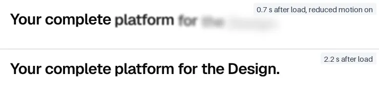
We turned on the browser's reduced-motion setting and reloaded: Words Stagger ran the same blur and fade. None of the 33 components checks prefers-reduced-motion, and Motion only respects it when an app opts in, for example with <MotionConfig reducedMotion="user">. That wrapper covers the nine Motion-based components; CSS and WebGL effects such as Light Rays need their own check. Add one before you put a blurring headline in front of every visitor.
More promise than catalog
The introduction describes "reusable components, blocks, and templates", and the home page "a large collection"; the site has 33 components and no blocks or templates. Several are specific rather than general: a Spotify card that needs an API route you add, a tweet embed, a signature effect that needs a font file copied into public, and a chart with a tooltip card that follows the cursor. Both setup steps are documented. Each component page has a live preview, CLI and manual install tabs, a props table and an Open in v0 link.
Maintenance has slowed
The last change to a component was a fix for a tweet crash on 19 June 2026. Commits since then added Carbon ads in July and August and took the sponsor program offline; the latest, on 10 October, changed an X handle, and there were none in the 30 days before our test. The code is small enough to maintain yourself, so plan to.
Performance: your bundle and spell.sh
JavaScript per page in our production build, gzipped:
| Test page | JavaScript |
|---|---|
| Blank page | 134 KB |
| Exploding Input | 136 KB |
| Words Stagger | 189 KB |
| Light Rays | 264 KB |
Exploding Input costs about 2 KB. Words Stagger adds about 56 KB, nearly all of it Motion, which other Motion components on the page would share. Light Rays adds about 130 KB, nearly all of it three.js, for one background effect. Lighthouse measures spell.sh itself. One run per page, Lighthouse 12.8.2, 22 November 2026:
| Page | Performance | Accessibility | Best practices | SEO |
|---|---|---|---|---|
| Home, mobile | 46 | 92 | 100 | 100 |
| Home, desktop | 72 | 96 | 100 | 100 |
| Light Rays docs, mobile | 41 | 92 | 100 | 100 |
| Light Rays docs, desktop | 56 | 95 | 100 | 100 |
The site is slow on phones. The home page transferred 2.6 MB, including a 980 KB PNG and a 229 KB album cover from Spotify, with 2.85 s of total blocking time. On the Light Rays page the largest element Lighthouse measured on mobile was the Carbon ad, at 14.0 s. Accessibility lost points for low-contrast text and links or buttons without names. None of this ships with the components.
What you still have to build
Reduced motion. Wrap Motion components in
MotionConfigand give CSS and WebGL effects a static fallback.Type packages. Add
@types/threefor Light Rays.Assets and routes. Spotify Card needs its API route, Signature its font file and Logos Carousel your logos.
Pausing heavy effects. Stop Light Rays when it is off screen, for example with an IntersectionObserver.
Updates. Copied files do not update; re-add a component with the CLI if Spell UI changes it.
Pros and cons
Pros
Free and MIT-licensed, with no account.
One file per component and few dependencies; Exploding Input added about 2 KB.
Distinctive effects, such as WebGL rays, a 3D book and an exploding input, that general kits rarely include.
A clean install through the shadcn CLI from a registry rated healthy.
Cons
No reduced-motion handling in any of the 33 components.
Light Rays broke the production build until we added its types, and costs about 130 KB of JavaScript.
A small catalog with no blocks or templates, despite the introduction.
No commits in the 30 days before our test; the last component fix was in June 2026.
How Spell UI compares
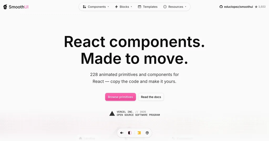
SmoothUI lists 228 animated primitives and components for React, installed through the shadcn CLI and built on Motion and GSAP, and says every component is reduced-motion aware. Pick it for a much larger set with accessible motion defaults.
React Bits offers 217 free animated components and backgrounds under an MIT plus Commons Clause license, which bars selling the components themselves, and has a paid Pro tier. Pick it for the widest choice of animated text and backgrounds.
See all animated component libraries for more options.
Who should use Spell UI
Use Spell UI if you want one or two distinctive effects for a landing page, launch page or portfolio, are happy to own a single file per component, and will add reduced-motion handling yourself. Look elsewhere if you need dozens of components, page blocks or templates, an actively maintained library, or motion that respects user settings out of the box.
FAQ
Is Spell UI free for commercial use?
Yes. Spell UI is MIT-licensed with no paid tier, so you can use its components in commercial and client projects.
Do I need an account to use Spell UI?
No. Components install with the shadcn CLI or by copying the code from the docs. The site's sign-in serves a sponsor program, not the components.
Does Spell UI have its own MCP server?
No. Its MCP page sets up shadcn's MCP server with npx shadcn@latest mcp init and the @spell registry, which lets coding agents find and install Spell UI components.
Does Spell UI respect reduced motion?
No. None of the 33 components checks prefers-reduced-motion, and Words Stagger animated the same with the setting on in our test. Wrap Motion components in MotionConfig with reducedMotion set to user, and add your own checks for CSS and WebGL effects.
Get new components like Spell UI weekly
Every Monday: the templates, components and tools added to Tailkits that week, each checked by an editor. Free, unsubscribe in one click.
17 new in the last 30 days313 products reviewed so farSee what you get
KEEP EXPLORING
More components