
shadcn/ui blocks, components and 21 Next.js and Astro templates via the CLI
8bit/cnlibs
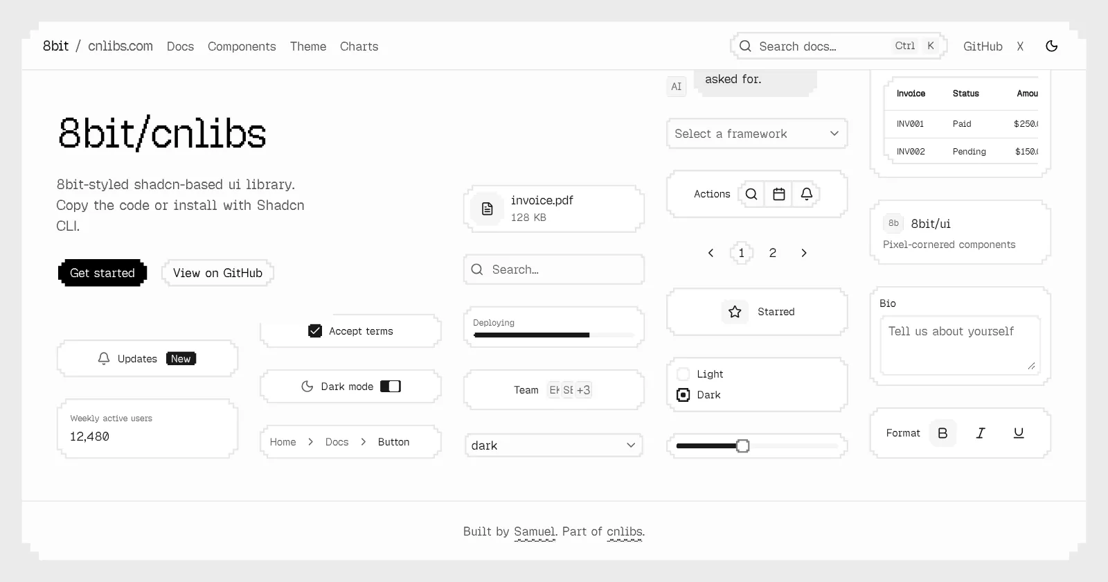
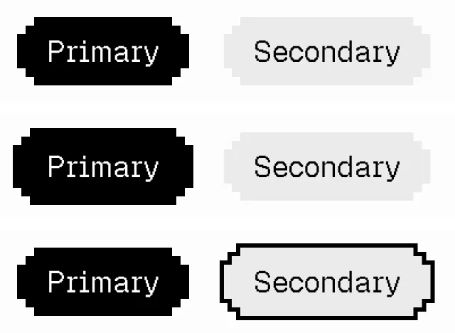
Pixel-cornered shadcn/ui components on Base UI, with 42 themes and charts
FreeComponents
8bit.cnlibs.comExplore the product
AT A GLANCE
- Website
- 8bit.cnlibs.com
- Pricing
- Free
- Categories
- Components
- Listed
- Sep 2026
- Updated
- Oct 2026
Details about 8bit/cnlibs
KEY POINTS
- Copy & paste
- Dark mode
- Theming
- Tailwind CSS v4
- Open source
Short verdict: 8bit/cnlibs restyles shadcn/ui as pixel art: 59 free components on Base UI with stepped corners, 42 color themes and dithered canvas charts, copied into your project with the shadcn CLI. In our Next.js test, the documented setup, ten components and a chart built and worked, and switching themes took one command. The catch is the order of steps: the corner, border and focus utilities ship with the themes, so a component installed on its own renders with no fill or frame, and the component pages do not mention it. It suits React developers who want a retro look on real app components; if you need game interface pieces or ready-made page blocks, look at 8bitcn/ui.
How we reviewed it: On 25 October 2026 we scaffolded a Next.js 16.4.2 app with the documented theme command, npx shadcn@latest init https://8bit.cnlibs.com/r/themes/default.json (shadcn CLI 4.22.1), added the Geist Pixel font, ten components and the dithered bar chart, built a test page from the docs examples and ran a production build. We used it at 1,280 px and 390 px with network logging, switched it to the Retro Arcade theme and back, and added components to a second shadcn project without an 8bit theme. Lighthouse 12.8.2 ran once on three pages of 8bit.cnlibs.com. We did not try other frameworks, test all 59 components or look at the sister ascii library. Counts, dates and the license come from the docs, registry and GitHub repository that day.
What 8bit/cnlibs includes
| Price | Free. There is no paid edition. |
|---|---|
| License | MIT, per the repository's LICENSE file. |
| Size | 59 components in the docs, from Accordion to Tooltip, including chat pieces such as Bubble, Message and Message Scroller. Plus four dithered chart families and 42 color themes, Default included. |
| Stack | React, Tailwind CSS 4 and Base UI, with class-variance-authority and lucide-react icons. The charts add d3-scale, d3-shape and Motion. |
| Install | shadcn CLI with a full URL per item, such as https://8bit.cnlibs.com/r/button.json, or copy the source from each page's Manual tab. 8bit/cnlibs is not in the shadcn registry index, so there is no @ namespace. |
| Activity | The cnlibs repository has 112 commits, from 17 July to its latest on 3 September 2026; 69 of them touch the 8bit app, most recently on 31 August. The docs have no changelog. |
| Maintainer | Samuel Breznjak, who also makes Neobrutalism components. 8bit is one of the libraries on cnlibs.com, next to ascii, with a third marked "Coming soon". |
What we found
Install a theme before any component
The pixel look comes from 25 CSS utilities (px-rounded-*, px-border-* and px-ring) that ship inside the theme items, not with the components. The Installation page puts the theme first: shadcn init with a theme's URL scaffolds a new project, and shadcn add adds it to an existing one. The scaffold gave us a themed Next.js project with the Button in 66 seconds from an empty npm cache. Ten more components and the bar chart took 9 seconds and added 34 files; each item carries the files it needs, so Toast brought its Spinner along.
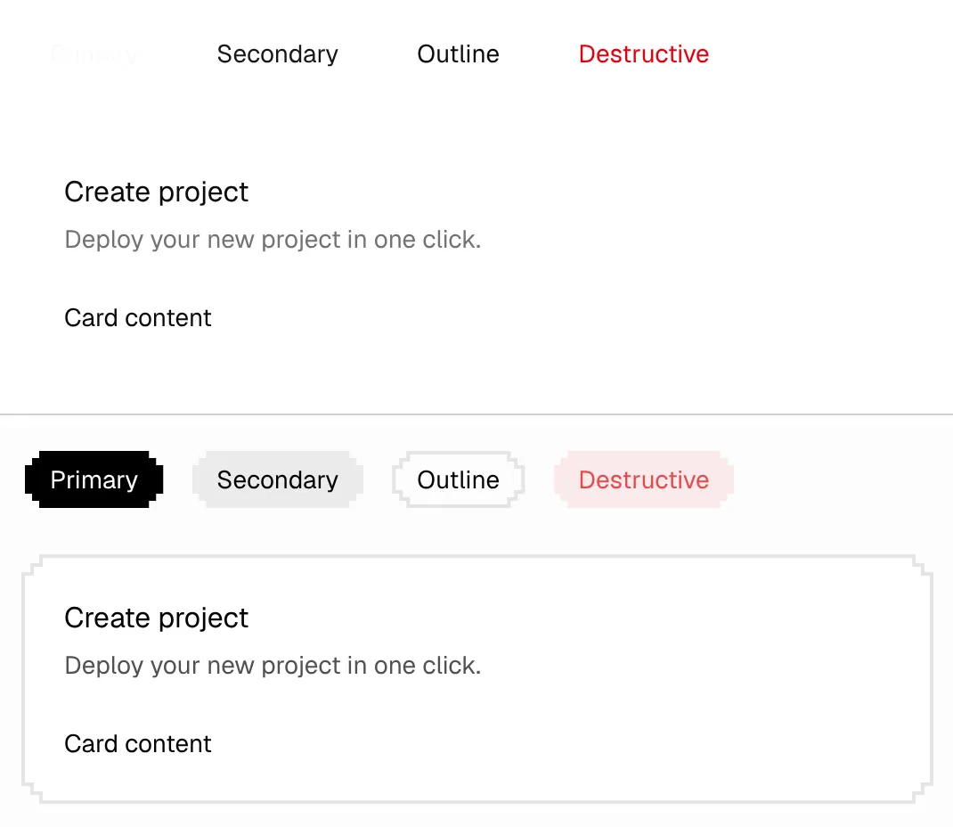
The component pages, though, show only shadcn add with the component's URL. We followed two in a fresh shadcn project without a theme: Button and Card installed and the build passed without a warning, but the Primary button rendered as near-white text on a white page and the card had no frame. Adding the Default theme fixed both.
The font is a separate step: themes set colors and corners, not the typeface. We added Geist Pixel from Google Fonts as the sans font, a two-line change with next/font/google; the build warned that it could not generate a fallback font for it.
42 themes, one command each
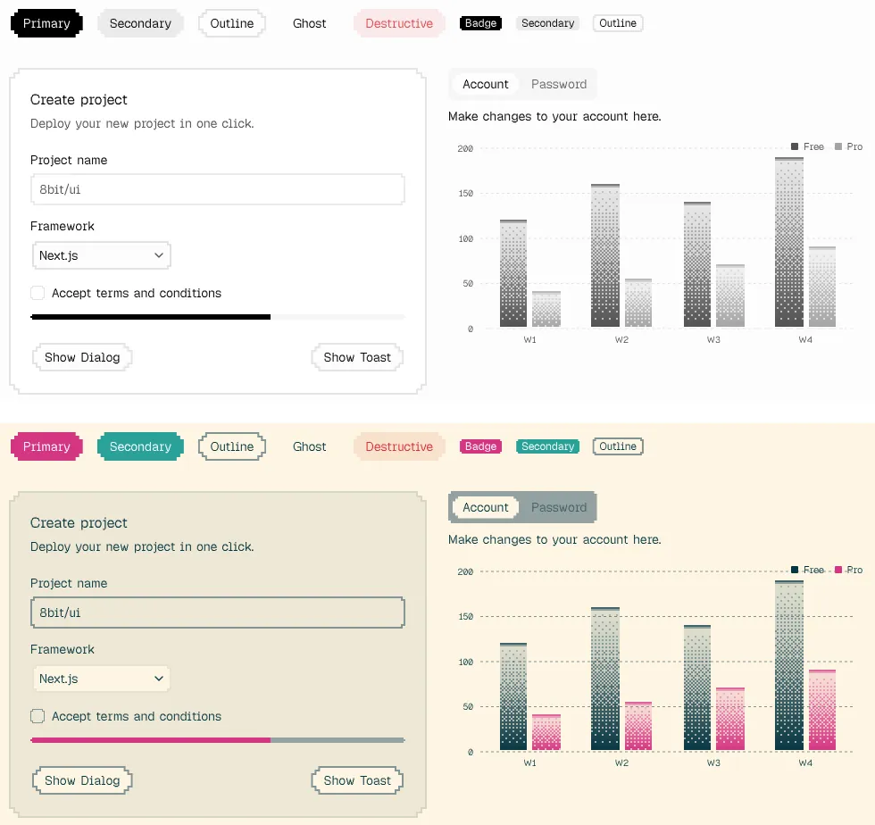
The Theme page previews each theme on sample components and remembers your pick. In our project, shadcn add with the Retro Arcade URL took 4 seconds and rewrote the radius and the 24 color variables for each of light and dark mode, leaving the pixel utilities alone; adding Default again restored globals.css byte for byte. The charts follow the theme because their series colors are slots, not colors: purple reads --chart-3, which is grey in Default and magenta in Retro Arcade.
Charts forked from dither-kit
The Charts page credits dither-kit by tripwire.sh. 8bit hosts its own copy, changed to take its colors from the theme, with area, line, bar, pie, donut and radar charts drawn on canvas. Our bar chart's tooltip showed the right values (140 and 70 for week 3), and the chart recolored with the theme and dark mode. It is also the heaviest part we installed.
Base UI underneath, with one Select trap
Behavior comes from Base UI. The Dialog moved focus to its Cancel button and closed on Escape, Tabs switched panels, and the Checkbox and Toast worked. Parts compose through Base UI's render prop rather than Radix's asChild, as in <DialogTrigger render={<Button />} />. One trap: Select shows the stored value, not the item's label, unless you pass Base UI's items prop. The docs' own example reads "apple" while the option says "Apple"; with items, our trigger showed "Next.js" instead of "next".
Keyboard focus is faint on primary buttons
The stepped shapes come from clip-path, which also cuts off outlines and shadows, so 8bit draws focus as a 2 px band in the theme's ring color. On Secondary, Outline, Ghost and Destructive buttons the band is easy to see. On the Primary button it is not: in light mode, 34 of the 42 themes, Default among them, give the ring the same color as primary, so a focused Primary button only grows by 2 px on each side. In dark mode Default draws a grey border, but Retro Arcade's Primary button showed no change. A ring color that contrasts with primary fixes it: with --ring set to a blue, the focused Primary button got a clear stepped outline in both modes.
Bundle size and the 8bit.cnlibs.com site
Your bundle depends on what you import, so we measured our own production build (Next.js 16.4.2), JavaScript per page after gzip:
| Test page | JavaScript |
|---|---|
| Blank page | 133 KB |
| Blank page with the Toaster in the layout, as the Toast docs set it up | 178 KB |
| Button, Card, Dialog, Select, Input, Label, Checkbox, Tabs, Badge, Progress and a toast | 217 KB |
| The same plus the dithered bar chart | 285 KB |
The Toaster added 45 KB to the blank page and, sitting in the layout, loads on every page. The ten components added another 39 KB and the bar chart 68 KB. Lighthouse measures the vendor's documentation site instead. One run per page, 25 October 2026:
| Page | Performance | Accessibility | Best practices | SEO |
|---|---|---|---|---|
| Home, mobile | 79 | 94 | 100 | 90 |
| Home, desktop | 100 | 96 | 100 | 90 |
| Button docs, mobile | 83 | 94 | 100 | 100 |
| Button docs, desktop | 99 | 95 | 100 | 100 |
| Charts, mobile | 64 | 95 | 100 | 100 |
| Charts, desktop | 92 | 100 | 100 | 100 |
The Charts page draws 11 charts on 22 canvases. On mobile its total blocking time was 2,070 ms, and the chunk with the chart code took 2.4 s of script time, so test chart-heavy dashboards on slower phones. The accessibility deductions are the docs site's own: icon buttons without labels, such as the copy buttons, and focusable controls inside decorative previews hidden from screen readers. The home page loses SEO points for decorative breadcrumb links without an href. The site has no sitemap, robots.txt or llms.txt.
What you still have to build
The font. Set up a pixel font yourself; the themes do not include one.
A visible focus ring. If your theme's
--ringmatches--primary, as in 34 of the 42 themes, give it a contrasting color.Select labels. Pass
itemsto every Select whose labels differ from its values.Chart colors. Choose
--chart-1to--chart-5in your theme, then map each series to a slot.Page sections and game pieces. There are no blocks, templates or health and XP bars; heroes, pricing tables and game interfaces are yours.
Pros and cons
Pros
The pixel style is a set of documented CSS utilities you can use on your own elements.
The documented setup type-checked and built in a new Next.js 16 app.
42 themes switch with one command, and the charts recolor with them.
Base UI handles behavior: focus moved into the Dialog and Escape closed it.
Free under MIT, with each component's full source on its docs page.
Cons
Components installed without a theme render with no fill, border or corners, and their pages do not warn about it.
Keyboard focus on the Primary button is close to invisible in light mode in 34 of the 42 themes.
Select shows raw values unless you pass
items, and the docs example has the same problem.No blocks, templates or game UI components.
No commits since 3 September 2026 and no changelog.
How 8bit/cnlibs compares
8bitcn/ui by OrcDev is a separate library with a similar name. Its registry has 56 components, including health, mana and XP bars, plus 63 blocks, and it is in the shadcn registry index as
@8bitcn. Its components wrap shadcn/ui's Radix-based ones, and its stylesheet loads the Press Start 2P font from Google Fonts. It is MIT-licensed and was last updated on 23 October 2026. Pick it for game interfaces, ready-made blocks or namespace installs.Neobrutalism components, by the same author, follow the same approach with a different look: thick borders and hard shadows instead of pixels. The site lists 64 components, charts and star shapes, built on shadcn/ui and Base UI. Pick it if you like this workflow but not the 8-bit style.
NES.css is a plain CSS framework in the style of NES games that works without React or Tailwind. It is MIT-licensed, but its latest release, 2.3.0, dates from December 2019. Pick it for static pages or another framework.
See all Tailwind component libraries for more options.
Who should use 8bit/cnlibs
Use it if you build a React app with Tailwind CSS 4 and want a pixel-art look on working app components, such as forms, dialogs, tables and charts, in code you own. It fits game sites, developer tools and side projects with a retro brand, if you are willing to set a ring color and a font. Look elsewhere if you need game HUD components, landing page blocks, a framework other than React or regular releases.
FAQ
Is 8bit/cnlibs the same as 8bitcn/ui?
No. 8bit/cnlibs is Samuel Breznjak's library at 8bit.cnlibs.com, built on Base UI and installed by URL. 8bitcn/ui is a separate project by OrcDev at 8bitcn.com that wraps shadcn/ui's Radix-based components and adds game UI components and blocks.
Can I use 8bit/cnlibs in commercial and client projects?
Yes. The repository is MIT-licensed, so you can use and change the components in commercial and client work as long as you keep the license notice. There is no paid edition.
Why do my 8bit buttons have no background or pixel corners?
The components were installed without a theme. The corner, border and focus utilities come with the theme items, so run npx shadcn@latest add https://8bit.cnlibs.com/r/themes/default.json, or another theme's URL from the Theme page, and the components pick them up.
Does 8bit/cnlibs work with Vite or Astro?
We only tested Next.js. 8bit/cnlibs needs React and Tailwind CSS 4 and installs with the shadcn CLI, whose init command also offers Vite, TanStack Start, React Router, Laravel and Astro templates. Load the pixel font the way your framework handles fonts.
KEEP EXPLORING
More components Good company for 8bit/cnlibs.
Full-page shadcn/ui examples for Next.js: dashboards, apps and email templates
Open-source component library for React + Tailwind