How It Works Components
Organise content with Tailwind How it works section. ARIA-labeled, keyboard-navigable and animated indicators for a snappy UX.
How it works 1
Row of icon‑labelled tabs above a gradient content panel
How it works 2
Three card‑style tabs with icons and descriptions below a headline
How it works 3
Center header with pill tabs leading into a pastel panel
How it works 4
Two‑column layout combining a details panel, tags and a gradient image
How it works 5
Large two‑column card with feature tags and CTA below the gradient image
How it works 6
Vertical list of icon cards on the left controlling a phone mockup
How it works 7
Vertical card tabs and smartphone preview within a clean card
How it works 8
Left column of vertical tabs paired with a large browser‑style preview
How it works 9
Split card with stacked tabs and a framed browser mockup
How it works 10
Panel with vertical tabs and pastel browser preview separated by border
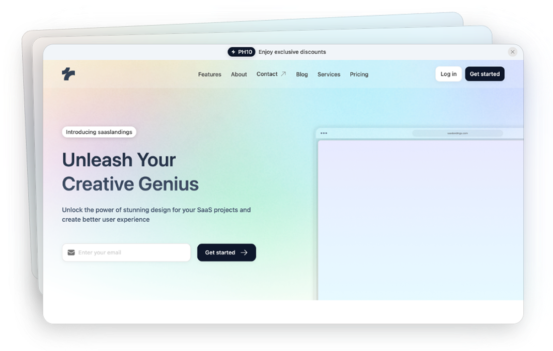
How it works 11
Vertical tab list with highlight beside a pastel browser preview
How it works 12
Pill tabs lead into a detailed features list and gradient preview panel
How it works 13
Stacked feature cards alongside a large browser preview area
How it works 14
Horizontal scrollable pills with arrows controlling description and preview
How it works 15
Phone mockup on left with card tabs on right for different features
How it works 16
Large phone mockup with separate card tabs on the right
How it works 17
Browser mockup on the left paired with card tabs on the right
How it works 18
Gradient‑tinted browser panel on left with card tabs on right
How it works 19
Pastel gradient browser mockup on left and card tabs on right
How it works 20
Colorful browser panel on left with simple list tabs on the right
Can’t find the answer?
Contact us