Free Tailwind CSS Components
30+ open-source components - copy, customize, and ship today
Hero – Minimal Gradient with CTAs
Minimal gradient with headline and two CTA buttons
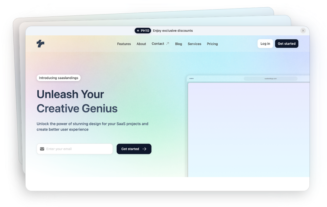
Hero – Gradient with Dual CTAs
Gradient hero with headline and two CTA buttons alongside nested windows
Hero – Blue Gradient with CTAs
Blue gradient hero with headline and dual CTA buttons
Hero – Grid Background Layout
Grid background hero with headline and simple subtext
Features – Split Layout with List
Two-column layout with image on the left and feature bullets on the right.
Features – Gradient Two Columns
Gradient background with heading and dual feature highlights side by side.
Features – Icon Row Highlights
Row of icon headings emphasising analytics, integration and intuitive UI with descriptions
Features – Horizontal Detail Cards
Horizontal cards for “Advanced Analytics” and “Seamless Integration” with details
Logo Cloud
Centered headline with supportive text and a row of simple abstract partner logos
Stats – Split Layout with Metrics
Split layout with phone image plus three big metrics on the right
Team – Grid Background Layout
3 column team members grid with with photos, names, and titles
Call to Action - Background
Call to Action - Centered
How it works – Center Header with Pills
Center header with pill tabs leading into a pastel panel
How it works – Vertical List with Preview
Vertical tab list with highlight beside a pastel browser preview
Testimonial - Gradient Panel with Avatar
Gradient panel featuring a centered avatar above the quote and dot indicators
Testimonial – Quote Block with Arrows
Simple quote block with author details and left/right arrow navigation icons
Contact – Two Column Block
Two‑column contact block with bold headline, short copy and contact button
FAQ – Accordion with Icons
FAQ card with SaaS heading and accordion of questions with plus icons
Newsletter – Centered Headline Form
Centered headline and subtext with email field and “Get started” button
Announcement Bar – Promo with Close
Minimal, full-width promo bar with a discount code, short message, and a close button.
Navbar – Full Bar with Divider
Full‑width bar with links and a vertical divider separating login and free‑trial buttons
Navbar – Links with Login & CTA
Horizontal navbar with logo, text links, plus login and “Open an account” buttons
Header – Headline with Email Signup
Header featuring SaaS tagline, subtext, email field, and CTA button.
Header – Bold Headline with Dual CTAs
Hero header with bold SaaS headline, subtext and dual CTA buttons
Blog – Two Column Feed
Two‑column blog feed with large image thumbnails, tag badges and post details
Pricing – Three Plans with Toggle
Three box‑style plan cards with a toggle; pro tier is emphasised
Pricing – Single Plan with Toggle
Single‑plan card with monthly/annual toggle, price and feature list
Footer – Minimal Grey with Links
Minimal grey footer with logo, three link columns, copyright and icons
Footer – Centered Logo Bar
Minimal bar footer with centered logo, copyright left and icons right
FAQ
Frequently asked questions
Are these Tailwind components really free?
Collapse
Yes, this page contains the free subset of Tailkits UI components you can copy and use.
Do I need a JavaScript framework?
Collapse
No. The components are HTML + Tailwind classes, so you can use them in plain HTML or inside React/Next.js/Vue/Svelte templates.
Can I use these components in a client project?
Collapse
MIT licensing generally allows commercial use. If you redistribute source, keep the MIT notice where appropriate.
Where can I find more sections?
Collapse
If you need more variants and categories, explore the full Tailkits UI library.
Can’t find the answer?
Contact us