Features Components
Highlight product wins via Tailwind feature grids: icon + copy pairs, screenshot slots and dark-mode variants included.
Features 1
Gradient panel with heading and two feature columns: analytics and integration
Features 2
Hero section with “Experience the difference” tagline and subtext
Features 3
Two‑column section with feature list on left and gradient image placeholder
Features 4
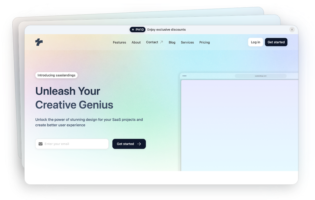
Hero with SaaS success headline, CTAs and two gradient placeholder panels
Features 5
Two-column section with gradient block and bullet features.
Features 6
Two-column layout with text and bulleted feature list.
Features 7
Hero with headline, CTAs and gradient feature panels.
Features 8
Hero with text, two CTAs and stacked gradient panels.
Features 9
Hero with smartphone mock‑up, bold headline, subtext and arrow controls
Features 10
Section with three coloured feature cards: analytics, data transition, guidance
Features 11
Hero with three cards “Data Mastery”, “Design that Speaks”, “Smart Insights”
Features 12
Grid showcasing six features like analytics, integration, UI, reporting, migration, consultation
Features 13
Hero with two horizontal cards labelled “Advanced Analytics” and “Seamless Integration"
Features 14
Hero with three cards tagged beta, v1.1 and responsive for features analytics, integration, UI
Features 15
Hero with three cards, each topped by a colourful gradient block representing a feature
Features 16
Row of icon headings emphasising analytics, integration and intuitive UI with descriptions
Features 17
Hero with heading and row of feature tabs labelled beta, v1.1 and responsive
Features 18
Split layout with headline and description on right and three features below
Features 19
Horizontal cards for “Advanced Analytics” and “Seamless Integration” with details
Features 20
Large panel listing six features—analytics, integration, UI, reporting, migration and consultation
Features 21
Hero with gradient squares above each feature description, emphasising analytics, integration and UI
Features 22
Section listing features first then gradient cards below each description
Features 23
Two‑column layout with features list on left and large gradient card on right
Can’t find the answer?
Contact us